

Pastiche Grotesque
Pastiche Grotesque is type design fanfiction looking at late 19th century Gothics through the lens of mid-20th century Neo-grotesques. It hypothesizes what a Neo-grotesque might look like if lower contrast forefathers like Akzidenz or Venus didn’t exist.
How the Neo-grotesque genre—represented by the likes of Helvetica, AG Book, or Unica—might change if they retained the higher contrast found in early Gothics derived from Clarendons / Egyptiennes (where someone had simply lopped the serifs off).
Sections:
-
Pastiche Grotesque Regular
-
Pastiche Grotesque Medium
-
Pastiche Grotesque Semibold
-
Pastiche Grotesque Bold
-
Pastiche Grotesque Black
Regular
Parody Artist
Medium
Eclecticisms
Semibold
Celebrations
Bold
Composition
Black
Art Imitations
Regular
22px
We hail the new century with its unrevealed treasures of discovery in art, science, and mechanics! Born, November 1st, one hundred years ago, in our infancy we struggled for light; the dawn gradually broke, the rising sun pointed out to us our road and led us ever onward, until now the full rays of the orb shine across our pathway. The honored position of being the leaders in the world of our class is instinctively awarded to us.
Medium
22px
Archibald Binny was a native of Scotland, in which country he had, after becoming a printer, conducted the business of type founding on a limited scale at Edinburgh. He emigrated to this country in 1793. After arduous endeavors, he established at Philadelphia, in 1796, in conjunction with James Ronaldson, the first permanent type foundry in the United States.
Semibold
22px
Hearst later elicited a protest from Frederic W. Goudy, 45 who recounted how, during his Chicago career, he had done some lettering for an edition of Mother Goose illustrated by W. W. Denslow. To my surprise, a little later on, the Inland Type Foundry of Saint Louis, without consultation with me, brought out a new type copied-not inspired-from my Denslow lettering, and added insult to injury by naming it Hearst.
Bold
22px
American Type Founders brought order out of chaos by standardizing both line and design on the basic faces. Efficient methods made type casting once more a profitable business, and assured the printer of prompt and excellent service. Type casting had come of age and Nelson was responsible for its maturity. He had given it the room to grow.
Black
22px
Never did a company need good management more and never was a company less ably managed than the American Type Founders Company during its first two years. It was put on the defensive; its foundries ceased to progress; it had no policy and no head; there was a disposition to cultivate the local interests of each foundry rather than the general interest of the whole company.
Regular
Many of the letterforms we use today are inherited from the Greeks, who substantially evolved their design by the sixth century B.C.
Lowercase
Uppercase
Ligatures
Lowercase Diacritics
Uppercase Diacritics
Punctuation & Symbols
Case-sensitive Punctuation
Numerals
Subscript
Superscript
Denominators
Numerators
Oldstyle Figures
Tabular Figures
Tabular Oldstyle Figures
Math Symbols
Arrows
Arrow alternates
U+2191
Up↑ → Up↑
Uppercase alternates
U+0052
Run → Run
Lowercase alternates
U+0061
Sail → Sail
Numeral alternates
U+0031, U+0032, U+0037
72.1 → 72.1
Oldstyle and tabular figures
U+0030, U+0031
01/01 → 01/01
Double story and single story
U+0067
Fig → Fig
Case-sensitive punctuation
U+007B, U+007D
{QA} → {QA}
Standard ligatures
U+FB01
fin → fin
Localized forms
U+015E
Şi → Și
Fractions
U+0052
1/2 → 1/2
Purchase
We sell typefaces by individual weights or in a reduced price family package. Please ensure you understand the terms of our EULA Agreement and select the correct license before completing your purchase.
Research & Process
Pastiche Grotesque
Written by


Pastiche Grotesque is typeface fanfiction and is named flippantly as such. It is a typeface based on the grotesques and gothics of the late 19th century, seen through the lens of the modernist neo-grotesks of the mid-to-late 20th century.
Beginnings
The beginnings of this project can be traced back to a 2019 digitization that I started of the 1898 sans serif by Nicholas J. Werner alternatively marketed as Gothic No. 8 (Inland Type Foundry, St. Louis), Standard Gothic (Keystone Type Foundry, Philadelphia), and ultimately, Gothic No.578 after American Type Founders acquired Inland.
As far as I know there had been no digital versions of this typeface available prior to my own. Which makes sense. Gothic No.578 is a strange, brutish, precursor to Morris Fuller Benton’s wildly popular Franklin Gothic with a flair of Akzidenz-like grotesk-ness. A midpoint between two type genres, It has the comparatively higher-contrast, and branching structure of a Franklin, but the flat terminal endings of a Helvetica.


This genre melding tension sent me back in time—exploring other late 19th century sans trying to track down the origins of Gothic No. 578. I attempted to trace the lineage of inspiration that had been electrotyped to hell and back by dozens of foundries on either side of the Atlantic. Hoping to uncover the source of characteristics like the lack of a horizontal bar on the uppercase G (seen in Keystone’s Standard Gothic)—a common attribute of many gothics as far back as Figgin’s Two-Line Great Primer Sans Serif (1832). I also tried to determine if there had been a Clarendon/egyptienne whose serifs had been lopped off in order to create the basis for No. 578—owing to the typeface’s many characteristics that match the style of a bold slab serif—notably the top of the ‘t’, and the higher contrast and weight distribution in the branching of the ‘n’.


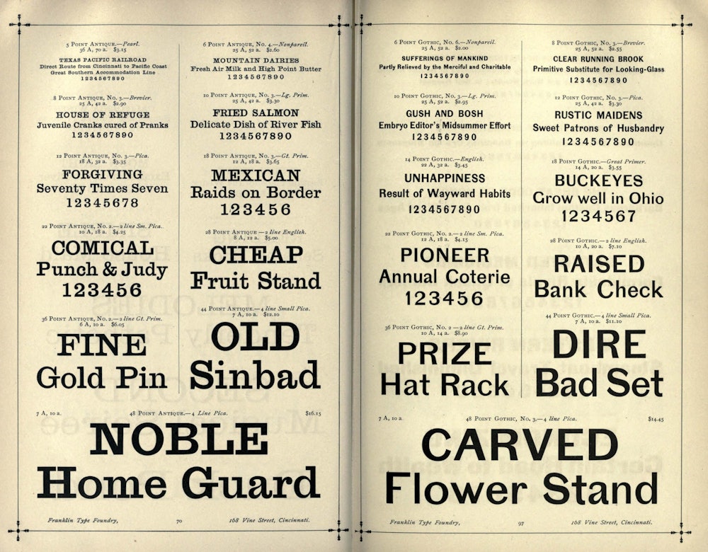
Hunting for slab derived gothics led me away from Gothic No. 578 and towards an obsession with other higher-contrast oddities found throughout type catalogs in the second half of the 1800s. Type faces that may have made sense with their serifs on, but without them they sometimes look naked, poorly spaced, unevenly drawn, half-baked. This incongruity was the inception point for Pastiche Grotesque. But not wanting to draw yet another revival, I set out to create a new typeface steeped in the past. A fusion of cherry-picked qualities from a wide amount of historical sources combined into a cohesive visual language.


Interpretations
I wanted to look into the past at these early gothics through the eyes of the typefaces that have come since. What might a contemporary grotesque look like in an alternate universe where Akzidenz Grotesk never existed? Where it wasn’t the basis for Helvetica and countless other grotesques in the years since? What would an AG Book, or a Haas Unica look like if they were based on the countless high-contrast gothics of the 1800s instead?
Pastiche Grotesque attempts to straddle a line between so-called rationalized modernism, and self-surmised 19th century idiosyncrasy. Determining how far the pendulum should swing in either direction was maybe the biggest challenge during the design process. Aside from the construction of the letterforms, the weight axis became a tool for modulating the visual tone from normal to weird. While the lighter weights start as unassuming, maybe even a bit neutral; as the stroke weight increases, so does the contrast. Creating a more undulating look reminiscent of the turn-of-the-century sans’.


This project is deeply indebted to the gracious criticism of designers Jesse Ragan, Hannes Famira, David Jonathan Ross, Connor Davenport, Delaney Weber, and Cris R Hernandez. Thank you all.
Benjamin Tuttle
2021


