
Etude
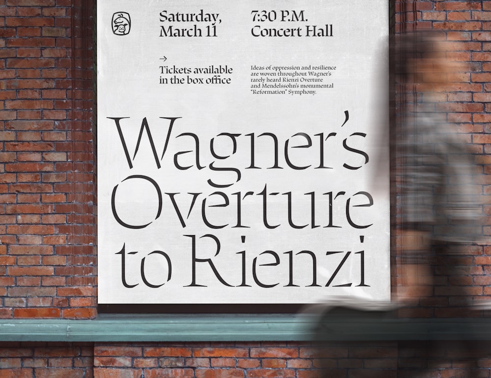
Inspired by the study of type design and experimental music techniques, the name “Etude” comes from the French verb “étudier” rooted in the meaning of “study.” True to the name, Etude is a study of the broad nib pen, the history of handwritten music notation, and the influence of Jean-Pierre Rousselet’s constructed stencil forms into three distinct weights. As the family cascades from Light to Bold, the weights become a crescendo from soft and delicate to loud and more prominent on the page.
Designed by
Emily Atwood→
Mastered by
Alphabet Type→
Sections:
- Etude Light
- Etude Regular
- Etude Bold
Light
Chopin’s Études
Regular
Tchaikovsky! ‘40
Bold
Mahler’s No. 09
Light
22px
Although Chopin is the originator of the concert étude for the piano, its evolution came about as a result of several developments in the history of music, some of which were interdependent and concurrent in their chronology. First of all, the piano in the early nineteenth century went through a series of rapid technological changes.
Light
22px
It was a time when pianists began to demand a more powerful tone and a greater dynamic range of their instruments. This led to the use of heavier strings, larger hammers, reinforced frames, and a faster repeating mechanism. As a result, the old “Viennese” action was losing favor to the heavier and stronger “English” action.
Regular
22px
The invention of the steam engine also made mass production of pianos possible for the first time. The increased production reduced the price of the instrument, and the piano became affordable by the masses. To cope with the growing demands of amateur pianists, numerous method books appeared, most containing technical exercises.
Regular
22px
This was the beginning of the mechanical studies for the piano, and Muzio Clementi (1752-1832) became the inventor of the modern piano étude. His introduction to the art of “Playing the Piano Forte” (1802) and his three-volume “Gradus ad Parnassum” (1817-26) revolutionized the art of piano playing during the set period.
Bold
22px
At the same time that the technical étude was gaining popularity, the character piece began nourishing. Chopin combined the two forms, and merged them into the concert étude. which was appropriate for both teaching and performance. His Études, opp. 10 and 25, published in 1833 and 1837, respectively, are monumental landmarks.
Bold
22px
In the history of the piano étude, they have inspired numerous other composers to follow suit. Since then, the concert étude has also been combined with variation form and transcriptions of music originally written for other instruments. A logical starting point in an investigation of the piano étude is perhaps the instrument itself.
Regular
Mahler’s Fifth Symphony, a work of vast emotional scope that moves from grief to jubilation and includes the composer’s famous Adagietto.
Lowercase
Uppercase
Ligatures
Lowercase Diacritics
Uppercase Diacritics
Punctuation & Symbols
Numerals
Subscript
Superscript
Denominators
Numerators
Oldstyle Figures
Tabular Figures
Tabular Oldstyle Figures
Math Symbols
Arrows
Punctuation
U+00B6
Pilcrow → 
Oldstyle figures
U+0036, U+0032
1927 → 1927
Fractions
U+00BE
3/4 → 3/4
Arrows
U+2192
Go--> → Go→
Math Figures
U+00D7
8x5 → 8×5
Diacritics
U+00C9
Etude → Étude
Purchase
We sell typefaces by individual weights or in a reduced price family package. Please ensure you understand the terms of our EULA Agreement and select the correct license before completing your purchase.
Research & Process
Etude
Written by

Etude is an original stencil typeface inspired by historical broad nib and calligraphic examples of music notation. The name parallels the French verb “étudier” which means “to study” with that of an “etude,” an experimental composition that allows composers to study different musical techniques.

(Left) Frédéric Chopin, Etudes, piano, op. 10. No. 3
(Right) Emily Atwood, Etude Sketches
Influence of the Broad Nib
The beginning of Etude started with the design of a translation contrast text typeface for sheet music notation. Typefaces and glyphs that are specific to music notation typically follow the expansion contrast model, exemplifying thicks and thins that are more vertically oriented. Functionally, the combination of the broad nib and music notation felt at odds, until I came across two examples of translation contrast music notation by Hermann Zapf, that started to justify the existence of Etude. Hans Baumann’s Der Helle Tag is an example of Zapf’s musical notation calligraphy in 1938-39 named, Alkor Notenschrift. In 1942-43, Zapf also designed Musica Roman, a typeface for Ludwig Voggenreiter Verlag, a prominent music publisher at the time. The calligraphic influence of the broad nib was evident in both of these examples. Musical glyphs like the staff or rest notes took on a slightly different form than their expansion contrast conunterparts, but remained functional and recognizable.


The Influence of the Stencil
As I looked deeper into the history of music notation, it was clear that some of the first handwritten examples of music utilized the broad nib. The square and diamond shaped music notes that danced across the page were accompanied by a unique calligraphic stencil. The more remarkable examples of handwritten stencil music notation are by French Illuminator and Scribe, Jean-Pierre Rousselet from the early 18th century. Rousselet’s liturgical manuscript for King Louis XV in 1719 (Officium S. Ludovici regis Franciae ac missae festorum annualium ad useum domus regiae Invalidorum M. DCC. XIX), demonstrates stenciled forms that are defined by exposed calligraphic exit and entry points. This was unlike a typical broken stencil that is a derivative of a roman because it revealed the construction of the letterform rather than breaking it.
(Left) Herman Zapf, Alkor Notenschrift, 1938-39

Rousselet’s hand calligraphed stencil characters were unlike a typical broken stencil that is a derivative of a roman because it revealed the construction of the letterform rather than breaking it. Other historical points of reference were the broken stencil examples from Louis Simmoneau’s engravings from 1701 and Fred Smeijers’ chisel cut brass stenciled characters.

(Left) Liturgical manuscript, France, early 18th century
(Top Right) Louis Simmoneau, Engraving for Des Billettes, 1701
(Bottom Right) Fred Smeijers, Stencil cut with short straight chisels, 2002
The beginning of the sketching and digitizing process was spent on developing a construction logic, which would extend across the entire typeface. The overarching conceit became quite simple in that thin entry points would start at the top left and move clockwise, and thick entry points would also start at the top left and move in a counter- clockwise direction. It was important that this stencil celebrated the entry and exit points of a stroke, and that the movement of the pen would be evident in each letter. Formally, Etude started to pick up on the subtle chiseled nature of letterforms reminiscent in Hermann Zapf’s Musica Roman and the calligraphic, interrupted forms of Jean-Pierre Rousselet’s work.

Etude distills influence of the broad nib pen, the history of handwritten music notation, and the influence of Jean-Pierre Rousselet’s constructed stencil forms into three distinct weights. As the family cascades from Light to Bold, the weights become a crescendo from soft and delicate to loud and more prominent on the page.

I am extremely grateful for the expertise and knowledge of Ryan Bugden, Hannes Famira, and Sascha Tochilovsky, who without Etude would not have been possible.
Emily Atwood
2022


Inspiration of hand-stenciled letterforms, and stenciled brass cuts were drawn on to create a custom drafting stencil plate. The core shapes of the Etude typeface can be used to draw the full upper and lowercase Latin alphabet.
Purchase the Etude Stencil in our merchandise section

