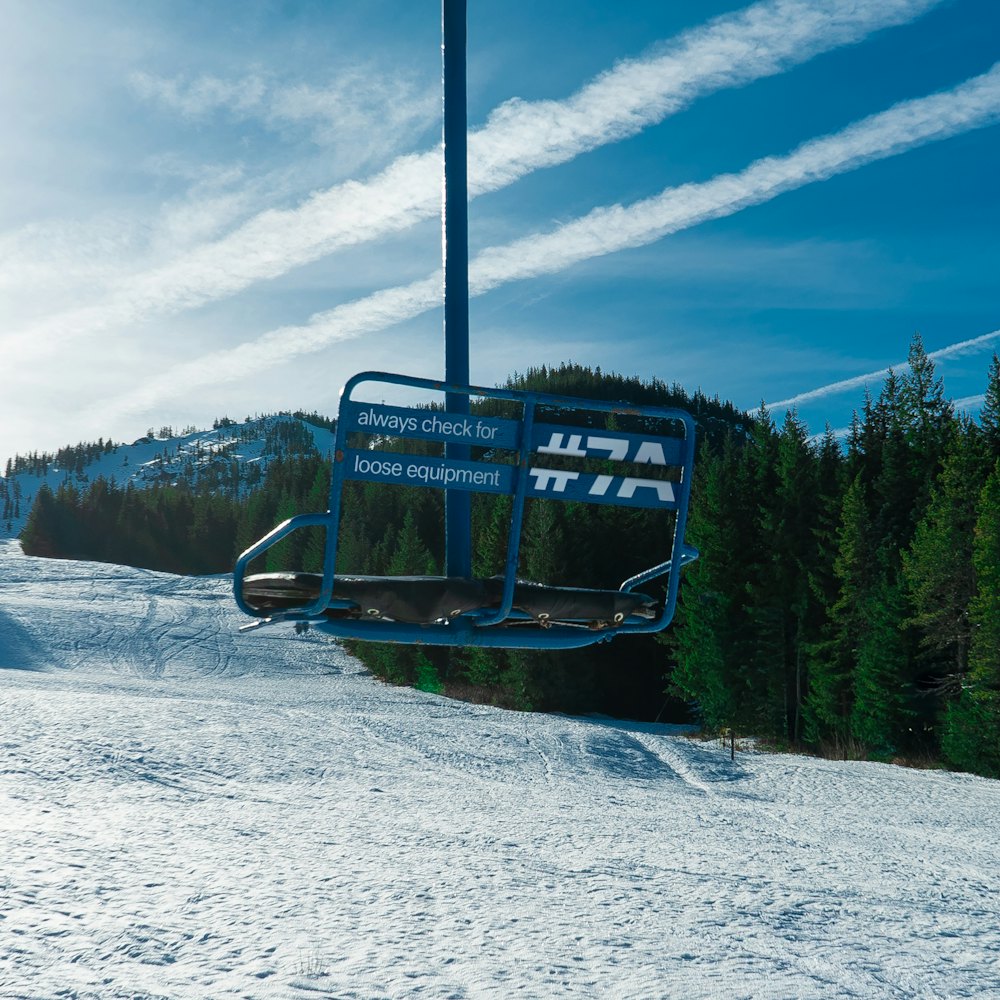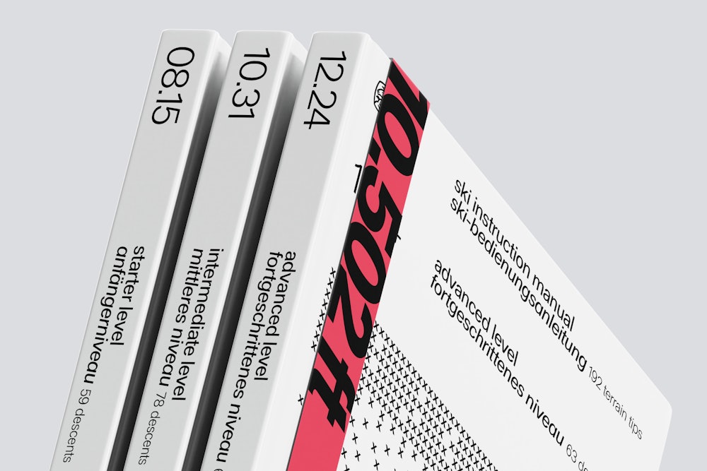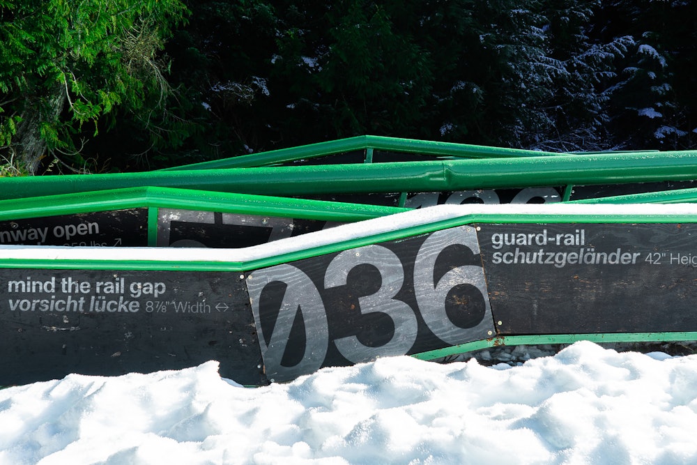
Haltung
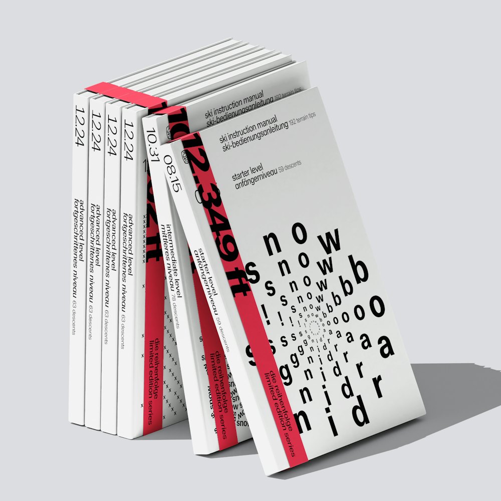
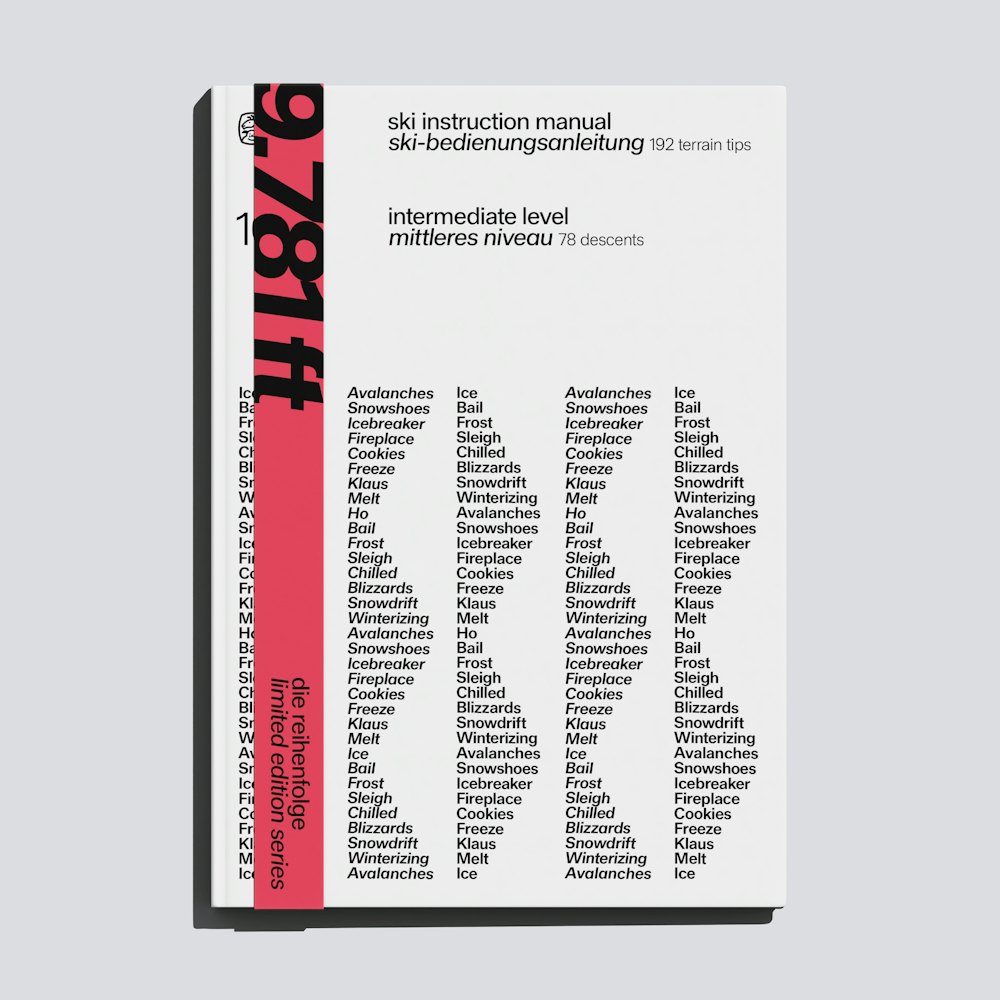
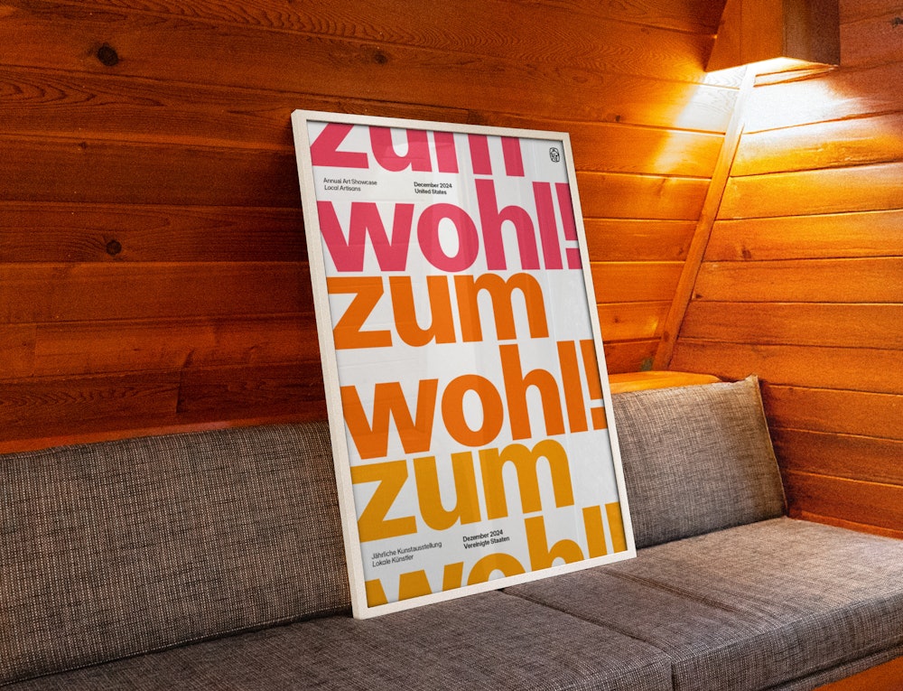
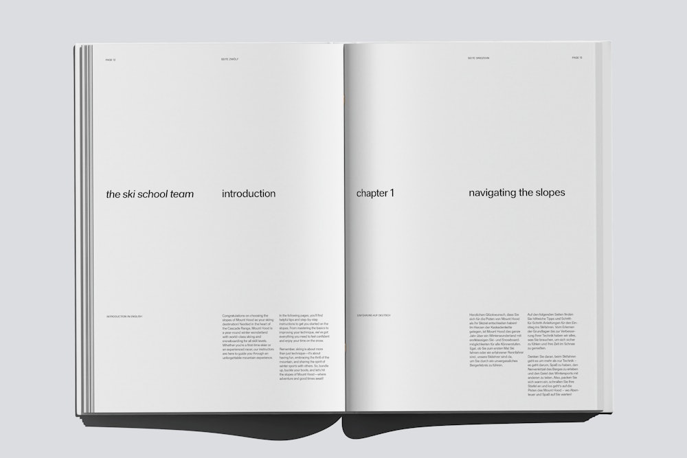
From the sans-serif lettering of Walter Käch to Frutiger’s Univers, to the students of the Basel school under Emil Ruder, Haltung is a neo-grotesk typeface inspired by a common attitude and design sensibility spanning these three generations.
Conceptually, Haltung aims to bridge a gap between the teacher and student, taking their common approach to the sans-serif and re-imagines a robust, contemporary neo-grotesk that is refined yet retains the airy impression of its source material. Haltung’s namesake comes from a monograph of Schmid’s work—Gestaltung ist Haltung (Design is Attitude).
Designed by
Joe Moore→
Mastered by
Tiny Type Co.→
Sections:
- Haltung Light
- Haltung Regular
- Haltung Book
- Haltung Medium
- Haltung Semibold
- Haltung Bold
- Haltung Extrabold
- Haltung Light Italic
- Haltung Regular Italic
- Haltung Book Italic
- Haltung Medium Italic
- Haltung Semibold Italic
- Haltung Bold Italic
- Haltung Extrabold Italic
Light
Quarterpipe
Regular
24 Olympics
Book
Ski Wipeout
Medium
Vertical Drop
Semibold
£52 Lift Fee
Bold
10% Ice Rate
Extrabold
No Visibility
Light
22px
The ancient origins of skiing can be traced back to prehistoric times in Russia, Finland, Sweden and Norway where varying sizes and shapes of wooden planks were found preserved in peat bogs. The word ski is related to the Old Norse word skíð, which means “split piece of wood or firewood.” Skis were first invented to cross wetlands and marshes in the winter when they froze over. Skiing was an integral part of efficient transportation methods in colder countries for thousands of years.
Light Italic
22px
In the 1760s, skiing was recorded as being used in military training. The Norwegian army held skill competitions involving skiing down slopes, around trees and obstacles while shooting The birth of modern alpine skiing is often dated to the 1850s, and during the late 19th century, skiing was adapted from a method of transportation to a competitive and recreational sport. Norwegian legend Sondre Norheim first began the trend of skis with curved sides, and bindings with stiff heel bands made of willow.
Regular
22px
The wooden skis designed by Norheim closely resemble the shape of modern slalom skis. Norheim was the champion of the first downhill skiing competition, reportedly held in Oslo, Norway in 1868. Norheim impressed spectators when he used the stem christie in Christiania (Oslo) in 1868, the technique was originally called christiania turn (norwegian: christianiasving or kristianiasving) after the city (first printed in 1901 in guidelines for advisement on best ski jumping practices).
Regular Italic
22px
The term “slalom” is from Norwegian dialects slalåm meaning a trail (låm) on a slope (sla). In Telemark in the 1800s, the steeper and more difficult trails were called ville låmir (wild trails). Skiing competitions in Telemark often began on a steep mountain, continued along a logging-slides (tømmerslepe) and was completed with a sharp turn (Telemark turn) on a field or frozen lake. This type of competition used the natural and typical terrain in Telemark. Some races were on “bumpy courses” (kneikelåm).
Book
22px
The first known slalom competitions were presumably held in Telemark around 1870 in conjunction with ski jumping competitions, involving the same athletes and on slopes next to the ski jump. Husebyrennet from 1886 included svingrenn (turning competition on hills), the term slalåm had not been introduced at that time. Slalom was first used at a skiing competition in Sonnenberg in 1906. Two to three decades later, the sport spread to the rest of Europe and the US.
Book Italic
22px
A skier following the fall line will reach the maximum possible speed for that slope. A skier with skis pointed perpendicular to the fall line, across the hill instead of down it, will accelerate more slowly. The speed of descent down any given hill can be controlled by changing the angle of motion in relation to the fall line, skiing across the hill rather than down it. Downhill skiing technique focuses on the use of turns to smoothly turn the skis from one direction to another.
Medium
22px
The oldest and still common type of turn on skis is the stem, angling the tail of the ski off to the side, while the tips remain close together. In doing so, the snow resists passage of the stemmed ski, creating a force that retards downhill speed and sustains a turn in the opposite direction. When both skis are stemmed, there is no net turning force, only retardation of downhill speed. Carving is based on the shape of the ski itself; when the ski is rotated onto its edge, the pattern cuts into an arc.
Medium Italic
22px
Checking is an advanced form of speed control by increasing the pressure on one inside edge (for example the right ski), then releasing the pressure and shifting immediately to increasing the other inside edge (the left ski). Then repeat if necessary. Each increased pressure slows the speed. Alternating right and left allows the skis to remain parallel and point ahead without turning. The increase and release sequence results in the up and down motions of the upper body. Some skiers go down the top of moguls.
Semibold
22px
Modern alpine skis are shaped to enable carve turning, and have evolved significantly since the 1980s, with variants including powder skis, freestyle skis, all-mountain skis, and children's skis. Powder skis are usually used when there is a large amount of fresh snow; the shape of a powder ski is wide, allowing the ski to float on top of the snow, compared to a normal downhill ski which would most likely sink into the snow. Freestyle skis are used by skiers who ski terrain parks.
Semibold Italic
22px
These skis are meant to help a skier who skis jumps, rails, and other features placed throughout the terrain park. Freestyle skis are usually fully symmetric, meaning they are the same dimensions from the tip of the ski to the backside (tail) of the ski. All-mountain skis are the most common type of ski, and tend to be used as a typical alpine ski. All-mountain skis are built to do a little bit of everything; they can be used in fresh snow (powder) or used when skiing groomed runs.
Bold
22px
Ski boots are one of the most important accessories to skiing. They connect the skier to the skis, allowing them full control over the ski. When ski boots first came about they were made of leather and laces were used. The leather ski boots started off as low-cut, but gradually became taller, allowing for more ankle support, as injuries became more common . Eventually the tied laces were replaced with buckles and the leather boots were replaced with plastic.
Bold Italic
22px
In most ski resorts, the runs are graded according to comparative difficulty so that skiers can select appropriate routes. The grading schemes around the world are related, although with significant regional variations. A beginner-rated trail at a large mountain may be more of an intermediate-rated trail on a smaller mountain. In the United States and Canada, there are four rating symbols: Easy, Intermediate, Difficult, and Experts Only.
Extrabold
22px
In 2014, there were more than 114,000 alpine skiing-related injuries treated in hospitals, doctor's offices, and emergency rooms. The most common types of ski injuries are those of the knee, head, neck and shoulder area, hands and back. Ski helmets are highly recommended by professionals as well as doctors. Head injuries caused in skiing can lead to death or permanent brain damage. In alpine skiing, for every 1000 people skiing in a day, between 2-4 will require medical attention.
Extrabold Italic
22px
Winter season lengths are projected to decline at ski areas across North America and Europe due to the effects of global warming. In the United States, winter season lengths are projected to decline by more than 50% by 2050 and by 80% by 2090 if greenhouse gas emissions continue at current rates. If humans manage to keep global warming below 2 °C, the snow-cover reduction would be limited to 30 percent by 2100.
Semibold
The word ski comes from the Old Norse word skíð which means “cleft wood”, “stick of wood” or “ski”. In Old Norse common phrases describing skiing were fara á skíðum (to travel, move fast on skis), renna (to move swiftly) and skríða á skíðum (to stride on skis)
Lowercase
Uppercase
Small Caps
Ordinals
Ligatures
Lowercase Diacritics
Uppercase Diacritics
Small Caps Diacritics
Punctuation & Symbols
Case-sensitive Punctuation
Numerals
Subscript
Superscript
Denominators
Numerators
Tabular Figures
Circled Numerals
Math Symbols
Arrows
Case-sensitive figures
U+0028, U+0029
(R) → (R)
Arrows
U+2192
G--> → G→
Fractions
U+00BD
41/2 → 4½
Math symbols
U+00D7
3x9 → 3×9
Small caps
U+0041, U+0031
Ha1 → Ha1
Ordinals
U+0079, U+007A
Xyz → Xyz
Circled numerals
U+2460, U+2461, U+2462
123 → ①②③
Negative circled numerals
U+2779, U+277A, U+277B
456 → ❹❺❻
Localized forms
U+015E
Şi → Și
Standard ligatures
U+0066, U+0066
O f f → Off
Purchase
We sell typefaces by individual weights or in a reduced price family package. Please ensure you understand the terms of our EULA Agreement and select the correct license before completing your purchase.
Research & Process
Haltung
Written by

From the sans-serif lettering of Walter Käch to Frutiger’s Univers, to the students of the Basel school under Emil Ruder, Haltung is a neo-grotesk typeface inspired by a common attitude and design sensibility spanning these three generations.
Bred from studio discussions, Haltung began as a much broader investigation into what gave certain sans serifs “air” in their letterforms. Typically certain typefaces like to be used in specific ways. In the case of Helvetica and most neo-grotesks in the style of the mid-century, they sit comfortably when set tightly in the corners of pages or butted up against the margins. What interested me was a contemporary neo-grotesk that had sufficient air in its letterforms, that meant it could hold itself floating on a page.
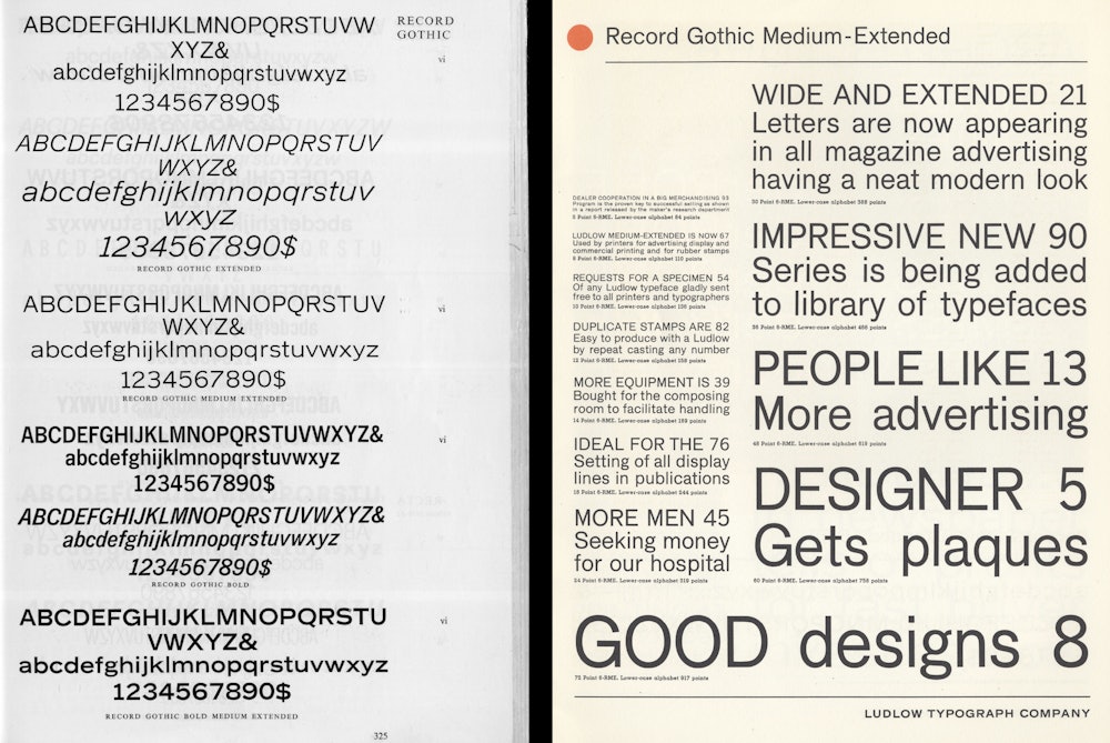
With this intention in mind I began drawing based on a medium-extended cut of record gothic by Ludlow that had caught my eye. Unlike the other styles of record gothic which were more akin to a news gothic, the extended cuts were more inline with Helvetica but with some interesting quirks—I thought it interesting to pull specifically from these weights and extrapolate out from there. This worked as a starting point but going forward I needed to do more research to inform my design decisions.
This led me to the design work of Helmut Schmid and his tutor Emil Ruder, two key figures from the Basel school of design. Schmid and Ruder were both avid users of Univers, and their layouts like Univers, have a hand-crafted sensibility. Their work was more present and less rigid than the gridded layouts I would associate with the graphic design of the era.
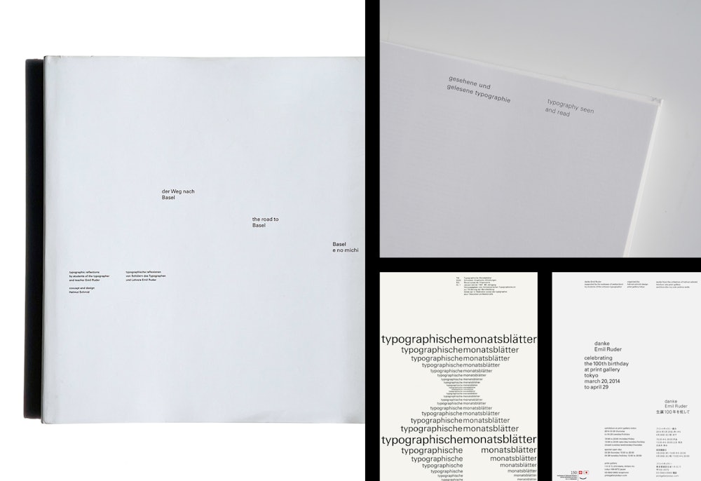
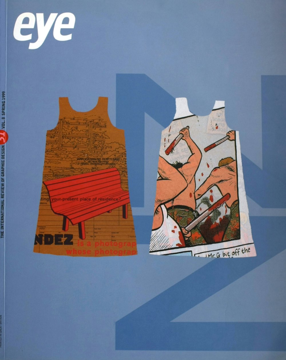
The use of Univers in this way caught my attention and, on closer inspection, the letterforms had a visible contrast and an emphasis on downward strokes that gave it a human and weightless impression. In an interview with Adrien Frutiger in the spring 1999 issue of Eye magazine, Emil Ruder is quoted: “Univers, as Roman-Grotesque, ended the ideological struggle between Roman and sans serif.” Expanding on this Frutiger states: “Univers is nearer to Roman than other sans serifs, since it displays a visual sensitivity between thick and thin in the up-and-down strokes, in the verticals and the horizontals.”
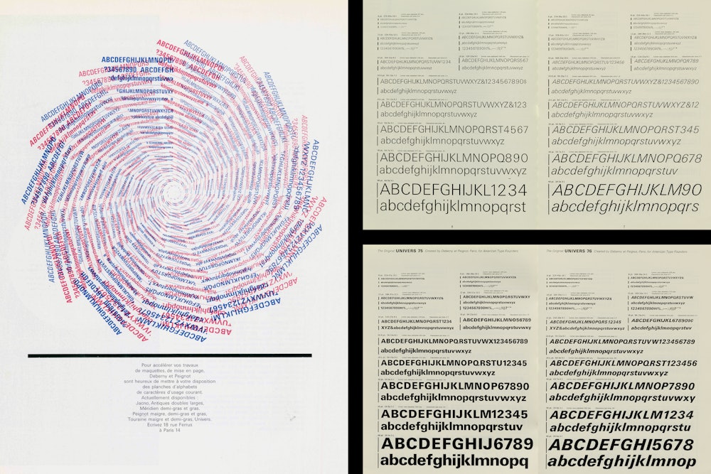
To get a better sense of the curves I traced a Deberny & Peignot specimen of Univers from 1960. I began to incorporate elements of Univers into my existing drawing such as the snipped lowercase ‘t’, the rounded bowl on the lowercase ‘a’, and a slight flaring of the stems. It was at this stage that I continued to dig deeper in order to clarify the intention behind the typeface.
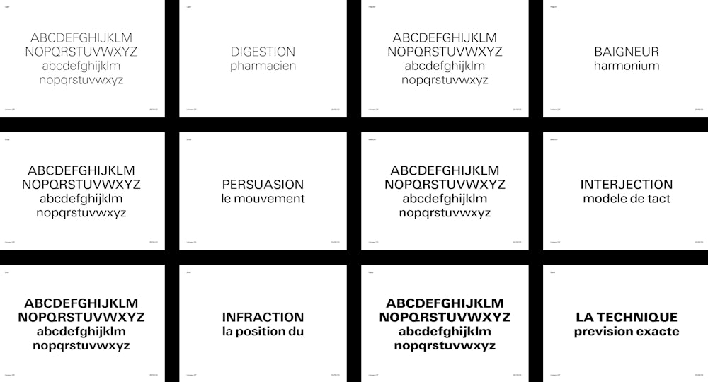
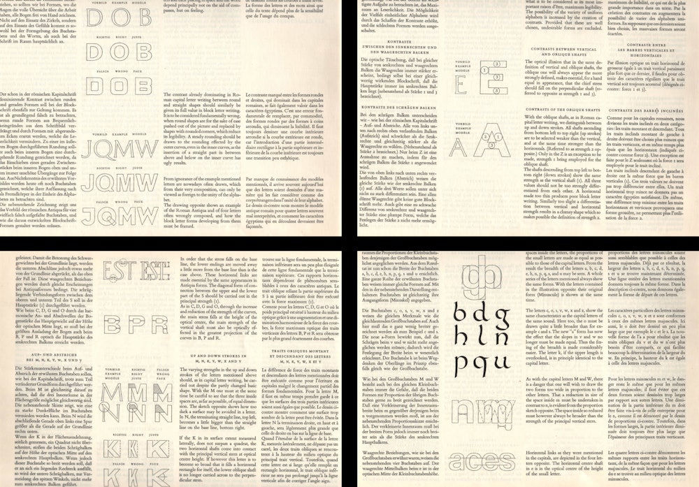
It was through that process that I discovered the lettering of Walter Käch, Adrien Frutiger’s teacher at the Zürich School of Arts and Crafts. Walter Käch taught the design of a contemporary sans serif rooted in classical Roman lettering and calligraphy that suggested evidence of the human hand. In his book “Die Gezeichnete Schrift”, Käch breaks down his method for the construction of the alphabet and the optical adjustments required.
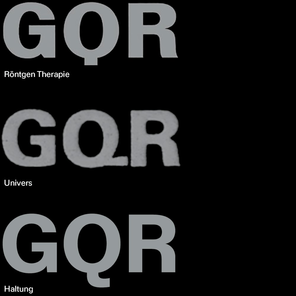
Frutiger began his initial sketches for Univers while attending the Zürich school and his tutelage under Käch is evident in the similarity of approach between Univers and Käch’s typeface, Röntgen Therapie.
I began analysing the similarities between these two typefaces. Namely, their shared high contrast model, the open aperture of the capital ‘C’, the tail of the ‘Q’, oblique stem of the ‘t’, and the emphasis on the downward strokes of the ‘X’, ‘Y’, and ‘Z’. Equally I studied the differences such as the lowercase ‘a’ and capital ‘G’.
The amalgamation of features from both typefaces became the main foundation behind Haltung. Incorporating elements from both designs, Haltung strikes a medium between their contrast models and proportions. The design of the ‘G’, ‘Q’, ‘R’, and ‘a’ for instance are a blending of the two approaches. In some aspects of the design I have opted to deviate such as the even weighting of the diagonal strokes or the join on the uppercase ‘K’.
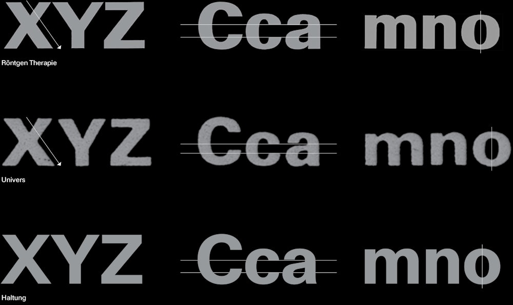
Conceptually, Haltung aims to bridge a gap between the teacher and student, taking their common approach to the sans-serif and re-imagines a robust, contemporary neo-grotesk that is refined yet retains the airy impression of its source material. Haltung’s namesake comes from a monograph of Schmid’s work—Gestaltung ist Haltung (Design is Attitude).
The design of Haltung was not a linear process and its drawing continuously evolved throughout as I gained more clarity. As Kris Sowersby once said to me: “at a certain point the typeface will want to go in its own direction…sometimes where it ends up is not entirely where you started”.
I am incredibly grateful to those that provided me with their expertise, critique, and encouragement throughout this project. A heartfelt thank you to Seb McLauchlan, Kris Sowebsry, Kelvin Soh, Dan Reynolds, and Matt Lamont.
Joe Moore
2024
