
Spades
Spades is a contemporary Baroque typeface that blends historical influences of ornate 18th century typography with the modern device of an inktrap.
The family explores the juxtaposition of two distinct historical periods: the Black Arts Movement and the Baroque Era. While seemingly contradictory, Spades finds an overlap and forges its voice as a typeface through the extravagance, expression, and attitude of the respective eras.
Designed by
Sascha Hopson→
Mastered by
Tiny Type Co.→
Sections:
- Spades Thin
- Spades Light
- Spades Regular
- Spades Bold
- Spades Black
Thin
1960-70s (BAM)
Light
Fresh Attitude!
Regular
Extravaganza
Bold
Off-Kiltered‽
Black
Subversions!
Thin
22px
The Black Arts Movement (BAM) was an African American-led art movement that was active during the 1960s and 1970s. Through activism and art, BAM created new cultural institutions and conveyed a message of Black pride. The movement expanded from the accomplishments of artists of the Harlem Renaissance. Famously referred to by Larry Neal as the “aesthetic and spiritual sister of Black Power”, BAM applied these political ideas to art and literature.
Light
22px
Black artists found creativity and art as a medium to express Blackness in America. Artists like Aaron Douglas, Hale Woodruff, and Meta Vaux Warrick Fuller pioneered the movement with a distinctly modernist aesthetic. This style influenced the proliferation of African American art during the twentieth century. The poet and playwright Amiri Baraka is widely recognized as the founder of BAM.
Regular
22px
Baraka’s example inspired many others to create organizations across the United States. While many of these organizations were short-lived, their work has had a lasting influence. Some still exist, including the National Black Theatre, founded by Barabara Ann Teer in Harlem, New York. There are often many parallels that can be made between the Harlem Renaissance and the BAM.
Bold
22px
The link is so strong, that some scholars refer to the Black Arts Movement era as the Second Renaissance. One sees this connection clearly when reading Langston Hughes’s work. Hughes’s seminal essay advocates that Black writers resist external attempts to control their art, arguing that the “truly great” Black artist will be the one who can fully embrace and freely express their Blackness.
Black
22px
During the Civil Rights era, activists paid more and more attention to the political uses of art. The contemporary work of those like James Baldwin and Chester Himes would show the possibility of creating a new ‘Black aesthetic’. A number of art groups were established during this period, such as the Umbra Poets and the Spiral Arts Alliance, which can be seen as precursors to BAM.
Light
In fact, particularly within the BAM’s second wave, artists articulated their own discomfort with prescriptive notions of Blackness, and worked to imagine Blackness as a space of plural, unfinishable questing.
Lowercase
Uppercase
Ligatures
Lowercase Diacritics
Uppercase Diacritics
Punctuation & Symbols
Case-sensitive Punctuation
Numerals
Subscript
Superscript
Denominators
Numerators
Oldstyle Figures
Tabular Figures
Tabular Oldstyle Figures
Math Symbols
Ordinals
Arrows
Case-sensitive figures
U+0040
H@ → H@
Arrows
U+2192
R-> → R→
Fractions
U+00BD
1/2 → ½
Math symbols
U+00D7
3x4 → 3×4
Ordinals
U+0065, U+0072
1er → 1er
Oldstyle figures
U+0031, U+0039, U+0038, U+0030
1980 → 1980
Purchase
We sell typefaces by individual weights or in a reduced price family package. Please ensure you understand the terms of our EULA Agreement and select the correct license before completing your purchase.
Research & Process
Spades
Written by

Spades is a contemporary Baroque typeface that blends historical influences of ornate 18th century typography with the modern device of an inktrap. The family explores the juxtaposition of two distinct historical periods: the Black Arts Movement and the Baroque Era.
While seemingly contradictory, Spades finds an overlap and forges its voice as a typeface through the extravagance, expression, and attitude of the respective eras.


David Hammons, Spade (Power for the Spade), 1969; Private Collection, Courtesy Tilton Gallery, New York; David Hammons, Spade, 1972, sold Apr 2017 at Swann Gallery

Bruce W. Talamon: David Hammons making a body print, Slauson Avenue studio, Los Angeles, 1974
(Left) The Atlantic, “Gold Teeth Are Beautiful On Their Own Terms” by Julian Randall
(Right) The Descent from the Cross, Rubens, 1612–1614
Inspiration and Process
The origins of Spades began with reflecting on the work of and paying homage to revered artist, David Hammons. A key piece of inspiration early on in the project was Hammons’ collection of body prints starting from the 1960s. The use of spades or shovels were frequent motifs throughout his early work, centered around confronting and reclaiming the deprecating racial slur “spade”. Beyond his direct confrontation of this language, Hammons used perversion in his art to ask provocative questions such as, what is Black art, what does it mean to make Black art, and can it be free to be anything?
These queries were also explored in depth throughout the Black Arts Movement, which served as personal inspiration for how to approach thinking about expression in any artistic medium — even typography. By refusing to set boundaries around what Black art can and should be, it becomes open, fluid, unfinishable, and expansive.
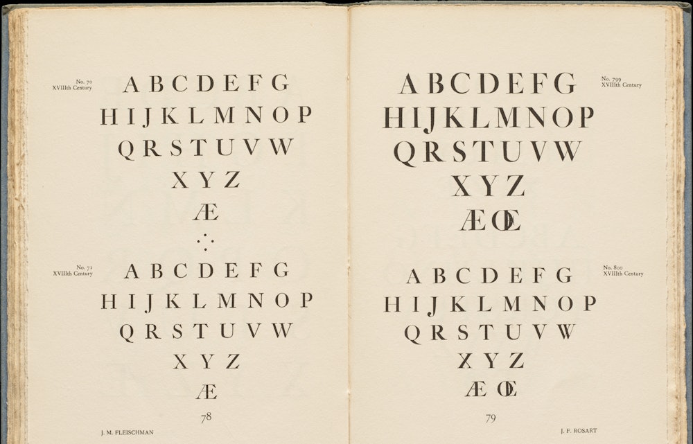
Technically speaking, the Spades family originated from sketch explorations in TypeCooker. Foundationally, the base of Spades is an old-style design. Delving deeper into more specific stylings of the 18th century revealed in the scalloped-serif construction of Fleischmann’s work. Through early exploratory sketches, I attempted to combine the modern visual device of an inktrap with these historical foundations. This exercise in merging two opposing styles leaned into the thinking of uncovering expression and subversion in Black art. The amalgamation created tension that — through later refinement — found a visual relationship.


(Above) J.M. Fleischman, No. 70 XVIIIth Century, J.F. Rosart, No. 790 XVIIIth Century; Courtesy of the Letterform Archive
Ink Trap, Serifs, and Construction
At first, the connection between the Rococo typography of the Baroque era and the Black Arts Movement felt at odds. What relationship does the “ornamentation and exaggeration” (Robert Bringhurst, The Elements of Typographic Style v3.0) of the scalloped serifs have with an inktrap?
Conceptually, the Baroque era shares commonalities with the Black Arts Movement, but separated by the obvious of race and racism. The Baroque era was known for opulence, frescos, empire, and wealth. The Black Arts Movement was about expressiveness, attitude, and abundance.
In The Atlantic article, “Gold Teeth Are Beautiful On Their Own Terms” by Julian Randall, it spoke about how Black people used gold to “dress their mouth up like a sun” in honor of Black tradition for extra-ness and beauty. While Black aesthetic is undefinable and infinite, it also exudes an ultra-expressiveness that the Baroque era attempted to capture.
Technically, there is a visual relationship between the shape of the scalloped serifs and inktraps. The juxtaposition of the inktraps’ inner-counter to the scalloped serifs almost represents a mirror of the serif shape itself. This is similar to how Toshi Omagari describes in their op-ed piece, Inktraps and Pals, “In a way, ink traps are becoming the serifs on the inside, gradually forming the mirror universe of the serif category”.
Additional adaptations to the 18th century form were made to help move Spades into a contemporary space, further solidifying it with the modernity of the inktrap device. The x-height was increased beyond what is already considered “taller” for the Rococo style. Inktrap’s angles cut into the shoulder of the typeface rather than be horizontally or vertically restrictive — integrating the device with the contrast model of the typeface.
Overall, Spades is a meditation on subversion through these juxtapositions, and an homage to the expansiveness of Blackness in the medium of a typeface.

I am incredibly grateful to everyone who played a vital role in bringing this typography project to life. My heartfelt thanks go out to my amazing Type West classmates and teachers, Troy Leinster, Graham Bradley, and Emily Klaebe — along with the entire Order team. Your support and expertise were instrumental in making this project a reality.
Sascha Hopson
2023


All imagery and artwork copyright of their respective owners (Deana Lawson, Ishmael Scott Reed, and Nicolas Poussin).
Exterior locations photographed at the Portland Art Museum.