Stringer
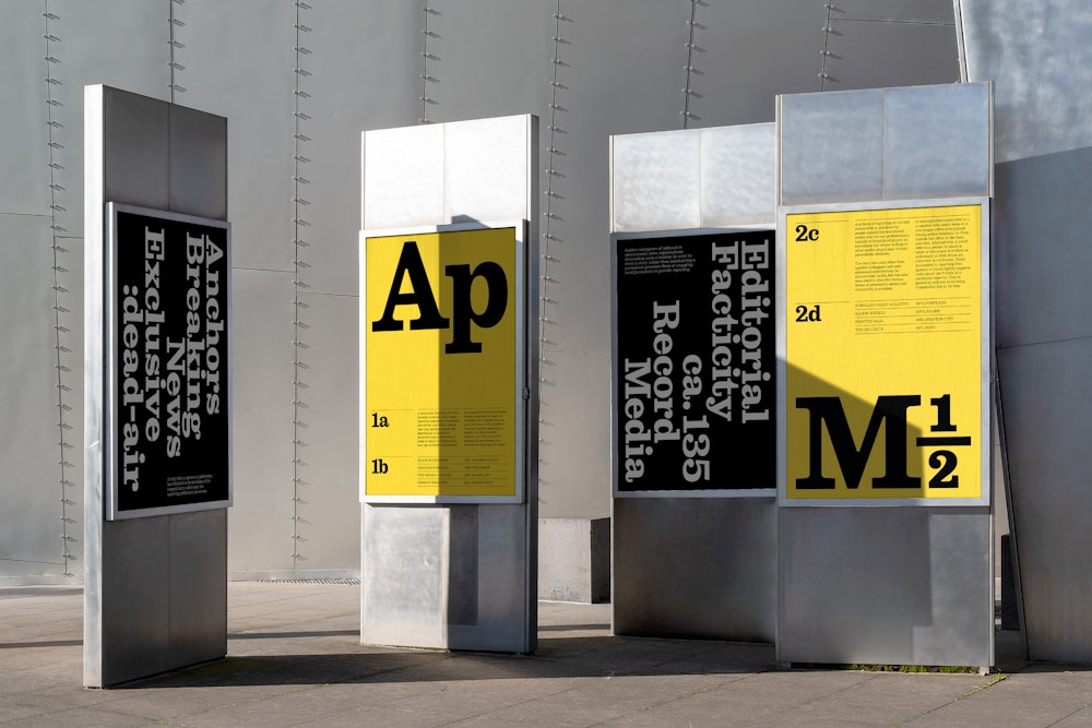
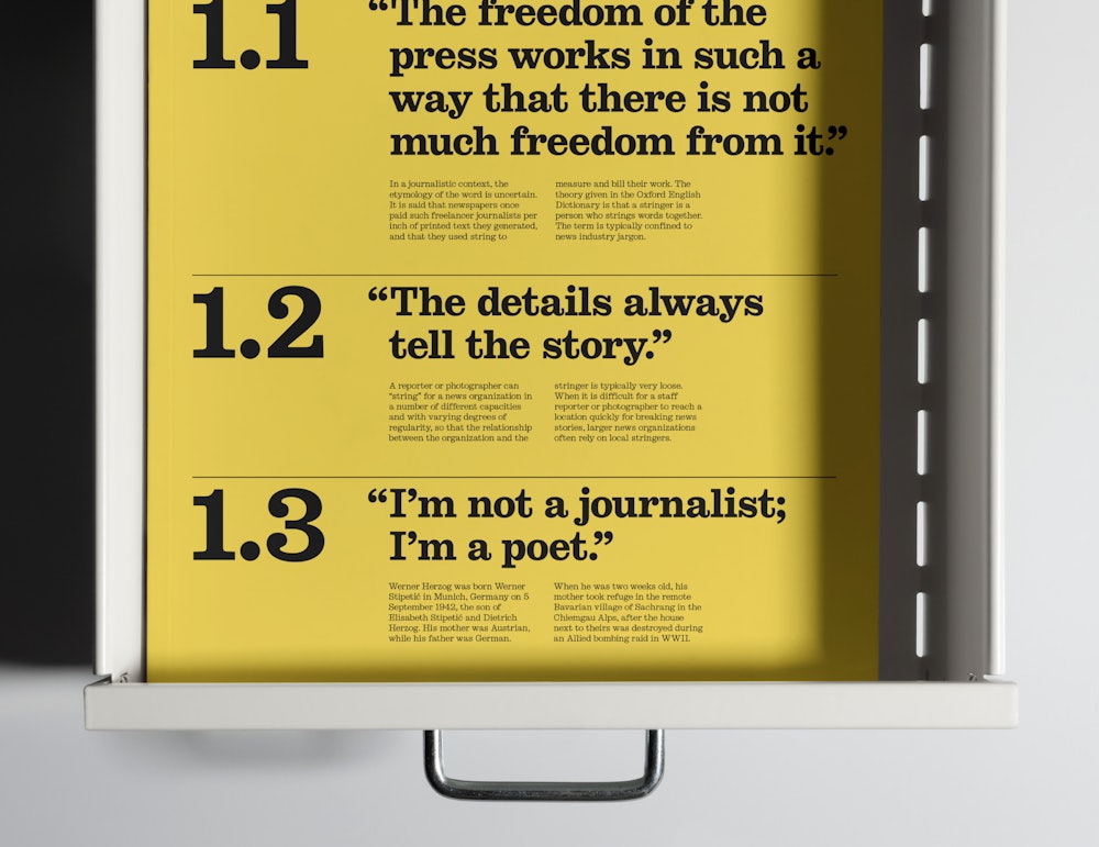
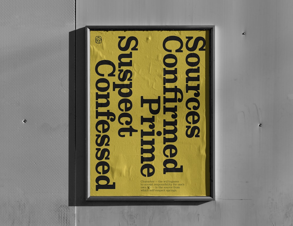
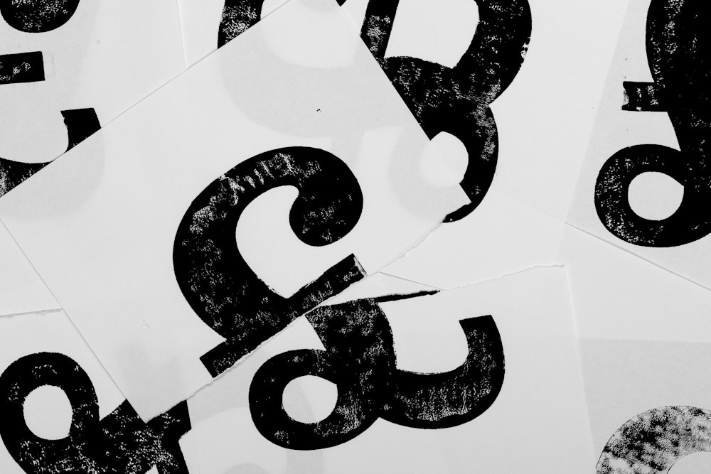
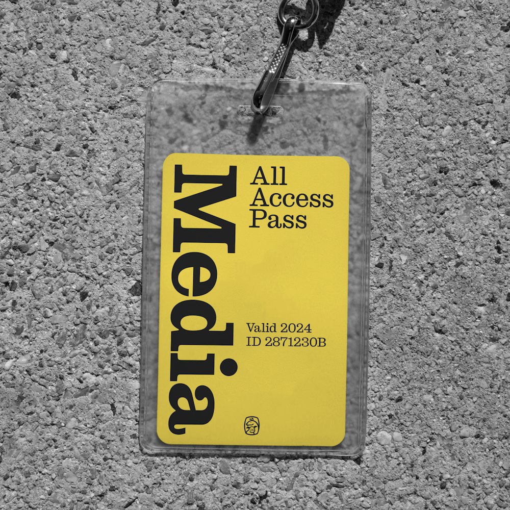
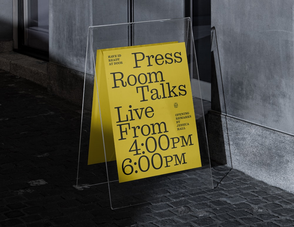
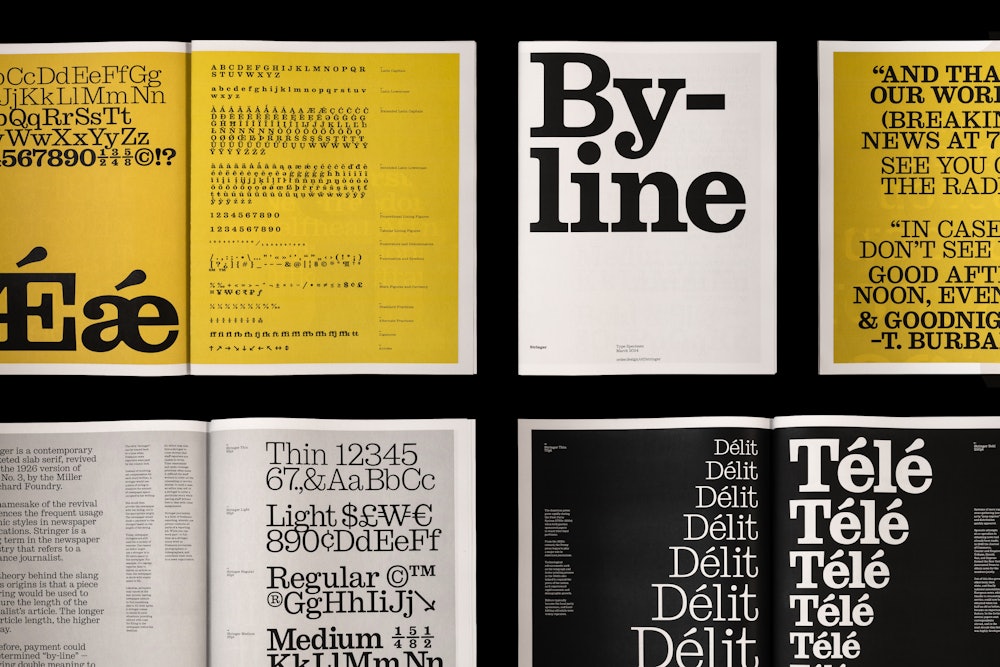
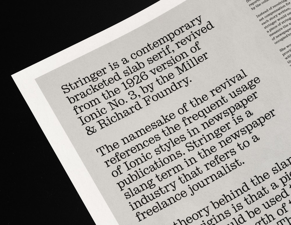
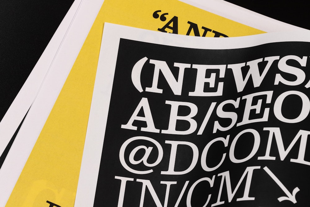
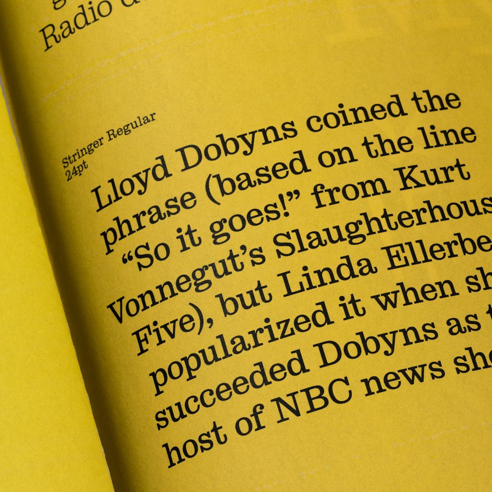
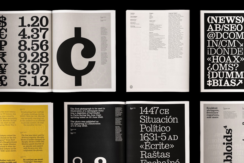
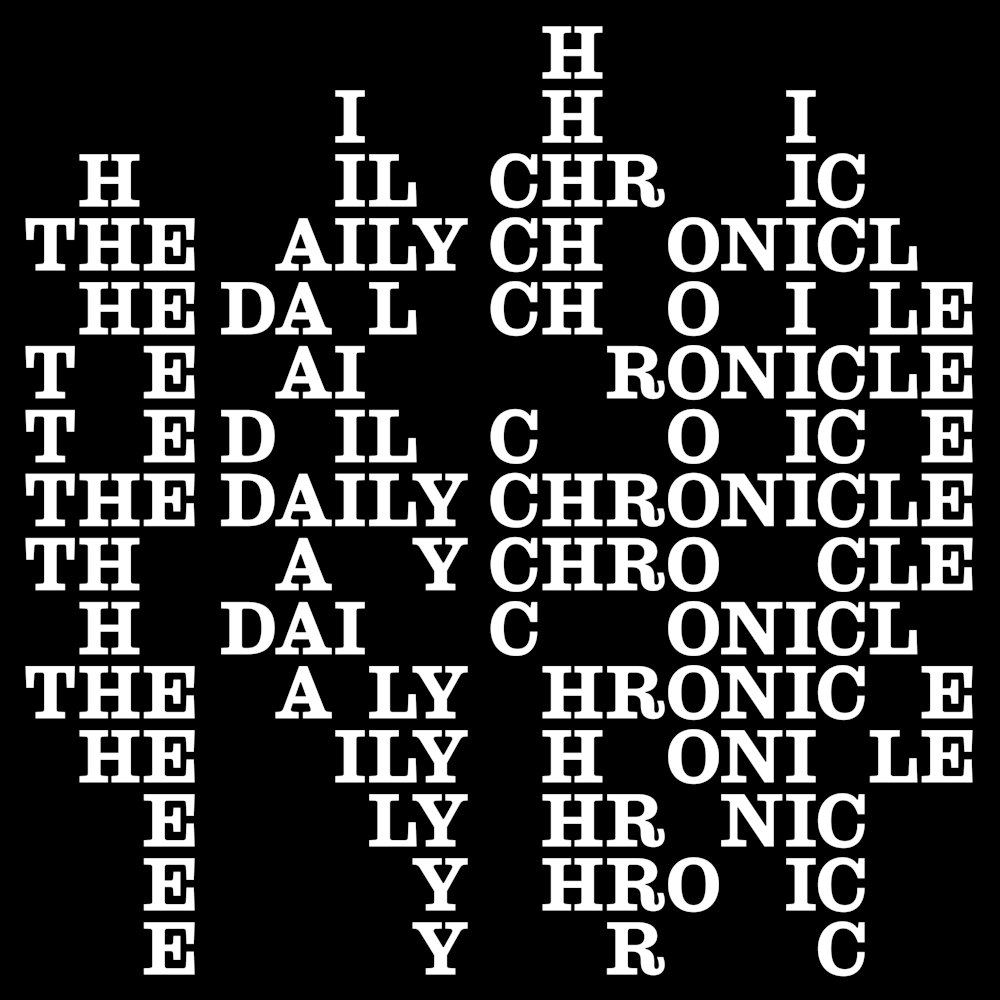
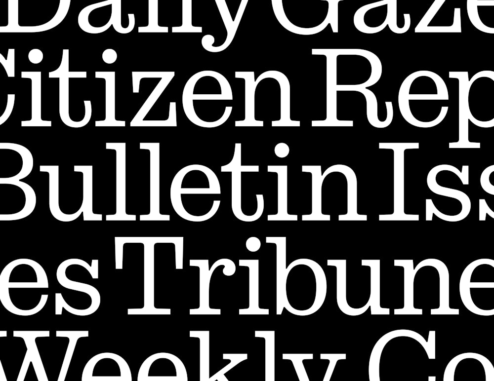
Stringer is a bracketed slab-serif revived from Ionics of the early 20th century and adapted for modern day typesetting.
Its namesake is a testament to the frequent use of Ionic styles in newspaper publications, with “stringer” being a slang term used to refer to a freelance journalist.
Designed by
Emily Klaebe→
Mastered by
Tiny Type Co.→
Sections:
- Stringer Thin
- Stringer Light
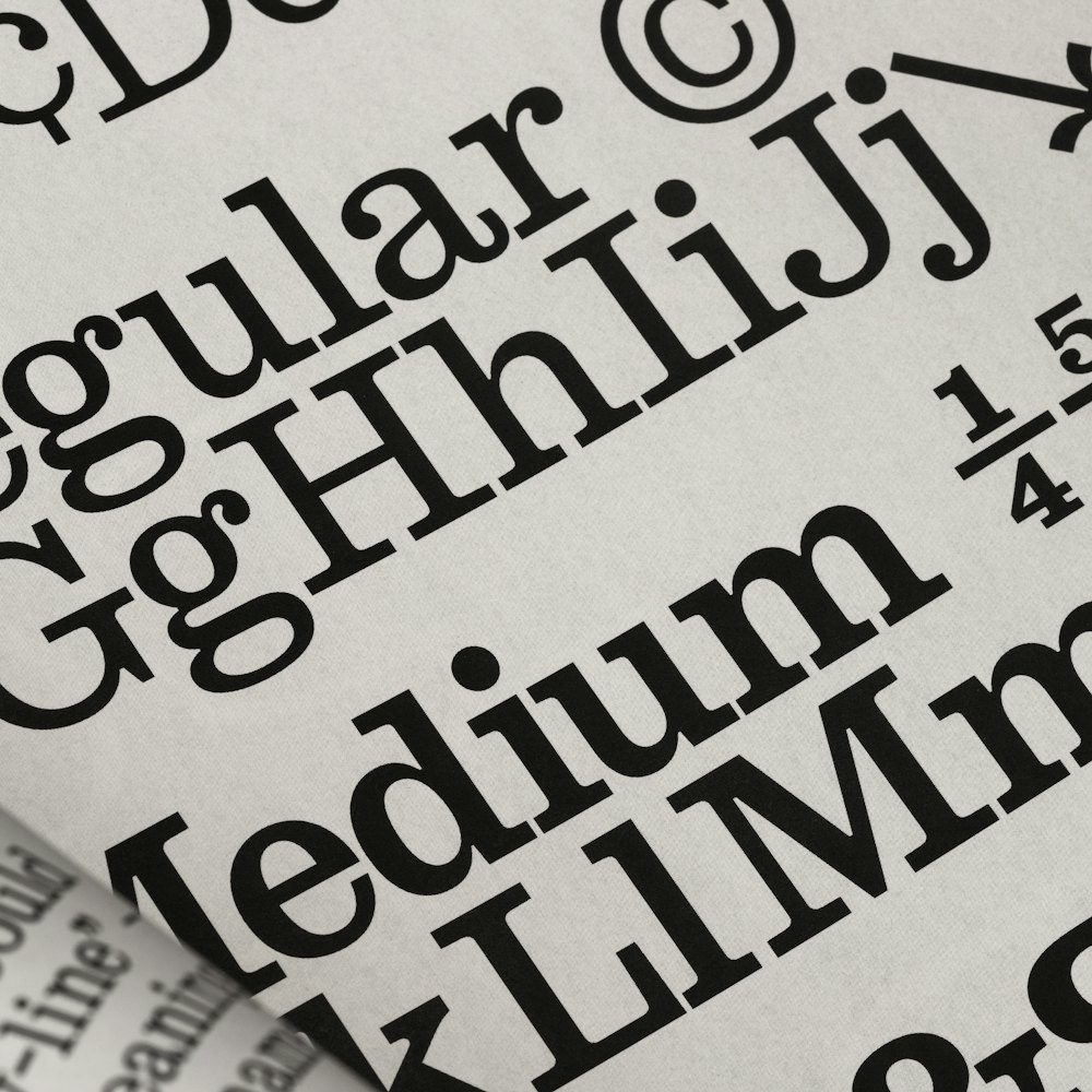
- Stringer Regular
- Stringer Medium
- Stringer Bold
Thin
Messenger
Light
Advertisor
Regular
Inquisitor
Medium
Harbinger
Bold
Telegraph
Thin
22px
The history of American newspapers begins in the early 18th century with the publication of the first colonial newspapers. American newspapers began as modest affairs—a sideline for printers. They became a political force in the campaign for American independence. Following independence the first amendment to U.S. Constitution guaranteed freedom of the press, citing the Postal Service Act of 1792 as a benefit.
Light
22px
The American press grew rapidly during the First Party System (1790s–1810s) when both parties sponsored papers to reach their loyal partisans. From the 1830s onward, the Penny press began to play a major role in American journalism. Technological advancements such as the telegraph and faster printing presses in the 1840s also helped to expand the press of the nation as it experienced rapid economic growth.
Regular
22px
The first editors discovered readers loved it when they criticized the local governor; the governors discovered they could shut down the newspapers. The most dramatic confrontation came in New York in 1734, where the governor brought John Peter Zenger to trial for criminal libel after the publication of satirical attacks. The jury acquitted Zenger, who became the iconic American hero for freedom of the press.
Medium
22px
By the mid-1760s, there were 24 weekly newspapers in the 13 colonies (only New Jersey was lacking one), and the satirical attack on government became common practice in American newspapers. It was James Franklin (1697–1735), Benjamin Franklin’s older brother, who first made a news sheet something more than a garbled mass of stale items, “taken from the Gazette” some six months late.
Bold
22px
His associates were known as the Hell-Fire Club; they succeeded in publishing a distinctive newspaper that annoyed the New England elite while proving entertaining and establishing a kind of literary precedent. Instead of filling the first part of the Courant with the tedious conventionalities of governors’ addresses to provincial legislatures, James Franklin’s club wrote essays and satirical letters modeled on The Spectator, which first appeared in London ten years earlier.
Bold
22px
After the more formal introductory paper on some general topic, such as zeal or hypocrisy or honor or contentment, the facetious letters of imaginary correspondents commonly fill the remainder of the Courant’s first page. Timothy Turnstone addresses flippant jibes to Justice Nicholas Clodpate in the first extant number of the Courant. Tom Pen-Shallow quickly follows, with the mischievous: “Pray inform me whether in your Province Criminals have the Privilege of a Jury.”
Light
The Pony Express was an American express mail service that used relays of horse mounted riders from April 3, 1860 to October 26, 1861
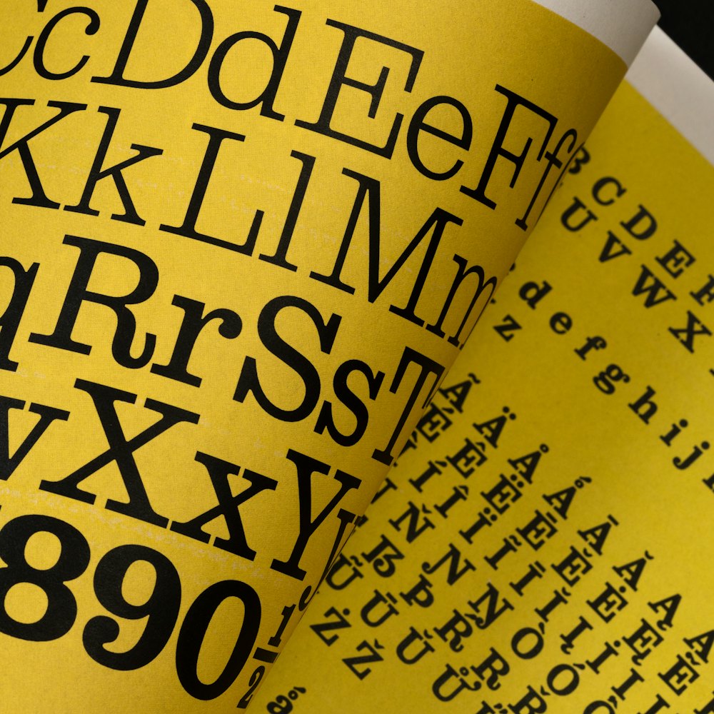
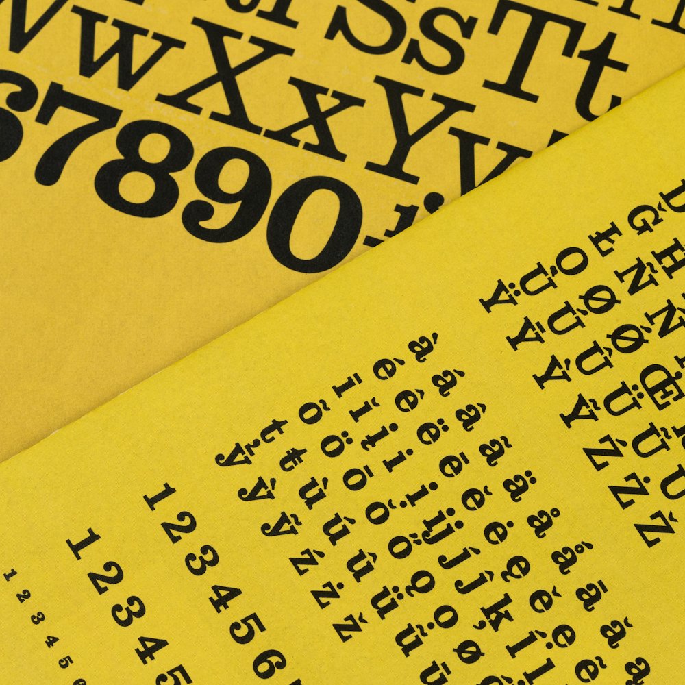
Lowercase
Uppercase
Ligatures
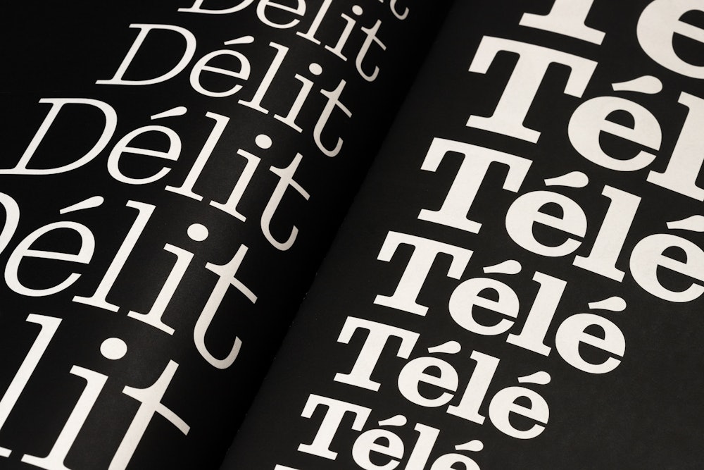
Lowercase Diacritics
Uppercase Diacritics
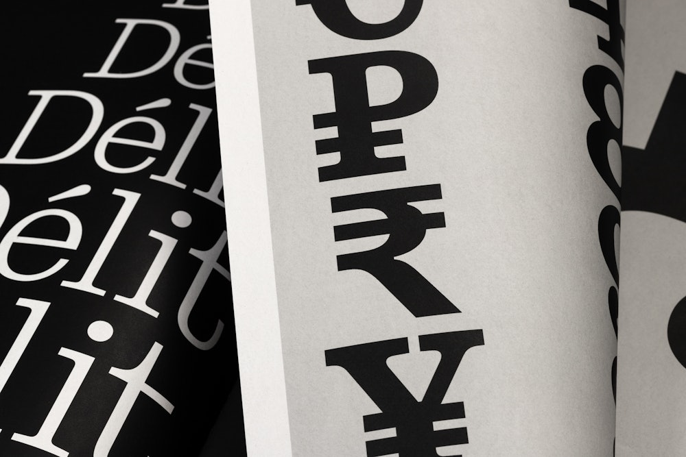
Punctuation & Symbols
Case-sensitive Punctuation
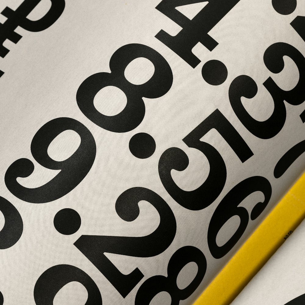
Numerals
Subscript
Superscript
Denominators
Numerators
Tabular Figures
Math Symbols
Alternate Symbols
Arrows
Case-sensitive figures
U+0028
(H) → (H)
Arrows
U+2192
A-> → A→
Nut fractions
U+00BD
3½ → 3½
Math symbols
U+00D7
7x5 → 7×5
Localized forms
U+015E
Şi → Și
Standard ligatures
U+0066
f f i → ffi
Purchase
We sell typefaces by individual weights or in a reduced price family package. Please ensure you understand the terms of our EULA Agreement and select the correct license before completing your purchase.
Research & Process
Stringer
Written by

Stringer is a bracketed slab-serif revived from Ionics of the early 20th century and adapted for modern day typesetting.
Its namesake is a testament to the frequent use of Ionic styles in newspaper publications, with “stringer” being a slang term used to refer to a freelance journalist.
Beginnings
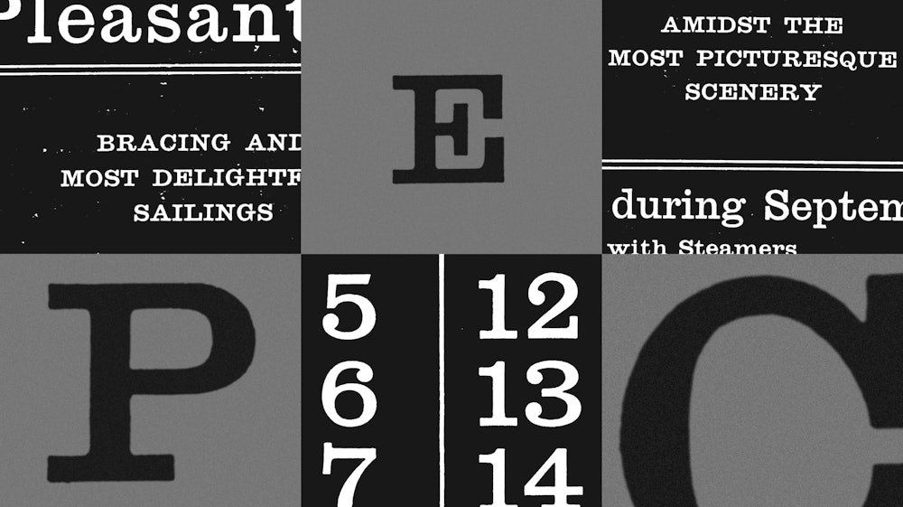
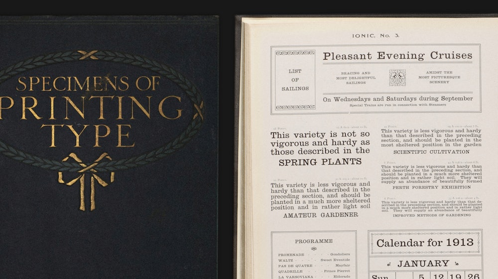
Creating the Stringer family began by exploring a single point of inspiration, Miller & Richard’s Ionic No. 3, to revive and digitize. Source material from “Specimens of Printing Type”, (1926), served as the rubric for building the skeleton of the typeface.
Establishing the baseline metrics for the typeface was a balancing act between pulling from the larger and smaller point sizes. The weight contrast in the smaller point sizes (10-, 12-, and 18-point) was more pronounced compared to the larger point sizes (60-, 72-, and 96-point), due to the need to preserve legibility when used at a smaller scale. The impact of these differences meant that digitizing based on the 12-point would result in a drastically different result than the 96-point.
Revival Foundation
Focused on the desire to preserve the proportions, width, and weight of the smaller point sizes, the 12-point source was used as the primary reference for the construction of the typeface. Compared to other Ionics of the early 20th century, Ionic No. 3 was consistent in its approach to a large x-height, wide characters, and long serif endings. These characteristics are exactly what made the Ionic style legible in contexts where longform reading is required (such as newspaper publications), and often printed swiftly on low quality paper at the time of their popularity.
Using the 12-point as a foundation for digitizing, core features of the construction were pulled into the drawing. One of these features was the gentle curving of the bracketed serifs, which helped to incorporate a comfortable reading experience in the design. By maintaining a consistent approach with the ball terminals’ drawing, a relationship was created between the bracketed joins on the serifs and the rounding of where the ball terminal joins the stroke.
Printed Material as a Source of Truth
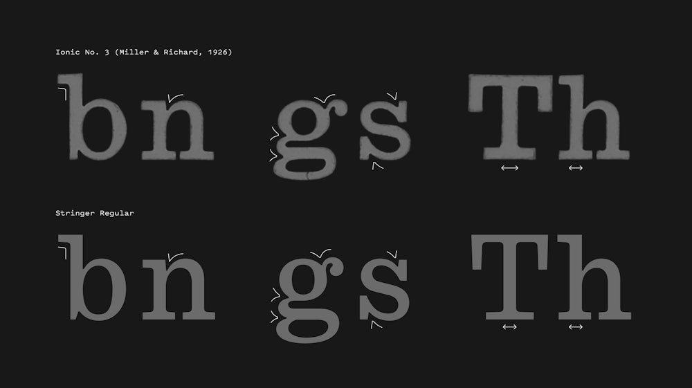
After the foundation of the design was established, the printed material (rather than the original metal type) was used as a source of truth for transcribing in the digitization process. When scaled up for closer inspection, the 12-point source featured subtle sloping of the serif endings and on the join of the “n”. Often in Ionics, these serifs are completely horizontal or vertical. While it was most likely that the sloping of these serifs was a result of the metal type becoming distorted through printing, this attribute was treated as an intentional decision and preserved through the design.
Within the 12-point, subtle inktraps were leveraged in the “n”, “m”, “g”, “s”, and “r” to prevent ink flooding when printed. This characteristic was lightly incorporated into the design to create more harmony across the glyph set. In other respects, the source material was modernized for design consistency. Within the 12-point reference, the capitals were optically much heavier in weight than the lowercase. This feature was revised to reflect compatibility between the characters’ weight.
Ionics with Flair
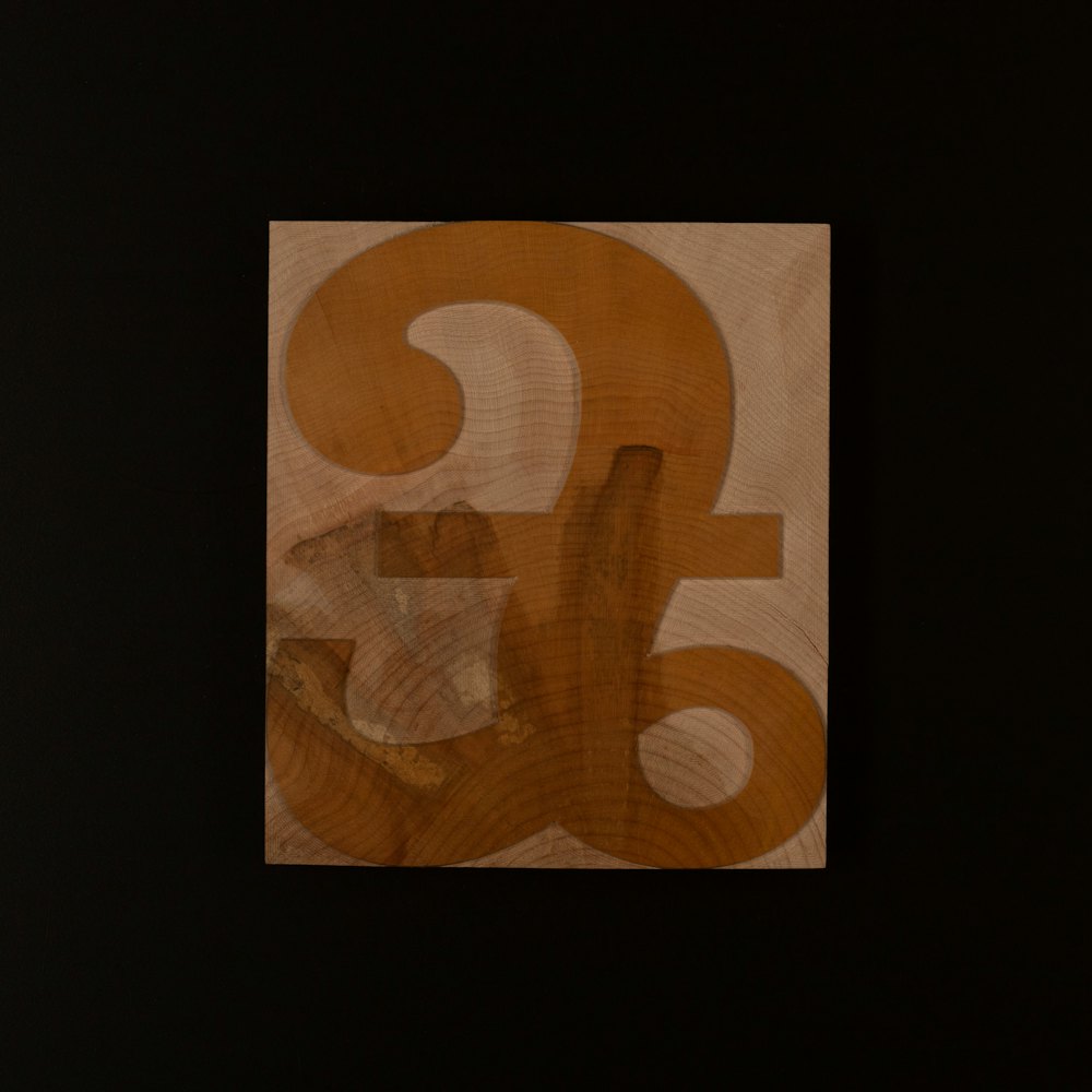
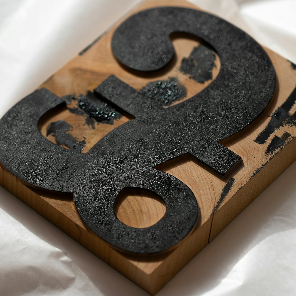
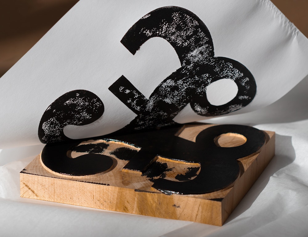
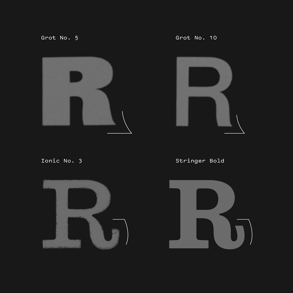
Adaptations were made to specific features of the design to elevate it into a distinctive approach for the Ionic category. When researching Grotesques of Miller & Richard’s catalogue from the 1920s, many examples reflected flair and exaggeration in the approach to their terminal construction. Grotesque No. 5 (1926) and Grotesque No. 10 (1926) shared a sort of “upturned” terminal. This type of weight distribution and additional emphasis felt reminiscent of the ball terminals in Ionic designs. By merging the “upturned” terminals/tails and the ball terminals, a more unique approach to weight distribution could be achieved, all while nodding to the holistic approach of Miller & Richard’s early 20th century catalogue.
Stringer would not have been possible without the expertise, critique, and encouragement of Juan Villanueva, Carl Crossgrove, Troy Leinster, Tamara Segura, Sandra García, Travis Kochel, and Lizy Gershenzon. I am deeply grateful for your time and support.
Emily Klaebe
2024
