
Autumn
Autumn is a deathcare marketplace, providing resources, guides, and a community to help manage life after loss.
Order created an identity designed for clarity and simplicity, placing the tools and resources Autumn provides at the forefront. This allows the visual language to focus on function first, supported by a softer brand mark.
Collaborators
Project team
Jesse Reed, Partner
Garrett Corcoran, Designer
Megan Nardini, Operations
Brooklyn Office
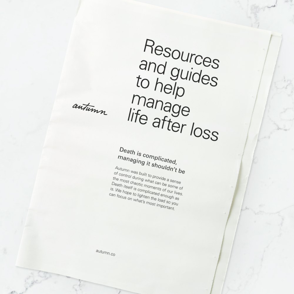
Death itself is complicated. With Autumn, their resources help lighten the responsibilities when managing the death of a loved one.


Our approach was to capture a subtle sense of clarity and comfort through the visual language. Balancing both logistics and grief is never easy and with the identity we draw on the human element that links these ends together.


All in support of providing a sense of control during what can be some of the most chaotic moments of our lives.


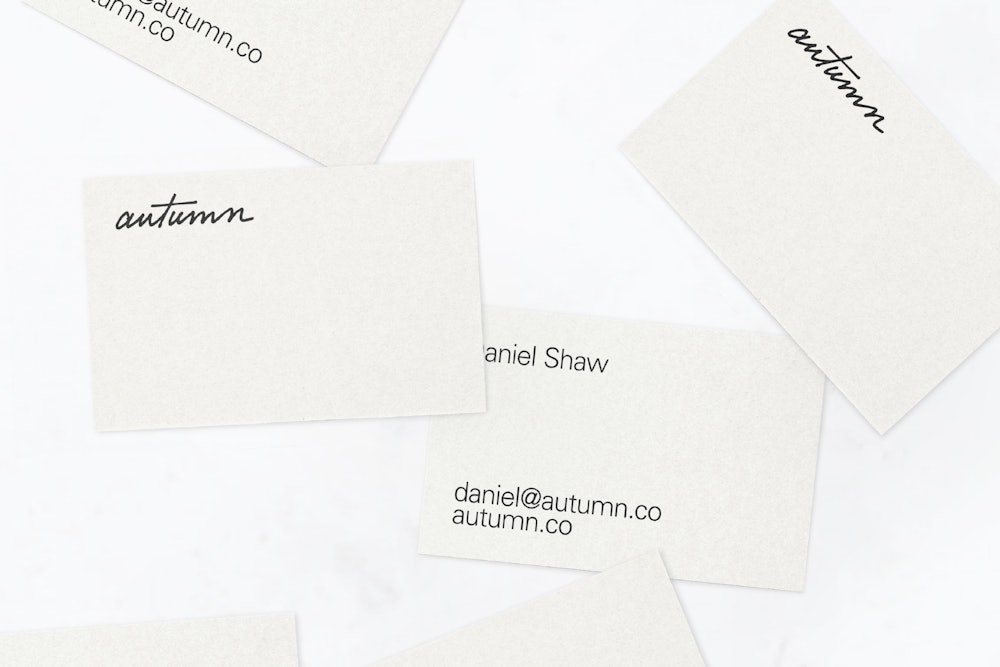
The wordmark uses a handwritten design, first beginning as a simple sketch on paper and seeking to maintain the unique quality of the human hand as it's translated to digital.


The brand symbol uses the singular 'a' from the full mark.


The primary palette uses an off-white tone to create a sense of warmth, while the remaining values are used as supporting, functional colors.
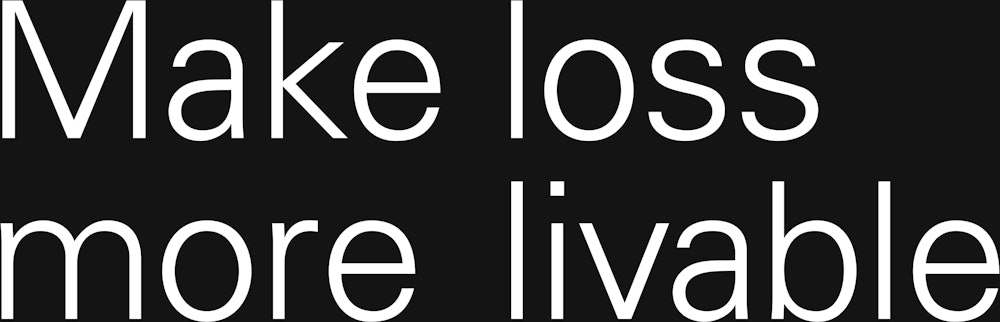
The typographic voice was designed for clarity, deploying the Univers family designed by Adrian Frutiger from Linotype→.


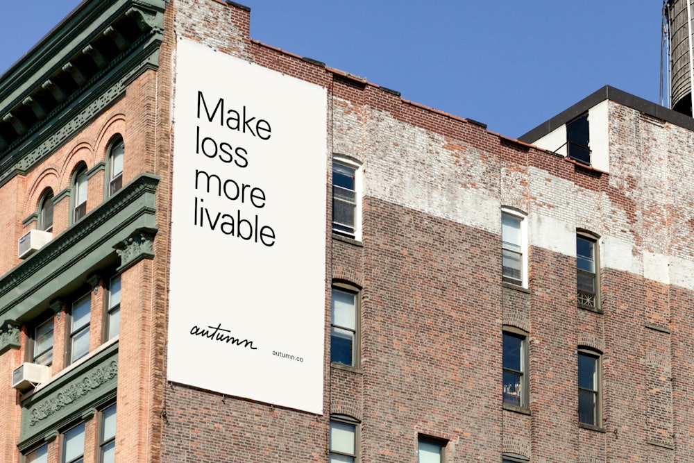
The light weight is used as the primary voice for headlines and larger applications.


Roman is used as the supporting choice for body copy and smaller use cases.


Bold is reserved only for contrast at smaller scales.


In application, the wordmark is used at a small scale along the grid, acting as a sign-off to the content.


In the extended visual language, iconography is used as a wayfinding component to help navigate the complexities of the process.


As the brand extends past the digital experience it maintains its simplicity and clarity, using only typography, color, and identity.


Guidelines were developed for typesetting, color use, and composition, giving the Autumn team a framework for continued expansion.

