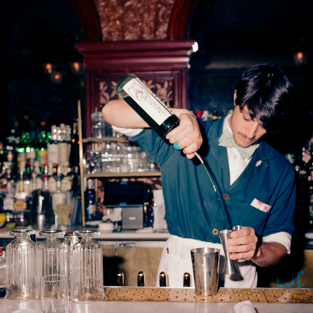

Gage & Tollner originally opened in 1879. The oyster and chophouse was a landmark in the Brooklyn dining scene for over a century, before closing its doors in 2004.
In 2016, three friends and restaurateurs took on the daunting task to bring Gage & Tollner back to life. With our help, the restaurant’s identity was also revived.
Collaborators
Jesse Ragan / XYZ→
Project team
Hamish Smyth, Partner
Kian Ansari, Designer
Chantal Jahchan, Designer
Brooklyn Office

Founder, Charles M. Gage,
circa 1890.

Co-Founder, Eugene Tollner,
circa 1890.

In the late 19th century, New York City experienced an oyster boom.
Charles Gage was reported to have worked with his father running on oyster stand on Navy Street. He later went out on his own, and opened his own restaurant.
“Oyster stands in Fulton Market,” from Harper’s Weekly, October 29, 1870.


Beginnings
Originally founded in 1879, Gage & Tollner was the centerpiece of the Brooklyn restaurant world for more than a century.
Its significance to the borough was once equated to what the Statue of Liberty meant to New York Harbor, and a 1930 guidebook even heralded the restaurant as “Brooklyn’s main contribution to civilization.”
After passing through several owners, the restaurant closed its doors and went dark in 2004. Various stores and restaurants inhabited the space in the years that followed, including a clothing store, a TGI Fridays, and finally, an Arby’s.
With the latter establishments putting up drywall interiors thanks to the landmarked interior designation, most of the Victorian elements were cocooned and preserved.

Gage & Tollner stood prominently on busy Fulton Street, a shopping destination which was once dotted with high-end department stores such as Abraham & Straus.

Fulton Street,
circa 1950.

Gage & Tollner dining room, early 20th century.
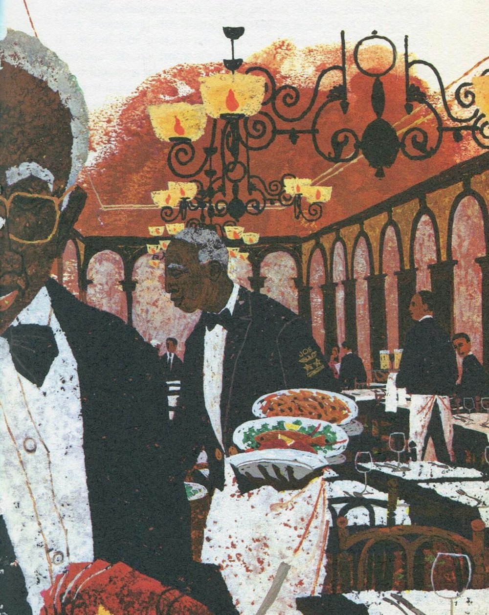
Waiters wore tuxedo jackets and white aprons. Jackets were embellished with military-like symbols designating their years of employment. It was not uncommon for Gage & Tollner waiters to work there for decades.
The lighting of the gas lamps was a daily tradition carried out only by the most senior staff.
Photo: Fred R. Conrad / The New York Times

Illustration by Al Kocab for “Great Restaurants of the United States and Their Recipes”, 1966.

Throughout the second half of the 20th century, the Fulton Mall shopping district began to change.
High end department stores were being replaced with discount clothing stores, and Gage & Tollner’s clientele began to dwindle.
Right, Gage & Tollner in 1987.


As a landmarked interior, thankfully most of the original details had been saved behind drywall. But years of neglect meant the space needed to be fully restored, brought up to code, and a modern kitchen installed.


Revival
In 2014, three restranteurs and Partners Sohui Kim (chef, Insa / The Good Fork), Ben Schneider (Insa / The Good Fork), and St. John Frizell (Fort Defiance), initially raised money using crowdfunding to fund the restoration.
With a successful crowdfunding campaign complete, work began to bring Gage & Tollner back to life in 2016. During construction, the team approached Order to begin work on the graphic identity.
Photo above:
Jeenah Moon / The New York Times
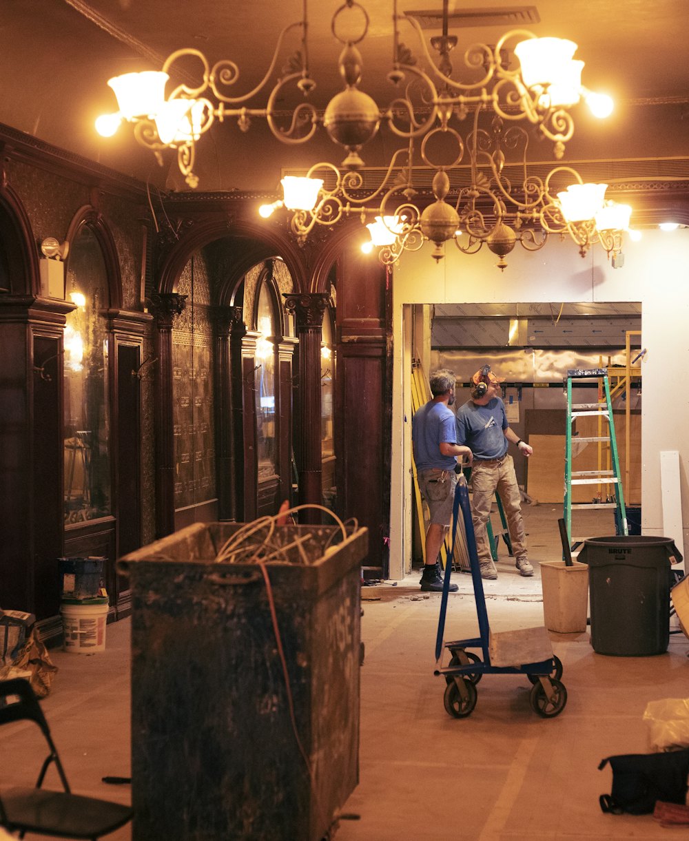

Partner Ben Schneider (left) and team members carried out most of the restoration themselves.

(Above) An original gas-lit sconce.
(Right) Lincrusta No.118 wall covering.
Photo: Sean Tice


Walls in the restaurant retain their original Lincrusta finish, a popular wall treatment in Victorian times, and a rare example of such a well preserve and large finish.
Pictured left and above is Lincrusta No.118.
Photo: Sean Tice
Partner Ben Schneider restored the original ornate brass lighting fixtures.
Even though the building converted to electricity in the 1890s, the gas lamps were retained late into the 20th century, as the owners wanted to keep the gas light's superior and flattering light quality for guests.


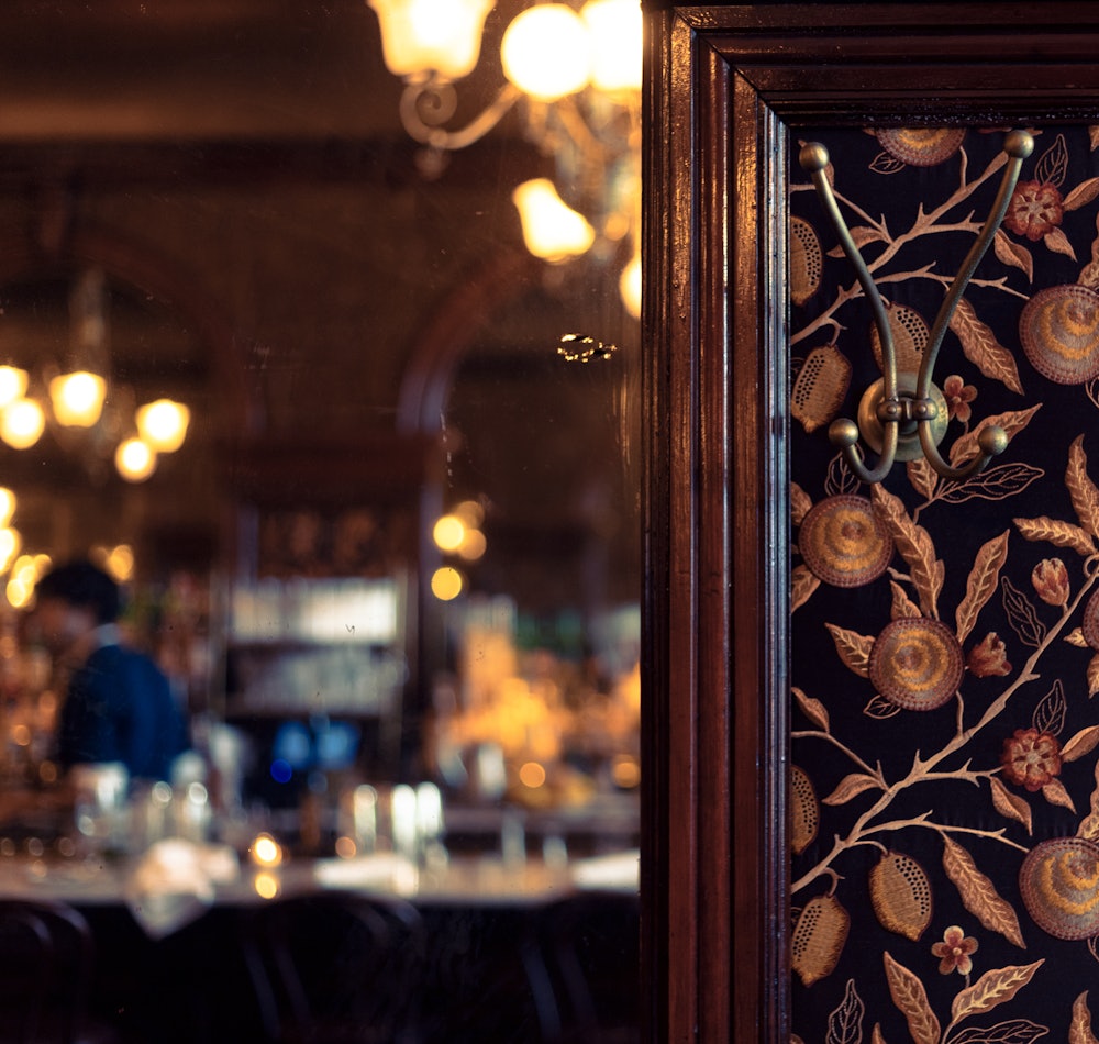
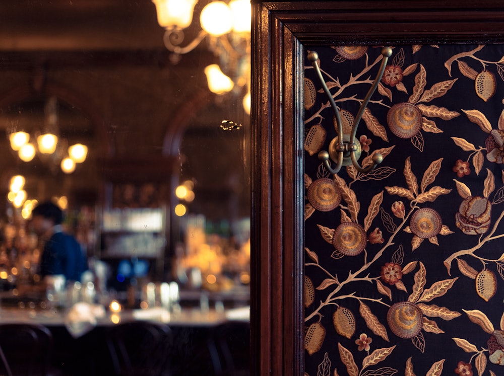
William Morris’s “Fruit” embroidered fabric was selected by partner St. John Frizell to replace the worn-out original wall coverings.


Partners Sohui Kim (chef, Insa / The Good Fork), Ben Schneider (Insa / The Good Fork), and St. John Frizell (Fort Defiance). Days before opening … and days before Covid-19 shut down New York City.
Photo: Grub Street→


Design
Restaurant partner St. John Frizell passed on extensive research and materials collected with help from the Brooklyn Historical Society.
From the outset, we decided that we wanted to try and bring back the original feeling of the restaurant’s branding, but updated for the 21st century.
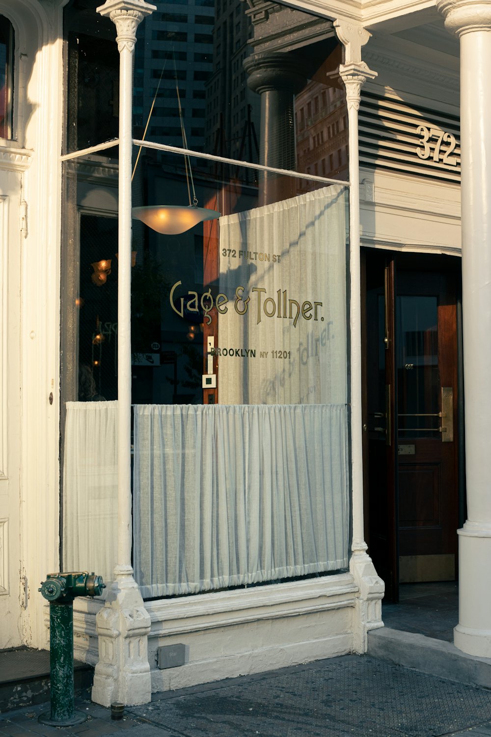
Over the years Gage & Tollner used several different logos. The original window lettering was distinctive, but was not found on any other materials. Our research showed the oldest printed logo the restaurant used was set in a typeface named Art Gothic.
Designer Jesse Ragan→ helped us identify the original lettering used on the packaging as Art Gothic, a popular Victorian Era typeface.


Jesse Ragan from XYZ→ sourced Art Gothic specimens from American Type Founders to inform the redrawing of the wordmark.


Travis Fitzsimmons of Travis Signs→ masterfully took our artwork and applied it in gold leaf to the building facade.


A G&T monogram was designed for use on smaller applications.



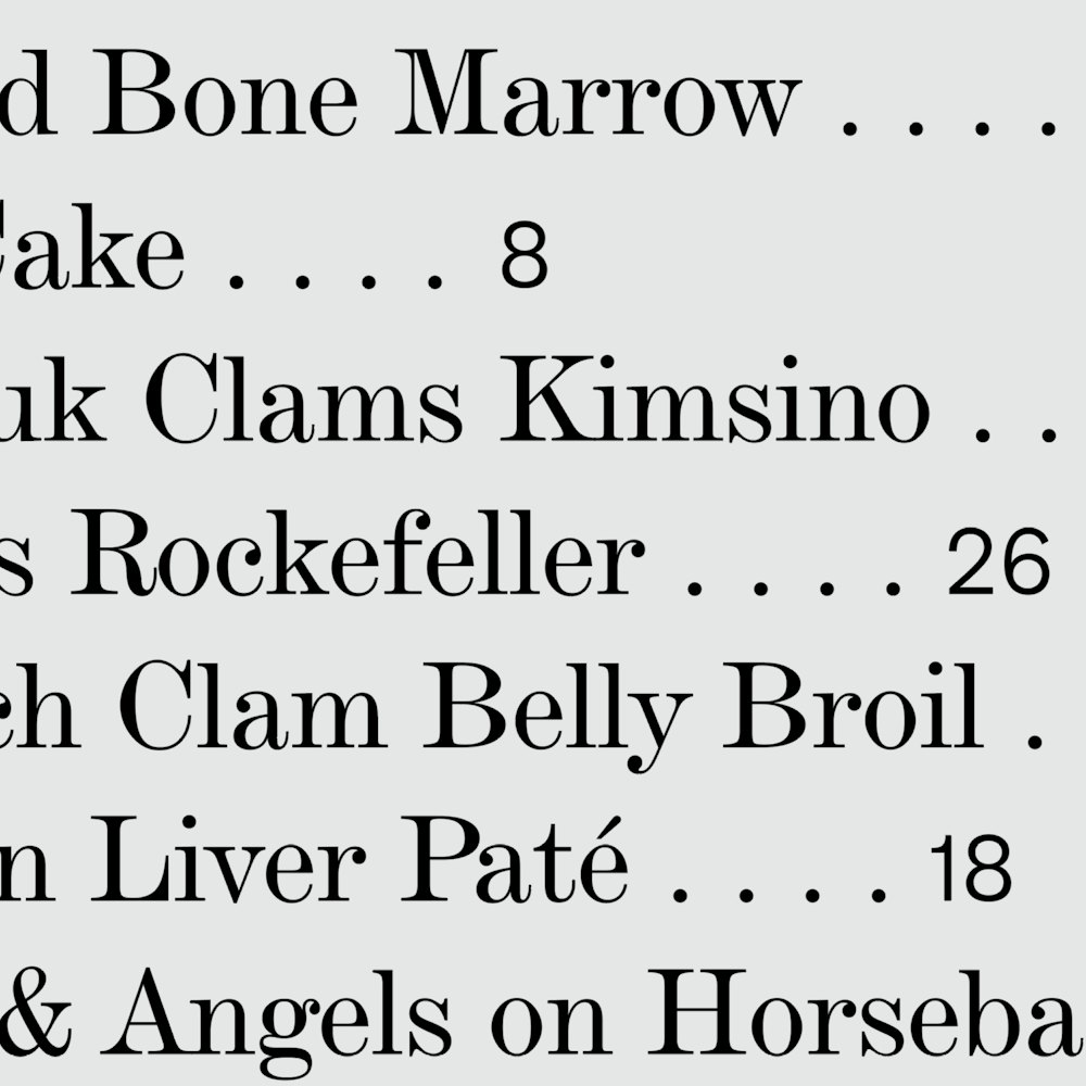
The 1890 menu served as a starting point for the new typographic system.
DeVinne Standard BT, based on Bruce Foundry No.11 c.1860 was chosen as a “Modern” typeface that resembled the fonts used in the early menus.

Proto Grotesk from Production Type→ was selected to be used when bolder type was needed. Its forms are reminiscent of turn of the century sans serifs that oscillate between an Egyptian and Modern.




Cocktail Photos: Lizzie Munro→


The pandemic moved the opening back, but online orders of pre-mixed cocktails was a lifeline for the restaurant.

Postcards using historic images are presented with guests' checks.


An extensive wine list is curated by wine director Étienne Guérin.

Guidelines were created to help the staff update the menus.

An evening at Gage & Tollner
The Order team thought the best way to document our work for the restaurant wasn’t a slick studio shots of food and menus, but instead a steak and martini-filled night armed with Yashica, Rolleiflex, and Mamiya cameras.
Thank you to the entire team at Gage & Tollner for pulling out all the stops and leaving us well and truly overserved.
Photos: Jesse Reed and Hamish Smyth.
Shot on Kodak Portra 400 NC, 35mm and 120 film.


