
Hillary for America
Together with Pentagram partner Michael Bierut, Order’s Jesse Reed developed the core identity system for Hillary Clinton’s 2016 presidential campaign. Working closely with the campaign’s creative team, they designed a system that was inclusive, adaptable, and flexible.
Collaborators
Michael Bierut→
Jennifer Kinon→
Project team
Jesse Reed, Designer


Reed worked with type designer Lucas Sharp→, to design a modified version of his typeface, Sharp Sans, to create “Unity.” It became the official campaign typeface and was later expanded into additional weights and styles by Clinton’s design director Jennifer Kinon and her team at campaign headquarters.


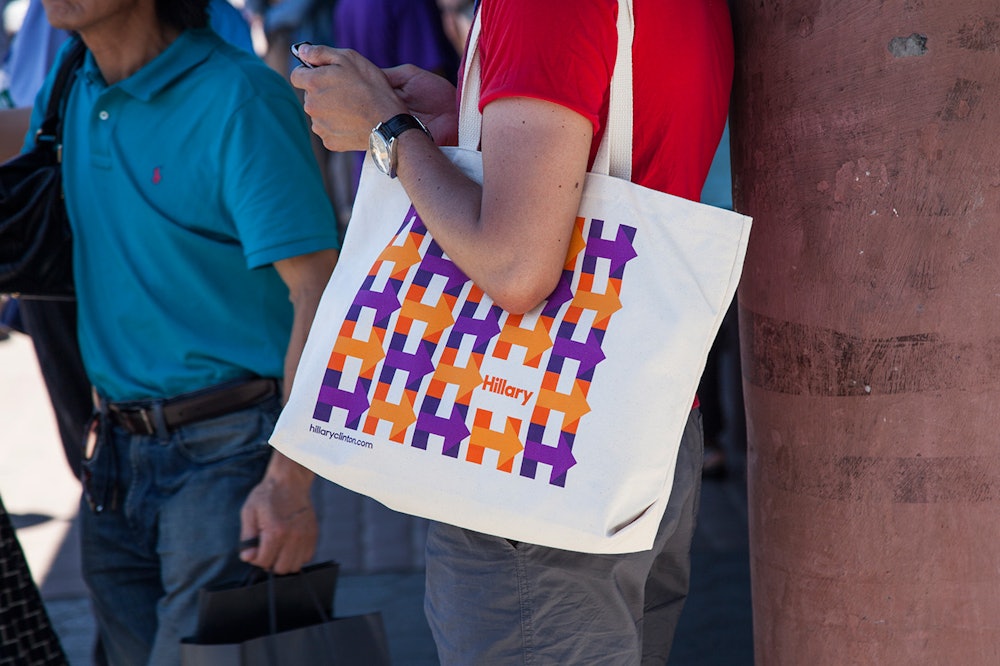
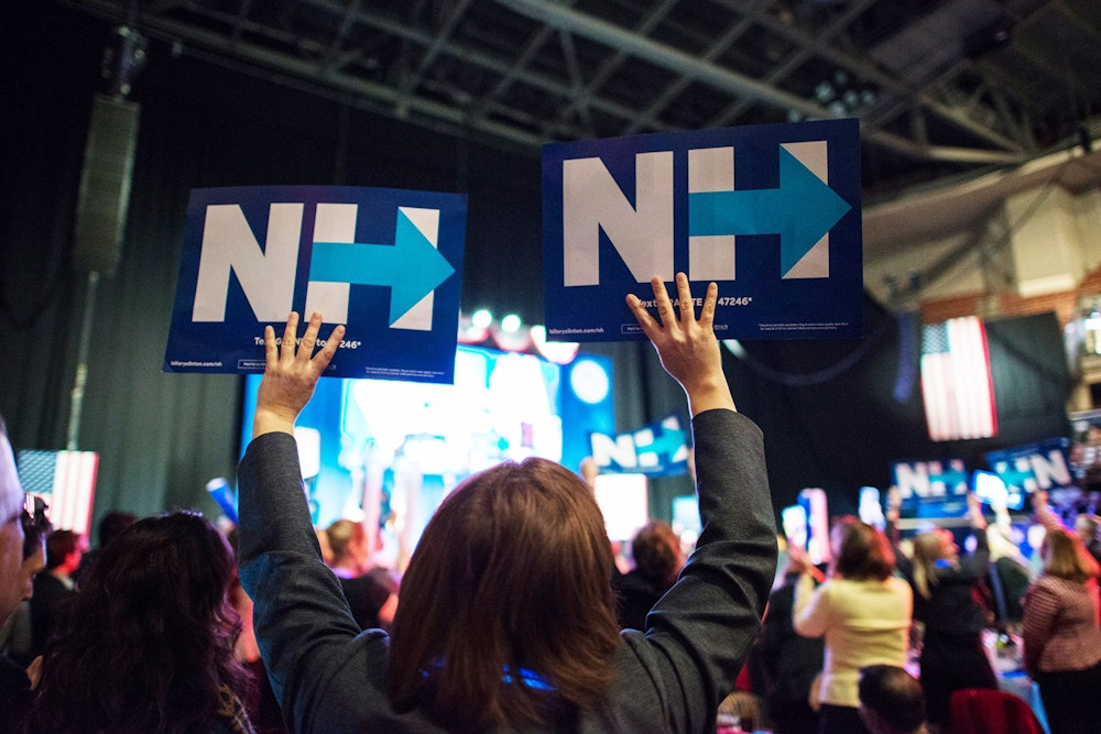
Kinon led her team in expanding the identity beyond its core state, including a wide variety of “H” variations, as seen above.
The logo’s simplicity drove its adaptability: supporters could easily create their own versions to share on social media, draw on posters, and more.

A robust guidelines document was created for the in-house design team to carry-out daily needs of the campaign.


