Industrious Labs
Heavy industry is the foundation of modern society. Materials like cement, steel, and aluminum build our bridges and roads, construct wind and solar projects, and manufacture vehicles and heat pumps. Industrious Labs works to ensure these solutions are delivered on with the environment top of mind.
Keeping in mind the vastly different audiences, between environmental activists and industry stakeholders, the identity system showcases the combination of ideas; highlighting the power community and collaboration.
Collaborators
Bggy→
Project team
Jesse Reed, Partner
Garrett Corcoran, Designer
Megan Nardini, Operations
Brooklyn Office
Industrious Labs exists to reimagine the industrial sector not only as a source of job opportunity, but where climate-driven solutions are not the goal but the standard.


Their work addresses issues within the industry on responsibility and accountability in emissions, waste, and environmental racism.

With this vision, heavy industry can be a platform where communities are built.

The environment is prospering.

And our infrastructure is secure.
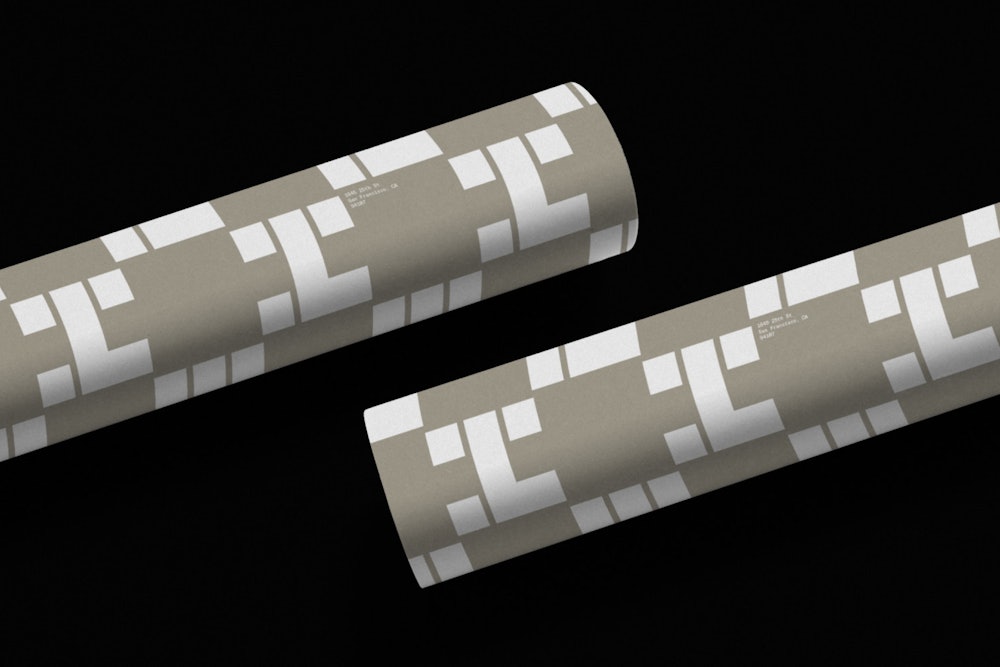
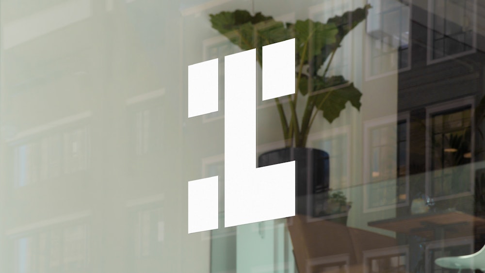
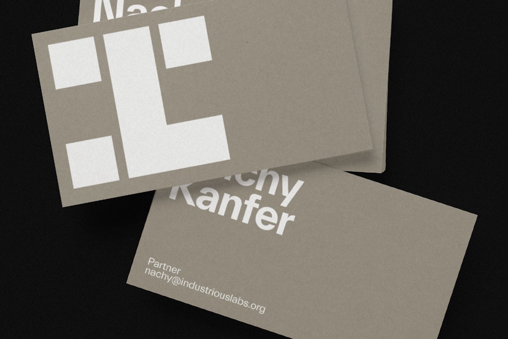
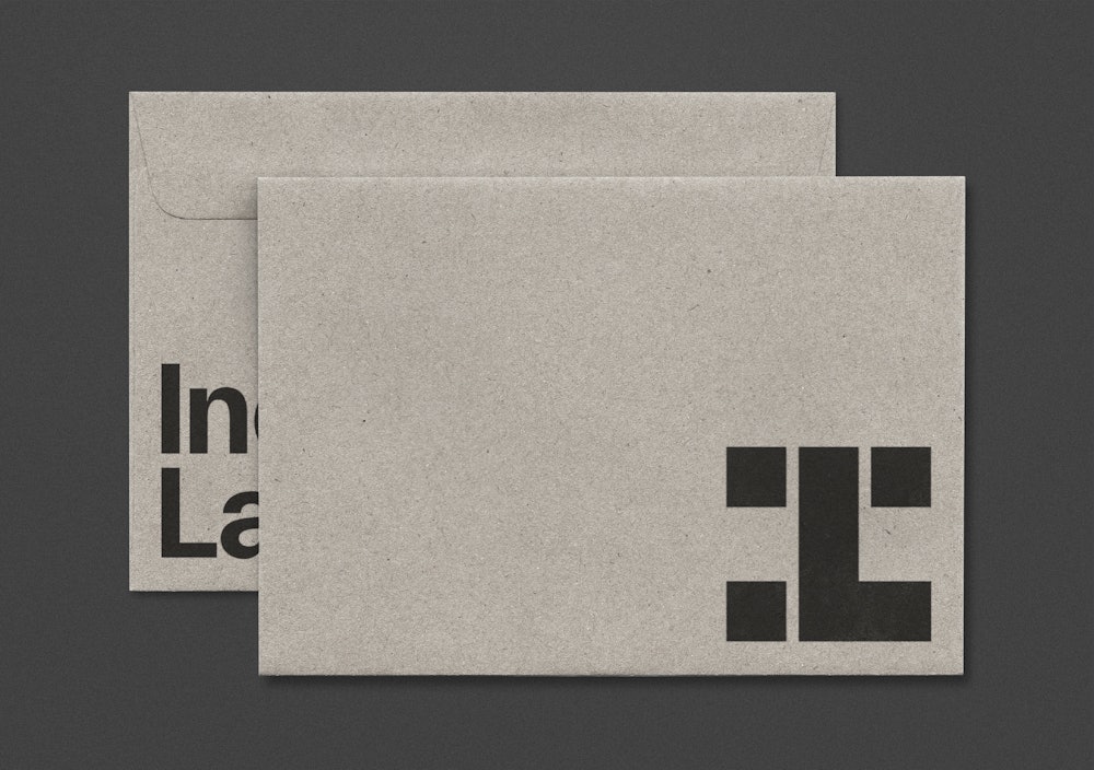
The identity builds on the familiar steel beam, embedding the letterforms of the name this symbol.




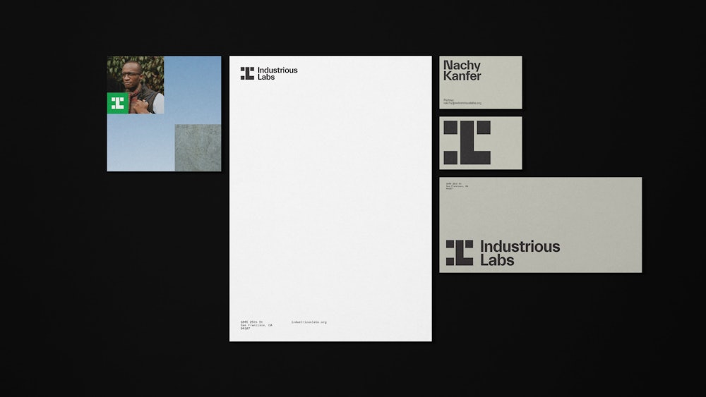
The symbol stands alone or alongside additional brand material as a building block.



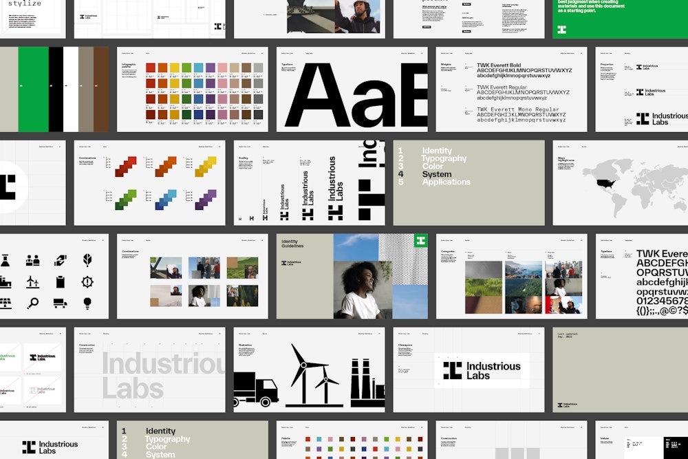
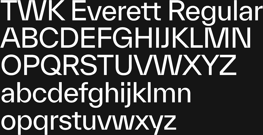
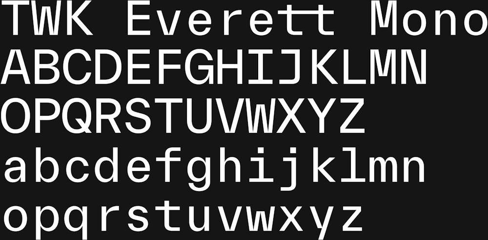
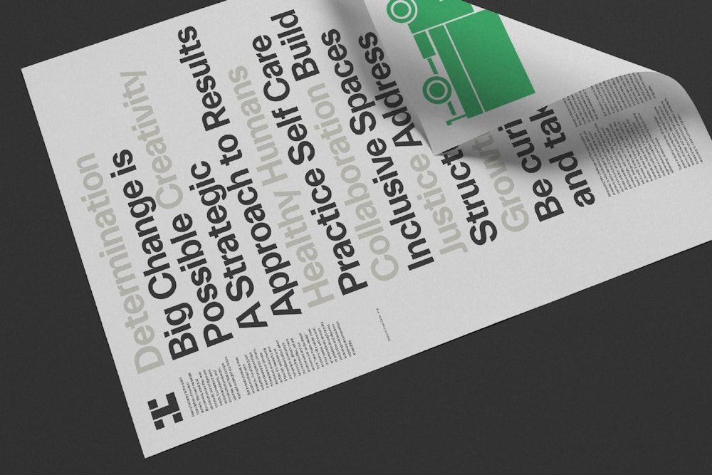
TWK Everett reflects the angularity of the brand elements. Designed by Nolan Paparelli→ and released by Weltkern→.
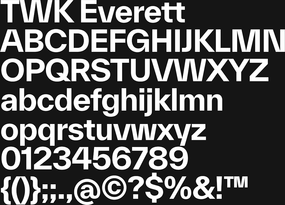
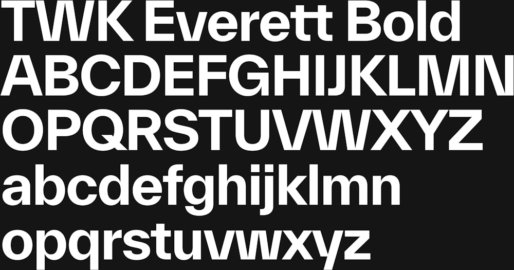
Two weights and a mono version together create a dynamic and clear typographic voice.
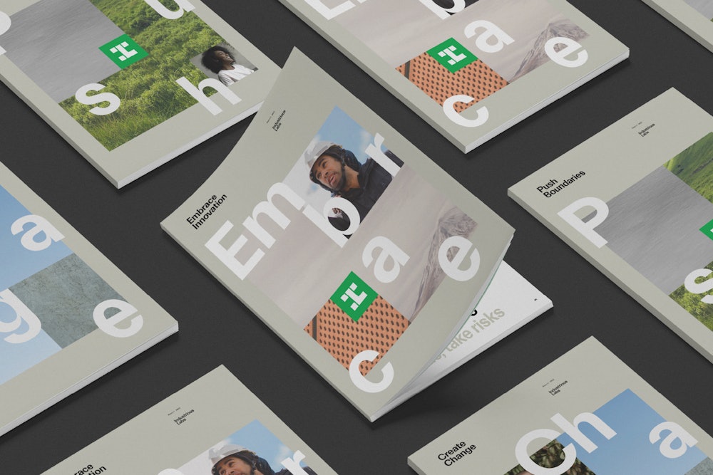
In the extended visual language, photography is used as a connective device with different imagery reflecting each aspect of Industrious Labs.

Community.

Environment.

Industry.


Each component comes together as individual components adding up to a whole.

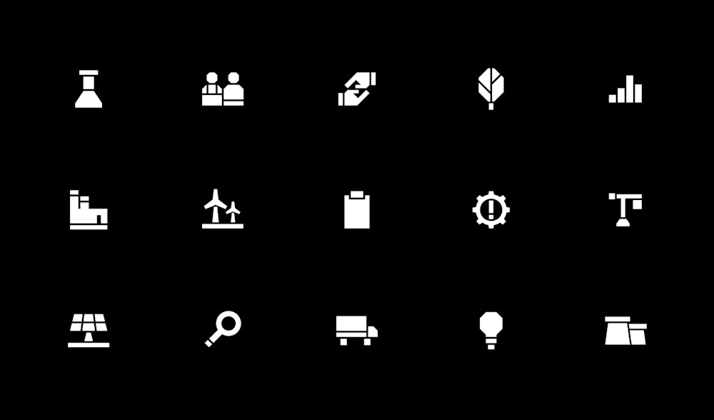
Custom iconography reflects the visual language of the mark, using angular and solid shapes.


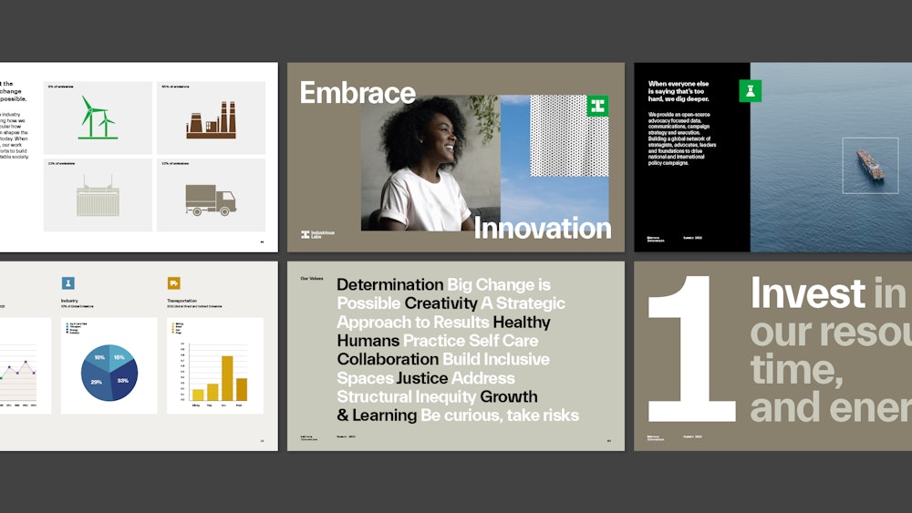

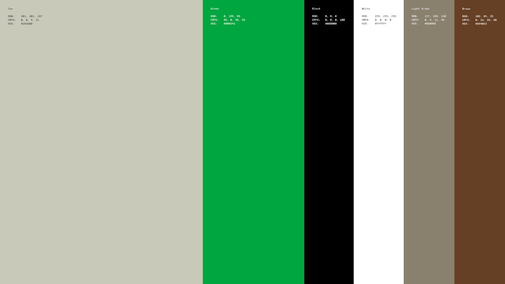
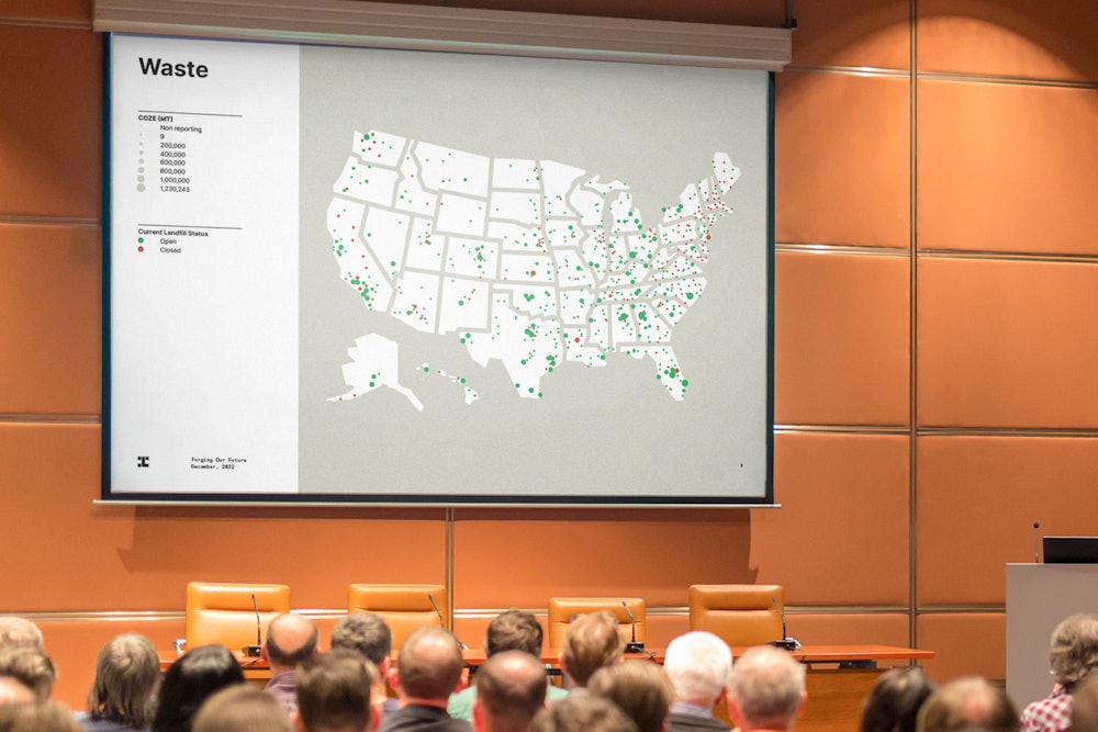
An extended color palette was developed for information graphics.
This helps information within different categories and sectors distinguish itself from the core identity.
Website developed in collaboration with Bggy→.

