Maxio
Maxio is a subscription billing management platform designed to empower growing B2B SaaS teams and enable efficiency in their workflow.
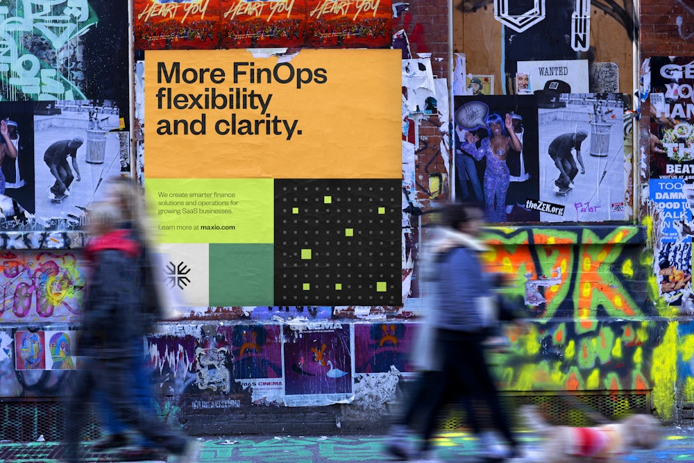
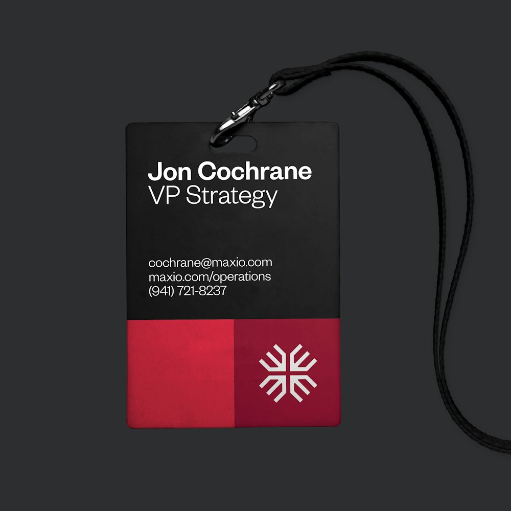
Following the company’s merger of Chargify and SaaSOptics, Order created an identity designed to balance the mathematical and human nature of the team’s practice.
Collaborators
—
Project team
Jesse Reed, Partner
Emily Klaebe, Designer
Megan Nardini, Operations
Brooklyn Office
The merging of Chargify and SaaSOptics blended their respective strengths and core functionalities to create a unified system that solves a wide range of billing needs.

The founding principles of these offers were used to develop layers of meaning behind their symbol.


A pencil to capture the team’s collaboration

An abstract letter “M” calling back the namesake

A plus symbol representing data growth


Custom-drawn logotype mirrors the construction of the symbol, and reinforces the data-focused practice in the unconventional letter “X”.
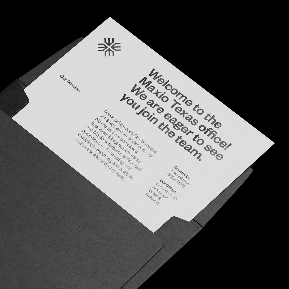
The symbol is used as a shorthand identifier of the brand.
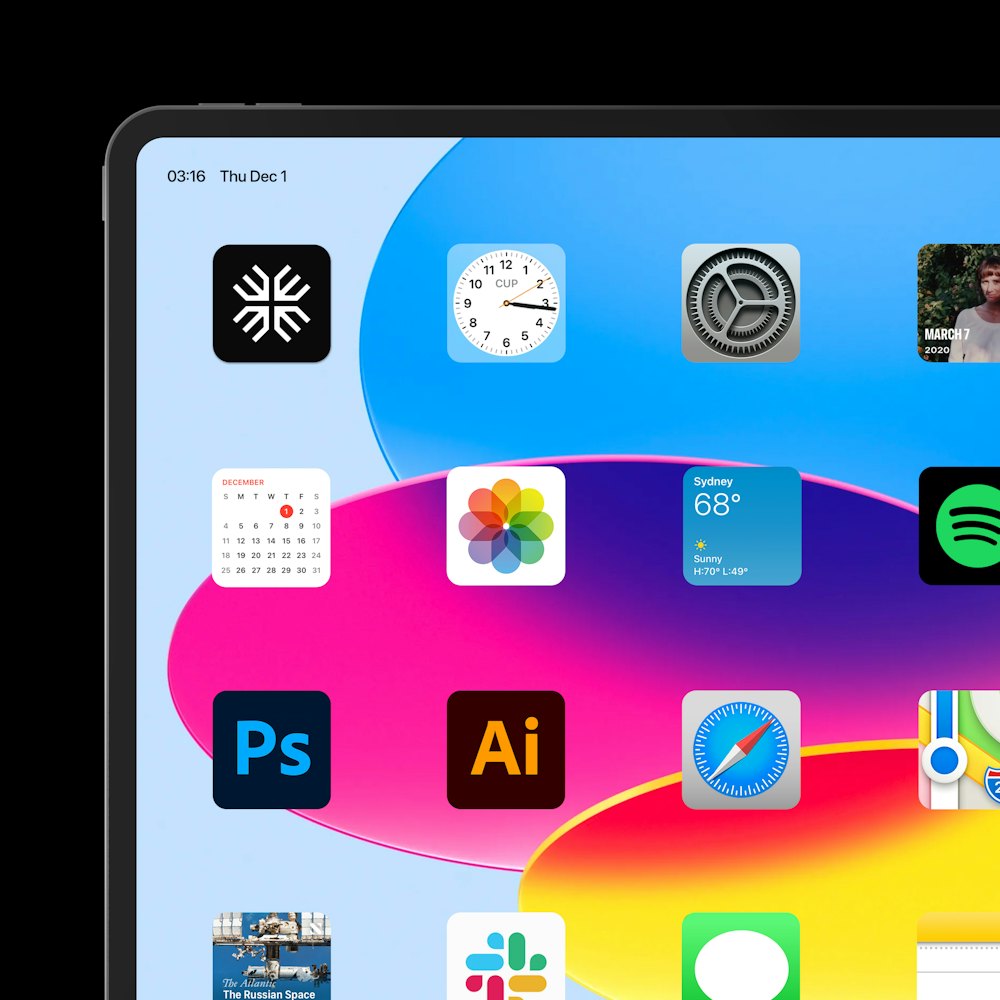
An iconography suite was developed based on the inktrap and monolinear characteristics found in the symbol.
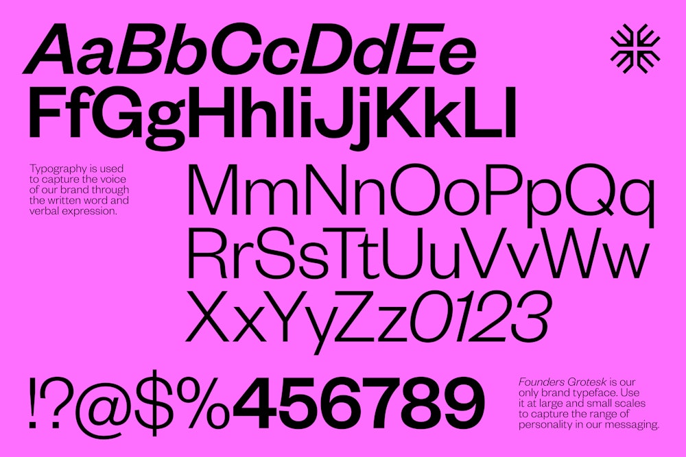
It was vital that the typographic language of the brand reflected the humanity of the Maxio’s team.
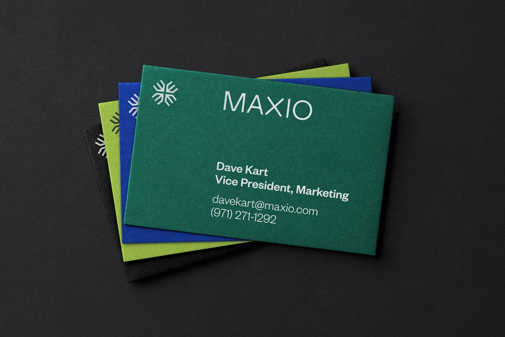
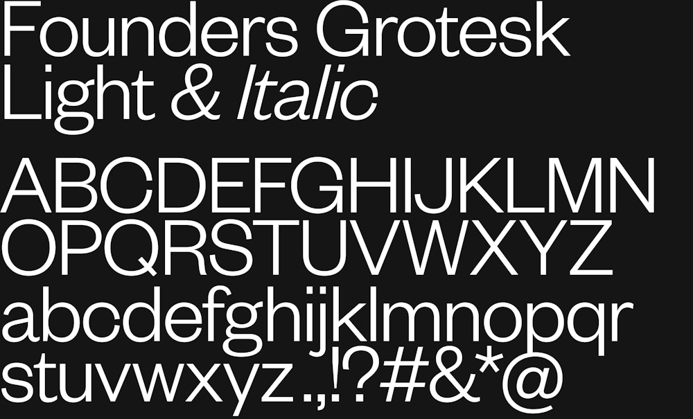
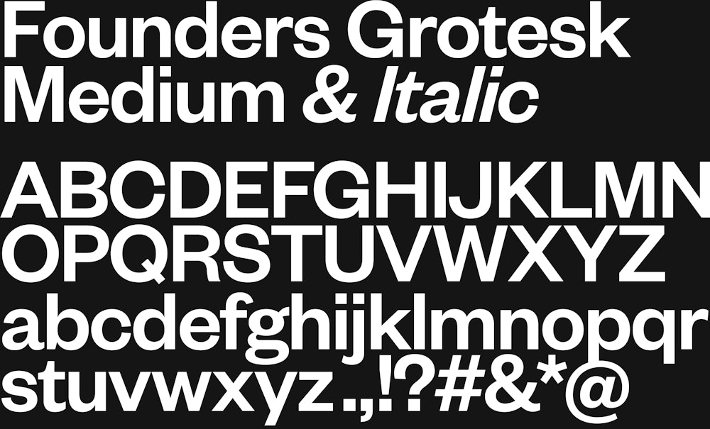
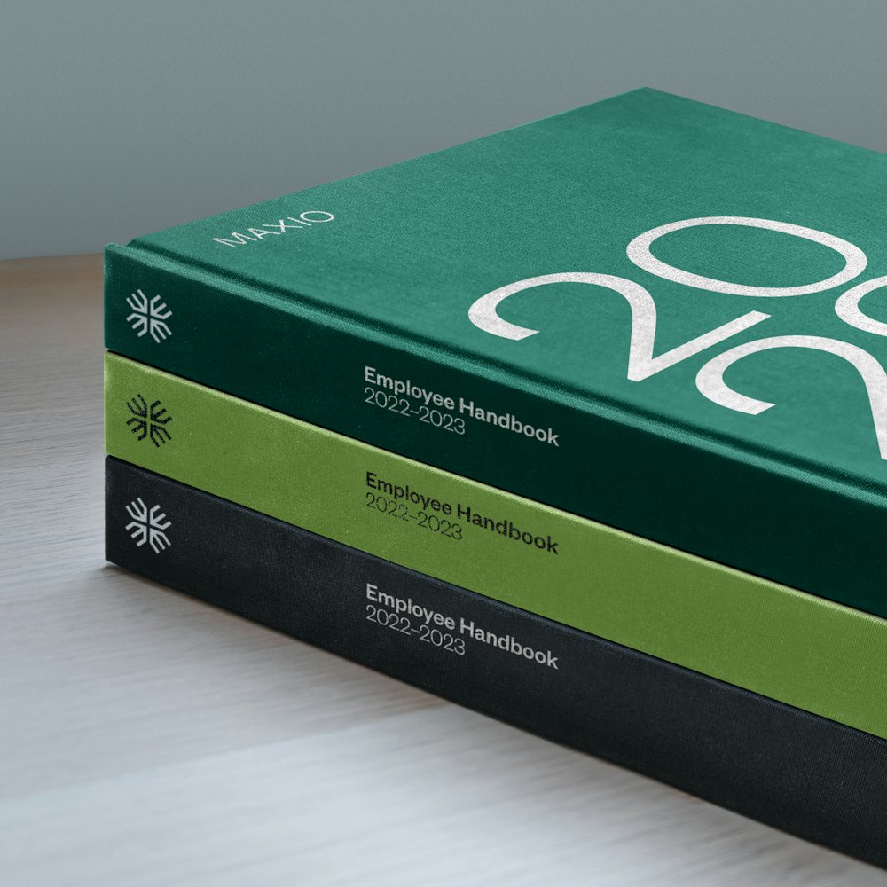
Founders Grotesk by Klim Type Foundry→ is used as the primary and only brand typeface for its balance of warmth and function.
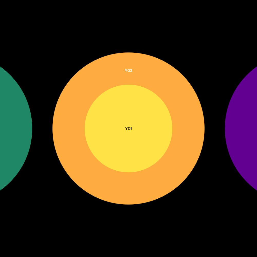
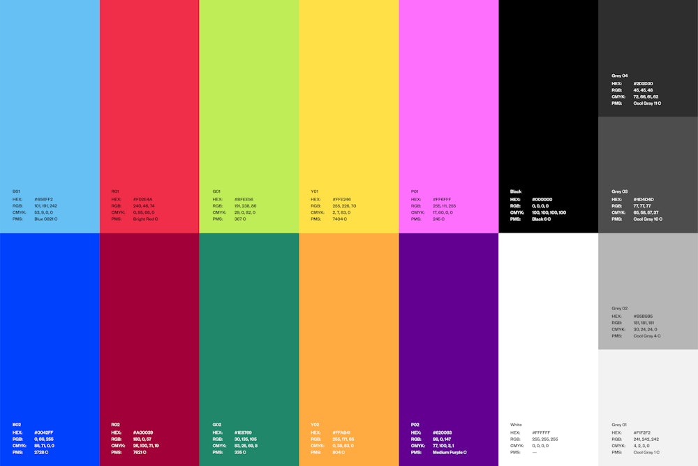
A system of color siblings were designed for harmonious support and contrast in the brand’s use of color.
The principles for combining within the palette were outlined to support the team, with three colors being used at most in any given composition.


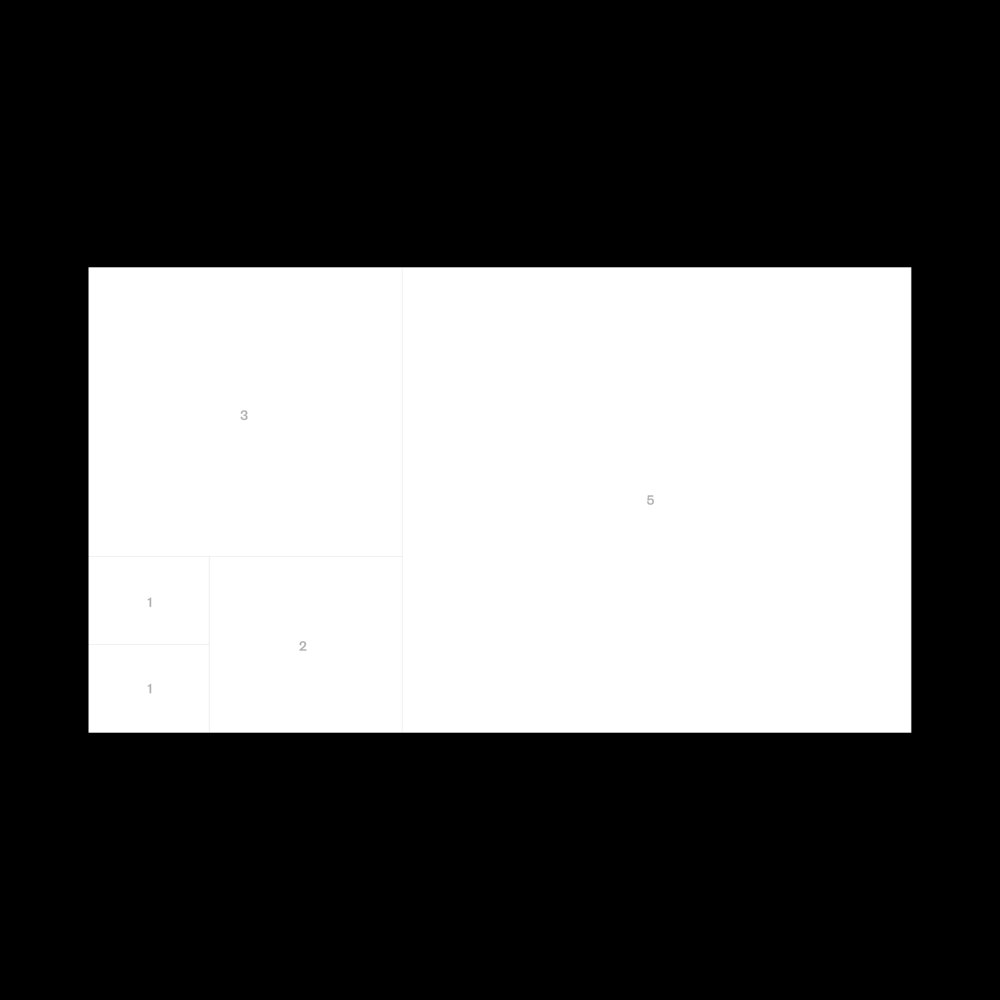
The grid system is derived from the principles of the fibonacci sequence.
The formula outlines each number being the sum of the two preceding ones. Based on that sequence, layouts are always created with mathematically sound growth.


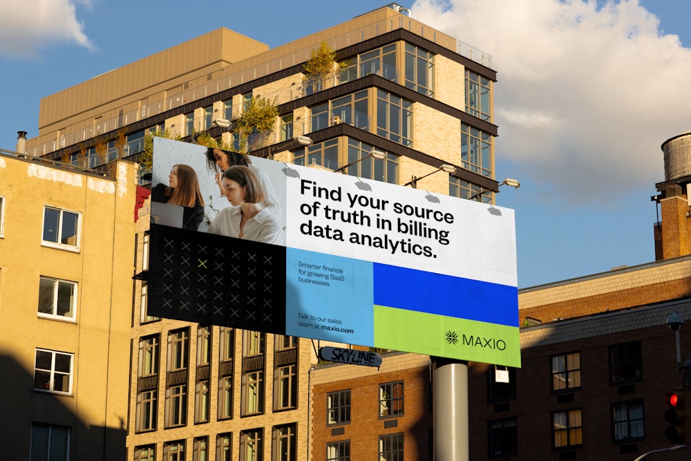
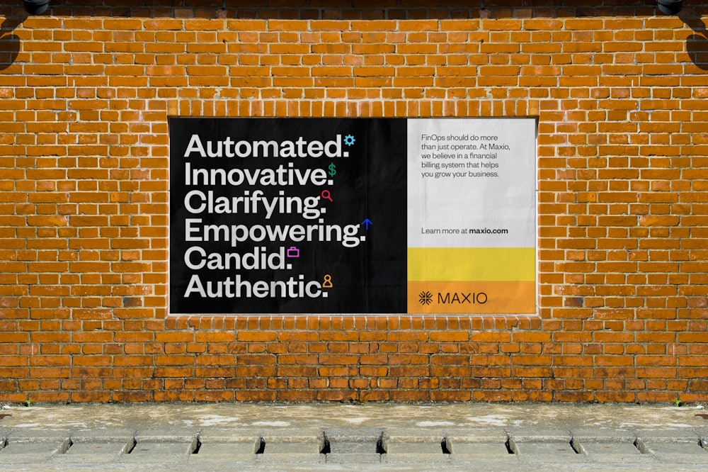
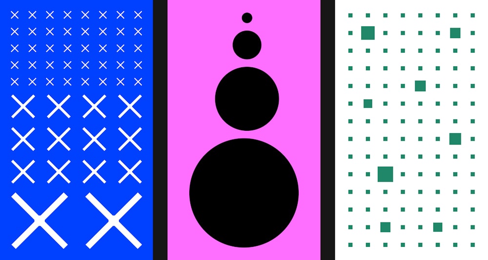
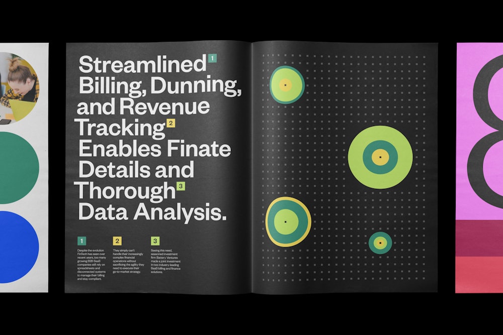
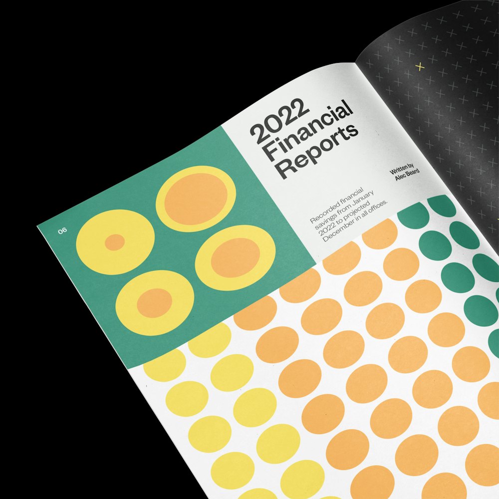
Maxio’s focus in mathematics was expanded into a visual system of data graphics for communicating information and opportunities of expression.
The shapes of data graphics originate from the geometric areas of the logo.
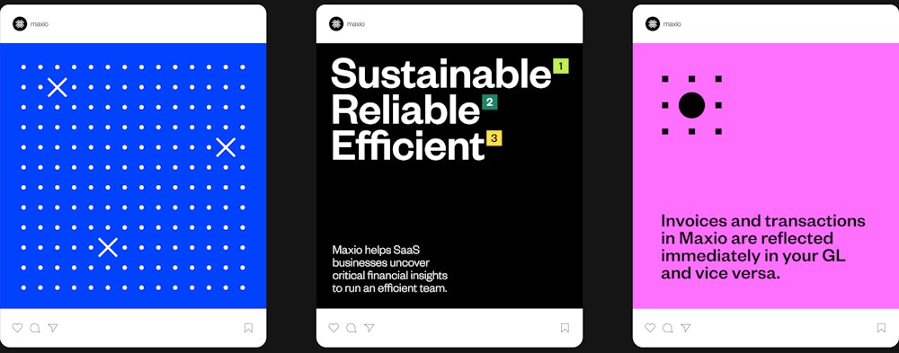
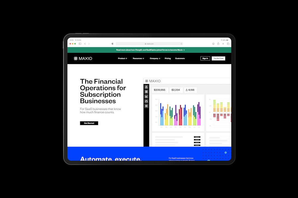
To coincide with the launch of Maxio’s new identity, Order designed a website that balances the expression of the system with the company’s pragmatic approach to billing solutions.
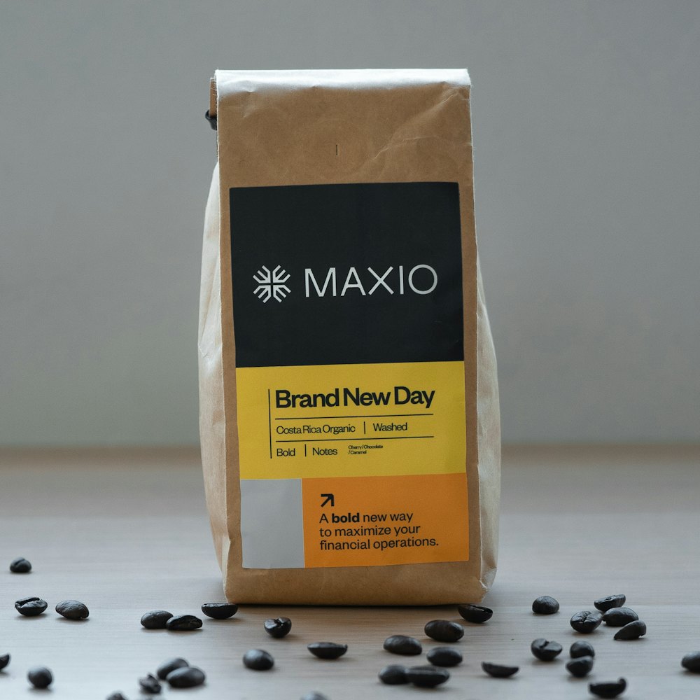
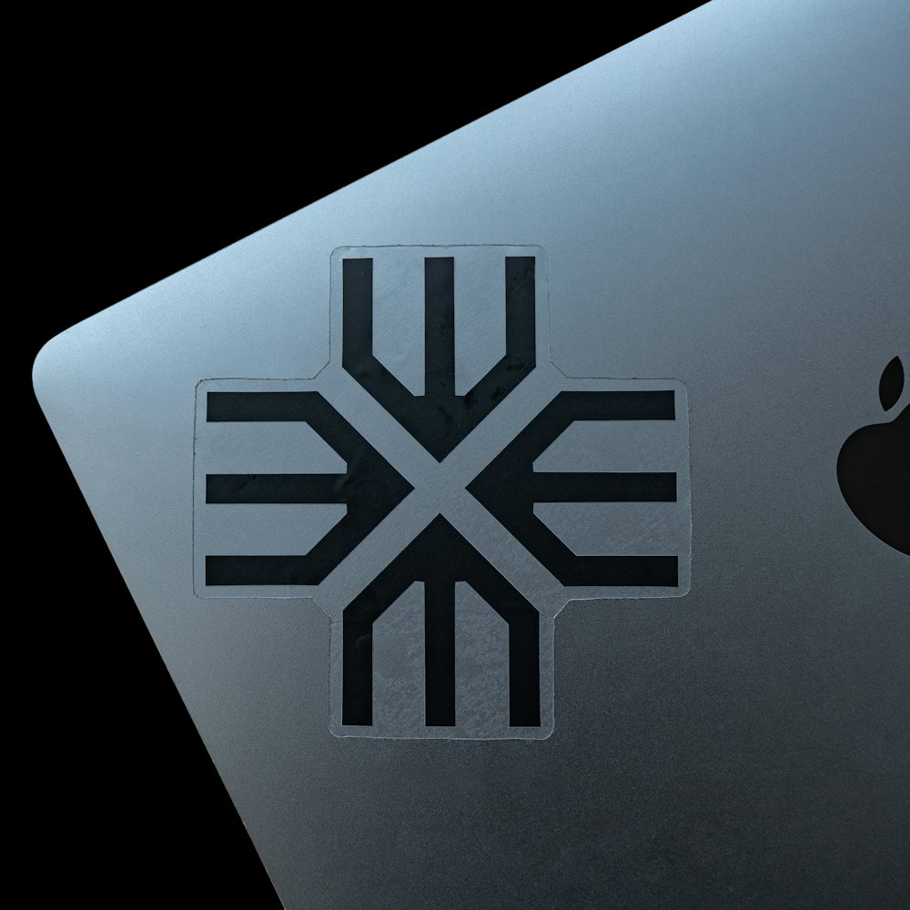
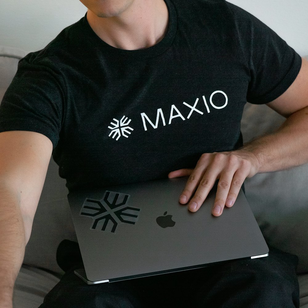

A comprehensive set of guidelines were developed to help the Maxio team wield and, naturally over time, expand the system.
