
Rebecca Atwood
Rebecca Atwood is an artist and textile designer of ethically made fabrics, wallpapers, and accessories.
With a background in fine art, Rebecca’s work begins with ink on paper and ends in rich textile designs. The new identity attempts to embrace the interplay between the layering and repetition in her work, embracing the complexity and depth.
Collaborators
Website designed and developed by Fuzzco→
Origins
Almost all of the designs found in Becca’s catalog originate from her sketchbook. As an experienced textile designer with a background in fine art, her practice has resulted in intricate designs with versatility that suit any home.
When approached to redesign the brand, Order’s focus was to help the brand feel more like themselves by reflecting their updated company mission, values, and vision. Since their founding the company has changed, but the old branding did not move with it.

Process
To better understand the brand we began by looking closely at Becca’s process. Her designs often begin before the first brush stroke on a page occurs at her studio, previously in Brooklyn's Navy Yard and now in Charleston, South Carolina.
Becca’s sources of inspiration are often drawn from the world around her: the joyful shape of clovers, the soothing effect of a horizon line, the hues of a beloved landscape, or the nostalgic print on a childhood tablecloth.


Moodboards and inspiration for the Spring ‘22 collection compile textures, interiors, paintings, and Becca’s own sketches.
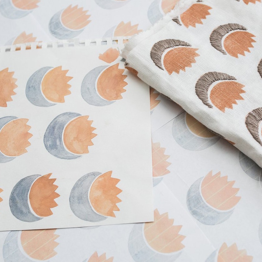
Becca’s designs are translated directly from her sketchbook to the final product. While concepts originate in inked mediums, the final products combine different methods of production. The fabric was woven in India, the sun motif was hand screen printed, and finally the moon motifs embroidered.


Woven fabrics made sturdy for upholstery, marble geode weaving on a hand dyed warp
Photography by Tory Williams→


The Nolita showroom features a range of fabric collections, organized by season and color.


Inspirations from the latest collection recalls candy shops, vintage textiles, men’s ties, and childhood memories.


The ‘fabric wall’ at the Nolita showroom.

The updated wordmark attempts to evoke pattern and repetition through typography.


By consolidating the letter-spacing of the wordmark, the full name is able to be used with more versatility, all while referencing the core foundation of Becca's work: pattern and repetition.


Repeating letters within the brand namesake allow for custom ligatures in the wordmark.
The serifs of the ‘C’s have been custom drawn to create a balance between soft and sharp in the logotype.


A reduced version of the wordmark utilizes the abbreviated initials of the brands’ namesake as an icon. Similar to the overlap of the “A” / “A” ligature, the diagonals of the “R” and “A” intersect.

Primary horizontal wordmark, used most frequently.

Secondary stacked lockup, used only when the proportions of the layout require it.

RA icon, for use at small sizes.


The icon is used as a shorthand identifier on the back of the fabric swatches.


Chap Light blends calligraphic stroke contrast and modern sans serifs. The balance of traditional and contemporary speaks to Becca’s workflow.

Signifier Light is a contemporary response to 17th century typefaces. Its rich historic background mirrors Rebecca’s traditional processes, and lends to headlines, paragraphs and body copy.


Supporting typographic treatments are used in the details of the identity system.
Söhne Mono Buch is used for product details and finite information. Becca’s own hand writing is used to lend personal touches to branded materials.


Chap and Signifier are paired for their shared sharp characteristics.


Söhne Mono at 5pt on fabric

Signifier Light at 7pt on fabric, and Chap Light at 10pt on fabric


Hilma af Klint’s work is a personal inspiration to Rebecca. Referencing Klint’s paintings, we pulled in key brand colors to use in the system, with the option to rotate seasonal colors in with new fabric collections.


Similar to Becca’s practice of layering to create new patterns, the identity system elements are layered above, below, and in-between pattern and color.

Key element is layered above patterns.

Key element is layered in between patterns.

Key element is layered behind patterns.


In the most expressive extensions of the system, color, pattern, imagery, typography, and handwriting are all used.
When the patterns need the focus of the composition, less elements of the system are used for a reserved expression.

The wordmark is often repeated to create its own pattern.


Extensive brand guidelines were created to assist both Rebeccas team and outside collaborators when creating branded assets.

The new website was designed and developed by Fuzzco→ and based on Order’s identity.


An iconography suite was designed for usage on the website and swatch backs.


Coinciding with the launch of new collections is a newspaper featuring details on new patterns, a look inside the process, and introductions to team members and interior designers.


Letterpress cards feature quotes from artists’ who share Rebecca’s values.


