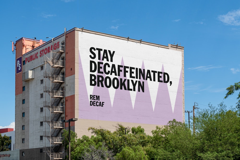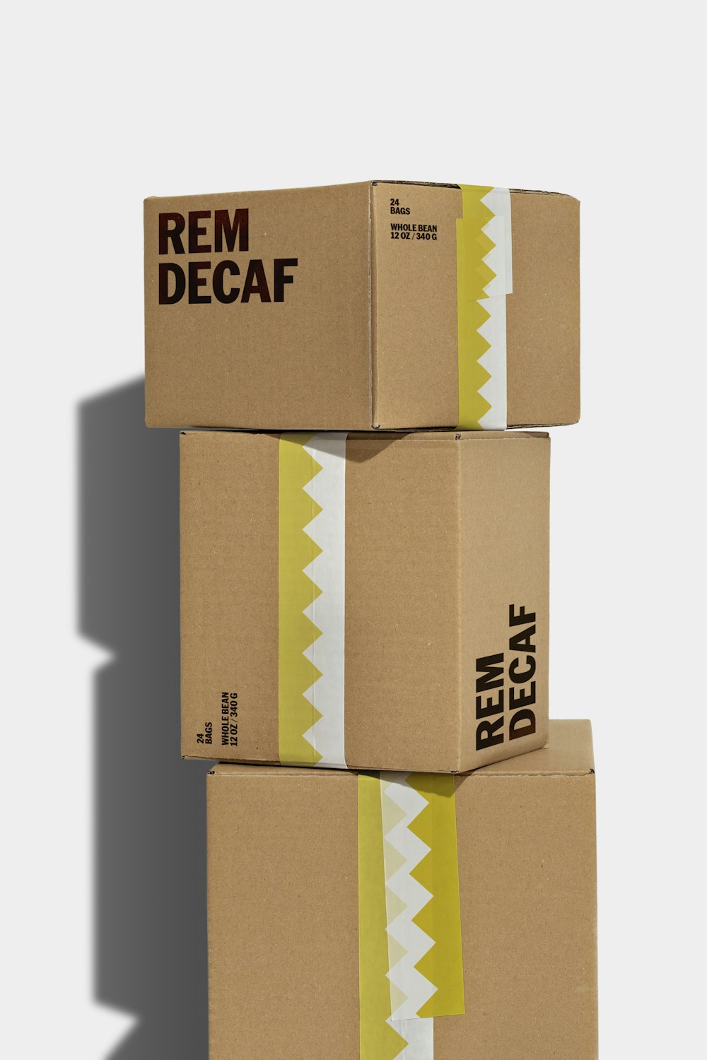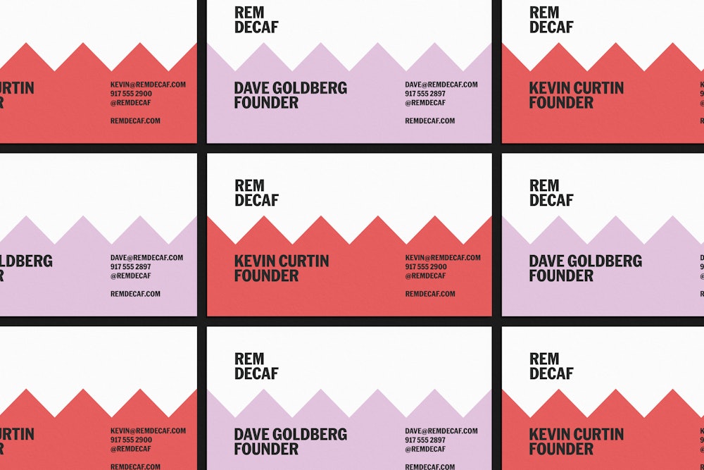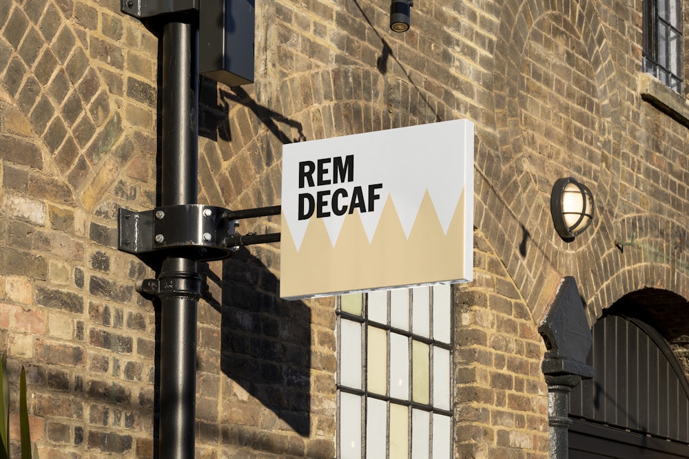

Founded in 2025 by Kevin Curtin and Dave Goldberg, REM Decaf is a new coffee company that makes exactly what the name suggests: decaffeinated coffee. Seeing a gap in the market for good, quality decaf coffee, REM is creating a family of beans that are high quality and expansive in choice.
Order developed the brand identity and packaging system based on the REM sleep cycle and its many stages.
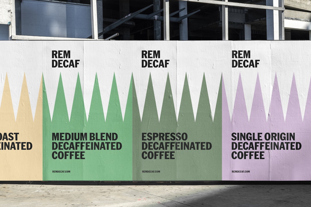
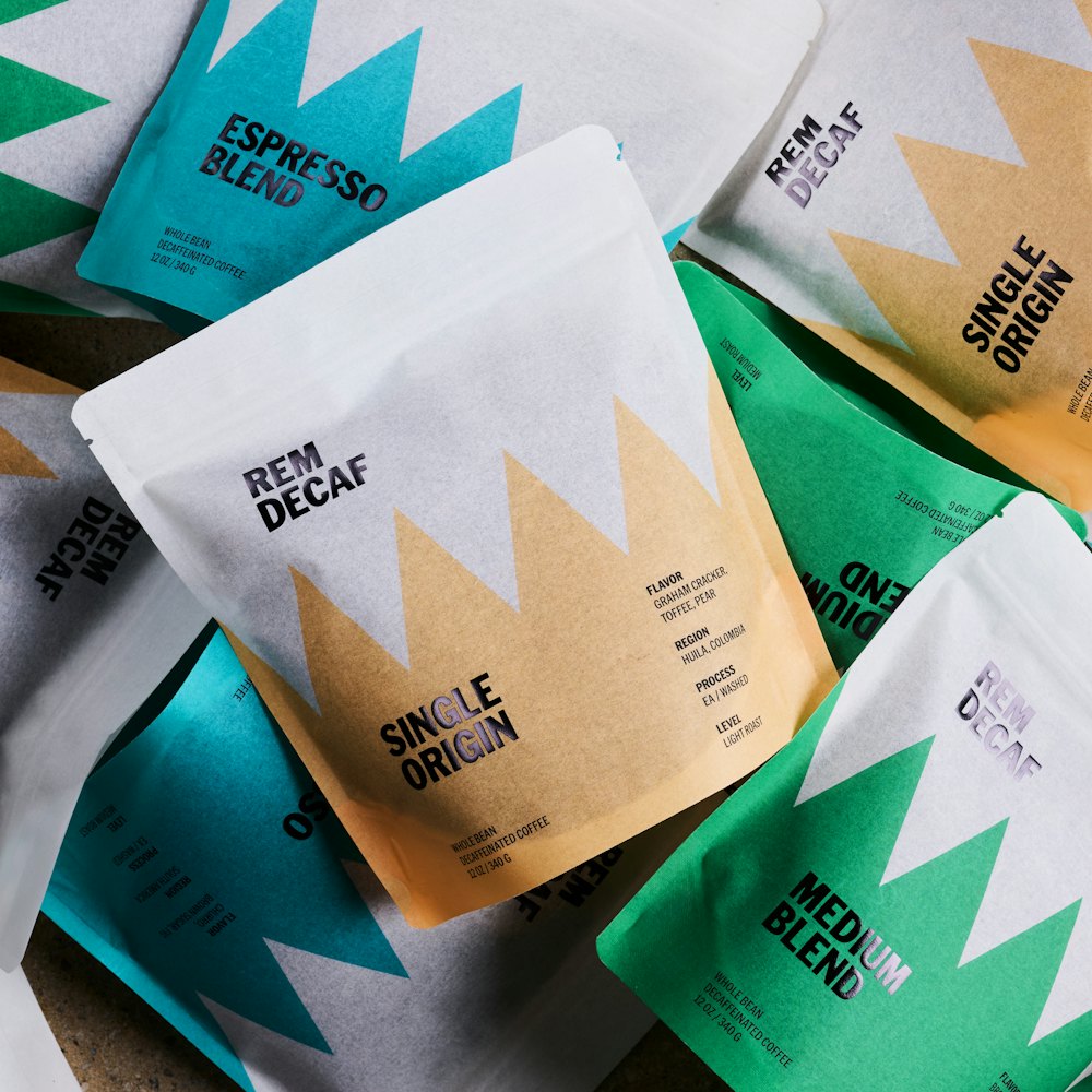
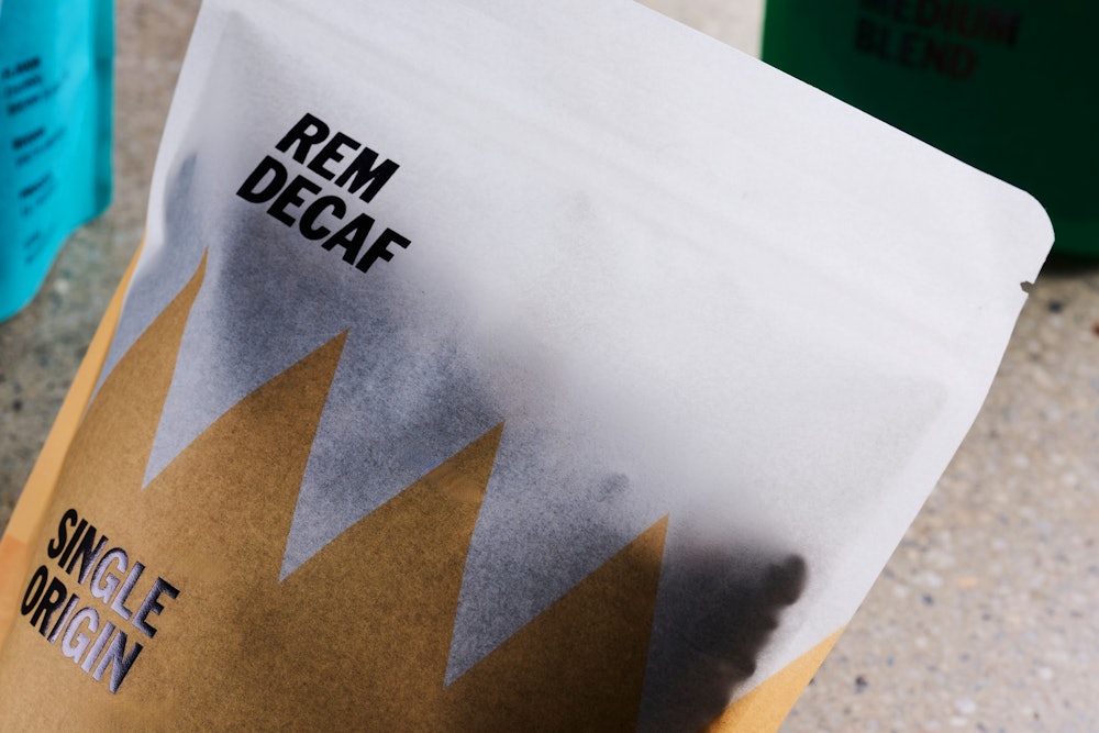
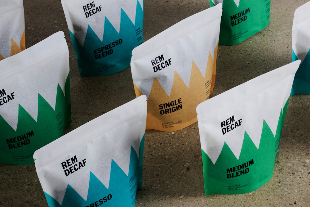
As a way to directly connect the identity to the name, REM, our team took a simple approach of converting the four "peaks" of an average REM sleep cycle into a flexible graphic device.
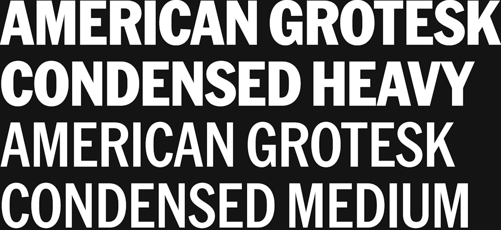
American Grotesk Condensed by Klim→ is the brand's primary typeface. This type choice was implemented for its "lack" of personality and emphasis on function, a relationship we saw to decaffeinated coffee.
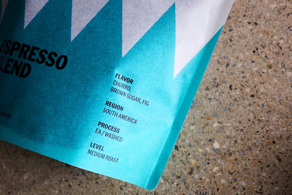
The simple typographic identity is accompanied by a broad yet functional color palette, which extends to the various application devices.

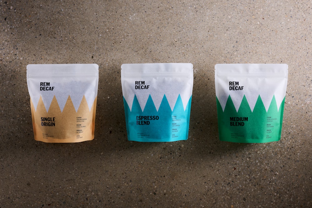
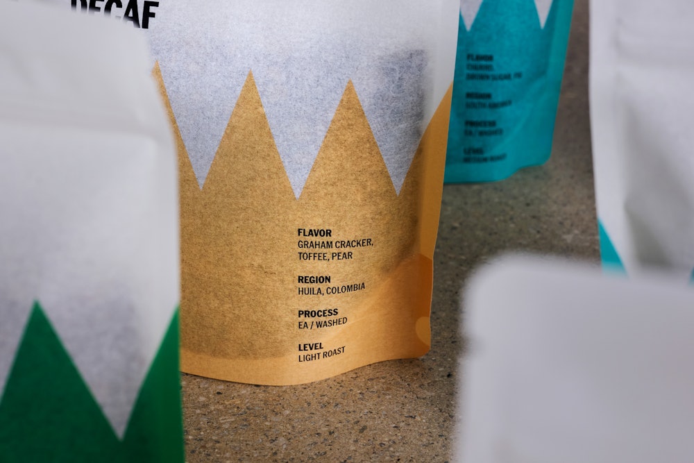
Each bean type is assigned a different color.
Photographs by Casey Steffens→.
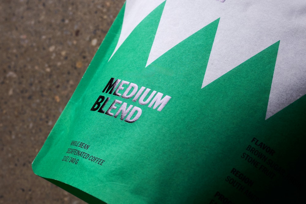

Rice paper bags were chosen intentionally, as rice has a similar "extraction" quality to the decaffeination process.

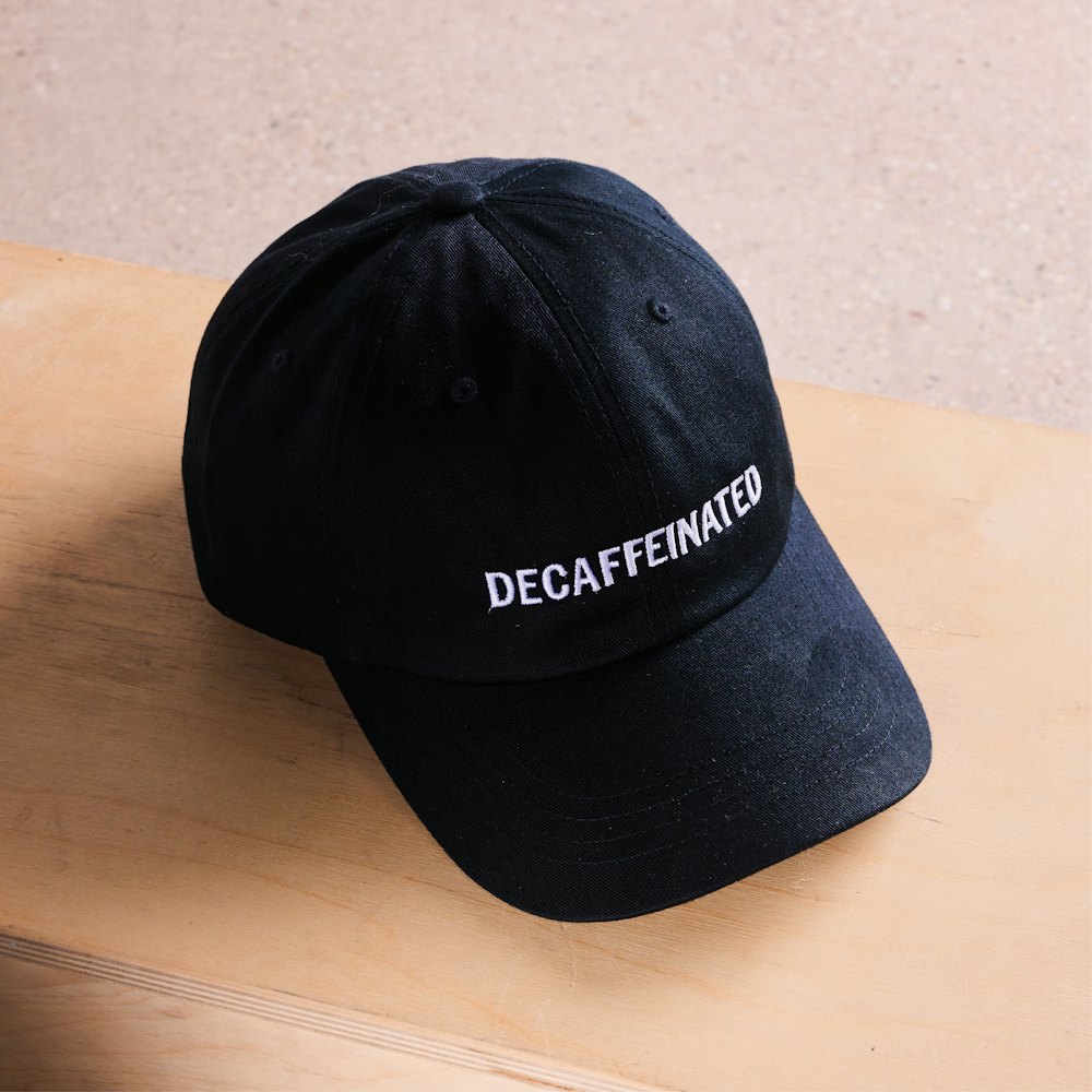
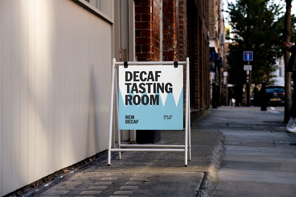
The identity system extends beyond packaging onto a variety of other applications, such as merch, website, marketing, and signage.
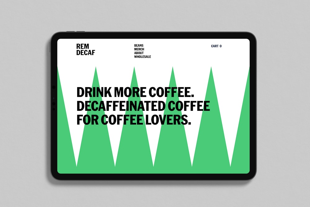
The website maintains its alignments to the REM device when responding to different device sizes.
Visit remdecaf.com→ to see more.
