


Schwartzapfel Holbrook
Schwartzapfel Holbrook is a personal injury law firm based in New York. Since their founding in 1981, they have secured some of the state’s most notable settlements, reflecting decades of steady, dedicated advocacy for their clients.
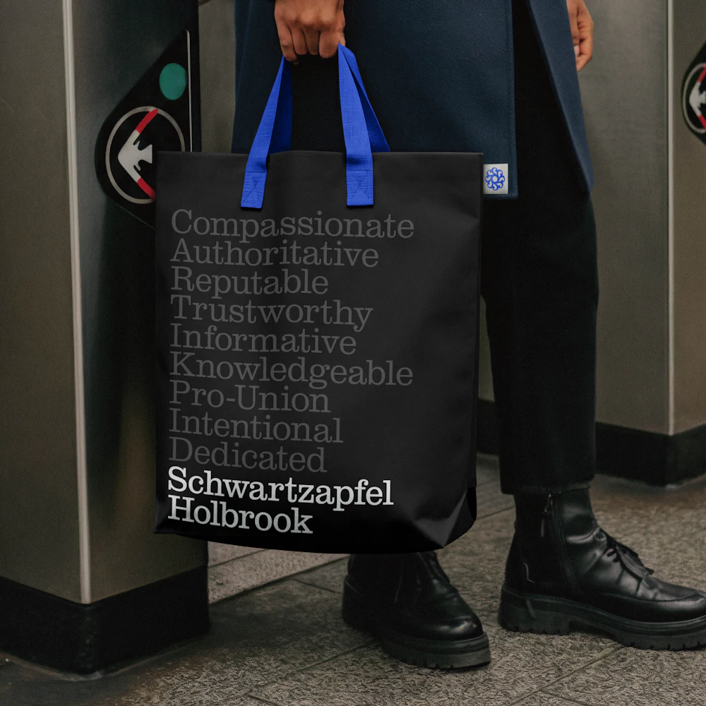
Order developed an identity system that reflects the firm’s expertise, longevity, and tenacity by leveraging the visual vernacular of Pro-Union ephemera across the decades.
Collaborators
Project team
Jesse Reed, Partner
Emily Klaebe, Designer
Megan Nardini, Operations
Brooklyn Office
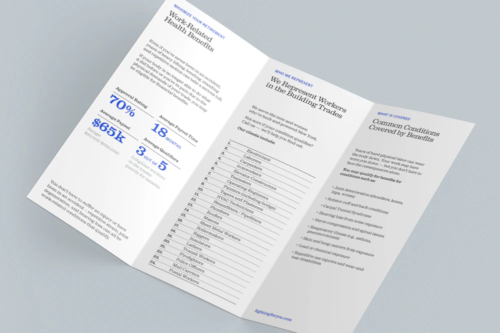
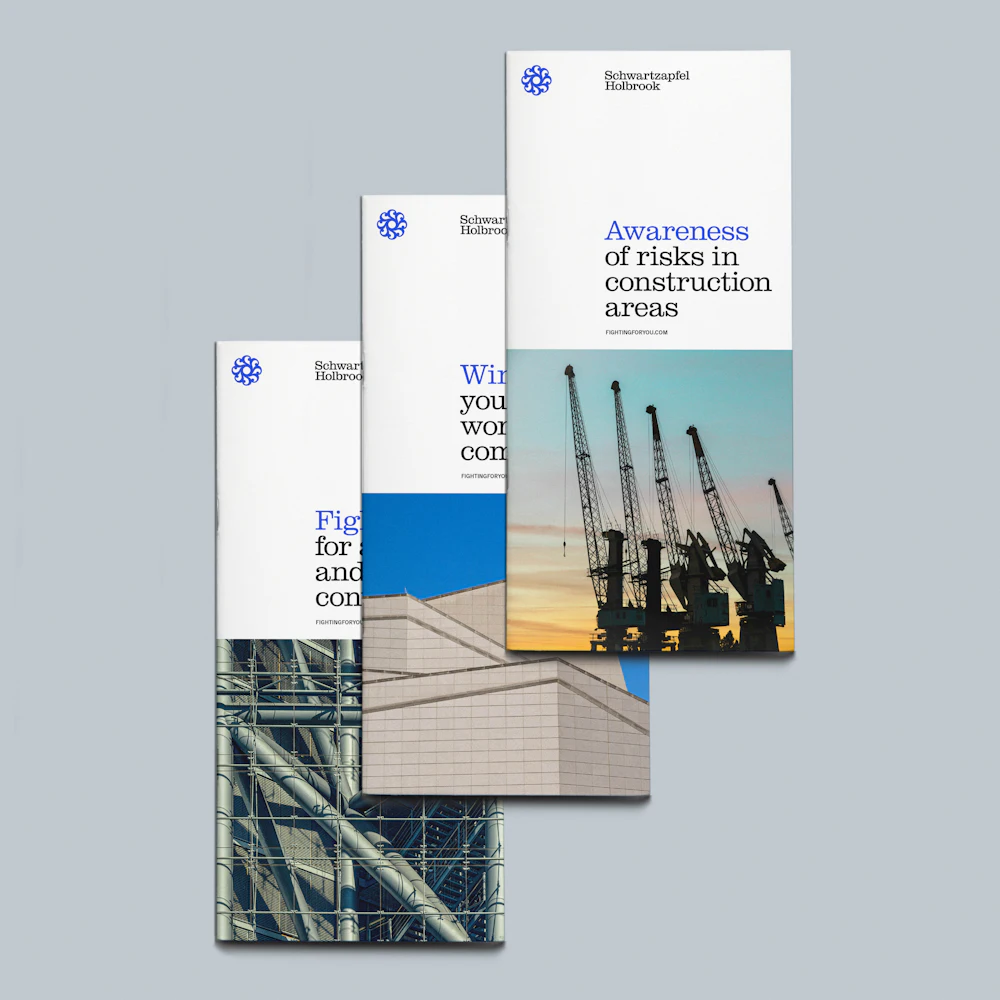
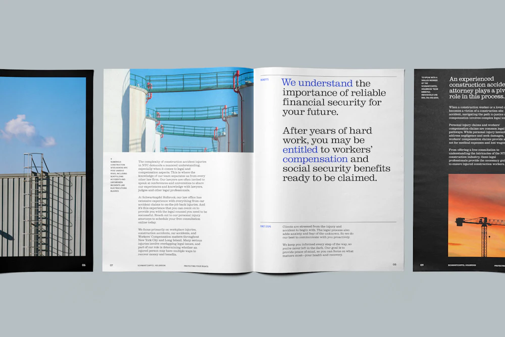
Working on construction sites is undoubtedly a role that exposes workers to significant hazards, where risk is often a daily part of the job.
In a worst-case scenario, when a person is injured, it can alter the course of their life.
In moments like these, Schwartzapfel Holbrook steps in to advocate for justice and secure meaningful financial support for those affected.


The firm responds to their clients’ cases with urgency — often arriving at the site of an accident to document evidence on behalf of their clients.
The Schwartzapfel Holbrook team focuses on three areas of practice:


Steven J. Schwartzapfel, the firm’s founding partner, is widely regarded as one of NY’s top personal injury attorneys.
Witnessing his father’s battle with multiple sclerosis, he saw the challenges families face when a loved one suffers.
“Fighting for those who can’t fight for themselves” has long been the team’s guiding motto.


Workplace injuries.


Car accidents.


Workers’ compensation.


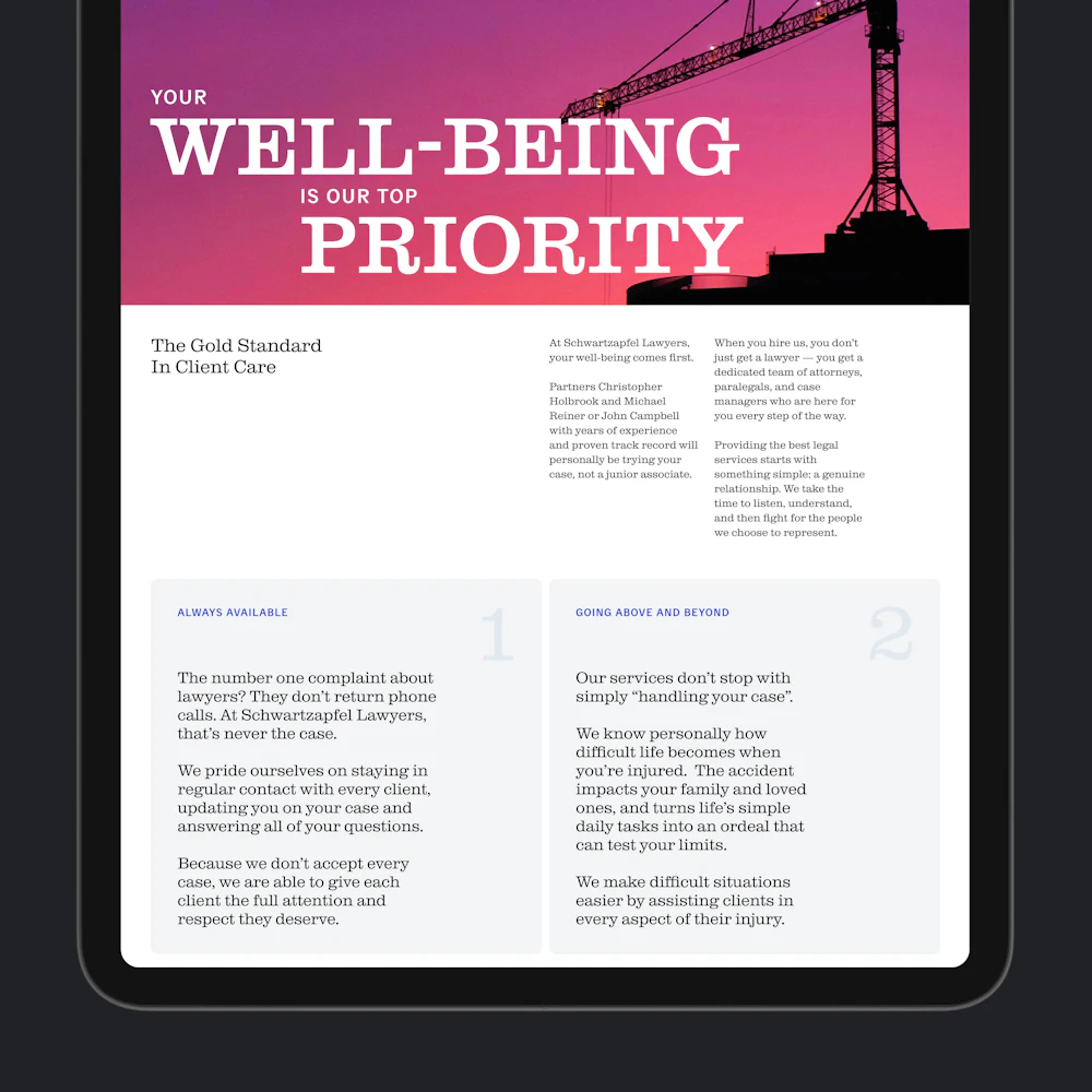
The Schwartzapfel Holbrook team’s approach with clients is deeply dedicated, often treating clients like their own family.
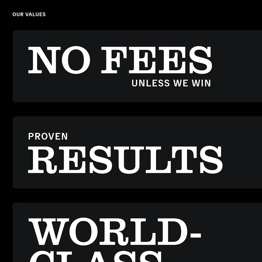
The result of their methods yields a near-100% success rate in cases.


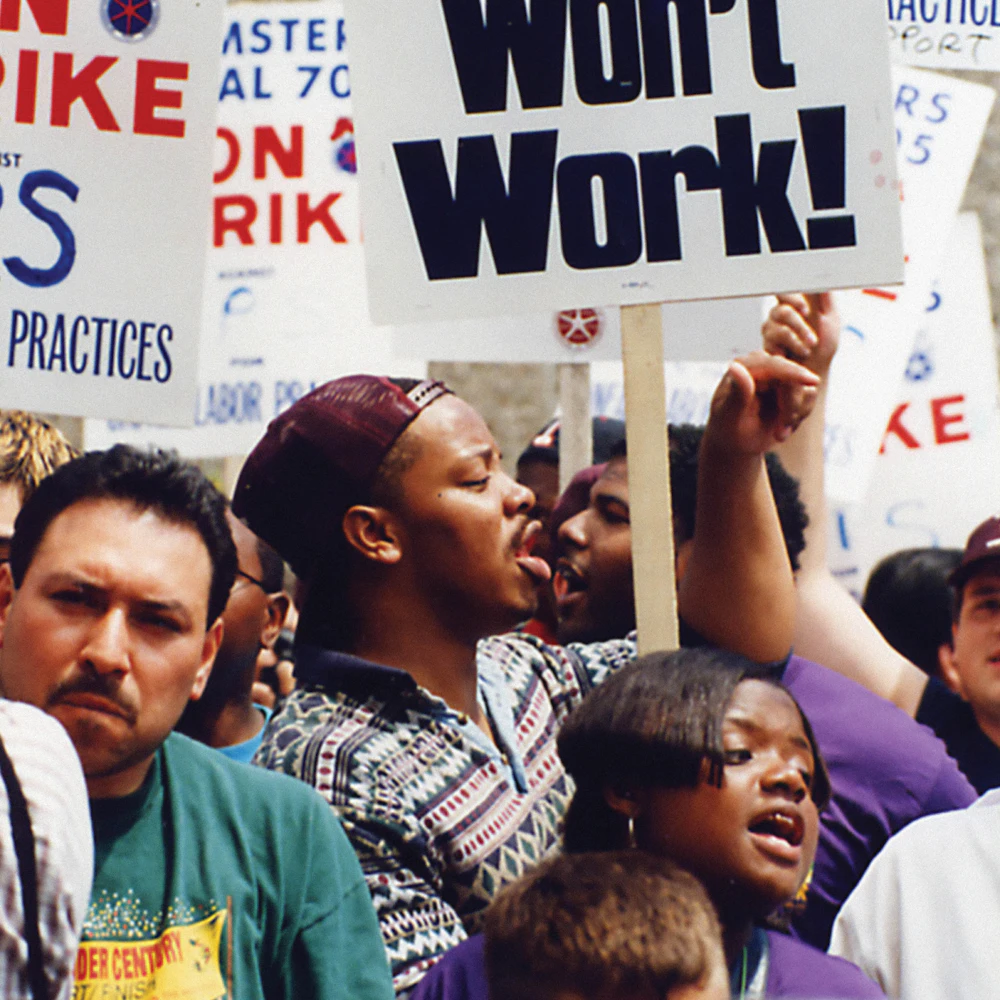
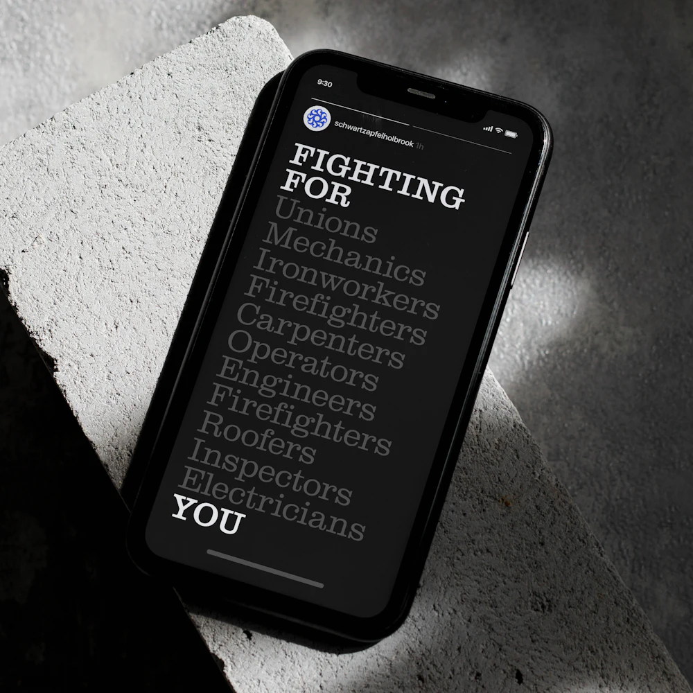
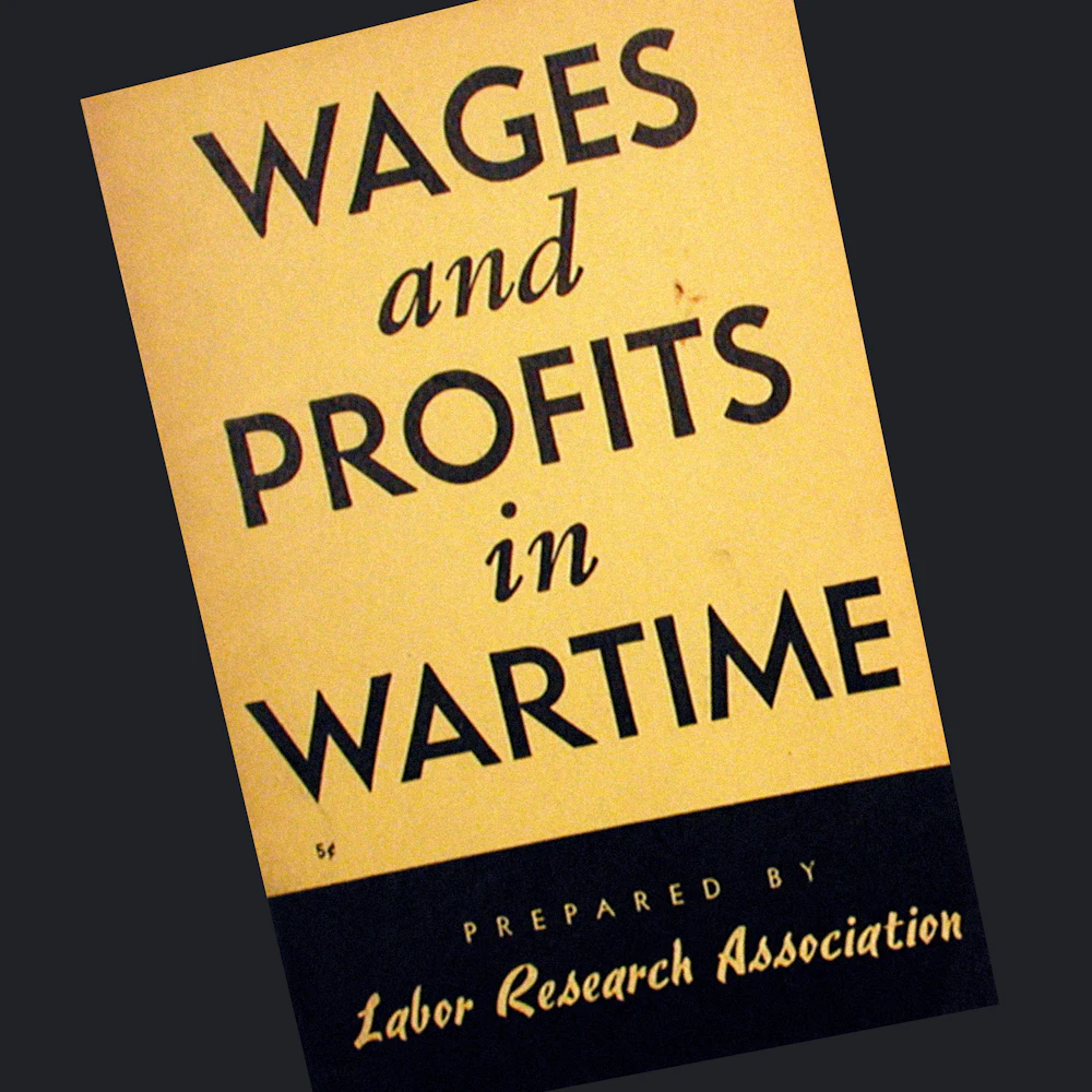
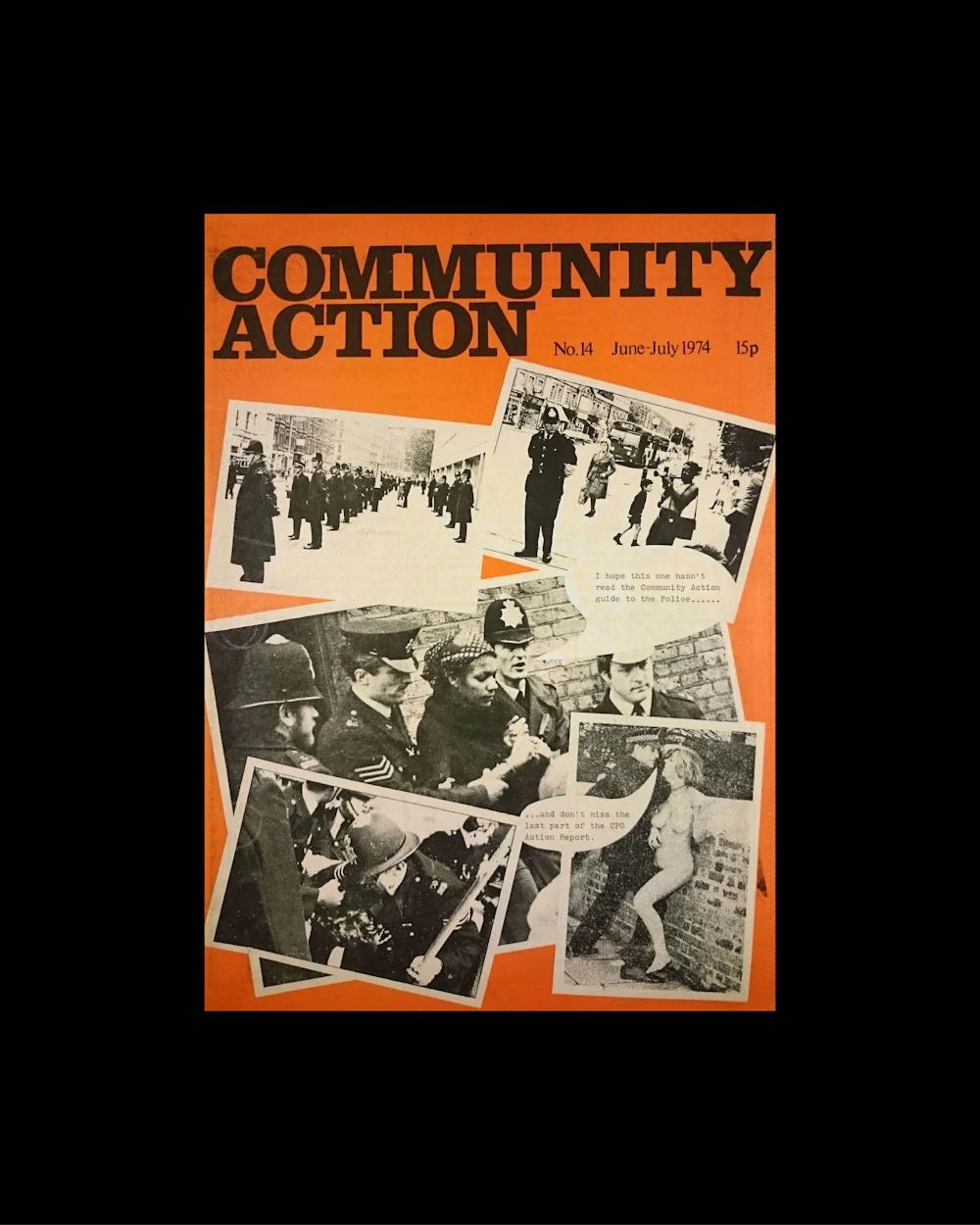
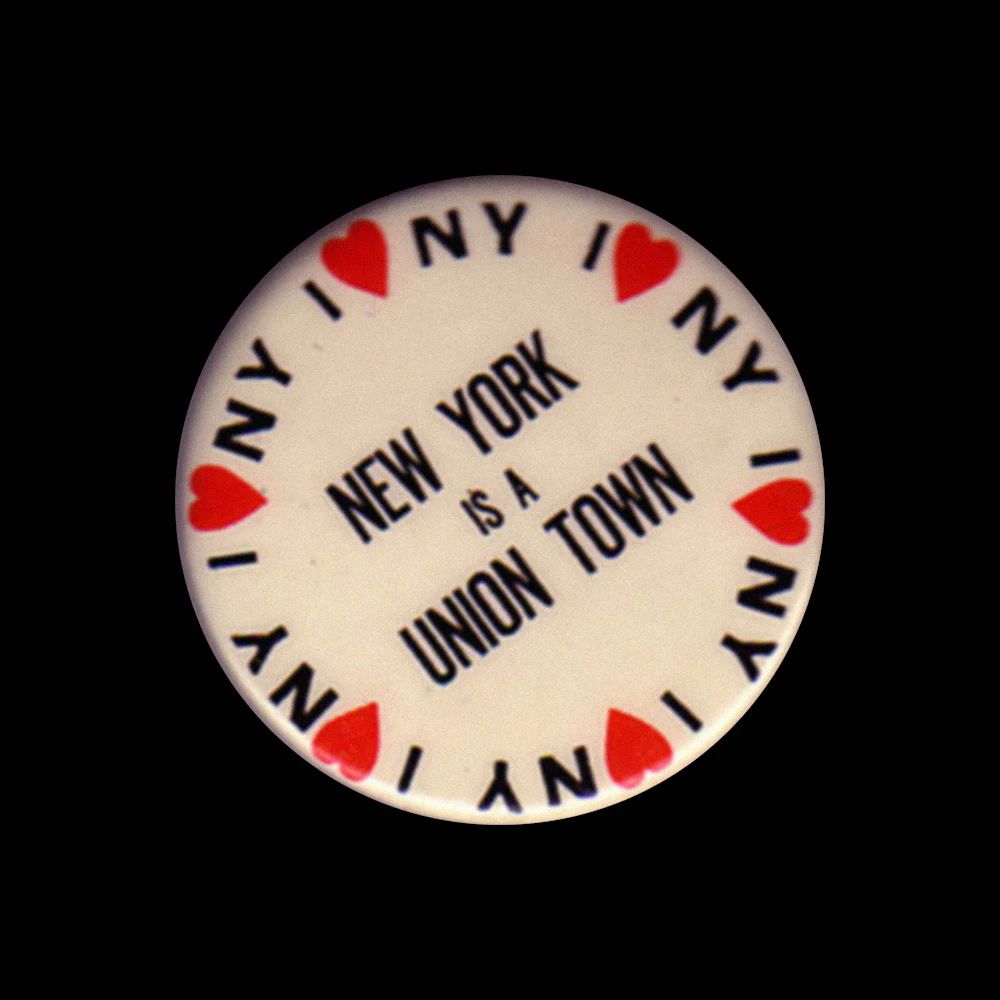
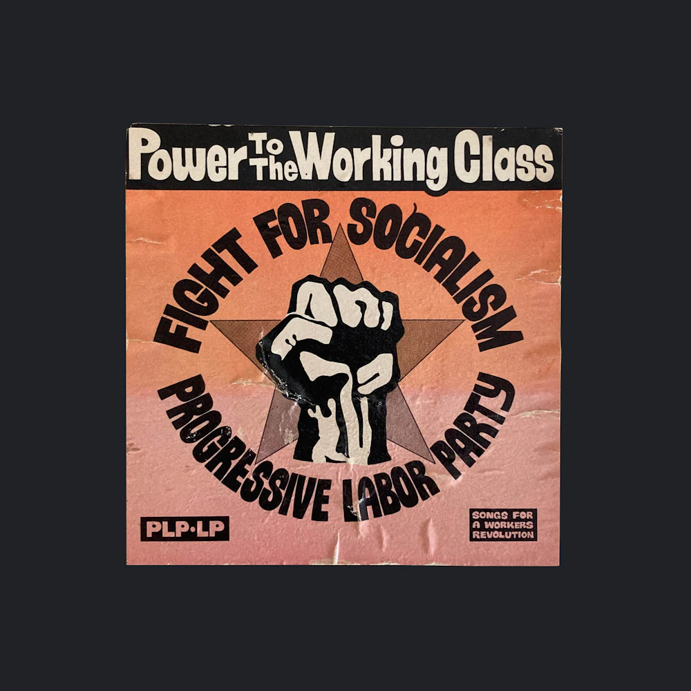
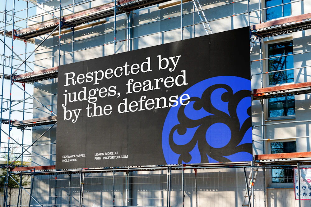
Union workers
From the early days of industrial labor, unions emerged from environments defined by risk and hardship, organizing workers to protest unsafe conditions and collectively shape fairer, more secure futures.


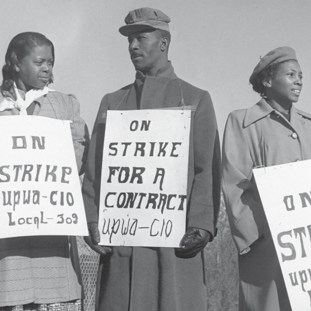
Photo credits
1. Library of Congress Prints and Photographs Division, fsac.1a35241; 2. W.C. Runder, Indiana University Limestone Photograph Collection; 3. Carol M. Highsmith

4. Wisconsin Historical Society; 5. The 1997 UPS Teamsters’ Strike; 6. Picket, oil workers' union, Seminole, Oklahoma

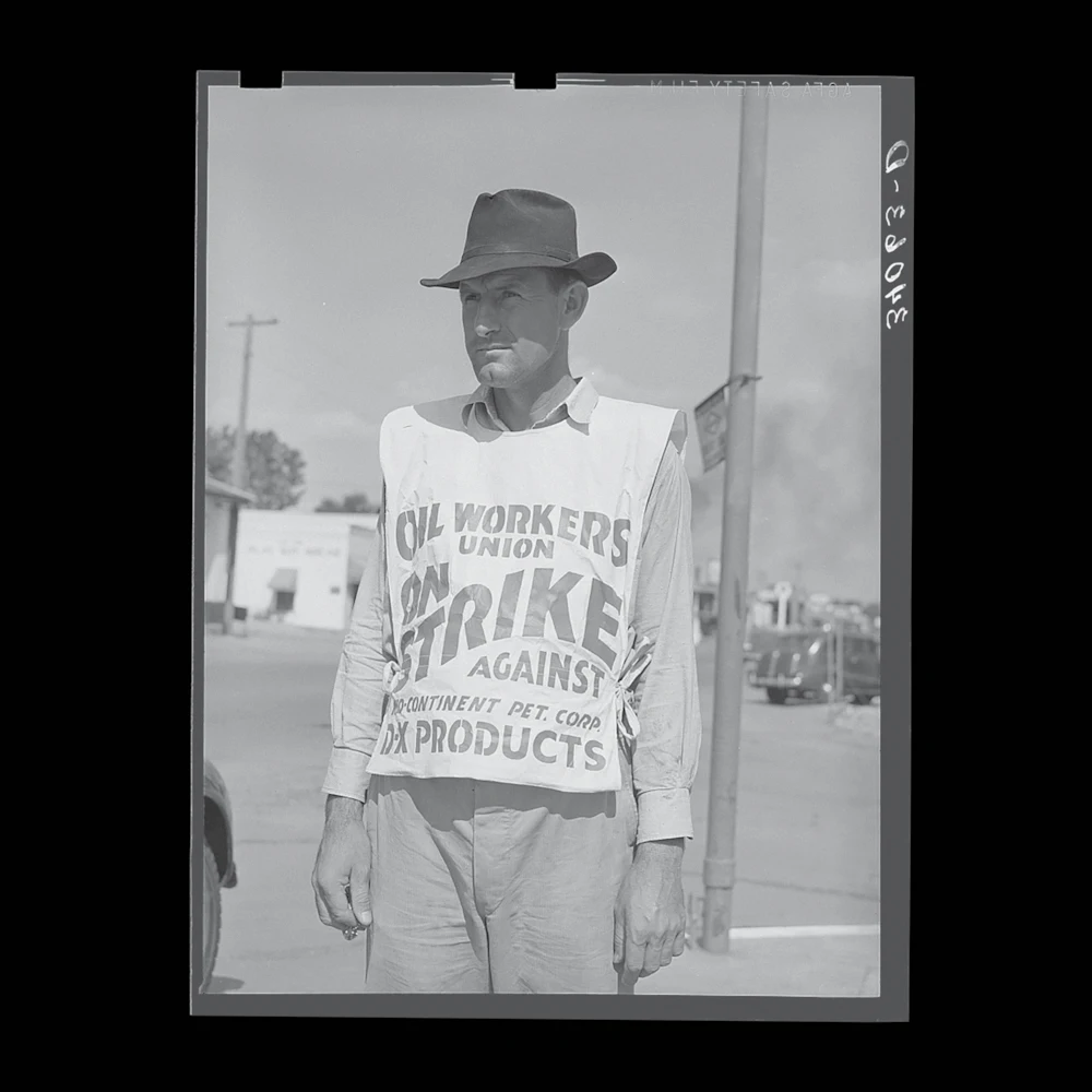


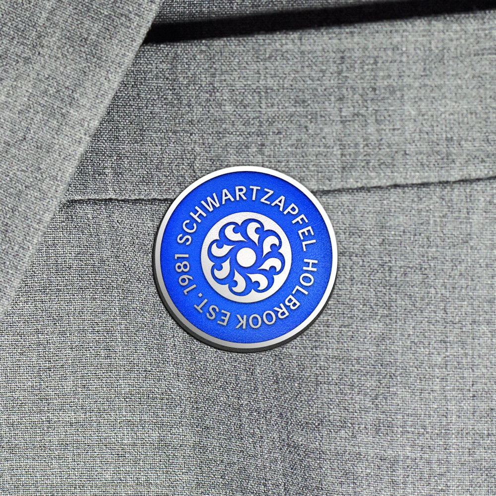
To better understand the significance of the client sectors the firm supports, Order looked to the visual history of union seals for inspiration.
Circularity, centrality, and unity are core characteristics of union seal design.
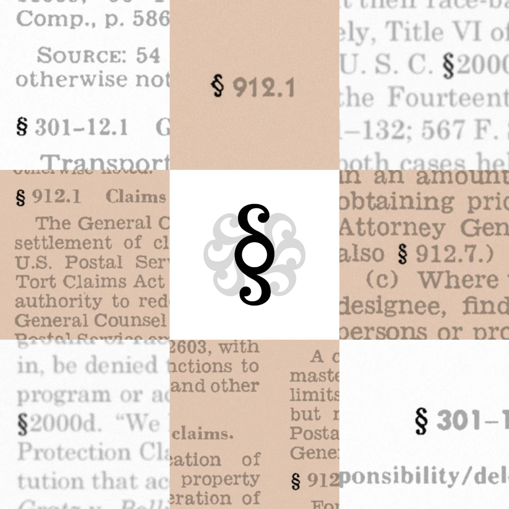
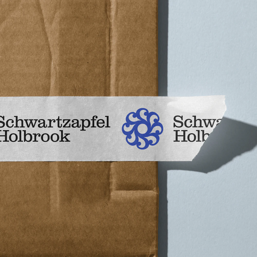
The symbol combines the “S” of founding partner Schwartzapfel’s name with a section sign to create a distinctive emblem.


Schwartzapfel Holbrook previously used blue as its primary brand color. Order updated the palette for contemporary use, while maintaining minimal colorways for accessible internal use.


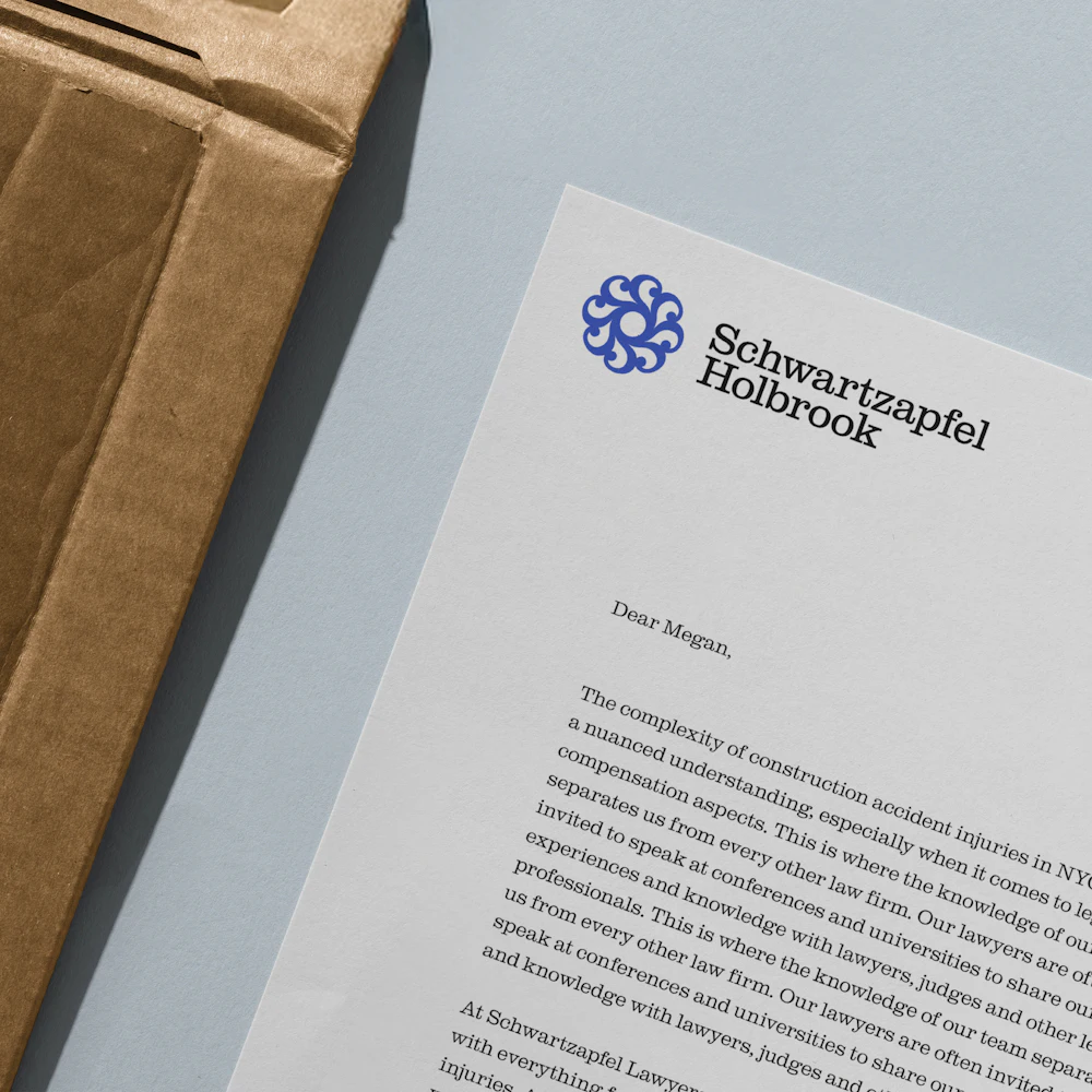


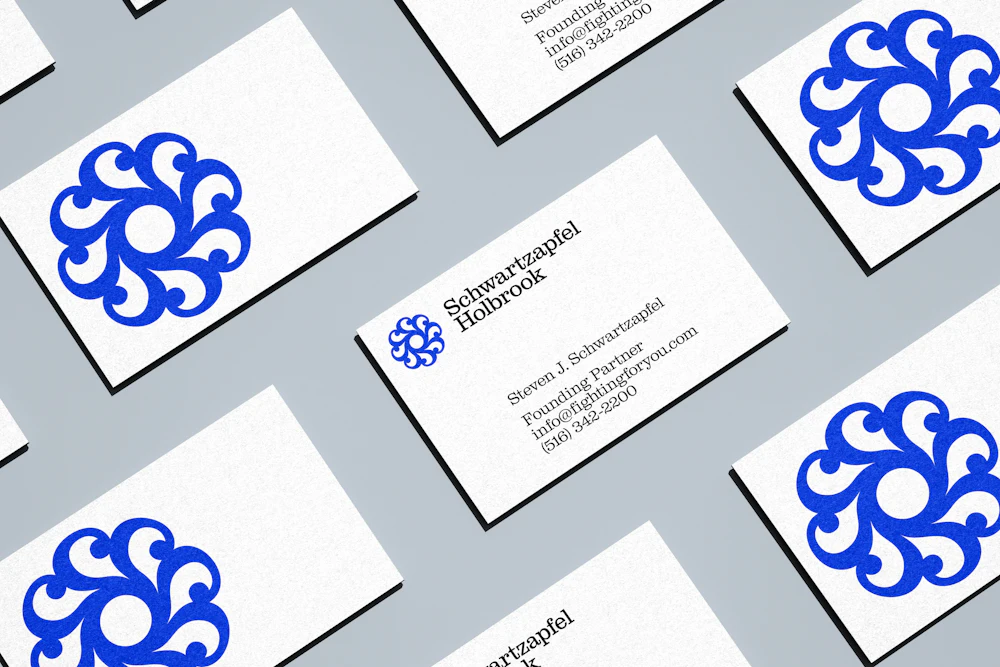


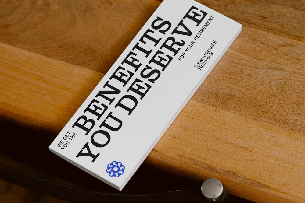
The typographic language of the Schwartzapfel Holbrook brand uses Clarendon Graphic, released by Optimo→, to establish familiarity in the legal space.
Delegate, released by Commercial Type→, is used as a supporting typeface for captions.


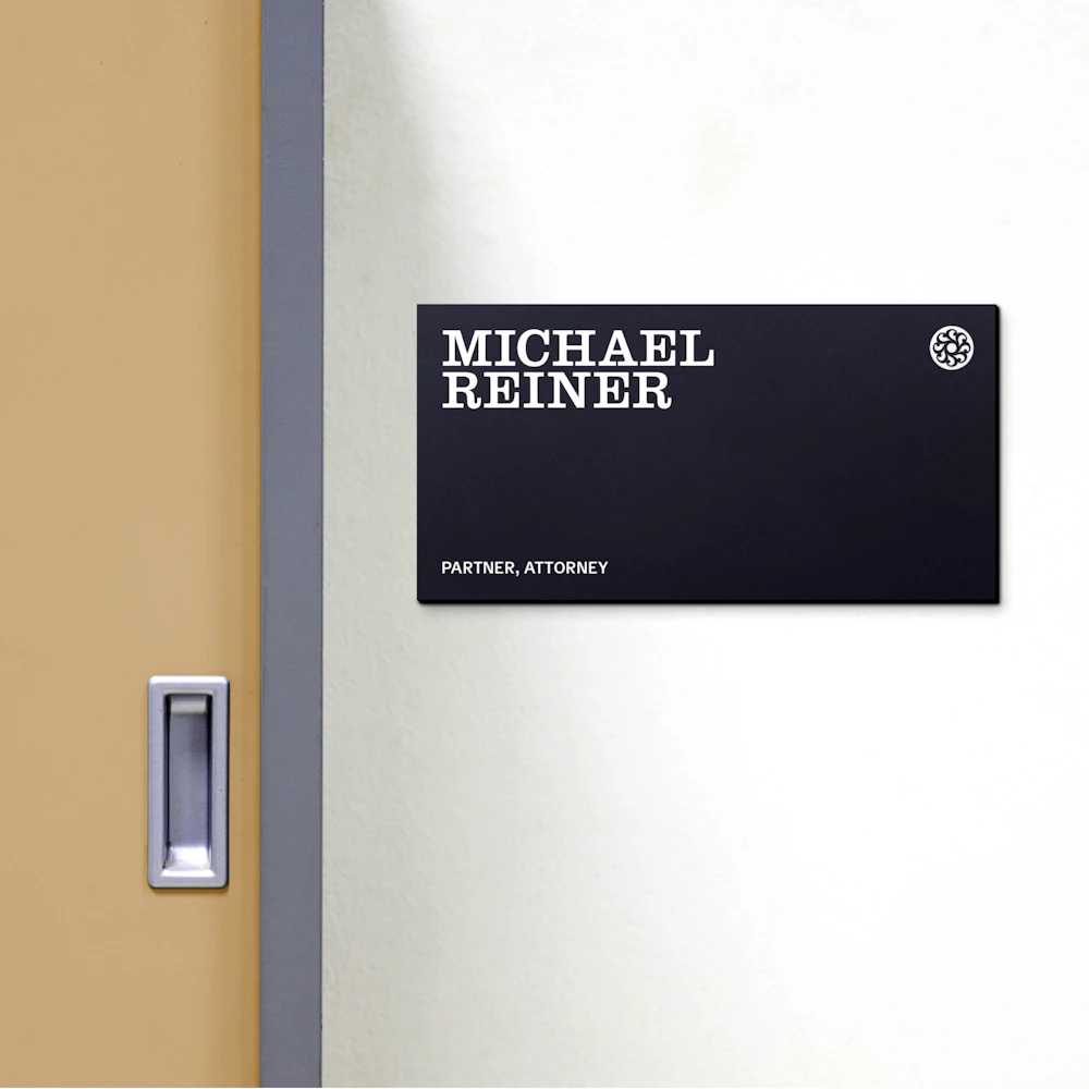
Typography fluctuates between uppercase and sentence case structure depending on the context of messaging.


Typography
Typographic treatments for the brand look to the layout of Pro-Union ephemera: stacked typography, combining multiple styles, and emphasizing key words with graphic scale.


Photography
While other injury law firms rely on literal or gratuitous imagery, Schwartzapfel Holbrook’s approach focuses on the environments their clients inhabit and the tangible results of their work, such as the buildings they create.


The combination of digestible and inspirational photography with clear written language makes communication to audiences direct.


When used together, the brand elements provide opportunity for distinctive, clear, and refined marketing in an often alarming and sensational industry.


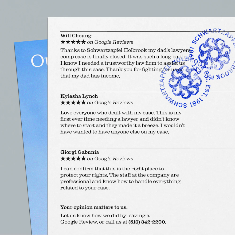
The symbol and seals are treated literally as “stamps” by anchoring to photography in compositions, or cropping graphically behind headlines.

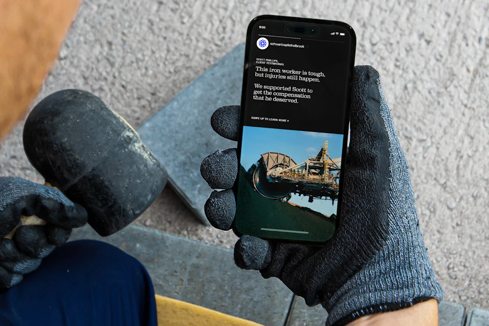
Website
Order designed a refreshed website to house the new Schwartzapfel Holbrook brand. Direct points of contact — like phone numbers — were prioritized for easy access to new clients visiting the website.


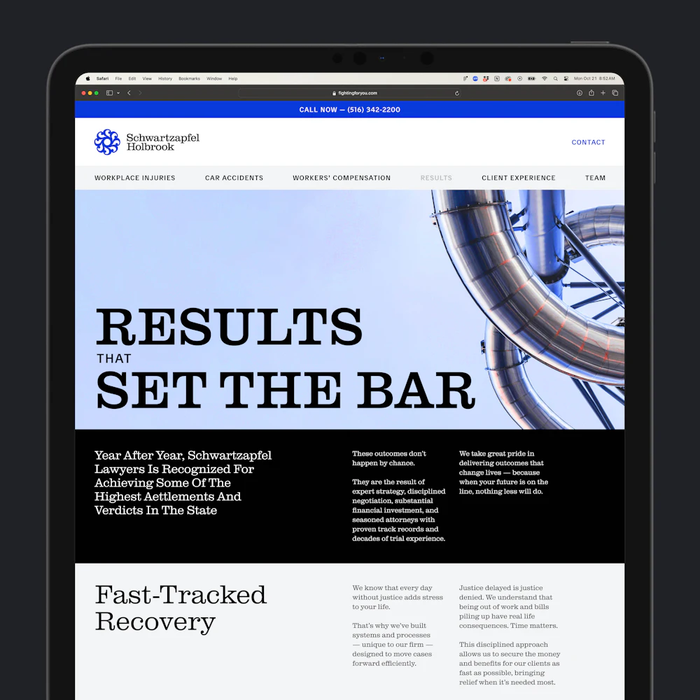


See the full website at fightingforyou.com→