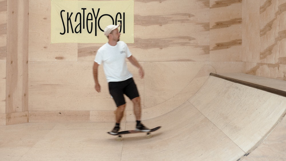
Skateyogi
Skateyogi is a skateboard school based in Brooklyn, NY that offers camps, classes, and lessons to all age groups.
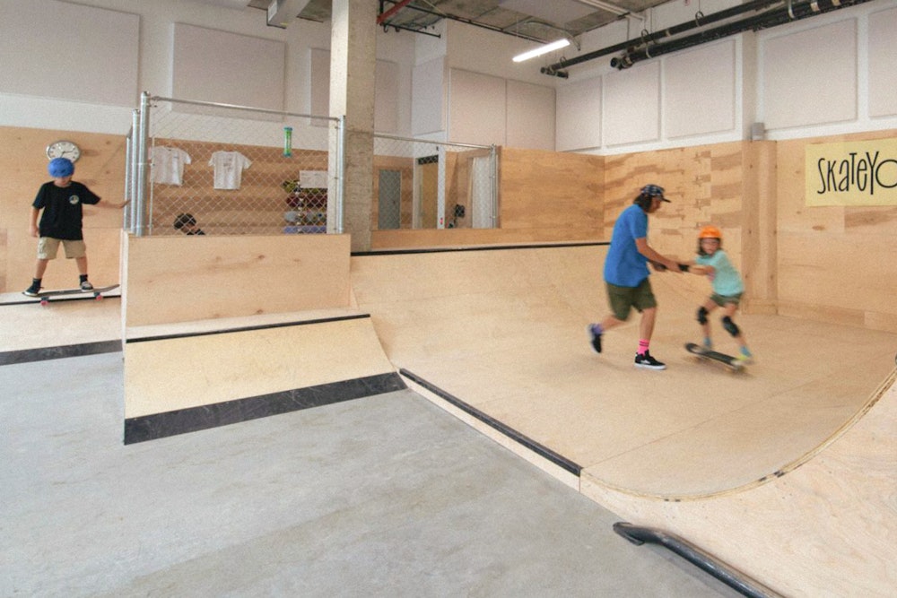
To mark the opening of their new Williamsburg location, Order created an identity that echos the movement and expression found in skateboarding. The vibrant, type-driven identity system celebrates the values of the Skateyogi community and captures their inclusive approach to learning.
Collaborators
—
Project team
Jesse Reed, Partner
Garrett Corcoran, Designer
Megan Nardini, Operations
Brooklyn Office
Skateyogi was born out of the idea to teach skateboarding to a yoga studio that co-founder Kevin Banahan was attending in 2013.

Co-founders Yasuyo Takeo and Kevin Banahan.
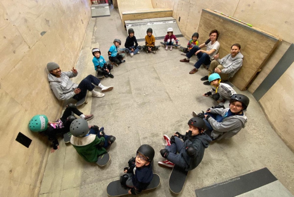
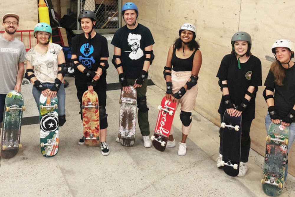

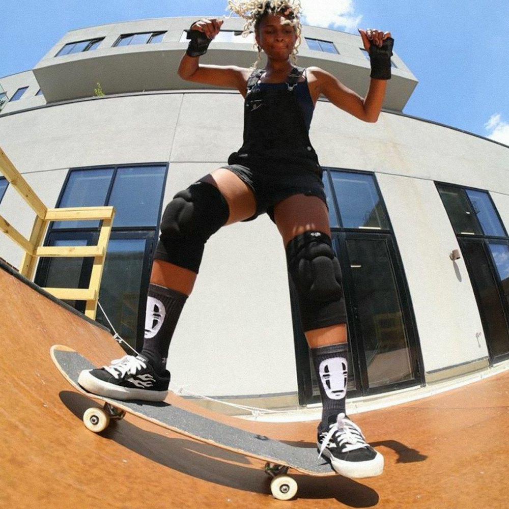

In the years since, it has expanded to numerous classes, lessons, camps, and most recently, a second location in Williamsburg, Brooklyn.

Our process involved hands-on sessions with Skateyogi's team to get an understanding of their perspective on the culture of skateboarding.
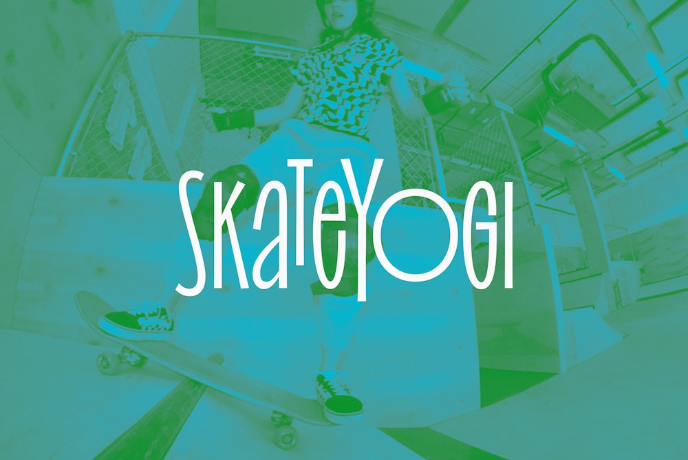
Movement echos the freeform nature of skateboarding.
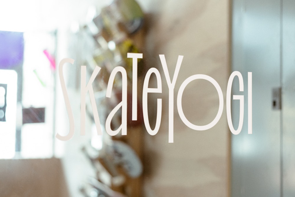


"Yo" (found within Skateyogi) is used as a shorthand icon for social media or other small applications.
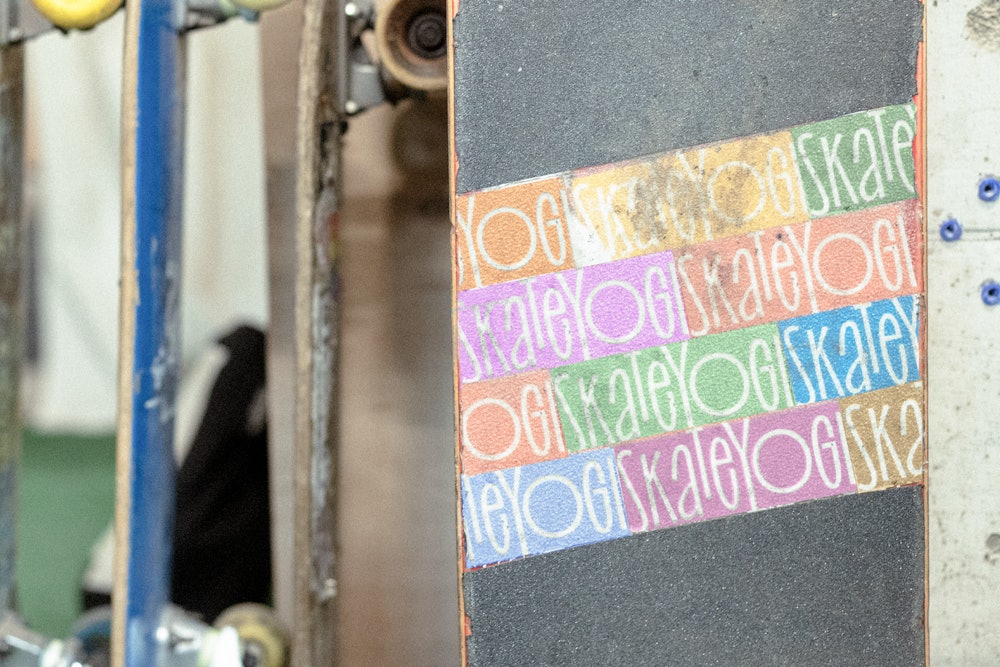
An eclectic color palette represents the diverse community Skateyogi has facilitated over the years.

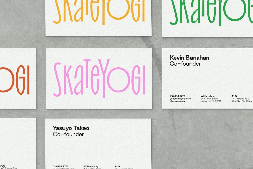


The primary typographic voice utilizes Irregardless, an expressive variable typeface from Oh No Type Co→.
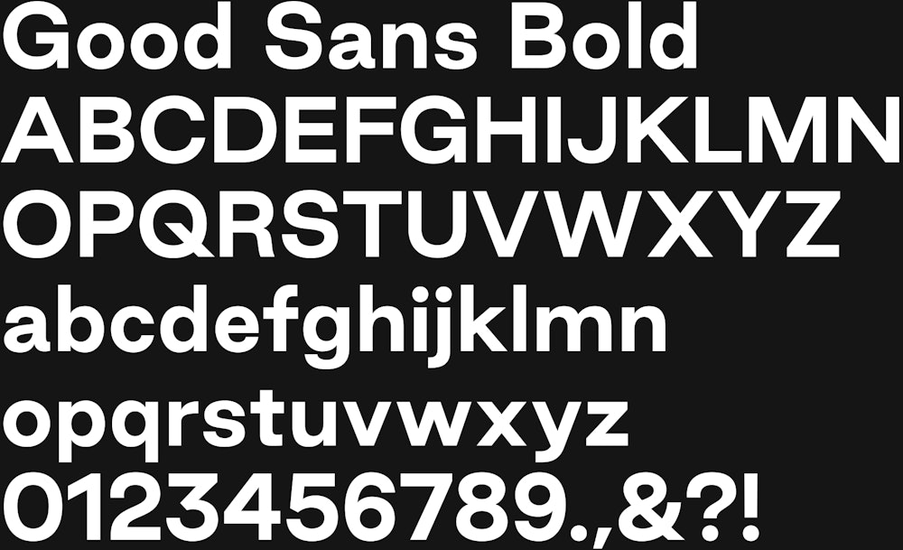
Good Sans from Good Type Foundry→ is the supporting type family and functions as the informative layer in the system.



In the extended visual language, typography reflects the movement of skateboarding. Using phrases and trick names to reinforce both Skateyogi's values and the process of learning.
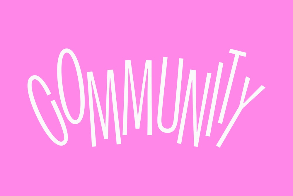
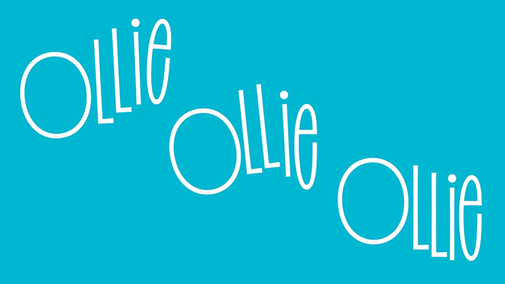
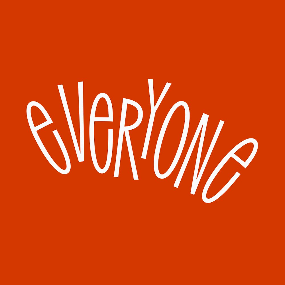
A library of gestures can be used throughout the system, interacting with photography and other brand components.
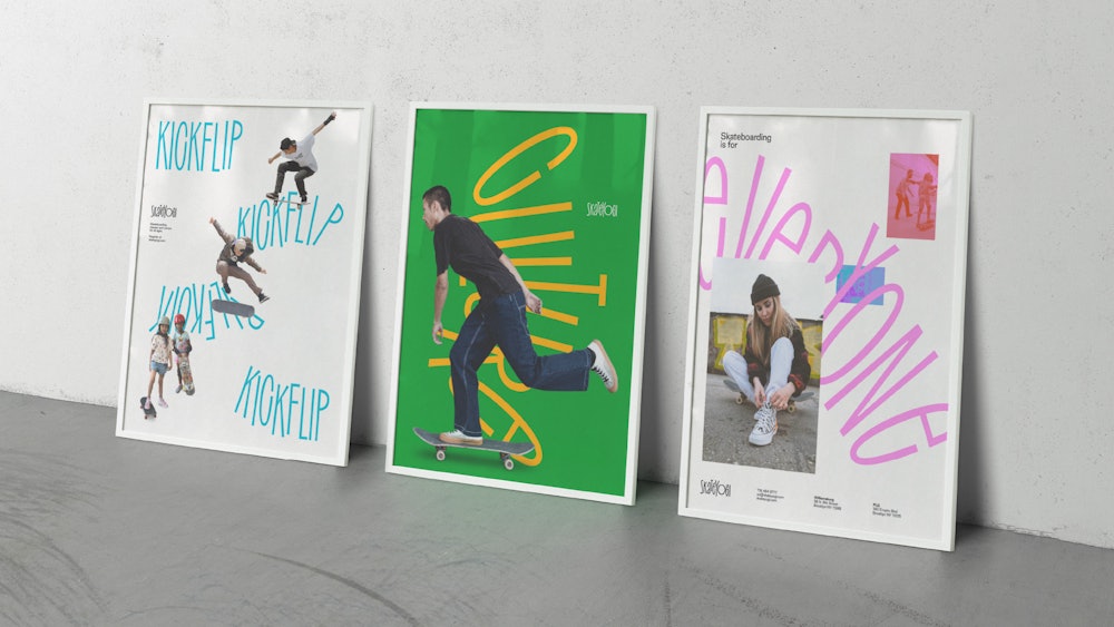

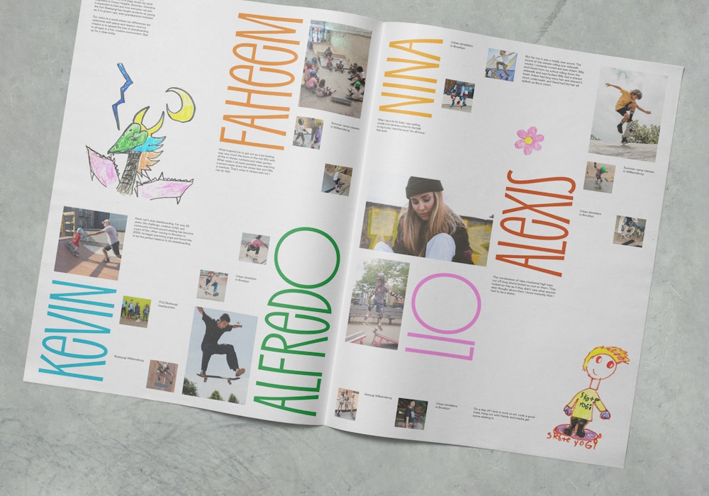
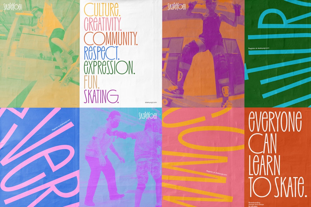
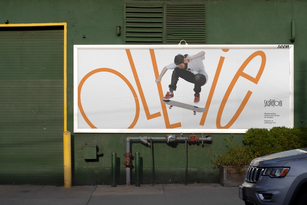
As the identity extends to print, it maintains a balance of expression and functionality. Combining high-volume typography and low-volume information.


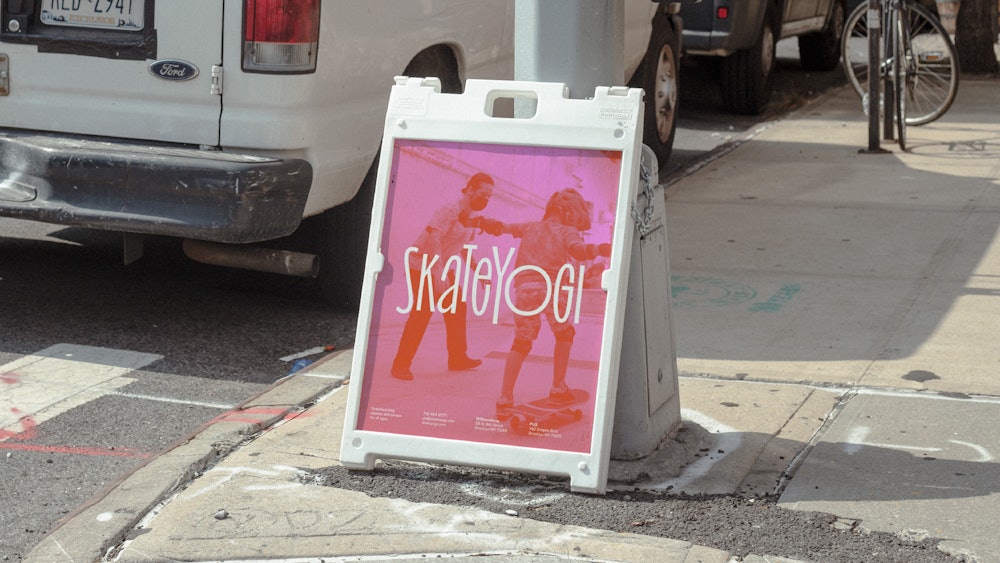
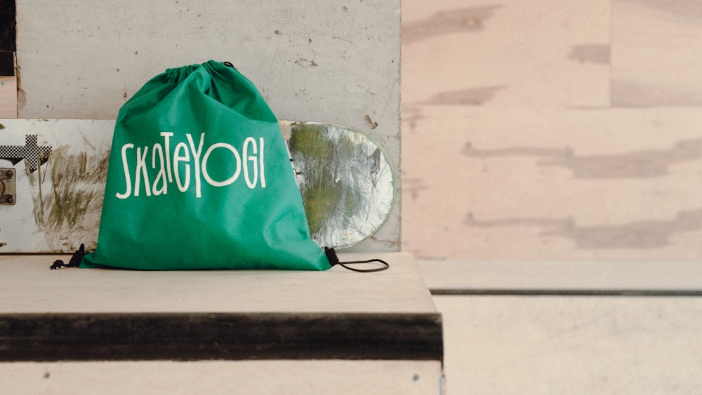
Print and digital collateral were developed for the launch of Skateyogi's new brand.
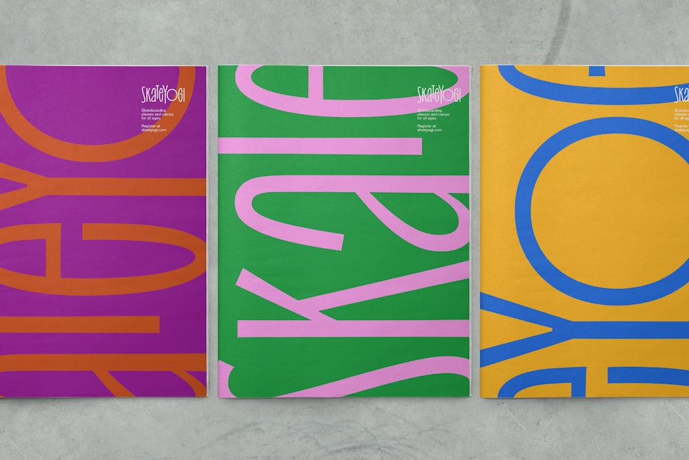
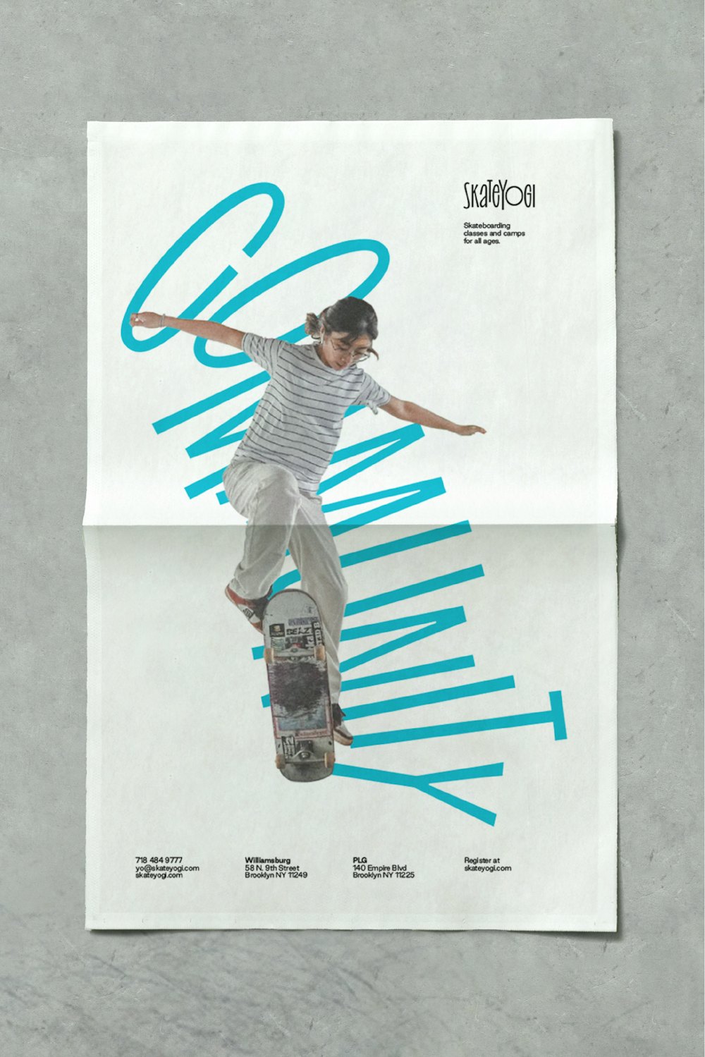
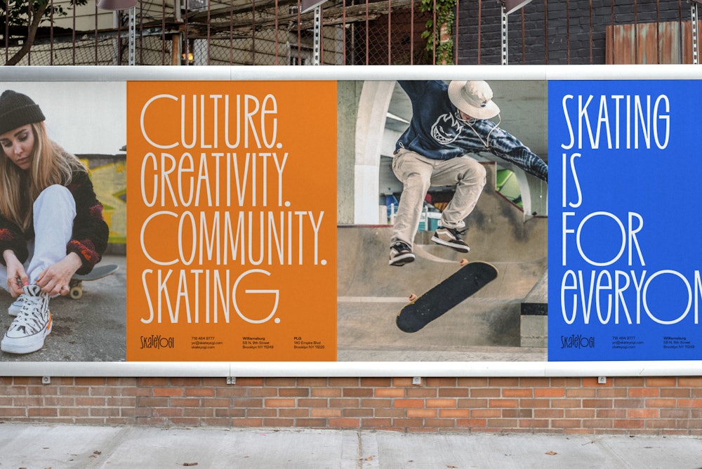
Guidelines were developed outlining the Skateyogi identity system including guidance on typography, color, photography, and composition.
