Sonny's Corner
Sonny’s Corner is a bar in Greenpoint, Brooklyn. After a sudden closure of the neighborhood’s beloved Pencil Factory, Sonny’s has taken its place on the corner of Franklin Street and Greenpoint Avenue.
Only a few blocks down from Order’s Brooklyn office, we were honored to work with the new owners to develop an identity for this landmarked location.


Positioned on the corner of Greenpoint Avenue and Franklin Street, Sonny's Corner occupies a storied location that has served the community for almost 100 years. Its previous tenant, the Pencil Factory bar, was eponymously named after the Eberhard-Faber Pencil Factory across the street. The landmarked building at 142 Franklin Street and the existing Pencil Factory building were both sources of inspiration.


A focus on welcoming New Yorkers into a place where they can relax after hard days and long commutes was a key component. And so, we turned to the NYC Subway and fellow Greenpointer, type designer Ben Tuttle→. We spoke to Ben about a typeface he had been developing based on the lettering of a now defunct PSA called ‘The Subway Sun’, which ran on trains from 1918–c.1965. It informed riders on public subway etiquette—often with great humor—all hand-drawn in a distinct typographic language by one person: Amelia Opdyke Jones, aka “Oppy”.


This revival of Oppy became a perfect voice to represent Sonny’s Corner, which sits in a building erected in 1930 and has welcomed the community in various incarnations ever since.
‘The Subway Sun’ images courtesy The New York Transit Museum→.


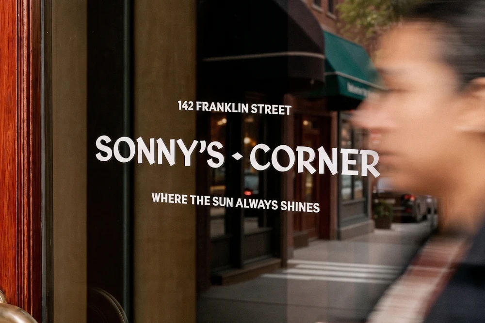
Oppy Sans is used for identification, signage, packaging, and everything in between. Limiting the typography to a single style allows Sonny’s to easily express the brand without over-designing any one application.


A deep red color was chosen to complement the interior’s wooden tones as well as the seating upholstery. Beyond that, simple neutrals and material choices support the identity’s color palette.
A de facto “motto” was also developed that plays on multiple levels of “easter eggs” — the source of Oppy Sans, the bar’s namesake (after one of the owner’s newborn child, Sonny), and a nod to the corner of Franklin and Greenpoint receiving the best afternoon sunlight due to its geographical alignment with Manhattan’s 23rd street corridor, aka Manhattanhenge — if you know, you know!