Standards
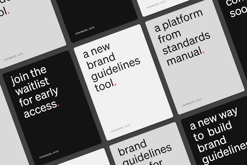
The approach to branding has evolved, so should the tools to design for them. Standards is the new way to design brand guidelines. In collaboration with Shore, Order has designed and developed the identity, UX/UI, and product experience for Standards.
Collaborators

The Standards identity takes its inspiration from the iconic forms established by influential graphics standards manuals of the past.

The typographic voice uses a similar point of reference. Unimark’s NYCTA Graphic Standards Manual utilizes Standard Medium as the typeface.
The Söhne family released by Klim Type Foundry→ is inspired by both Akzidenz-Grotesk and Helvetica, but seeks to capture the essence of Standard Medium.


Subcategories of the product to follow the logo’s framework.


Standards gives designers the ability to embed more information such as color values, assets, typefaces, animation and more directly into their guidelines. It is built for how we work today.
Standards takes the knowledge we’ve gained from Standards Manual and introduces enhanced functionality that the web allows.

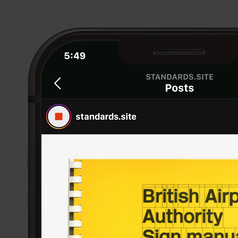
Follow @standards.site→ for a look at the guidelines that inspired the project.
Visit standards.site→ to apply for early access and for more information.

