Teal is a career growth tool that arms users with malleable resources aimed at energizing your professional life. Its innovative job bookmarking browser extension allows users to save prospective positions from anywhere across the internet, all while finessing their professional credentials in more detail through the platform.
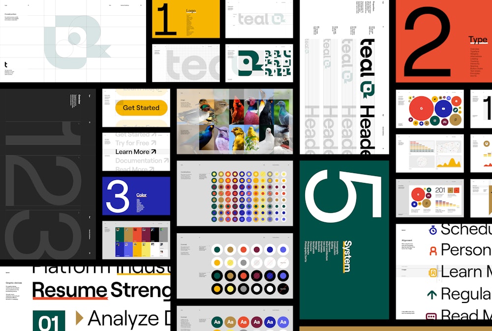
Order developed an extensive identity system that harkened back to Teal’s primary and most recognizable feature: their job bookmarking plug-in.
Collaborators
—
Project team
Jesse Reed, Partner
Emily Klaebe, Designer
Megan Nardini, Operations
Brooklyn Office
Teal was founded in 2019 by Dave Fano→, a veteran in the career-development industry who sought to create more opportunities for employees to gain meaning from their professional lives.


There was a significant cultural shift in work-life balance resulting from the Covid-19 related office-to-home transition.
While it felt that some power had been restored to an often imbalanced employer-employee relationship during this time, many also felt the presence of work had amplified in their lives.
The question arose for many workers: am I reaching my full potential in my current role?
Strategy and messaging by Molly Carkeet→


Teal sought to address this issue of restoring meaning to careers and employee representation through its comprehensive platform.
Its resources address a variety of fields and industries — from construction to teaching.


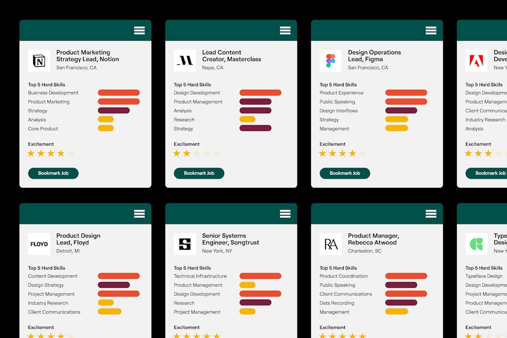
The primary feature of Teal’s offerings is its job bookmarking plug-in.
Through a browser extension, users can save position listings from anywhere across the internet, at any time.

The color teal originates from the species of the duck, the Eurasian teal.
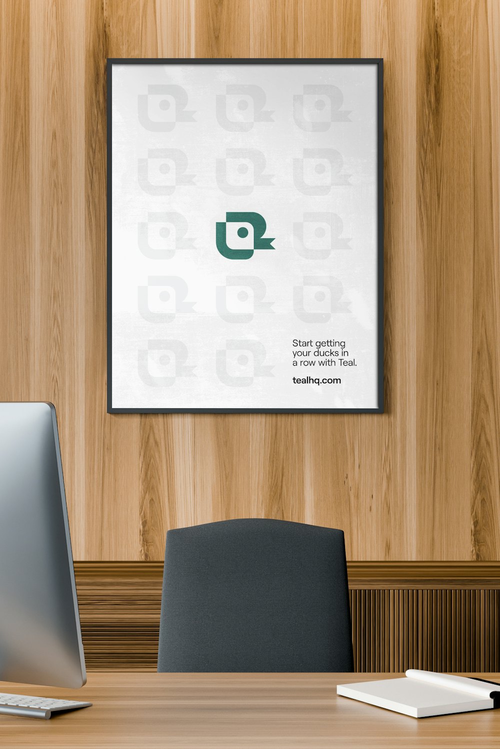
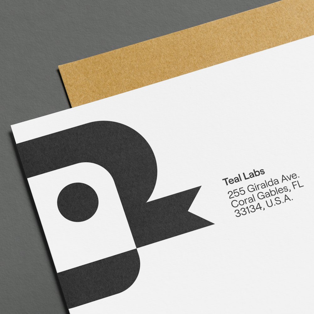
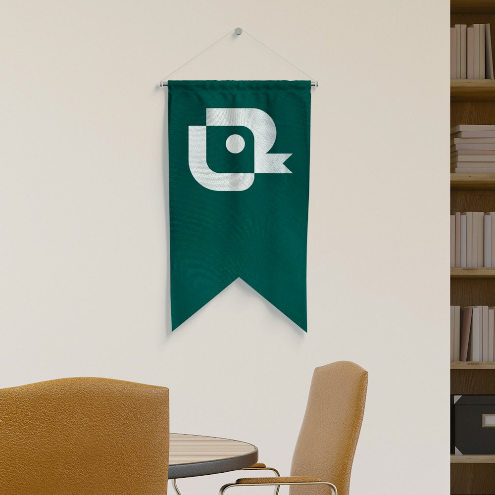
A connection was made between the platform’s bookmarking feature and the duck’s beak to create a unique symbol as the brand’s identifier.




Custom-drawn letterforms utilized geometric shapes to remain consistent with the symbol.
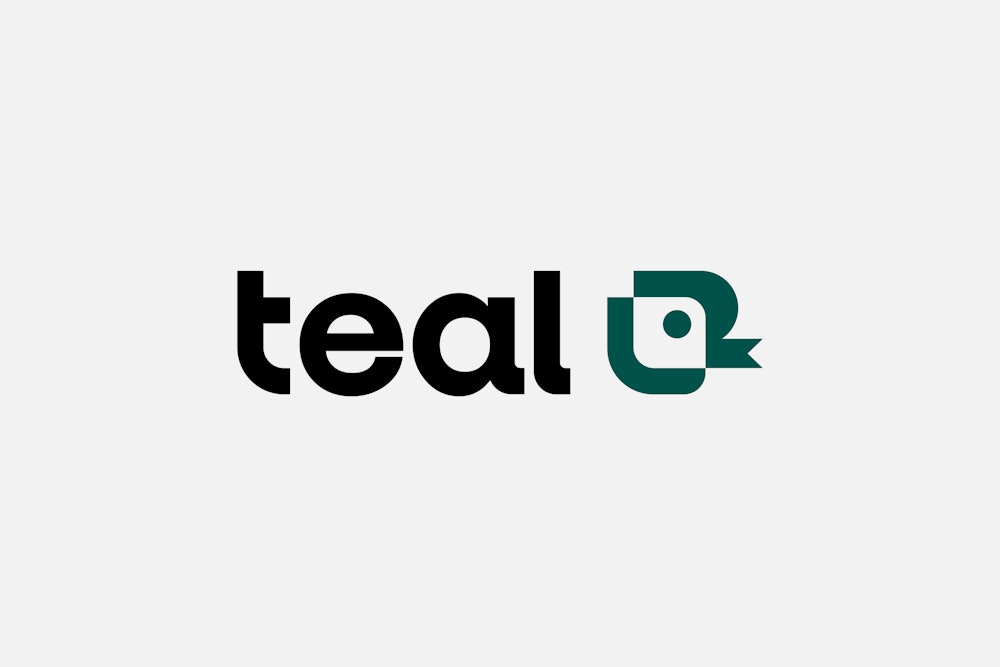
The symbol’s spine was pulled directly into the drawing of the letter, “t”.

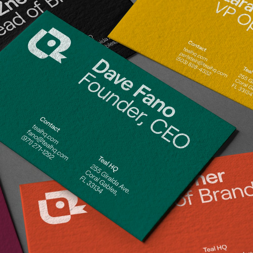
The symbol and wordmark are used together for brand recognition.

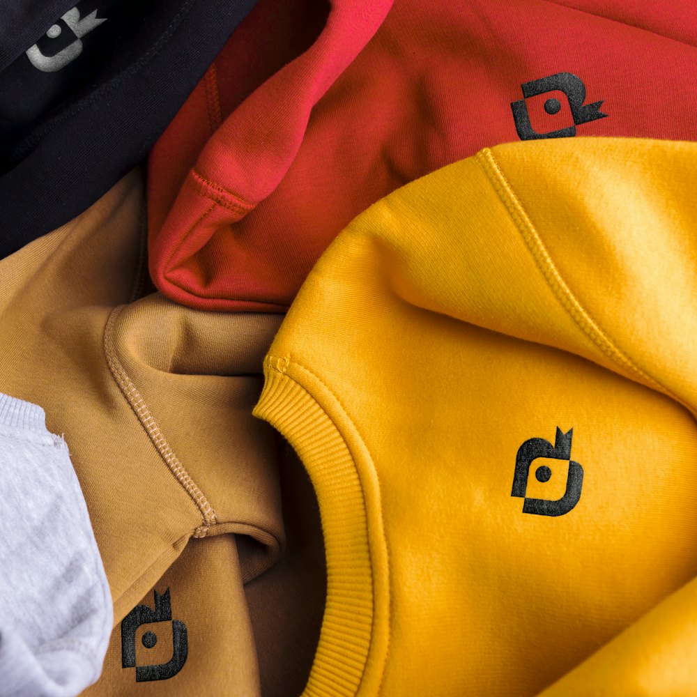
The symbol is used as the primary identifier.

A micro-version of the symbol was drawn for smallest scale use.
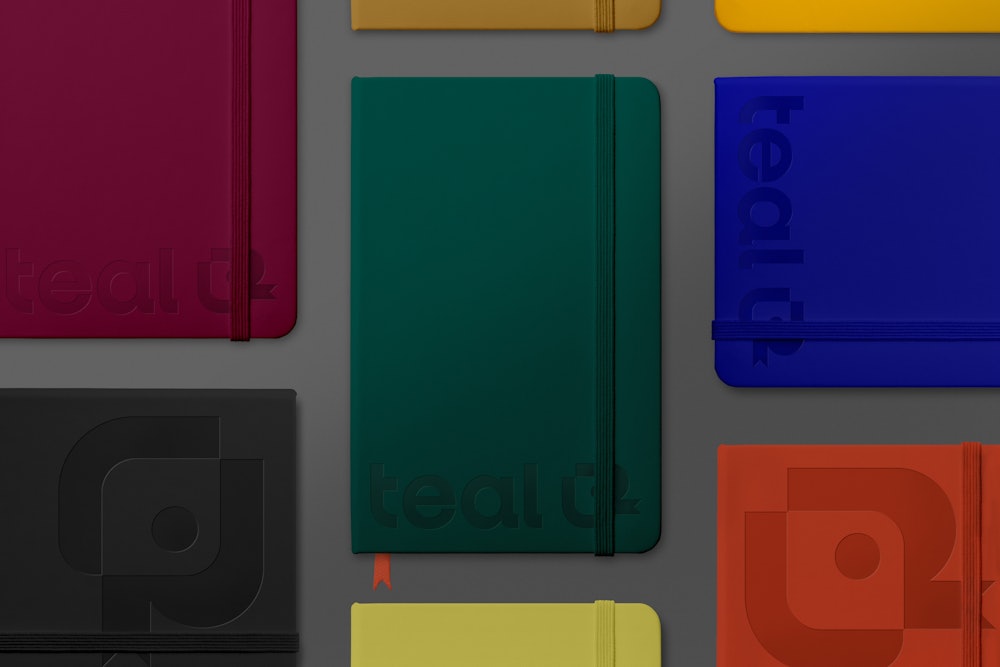
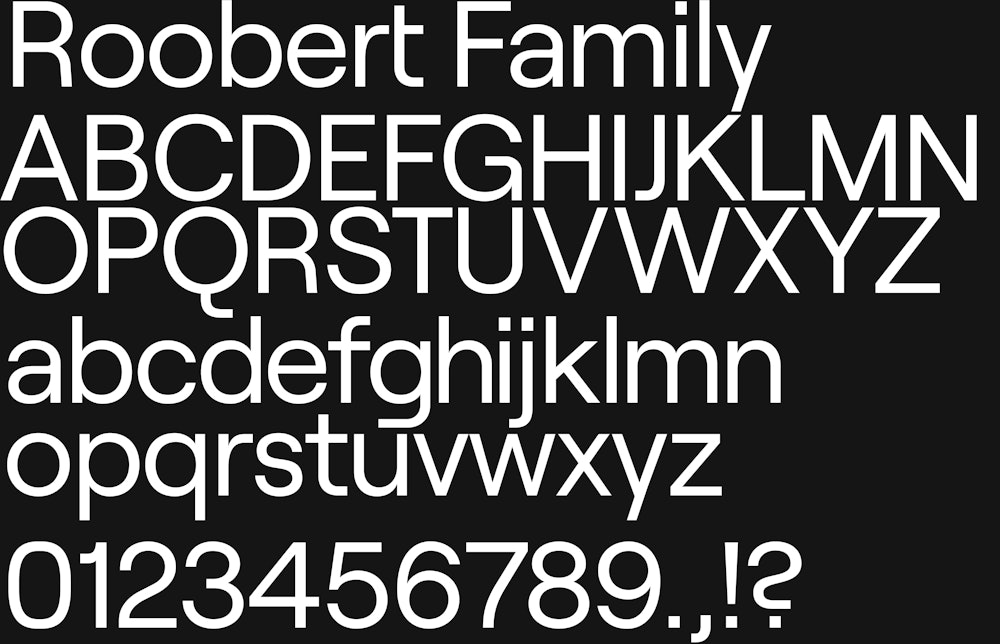
Roobert, designed by Displaay Type→, is used as the typographic voice for the brand. Its geometric and square forms speak to the curves drawn in the duck.
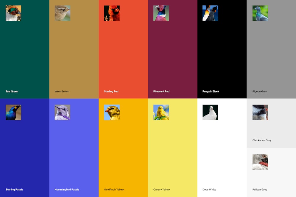
Similar to the namesake’s color origins in teal, the extensive brand palette uses colorful avian connotations.
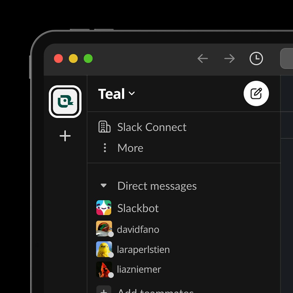
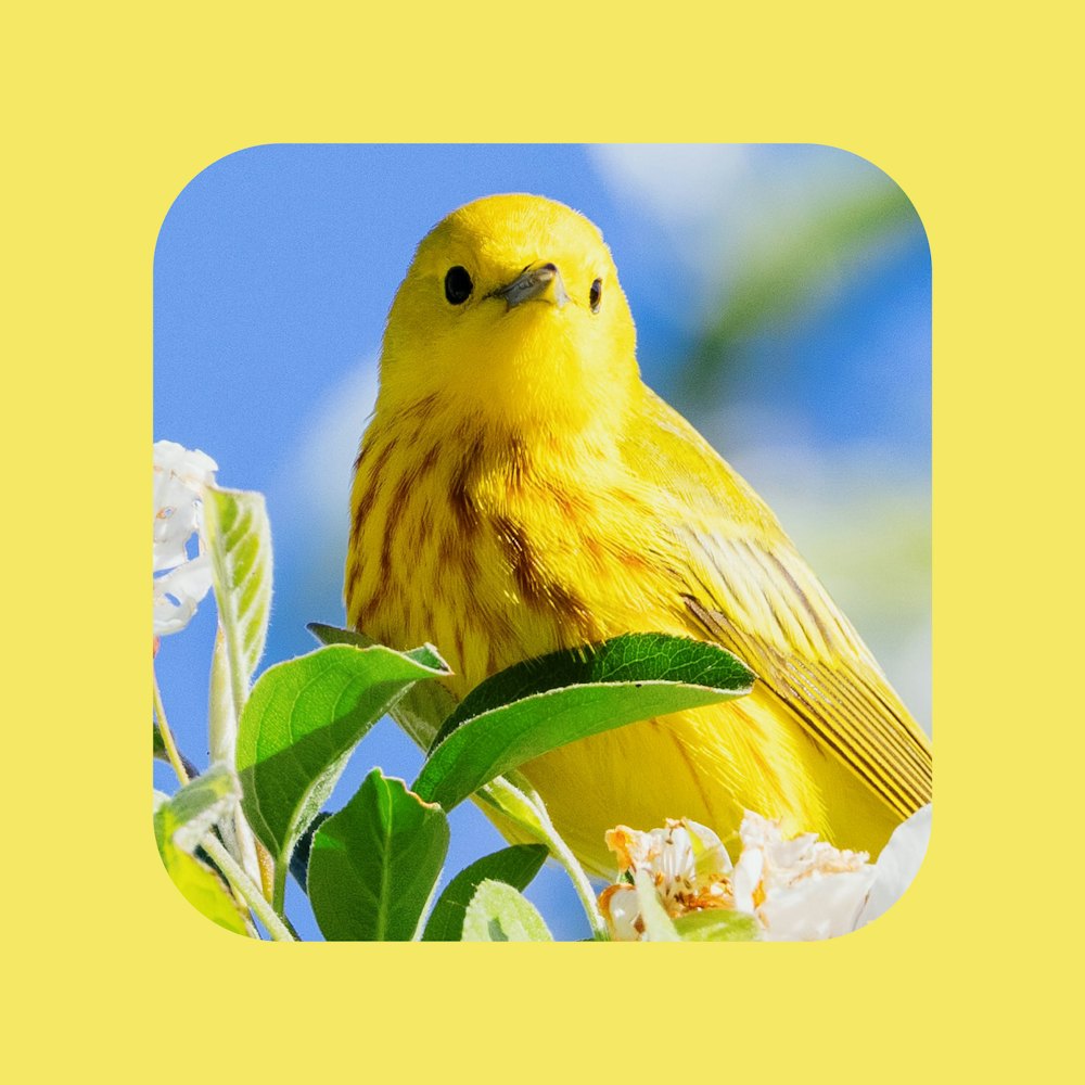
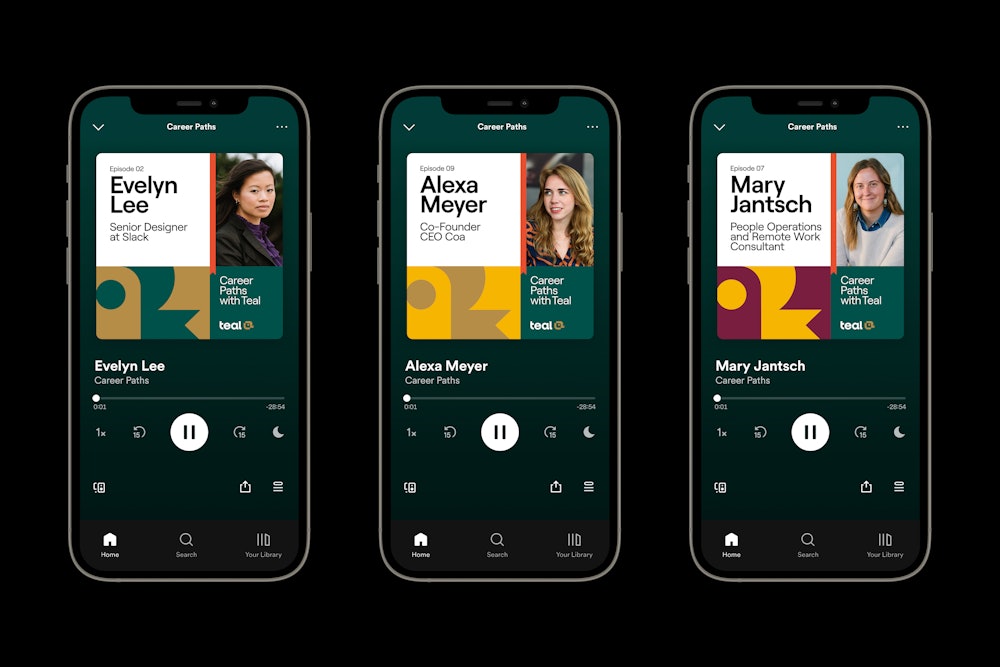
The bird portraits doubled in their use as internal profile icons.
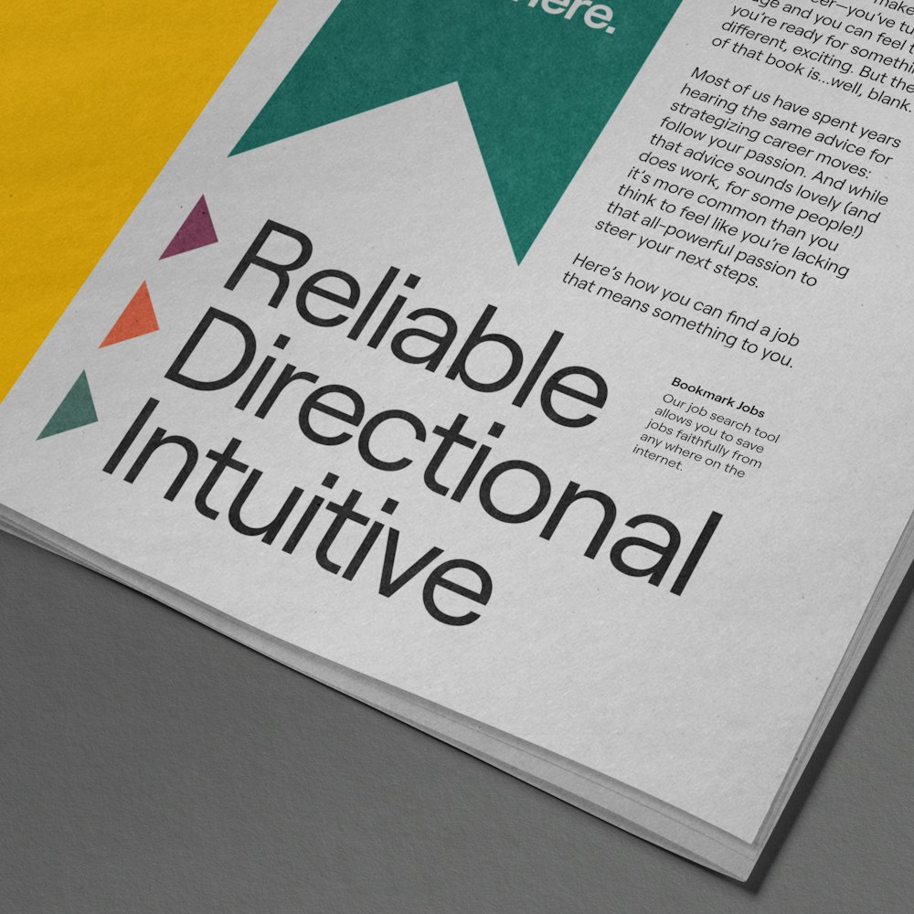
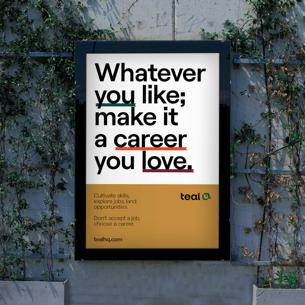
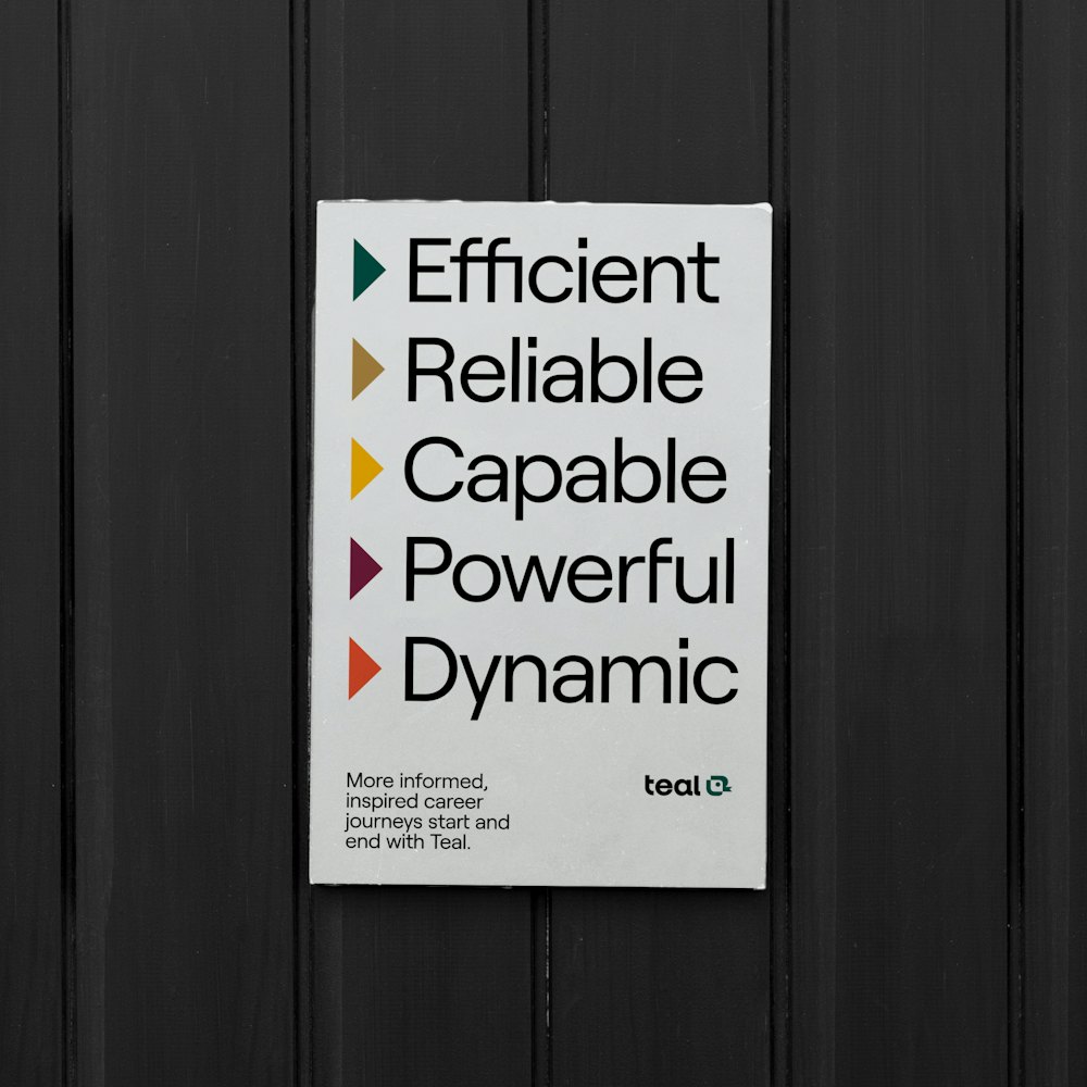
In the extended brand language, the bookmark device is used to interact with typography in similar ways that users’ interact with the product: through bookmarking, analyzing, and organizing information.






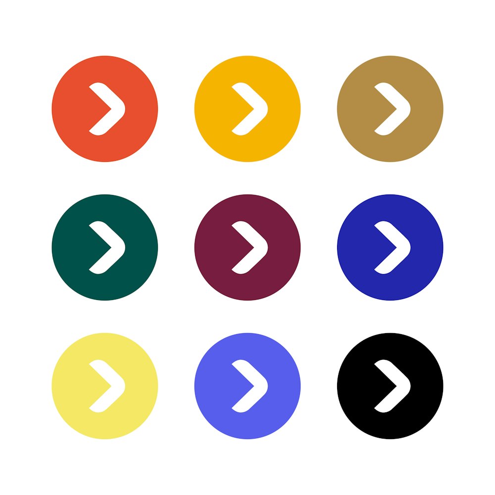
A full iconography suite was developed for large to small scale use. Its primary characteristics were drawn from the symbol’s weight and curves.
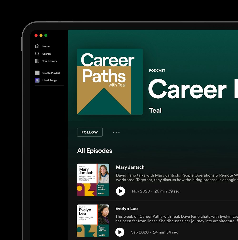
The devices of the brand language are used both as expressions in the brand, and to functionally call attention to information.
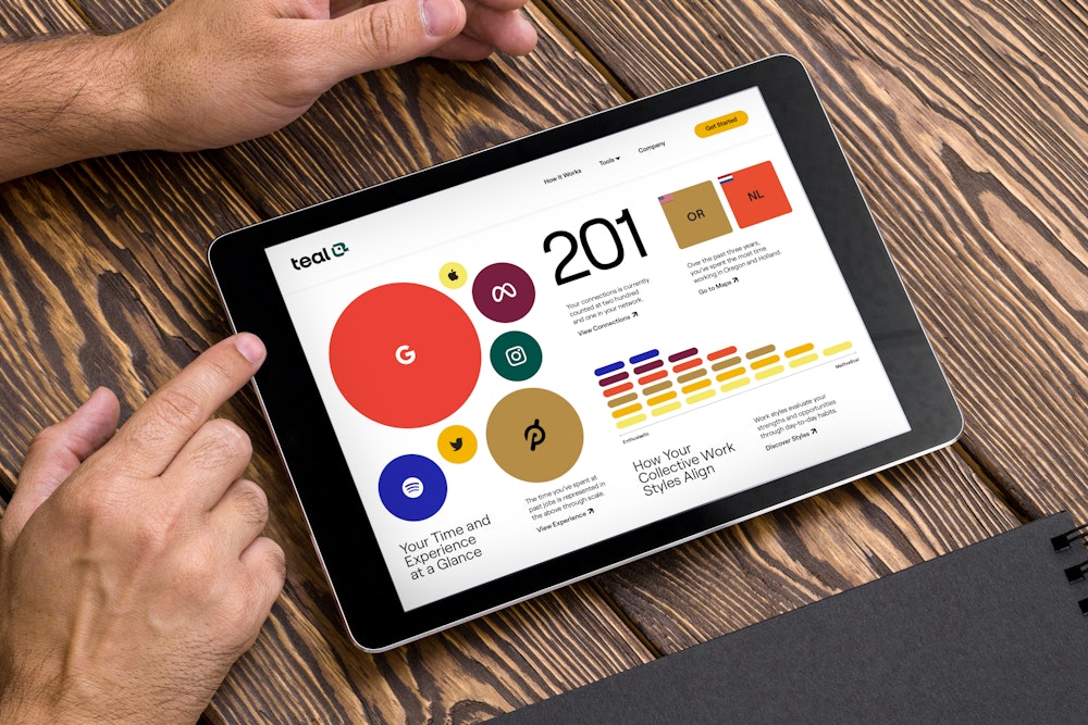
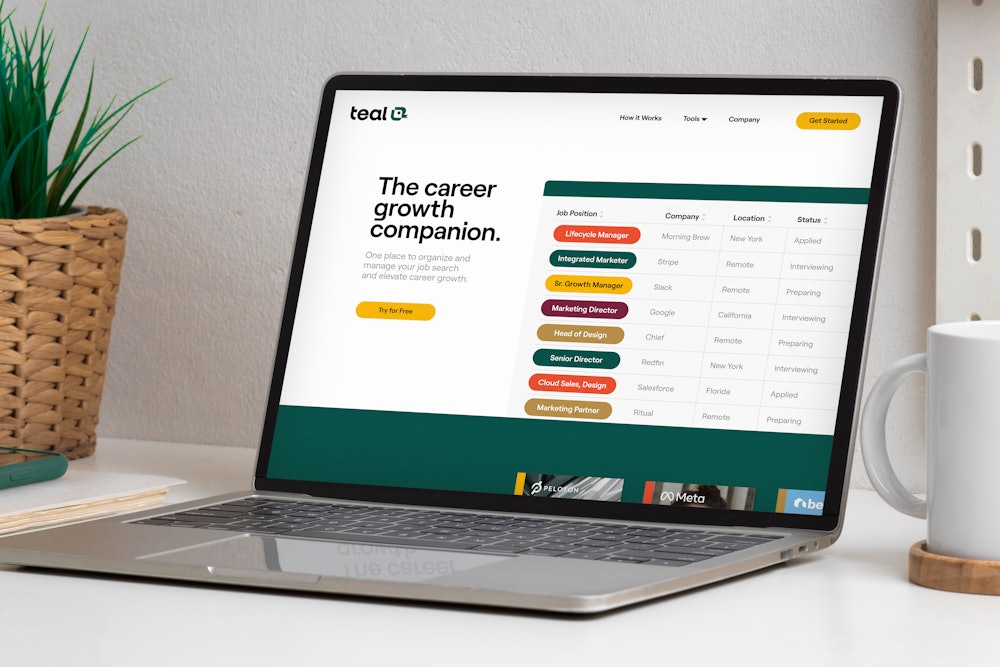
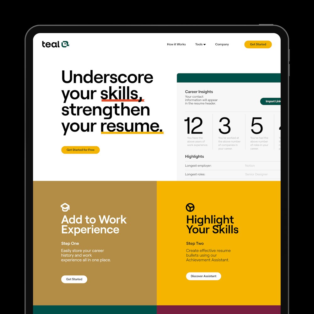
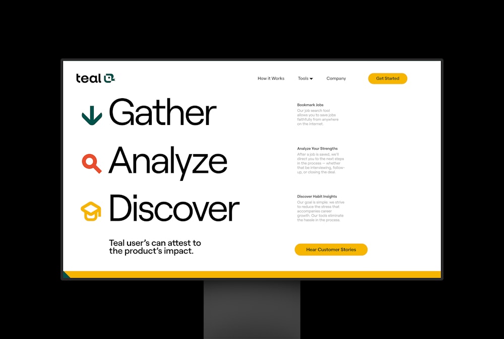
Teal launched its new brand alongside a website designed by Order.
The website serves to inform users of the product’s responsive tools and services, all while showcasing the bright and relatable brand tone.



A system for data infographics was constructed to support Teal’s Work Styles.
The service provides conclusive summaries of past work experiences, targeted at gaining insights to improve your future professional relationships.
