Undivided
Undivided is a trusted partner helping parents raising kids with disabilities to dream bigger and achieve more through community, collective knowledge, and resource support.
Following the revitalized name, messaging, and positioning, Order worked with Undivided to translate their comprehensive database to an identity that celebrates the history and strengths of the community.
Collaborators
A Hundred Monkeys→
Project team
Jesse Reed, Partner
Emily Klaebe, Designer
Megan Nardini, Operations
Brooklyn Office
By the time CEO and Co-Founder Jason Lehmbeck established Undivided, he had 13 years of personal experience raising children with disabilities.
Jason and his family had witnessed first-hand the inequities and lack of quality support within integral systems for kids with disabilities.
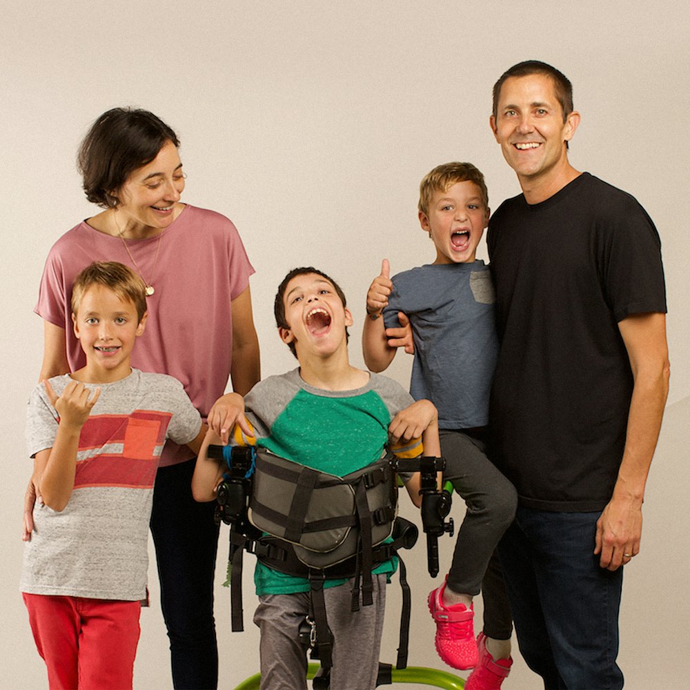
The complicated process of locating all options for care, health insurance, service providers, and educational resources affects all young members of the disability community.



Through solidarity in his community of parents in similar situations, Jason realized that a supportive team of experts who can help to advocate for resources, and navigate complicated bureaucracy was essential to the well-being of the children.
In order to maintain organization of complicated bureaucratic documents relating to their child’s care, parents of the Undivided community frequently carried binders with them to every administrative-related meeting.

The Undivided app’s goal was to reduce the physical clutter that parents were burdened with, and recreate the nuanced organization in a digital setting.
To better understand the organizational tools used by the community, Order dived into the historical background of the binder.


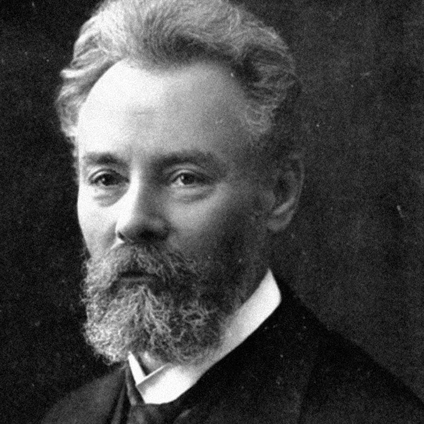
Friedrich Soennecken was a German inventor and entrepreneur, who is best known for creating the organizational system of the two-hole ring punch, and later, the ring binder.
Looking to the history of early binder organization, a connection was made between the direct visuals used to consolidate information within binders, and an opportunity for the identity’s system.

Soennecken’s tabular organization, 1950s

Contemporary tabular organization, 2021

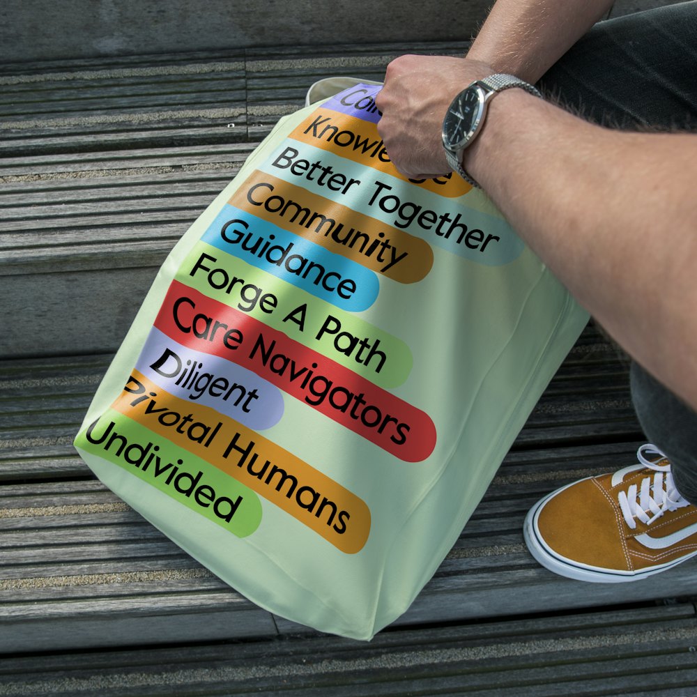
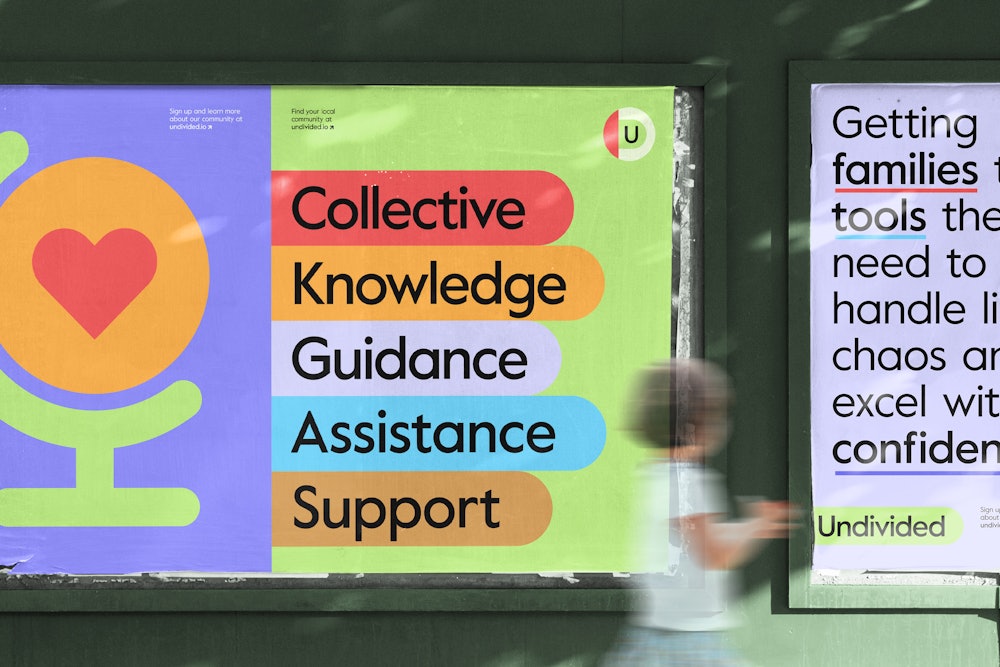
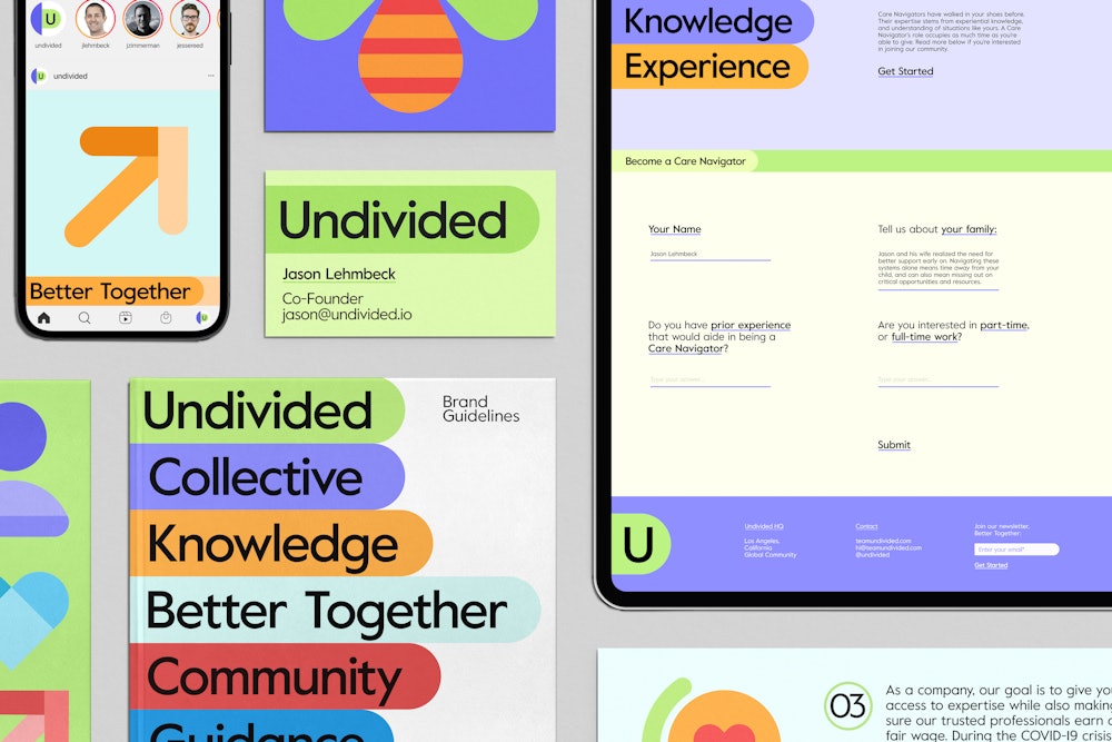
The logotype pulls from the language of binders, using tabs as a key identifier for prioritizing information.
The tabular container of the logo is reinforced through its nested usage with left-alignment to the metaphorical binder edge.


When reducing the logotype to smaller scales, the rectangular shape to the left of the icon represents the edge of the binder.


The binder edge color is flexible within the identity’s palette. The logotype and icon remain consistently green, in their connotation of the mental health foundation’s ribbon.


An extended color palette allows for a broader range of expression in the system and product design.


Undivided’s foundational values revolve around accessibility to all materials, including the written word. Value was chosen as the primary typeface in the system for its geometric and legible characteristics.
The open apertures and counters, wider forms of narrow characters, and large x-height were all desirable traits for informing legibility.
A range of binder-inspired visual devices were created to connect Undivided’s mission of reducing parents’ overwhelm to the identity’s system.


The ‘super binder’, coined by Jason, was designed to functionally cover typographic hierarchy within a range of applications. The diagram details the spectrum, extending from binder labels, tabular organization, and documents.


A suite of iconography was developed based on the rounded shapes in the tabular logo. The icons are designed to work in both expressive settings with their tri-color treatment, and functional settings with single-color usage.


Designed to reduce the overwhelming nature of parents’ day-to-day lives, the Undivided identity respects the nuanced information, while still celebrating the joyful moments for kids with disabilities.


