Washington Metropolitan Area Transit Authority
The Washington Metropolitan Area Transit Authority (WMATA) is the public transportation agency operating rail and bus service in the Washington D.C. metropolitan area.
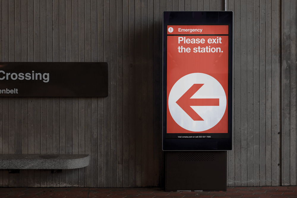
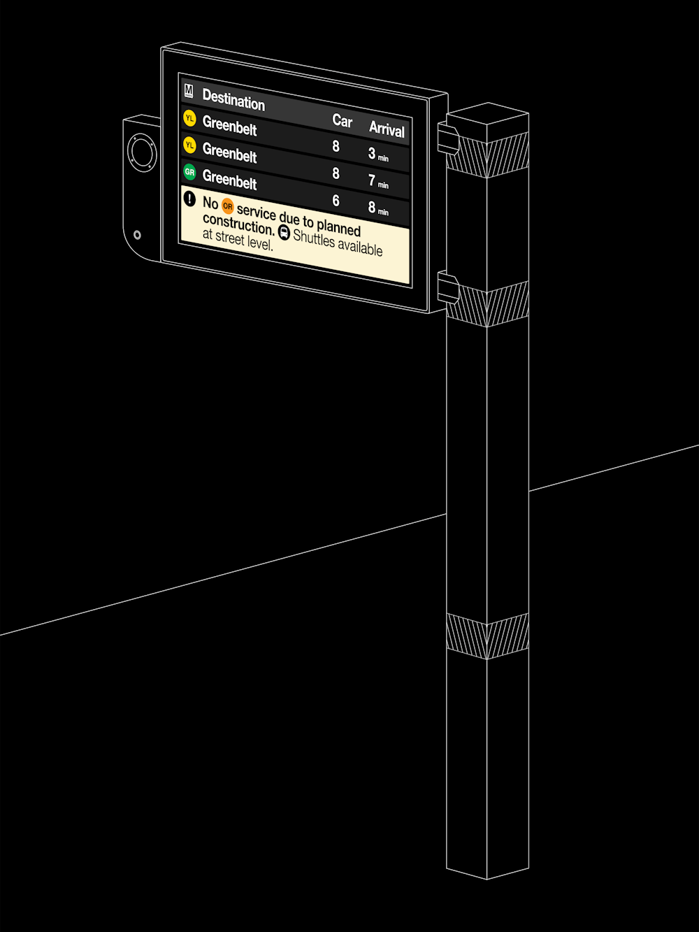
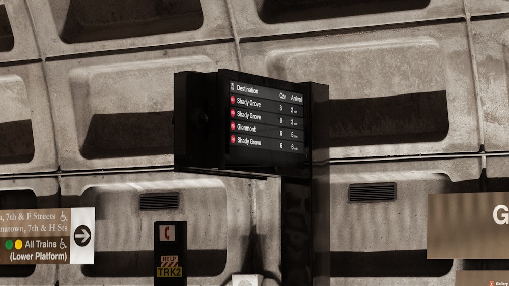
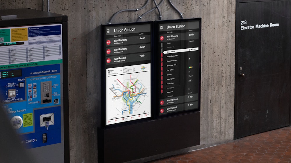
Order created a digital signage system to support the existing wayfinding throughout the WMATA network, providing tools to communicate arrival times, real-time service updates, up-to-date transfers, and more.
Collaborators
Entro→
Jacobs→
Vijay Mathews→
Project team
Jesse Reed, Partner
Garrett Corcoran, Designer
Megan Nardini, Operations
Brooklyn Office
Operating in the Washington D.C., Maryland, and Virginia area, WMATA serves over 500,000 passengers per day and is the second-busiest heavy rail rapid transit system in the United States.

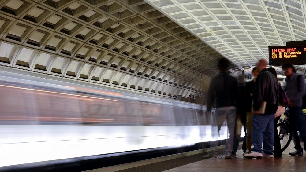
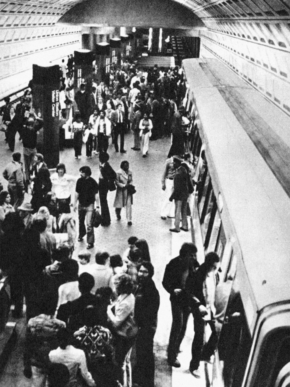
The WMATA rail system first opened in 1976 with stations designed by architect Harry Weese. Today, the stations’ architecture stand as icons of Brutalist and Neoclassical design with a heavy use of exposed concrete and overarching coffered ceiling vaults.
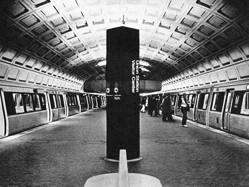
Union Station, 1976
Photo: Phil Portlock
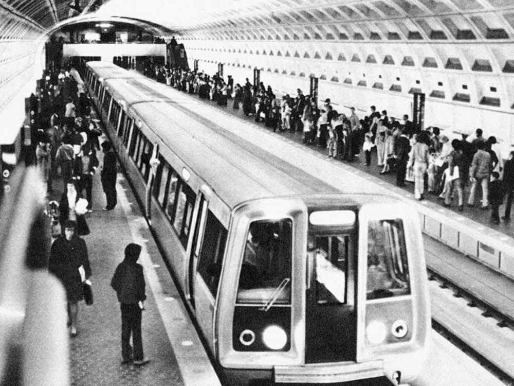
Passengers boarding, 1976
Photo: Paul Myatt
Passengers boarding, 1976
Photo: Paul Myatt
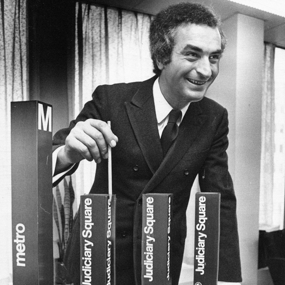
Massimo Vignelli shows proposed designs, 1968
Photo: Jim McNamara

Rhode Island Ave station, 1976
Photo: Paul Myatt

Station interior, 1976
Photo: Paul Myatt

The signage system, originally designed by Massimo Vignelli at Unimark International in the 1970s, established a graphic foundation for the WMATA visual language. Alongside the signage, the map and icons, designed by Lance Wyman in 1971, provide an additional wayfinding tool to support riders.

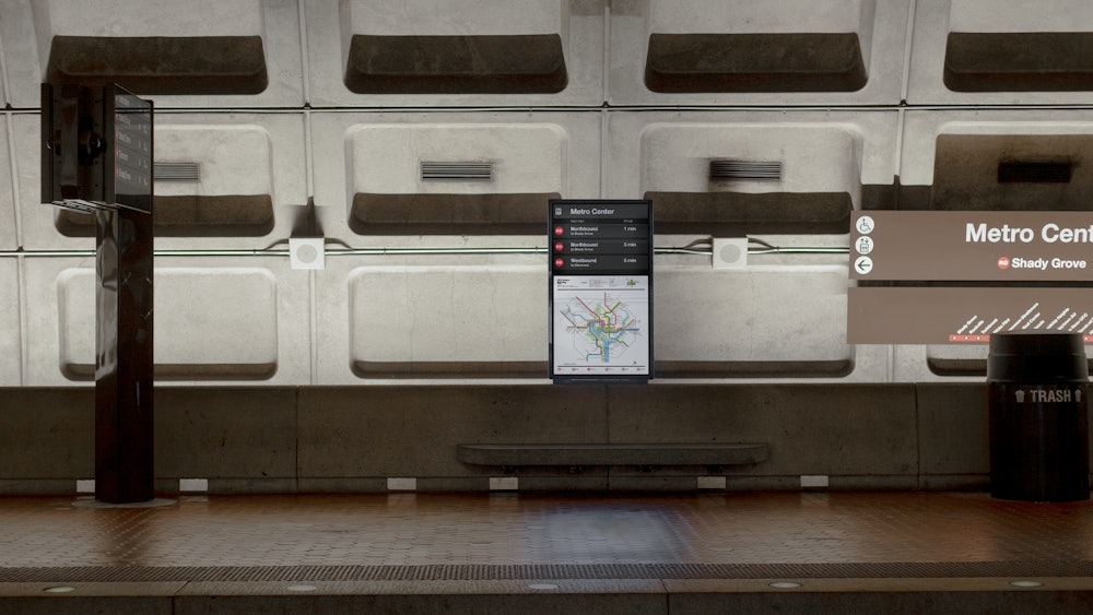
As part of a larger effort to update the wayfinding throughout the WMATA system, lead by Jacobs with support from Entro, Order was tasked with creating a visual language for the digital system that maintained the integrity of the existing WMATA identity while adding new tools to adapt for real-time information.
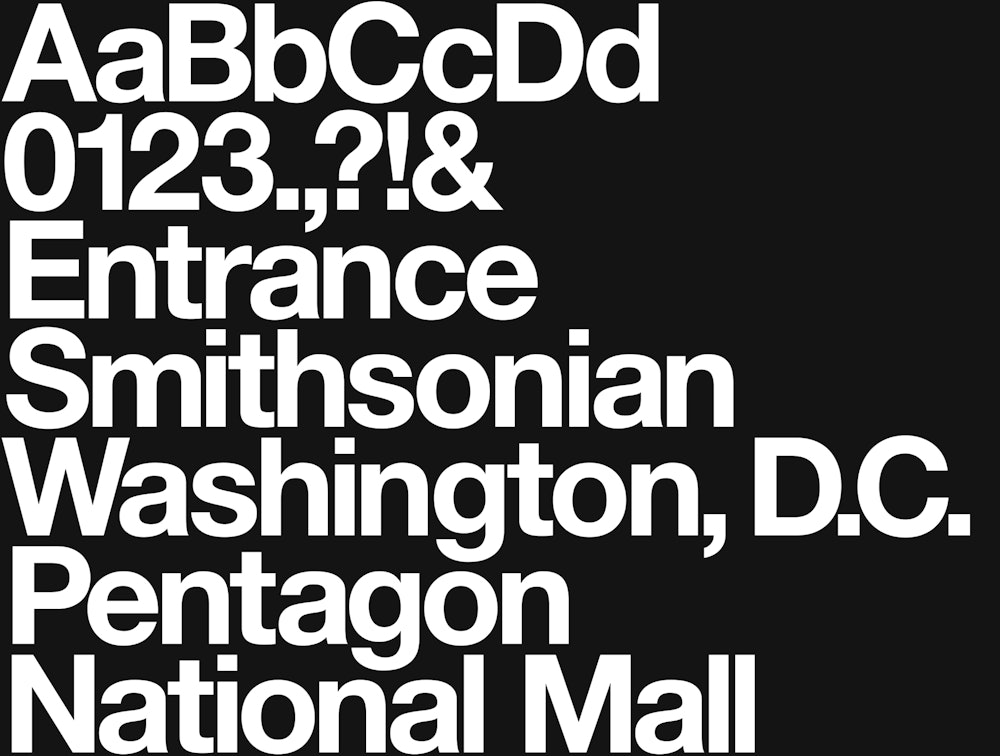
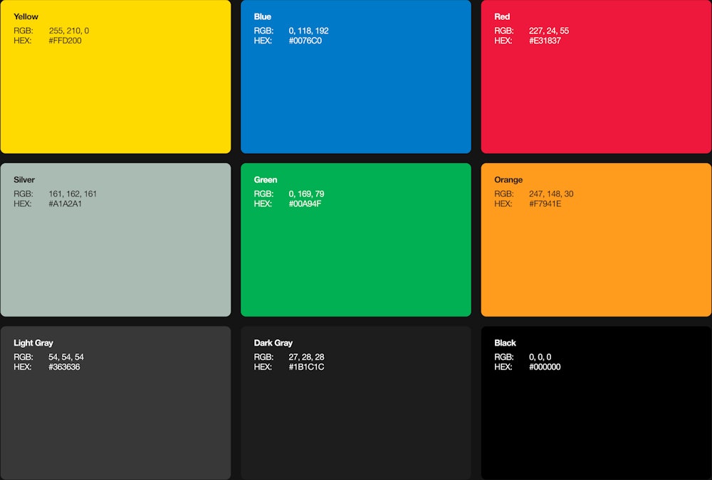
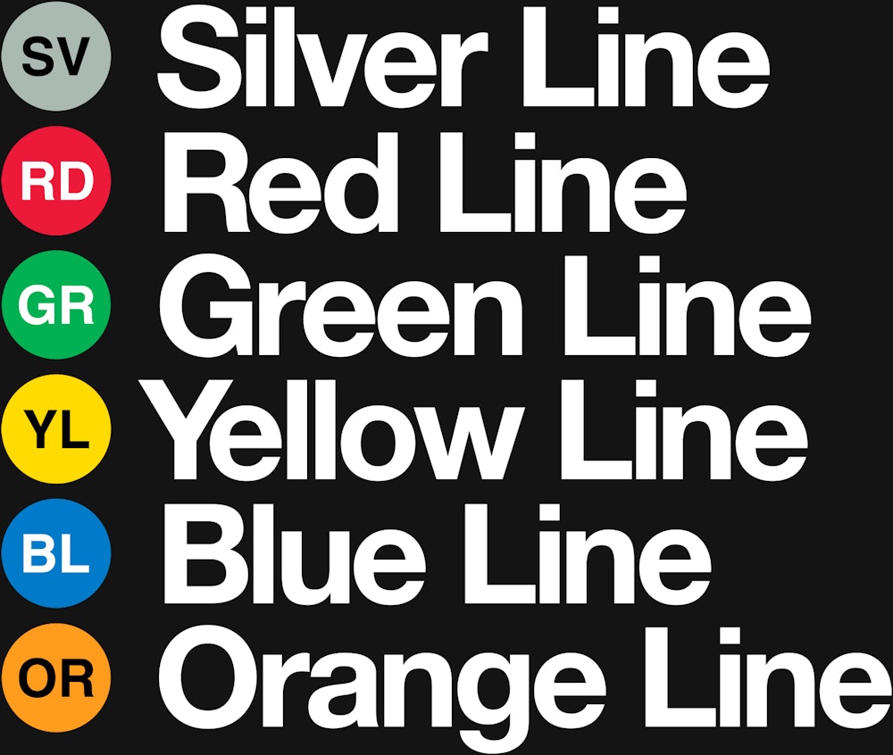
Helvetica remains the typographic voice of the system, while the existing colors from each line were used to expand the language and maintain consistency throughout.
The U.S. Department of Transportation icon set, first published in 1974 and designed by Roger Cook and Dan Shanosky in collaboration with AIGA and DOT, is used throughout the existing signage in each station and is reflected in the digital system.
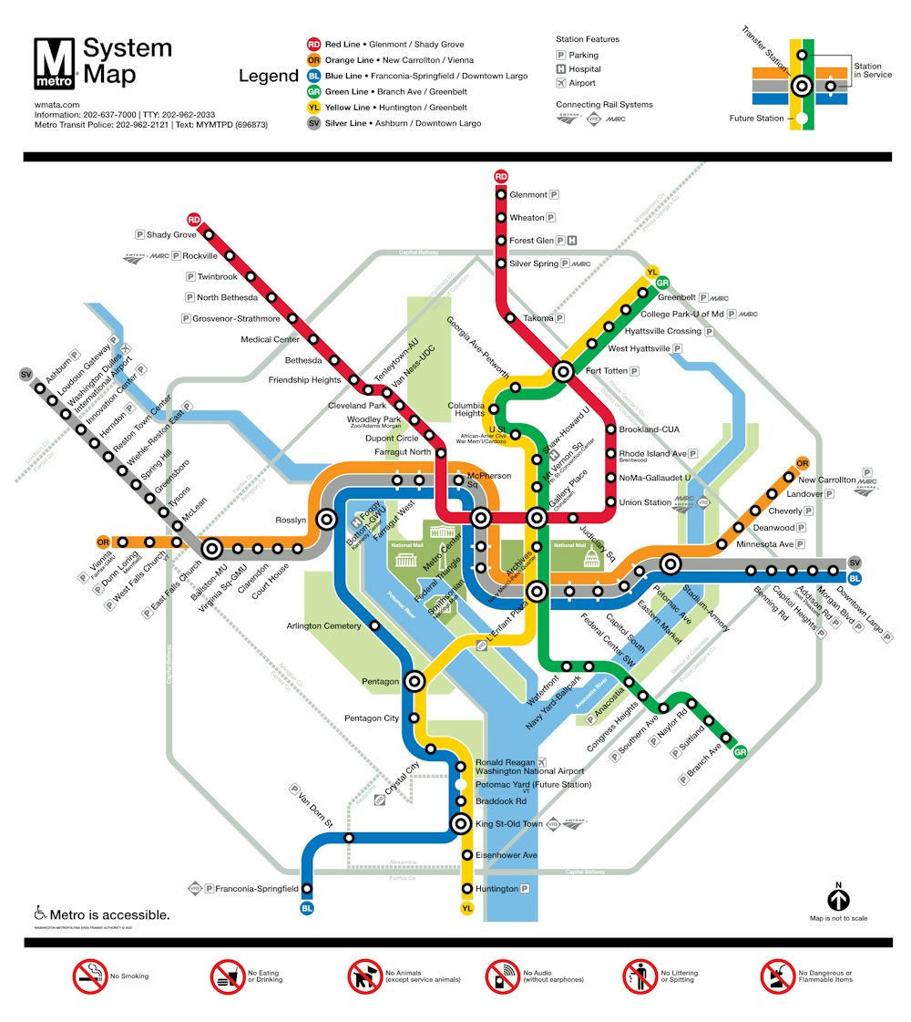
The WMATA map by Lance Wyman informed an expanded language of supporting visuals highlighting real-time stations ahead and service updates.

The core of the digital system builds on both the existing identity of WMATA and the station architecture to create an expanding modular system.


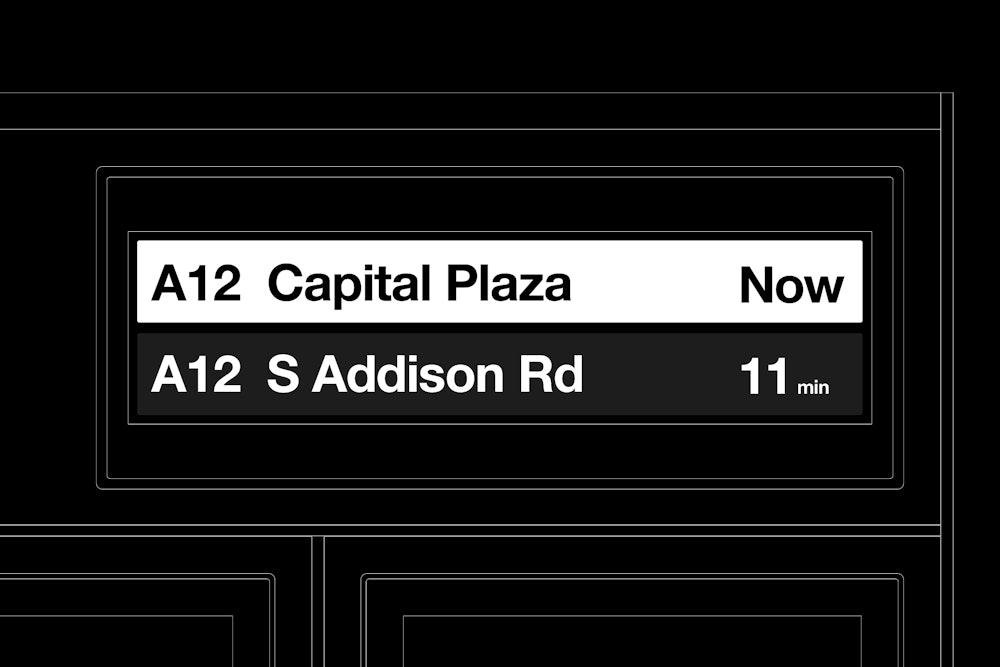
The modules are used throughout the digital ecosystem and update, expand, and adapt for each station or use case.

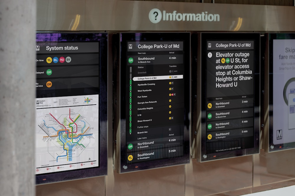
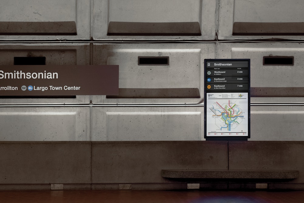

With the digital system, real-time service information can be shared instantly allowing riders to be informed of arrivals, service changes, or emergencies.

Iconography used throughout highlights both station amenities and available transfers to provide riders a clear visual for available resources.
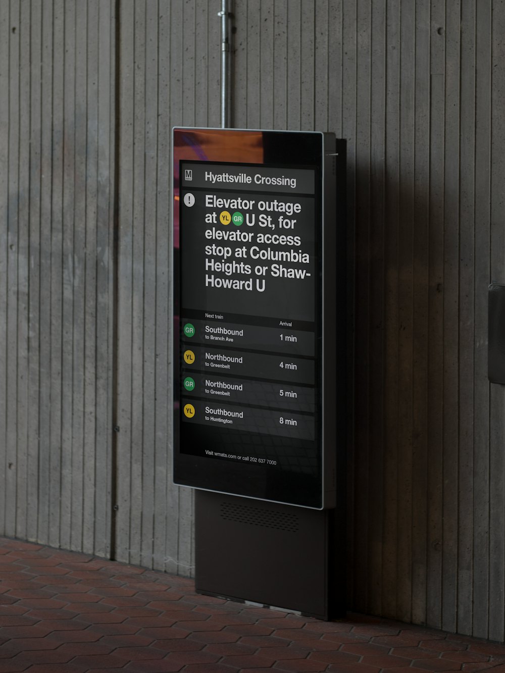
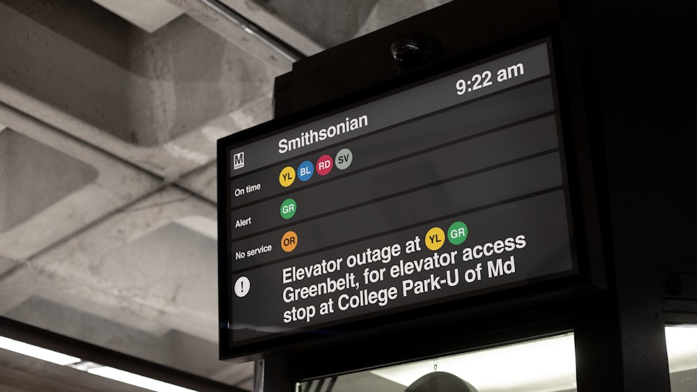
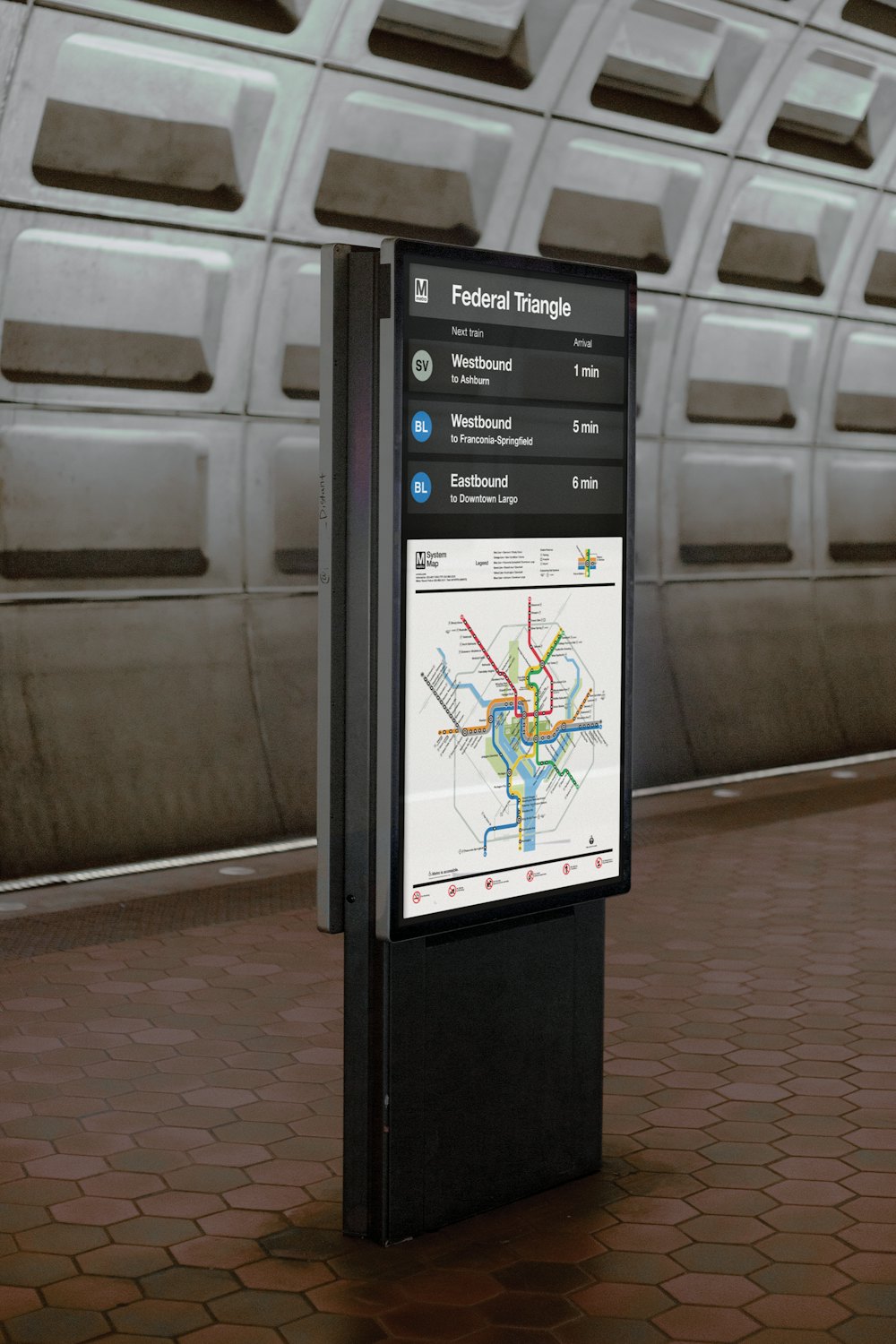
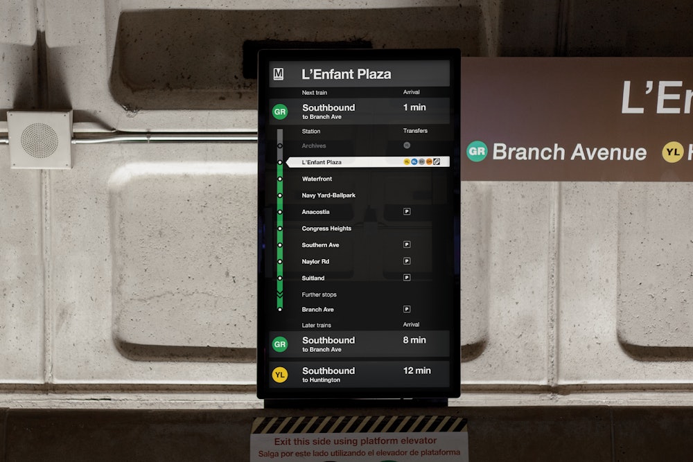
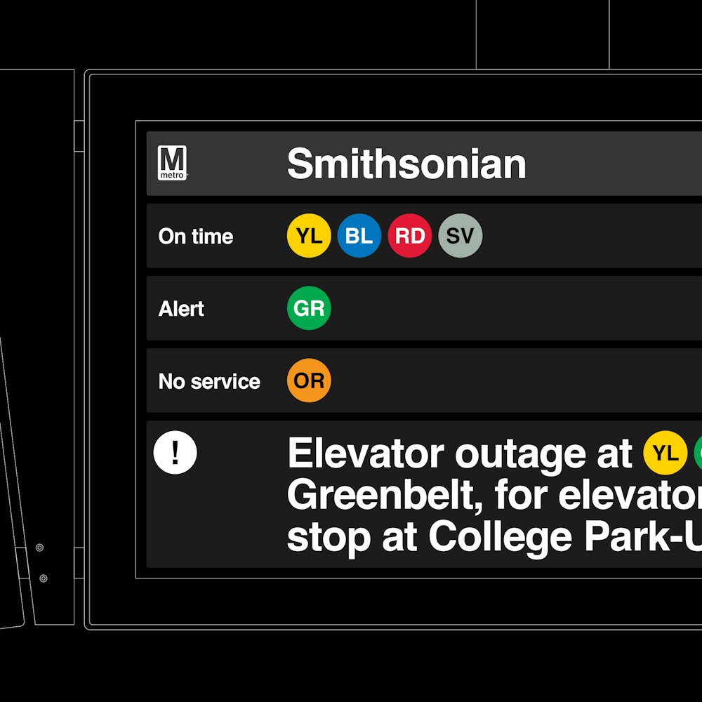
The modular language features a color coded system for standard service, changes in service, and emergencies.
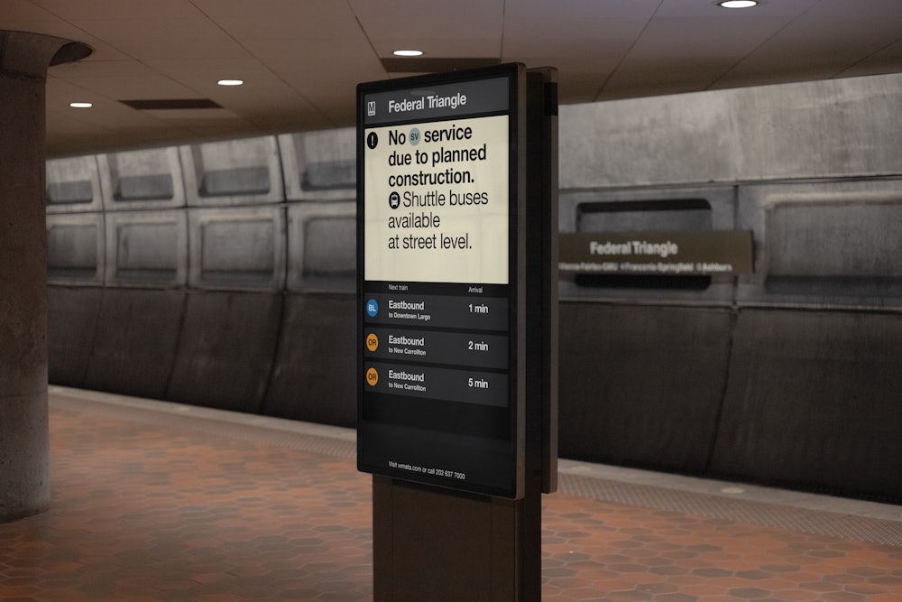
Cardinal direction language was added, through a collaboration with Jacobs, Entro, and the WMATA team, to provide new directional points of reference for riders.

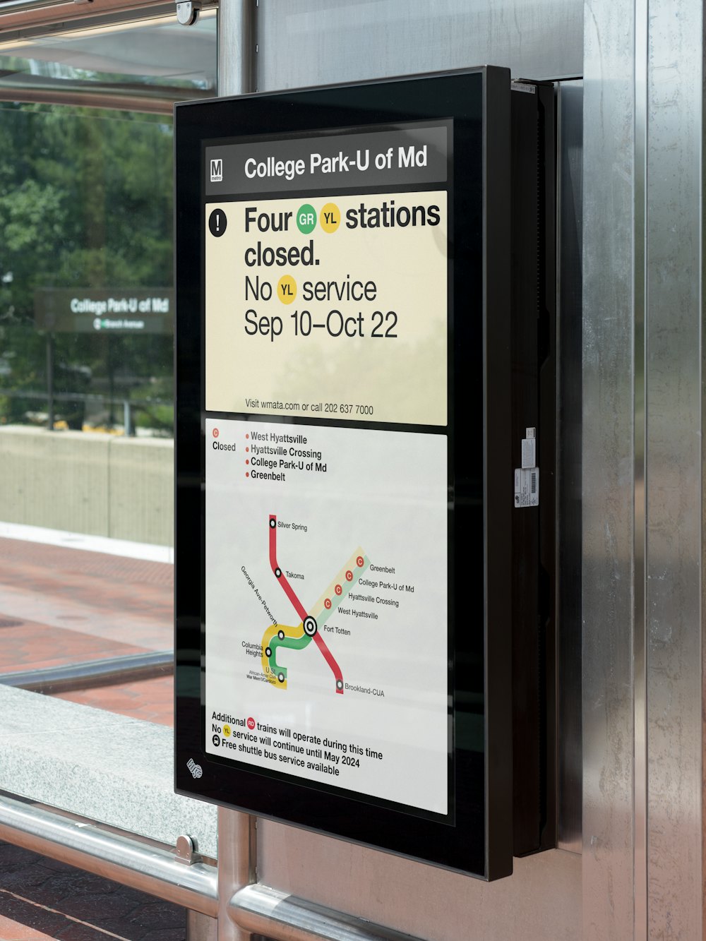
Adapted service map modules allow WMATA to highlight any closures, construction updates, or changes as the system expands.

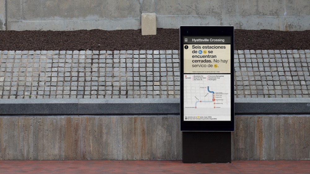
The digital system also allows for additional languages to be used providing WMATA an expanded ability to communicate with as many passengers as possible.
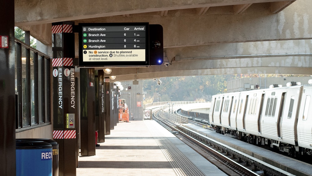
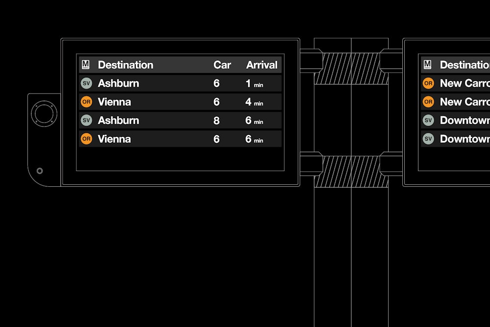


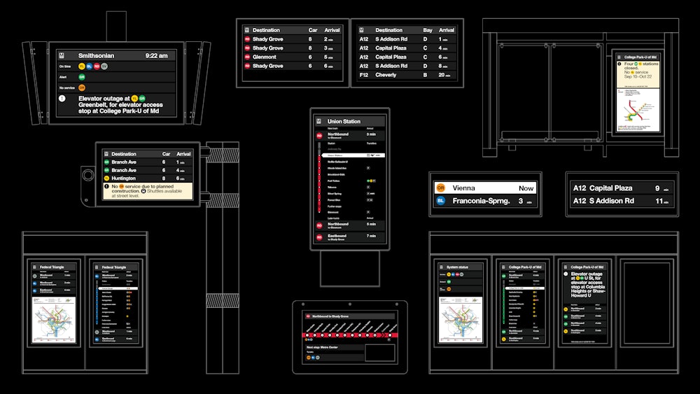
A digital guidelines document was created allowing the WMATA team to create, adapt, implement, and evolve the system as Metro continues to update and expand.
