

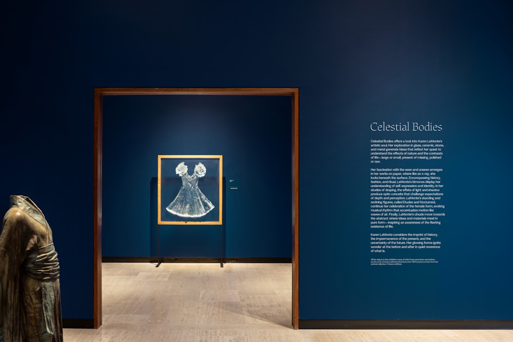
Celestial Bodies
Karen LaMonte is an American artist and sculptor whose 30-year career has spanned an astounding range of mediums, from paper to glass, porcelain, marble, and bronze.
The Munson Museum of Art organized a retrospective of her work, which featured pieces from her personal studio, many of which were on view for the first time.
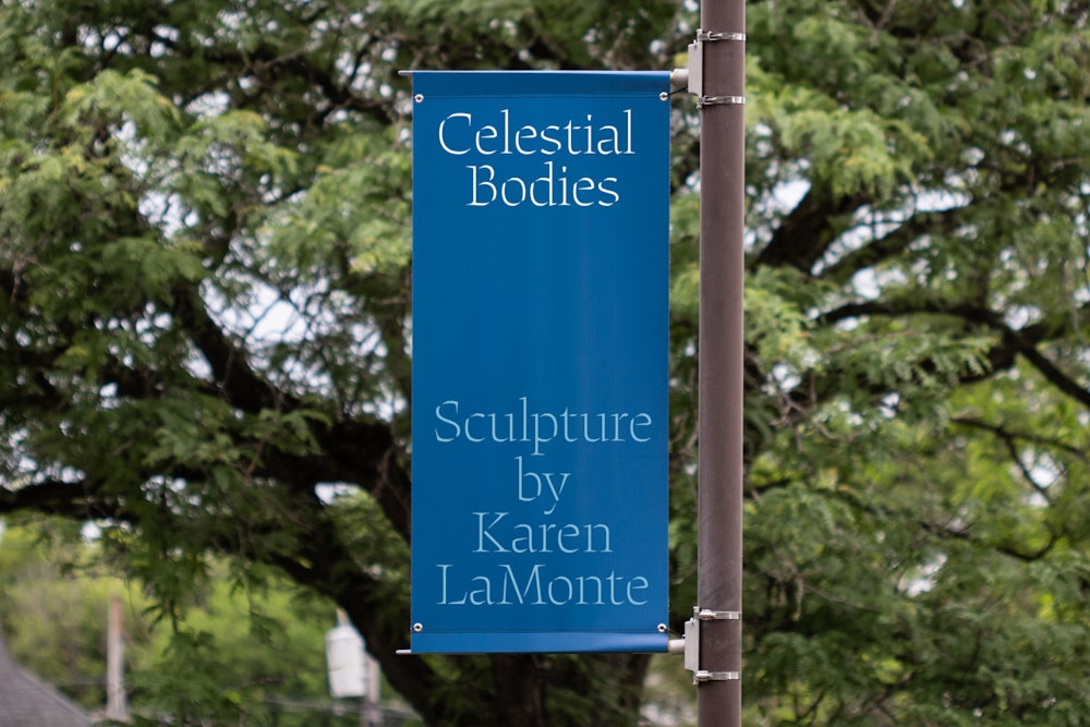
Order was tasked to create a visual identity for the exhibition, which premiered in the summer of 2025.
Collaborators
Project team
Jesse Reed, Partner
Laurel Warner, Designer
Megan Nardini, Operations
Brooklyn Office


Impression 7
2001
Collagraphic print


Impression (Christening Dress)
2001
Collagraphic print on pink paper


Impression 16 (Overcoat)
2001
Collagraphic print in brown ink
LaMonte’s earliest works take thrifted garments, coating them in ink and pressing them into paper to reveal traces of their former owners. Dubbed “sartoriotypes,” they explore themes of the body, identity, and absence.

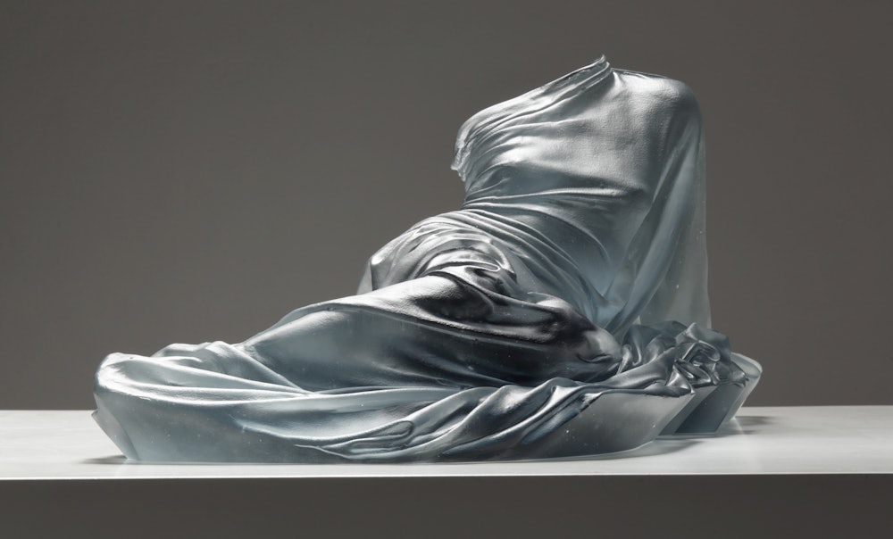
Reclining Etude
2017
Cast glass
LaMonte’s draped forms continue her interest in the human figure. By focusing on the clothing instead of the wearer, she highlights the tensions between presence and absence, subverting traditional depictions of the female nude.


Nocturne 2
2015
Cast iron


Hanako
2012
Bronze
LaMonte’s recent work depicts cloud formations that have gone extinct due to climate change. Based on real-life cloud data, these sculptures extend themes of absence and loss into the realm of science and technology.


Cumulus 1:8
2020
Marble


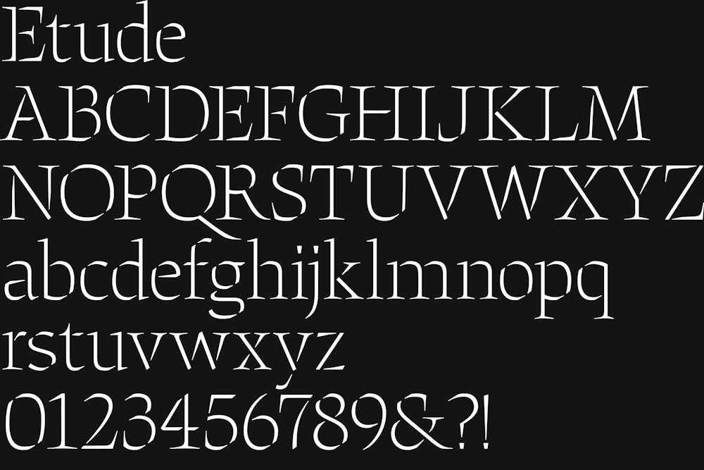
Despite her varied use of subjects, techniques, and materials, light and shadow continue to be a regular theme in LaMonte’s work and informed the basis of the exhibition’s type and color choices.


Etude, designed in 2022 by Emily Atwood for Order Type Foundry→, was selected as the primary typeface for the exhibition.
Its stenciled design echoes carved material, capturing the ever-present relationship between positive and negative forms in LaMonte’s work.


A range of blue tones provides the base of the exhibition’s color palette. Inspired by the infinite shades of LaMonte’s glasswork, the palette is layered strategically throughout the galleries to form a gradient.


Munson’s house typeface, Munson Sans is used for supporting copy.
A light weight was selected for its similarities to Etude.
Both typefaces were designed by Emily Atwood.


The exhibition reception’s invite uses a blind embossed treatment as a nod to LaMonte’s sculptural forms.


Campaign materials feature a variety of works to highlight the breadth of the exhibition.

