Herman Miller
Spanning over 100 years and creating some of the most iconic and influential pieces of design, Herman Miller has become synonymous with “modern” furniture.
Order created an identity system establishing a new but familiar foundation for their visual language, capturing and building on its rich history and influence.
Collaborators
—
Project team
Jesse Reed, Partner
Garrett Corcoran, Designer
Megan Nardini, Operations
Brooklyn Office
As a recognized innovator in contemporary interior furnishings, the Herman Miller portfolio of work spans from workplace and home to healthcare and technology.

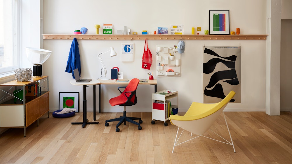
History: Understanding the legacy
The process began with a deep dive into the storied past of Herman Miller. Exploring their archive, studying their products, and understanding their influence was essential to expanding the identity for the future.

Initially the Michigan Star Furniture Company, the Herman Miller Furniture Company was founded by D.J. De Pree and named after his father-in-law, Herman Miller, in 1923.

Herman Miller’s first President, D.J. De Pree.
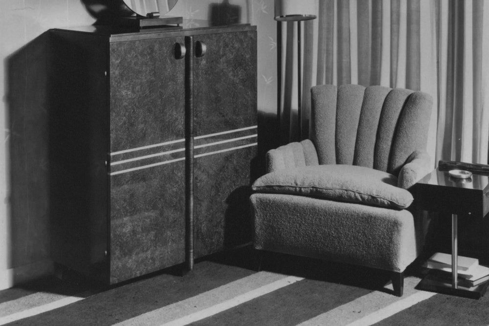
1933
Herman Miller debuts its Rohde-design furniture.
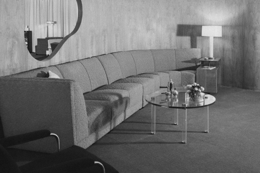
1939
Signature curves for Herman Miller’s Chicago showroom.
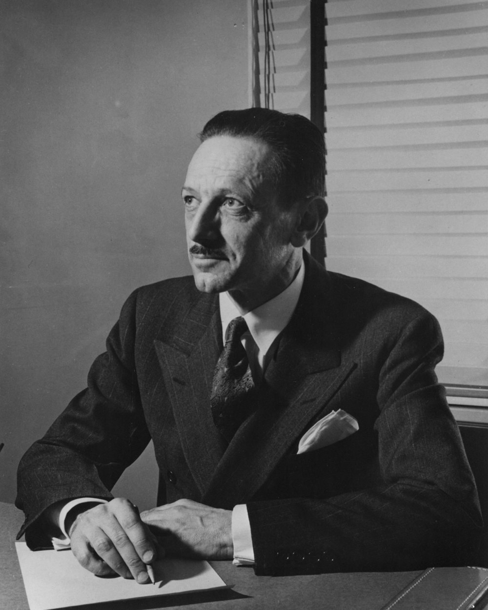
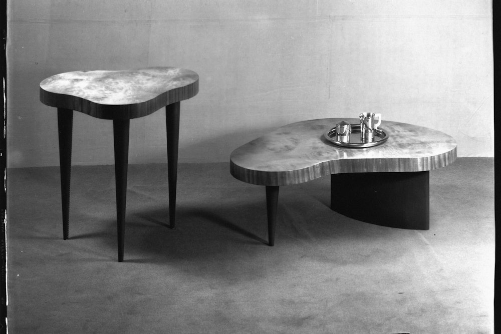
The hiring of Gilbert Rhode began a shift away from traditional furniture and a focus on products suiting the changing needs and lifestyles of Americans.

1939
Herman Miller opens a showroom in Chicago’s Merchandise Mart.

1942
An History of Modern Furniture from Prehistoric Times to the Post War Era, an early catalog developed by Rohde and illustrated by Peggy Ann Mack.

1942
Executive Office Group designed by Gilbert Rohde signals entry into office furniture.

1945
George Nelson is hired as Design Director beginning a new era of innovation.
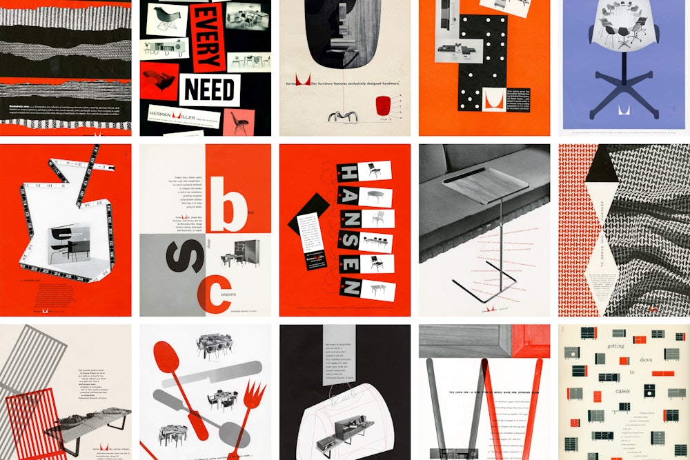
The early visual language of Herman Miller developed by Irving Harper and the Nelson Office.
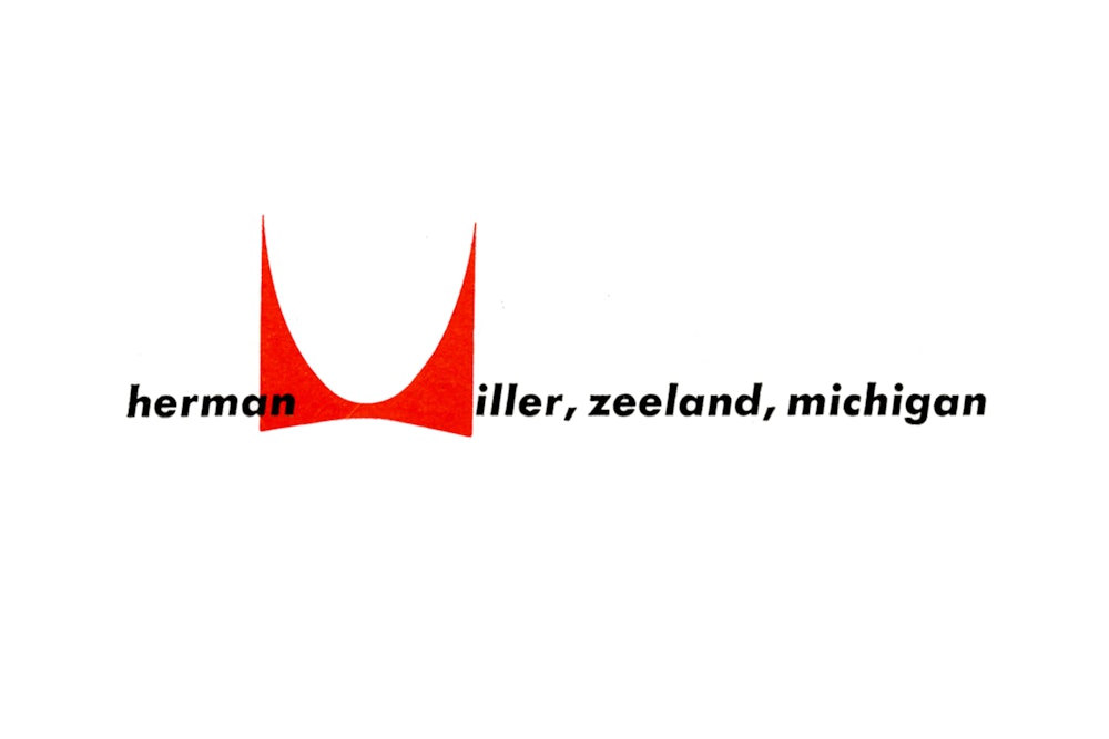
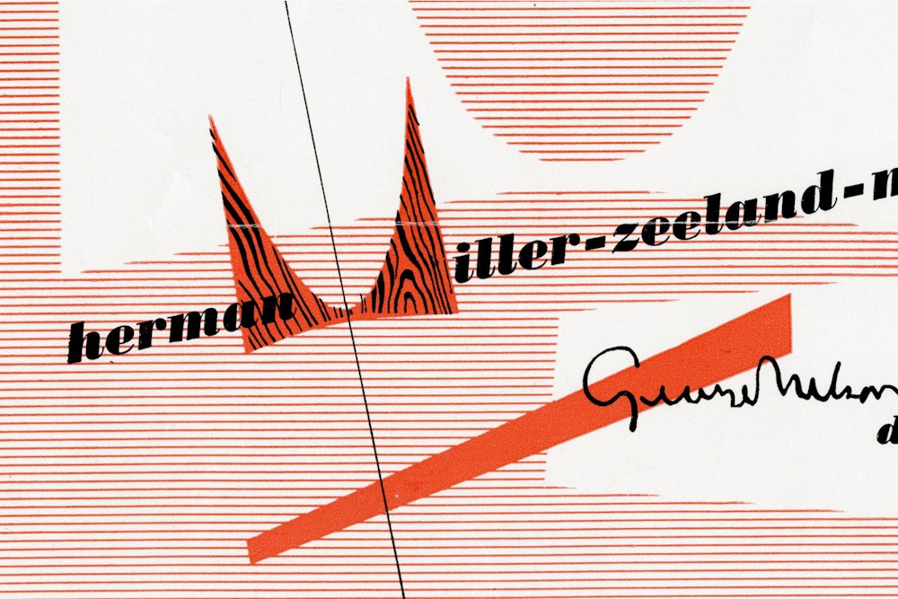
1946
Early versions of the iconic "M" symbol drawn by Irving Harper.

1946
Nelson and De Pree recruit Charles and Ray Eames.

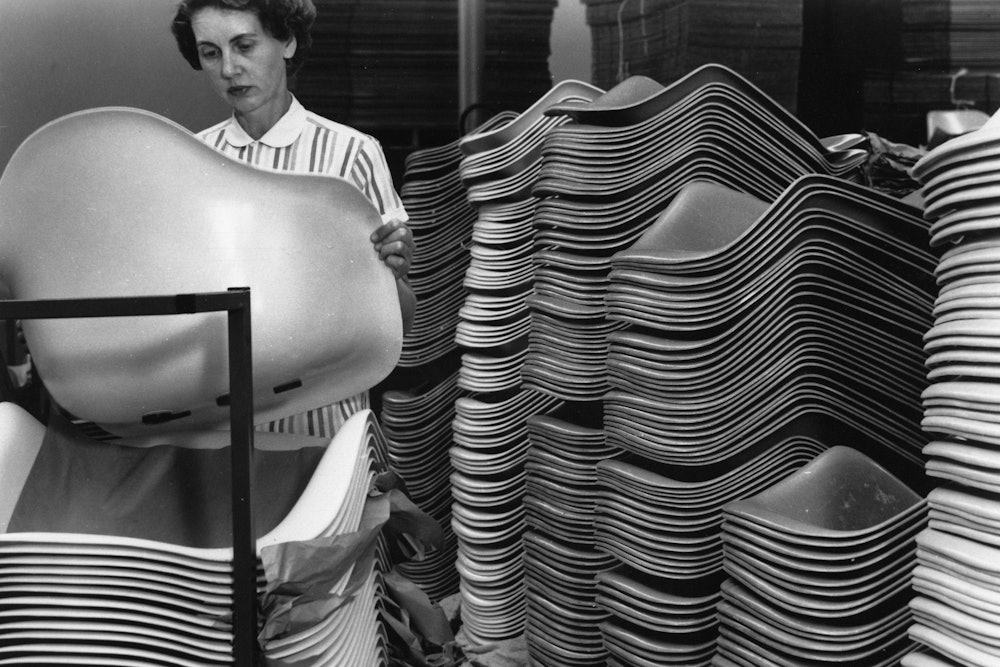


In the early 1940s, the Eames' experimented with molding techniques that would have profound effects on the design world for decades to come.


1952
Alexander Girard leads the newly formed Herman Miller Textile Division.
1956
Eames Lounge Chair and Ottoman are introduced becoming a highly visible emblem of Herman Miller quality and innovation.


Herman Miller introduces Action Office 2, the world's first open-plan modular system of panels and attaching components. Designed by Robert Propst and Jack Kelley, Action Office revolutionized office design and began a whole new industry.

In the late 1960s, Herman Miller's visual design began to streamline with updates to the identity by John Massey.

Steve Frykholm is hired as the first in-house graphic designer in 1970. Frykholm's first assignment on the job, a poster for the company picnic. The series would go on to be one of the most iconic pieces of graphic design for the brand.


Throughout this era, the brand's visual design aligned with its corporate direction while maintaining its personalty and wit. Work shown was created by Linda Powell, Barbara Loveland, Steve Frykholm, John Massey, and Tomoko Miho.


In the late 1970s, Herman Miller began a new era of ergonomic seating with the world's first research-based ergonomic chair. Nearly 20 years later, Bill Stumpf and Don Chadwick would design the Aeron Chair and revolutionize the office furniture industry.
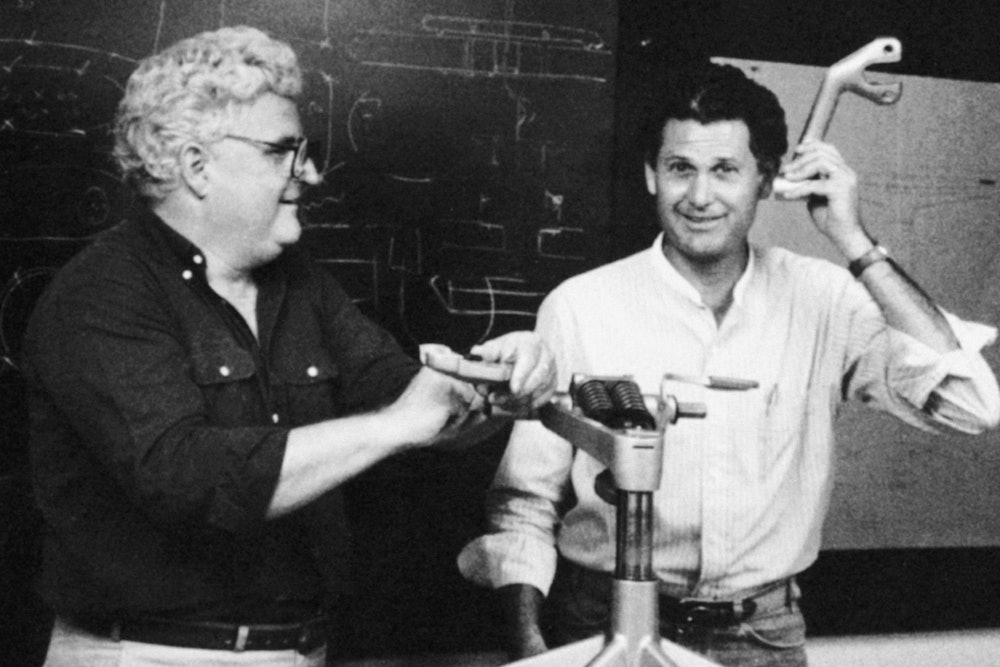

As part of their commitment to efficiency following the economic boom of the 1990s, Herman Miller develops the Herman Miller Performance System in collaboration with Toyota.
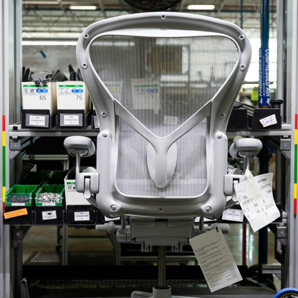
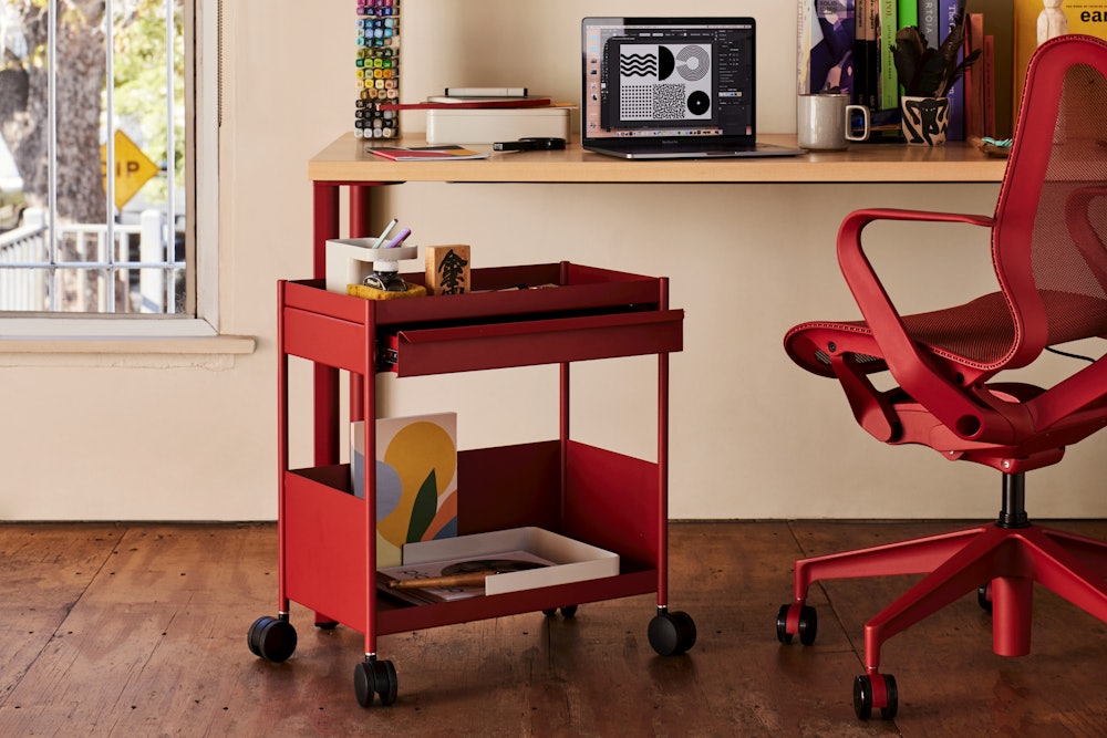
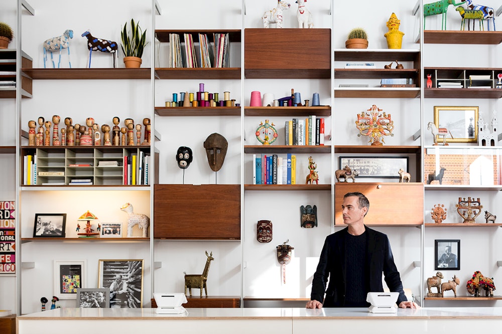
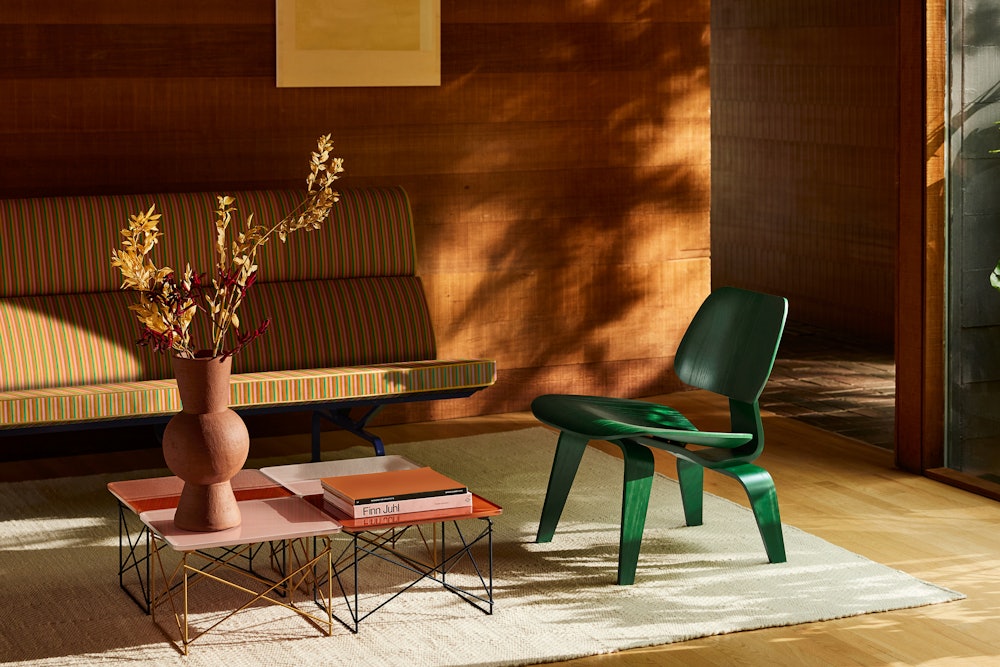
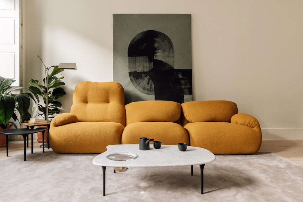
Today, Herman Miller continues to innovate with the introduction of new products and reissues of classic icons. Their commitment to solving problems for the changing needs of consumers remains as strong as ever.
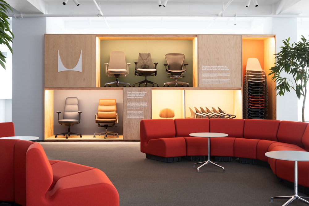
System: Embracing the identity
Staying true to the history of the company, the identity system takes careful consideration in its treatment of each element. Each piece has been refined and expanded on to allow for a full range of brand expression with Herman Miller at the core.
The symbol, originally drawn by Irving Harper, has had many iterations throughout its history. The system embraces its iconic legacy using it in its clearest and most free form.

The original drawing remains unchanged but removed from containers, allowing for an increased use throughout the brand.


Used at all scales, the symbol continues to serve as a primary piece of the identity.

The logo has had various iterations throughout the years. First by Irving Harper in 1946, then by John Massey in 1968, followed by Steven Frykholm in the 1990s. The latest evolution allows each element, name and symbol, to work both independently and together creating a flexible and functional identity.



Used both together and separately, the symbol, wordmark, and logo create the full identity suite.

The logo is used most often to identify the brand.

The wordmark is used to carry the name.

The symbol is used to capture the legacy.

The color palette takes into consideration the rich use of color throughout the history of Herman Miller adding new values to expand its use.
Herman Miller Red remains the primary brand color while the additional values add new layers to the brand’s expression.

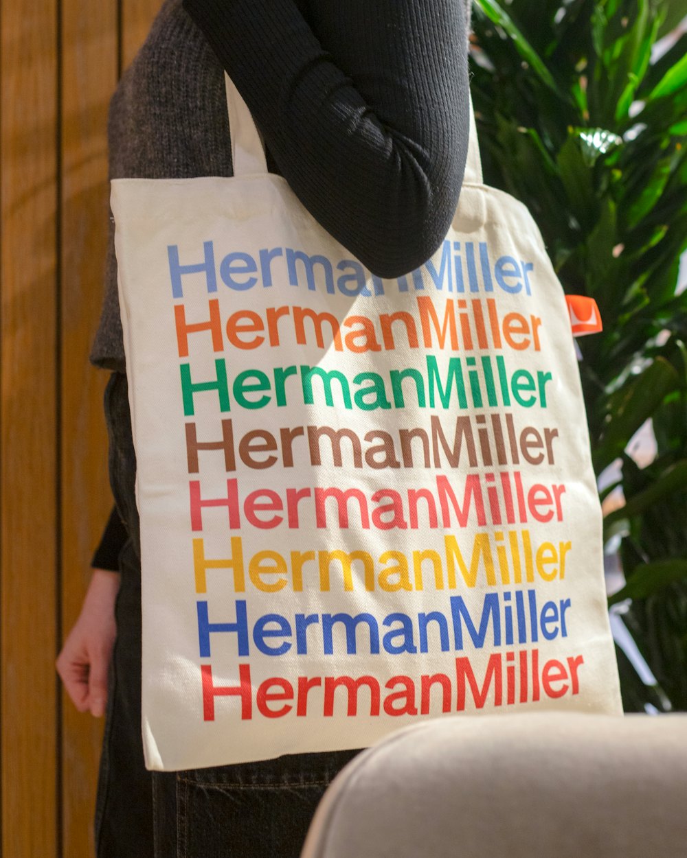
In application, these colors capture the broad range of materials, uses, and audiences for Herman Miller products.
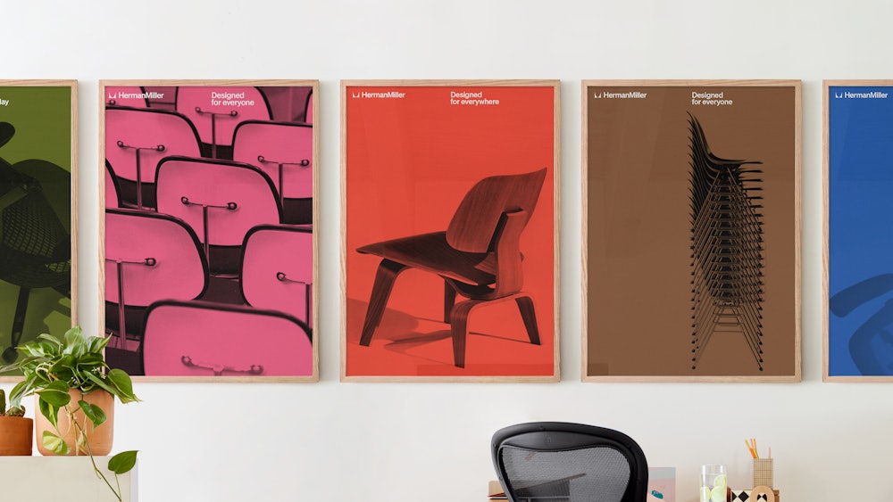
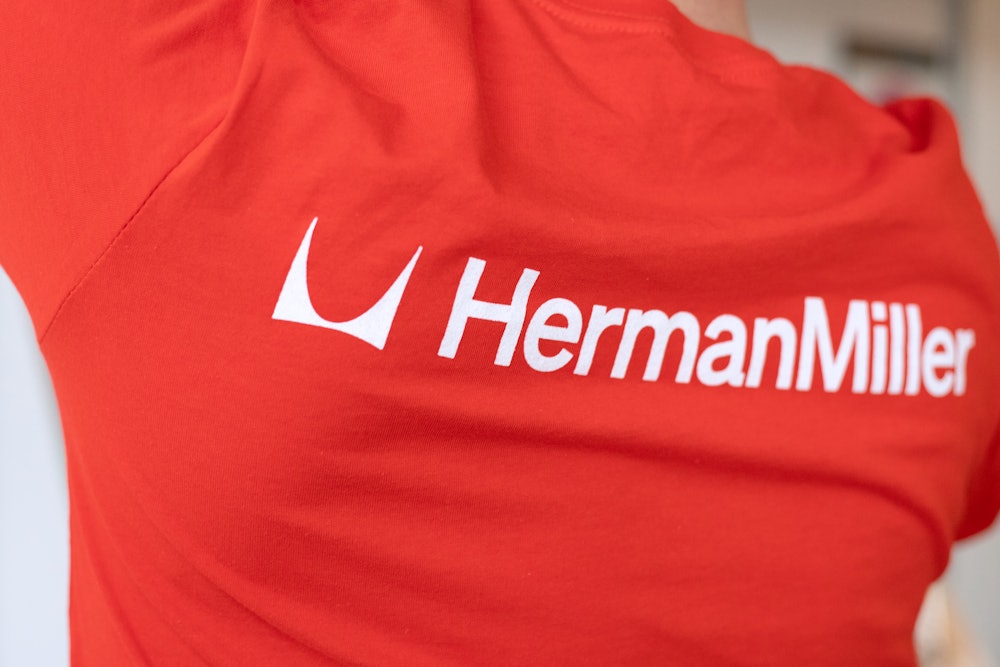
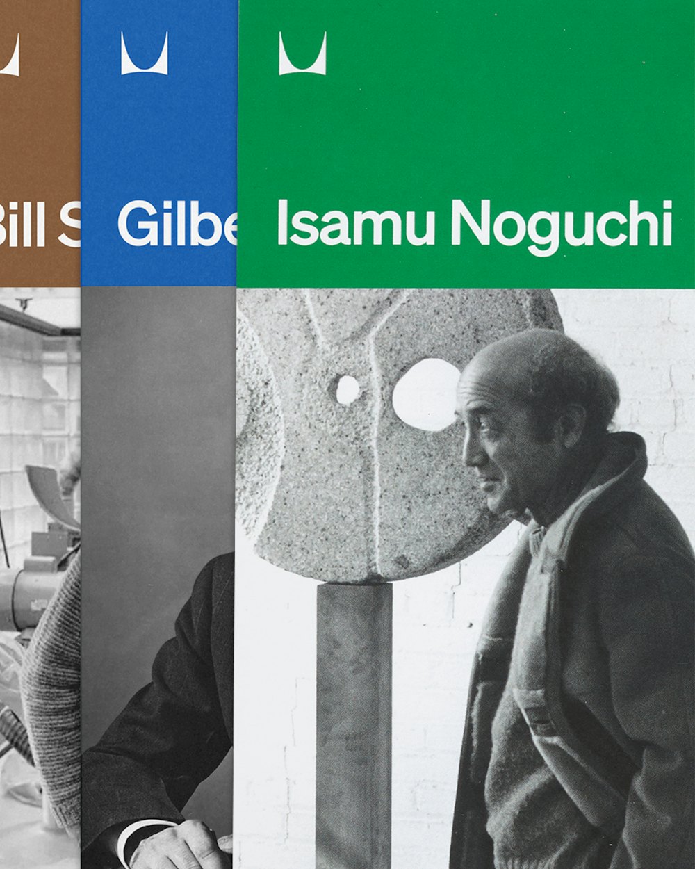
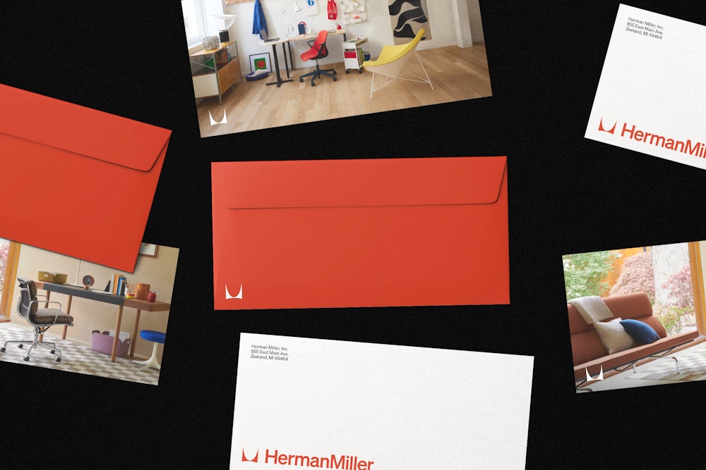
As one of the most significant elements of the brand system, typography balances both utility and personality. The system continues this relationship in both the formal characteristics of the typeface as well as expanding on how it can be used.


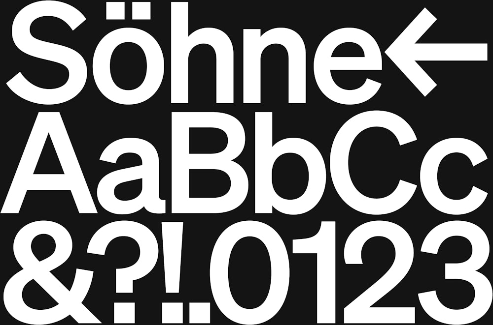

Söhne by Klim Type Foundry→ is used as the primary voice of the brand. It captures the defining characteristics of the past while allowing for new areas of expression moving forward.

At all scales and in all applications, Söhne balances both the form and function of brand and information.
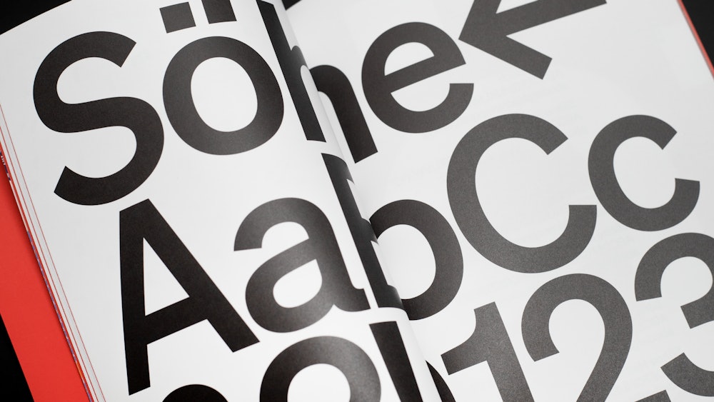
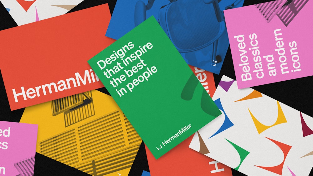
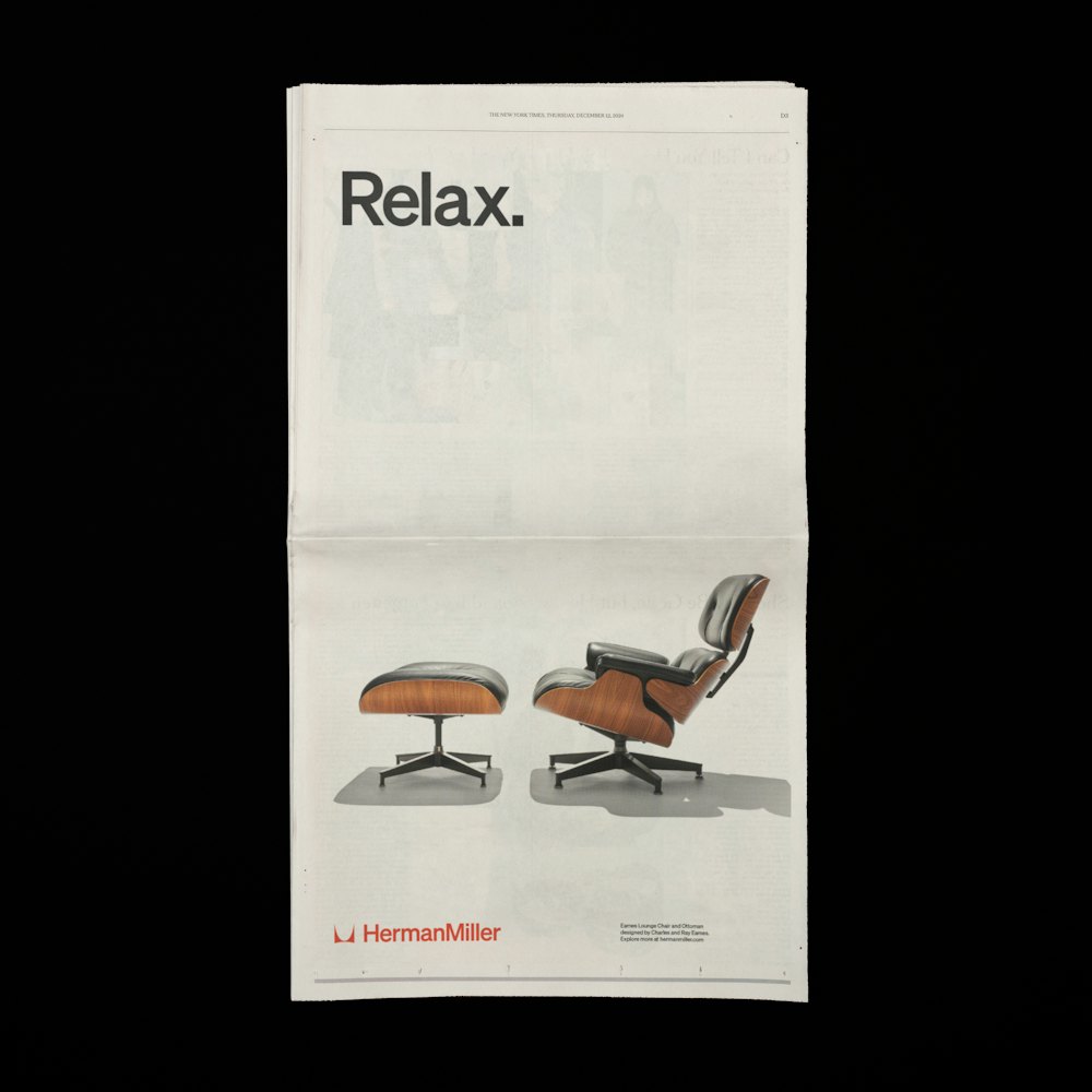
In the system, each element can be used depending on the communication need. Reserved uses allow for a more dialed back application, while expressive uses dial up the brand volume.
This range of applications provides maximum flexibility for the visual language and embraces Herman Miller’s design philosophy; beautiful and useful.
To document the updated system, online guidelines were produced through the Standards→ platform, outlining the use of each element individually as well as the full system.
Assets can be added, changed, downloaded, or removed as needed allowing the guidelines to evolve as the brand system does.


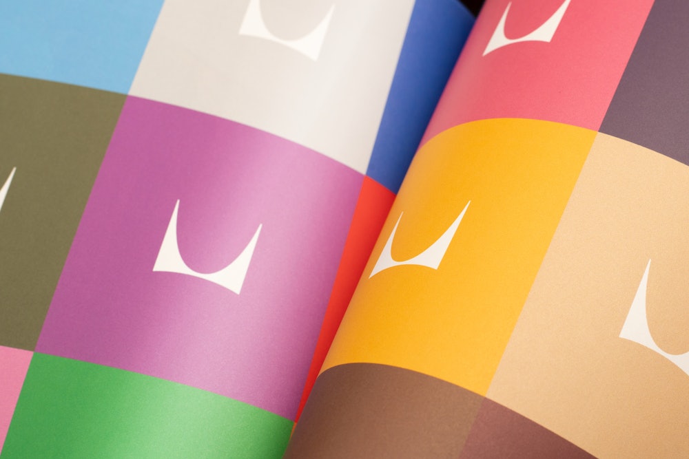
To support the online guidelines, a reduced printed version was created to highlight the primary components of the expanded system.
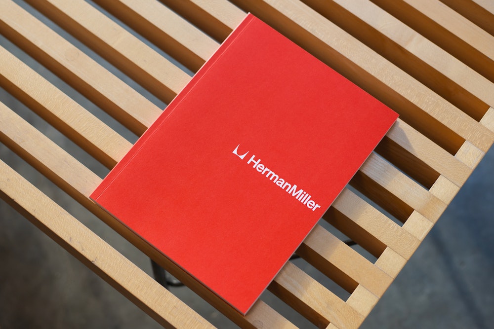
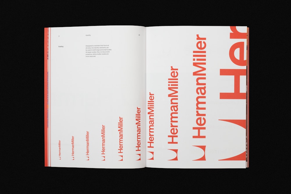
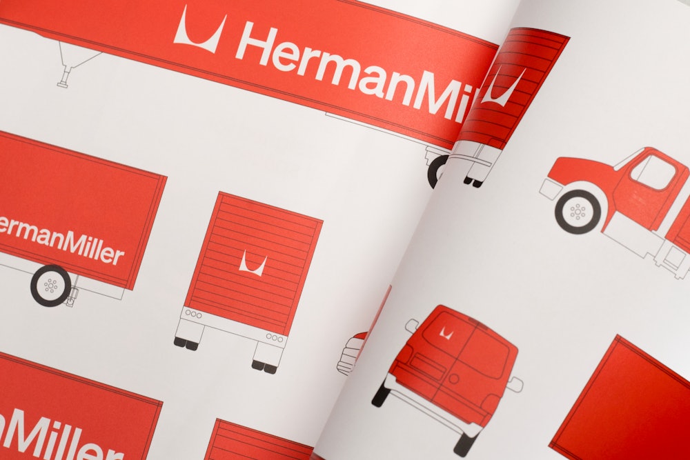
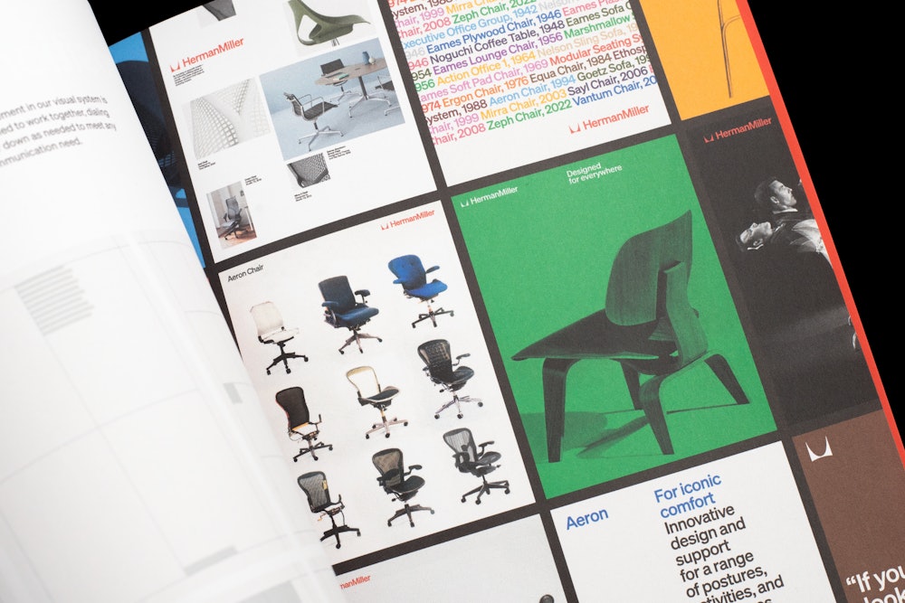
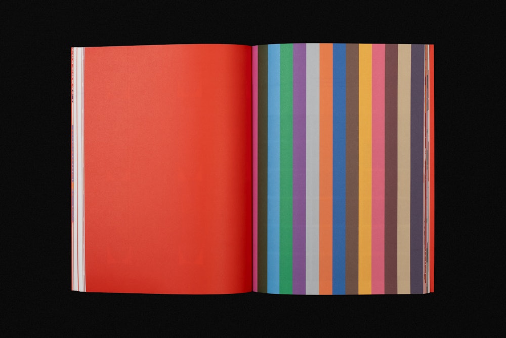
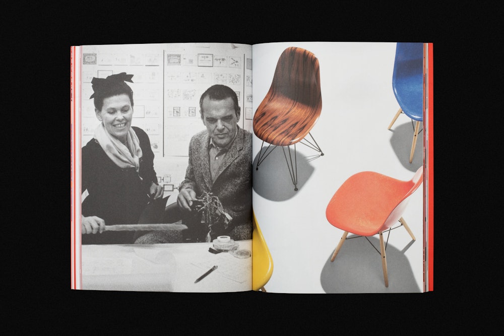
A celebration of the brand, the printed document captures elements of the past, present, and future.
Application: System in use
In application, the system is designed to create an expansive yet cohesive visual language for the Herman Miller brand. Each element is added, removed, dialed up, or dialed down depending on the communication need.
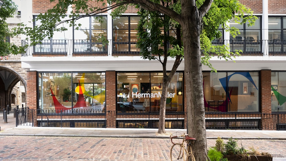

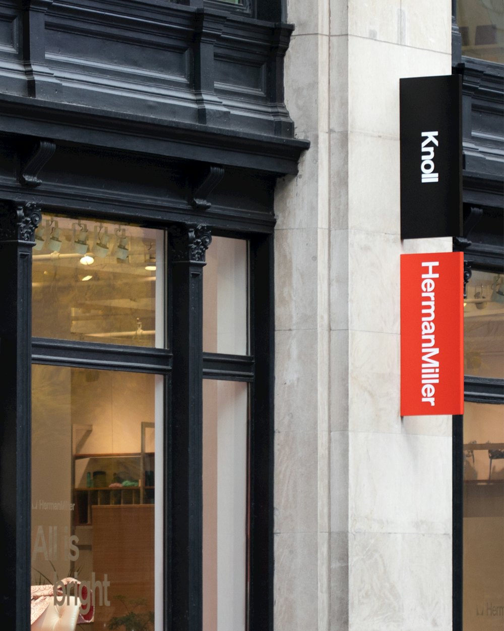

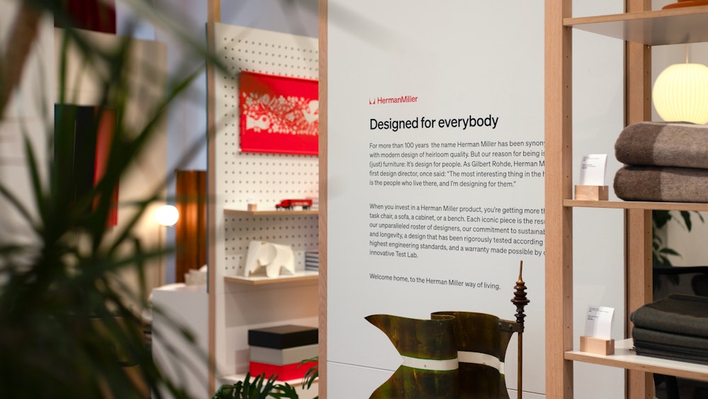
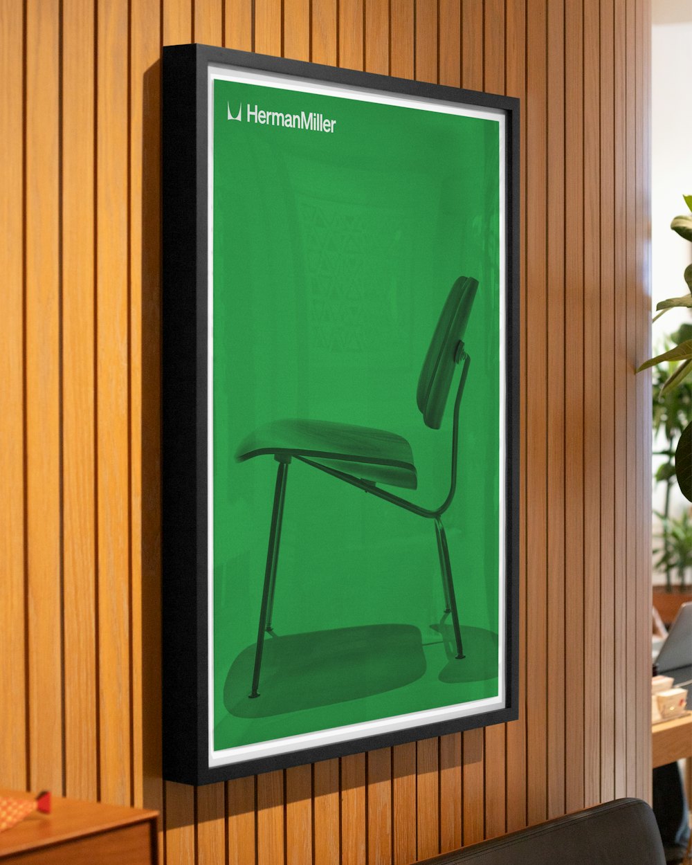

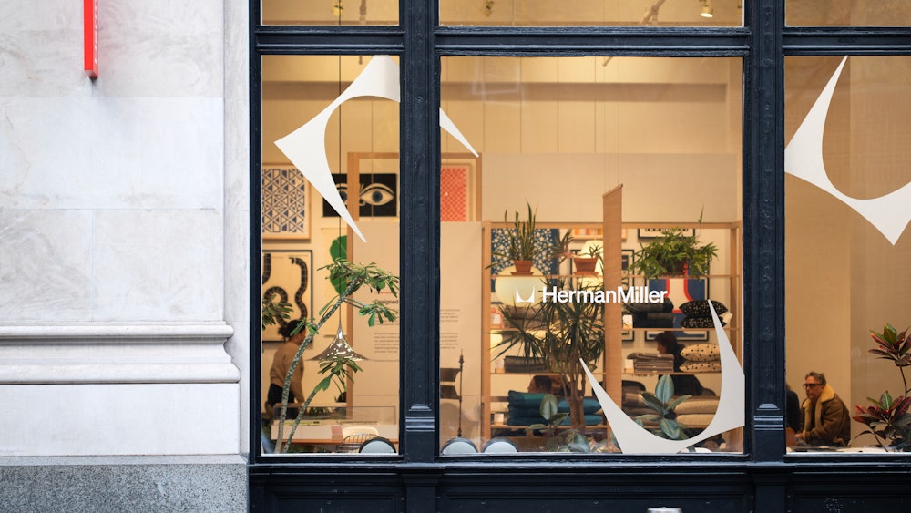
In use, the system identifies the brand and highlights the design philosophy. Additionally, it showcases the range of products, services, and uses.


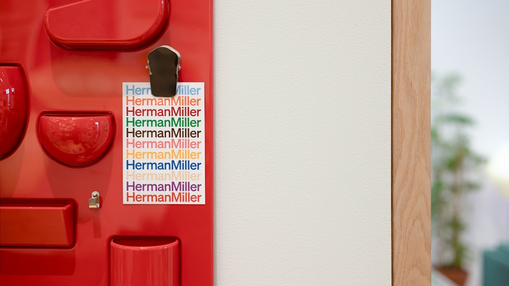
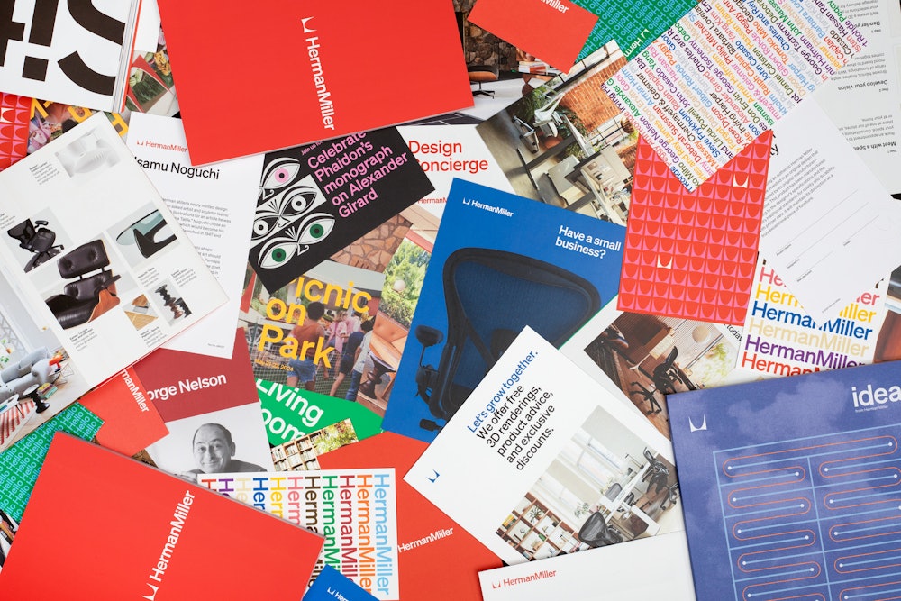
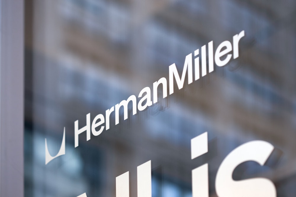

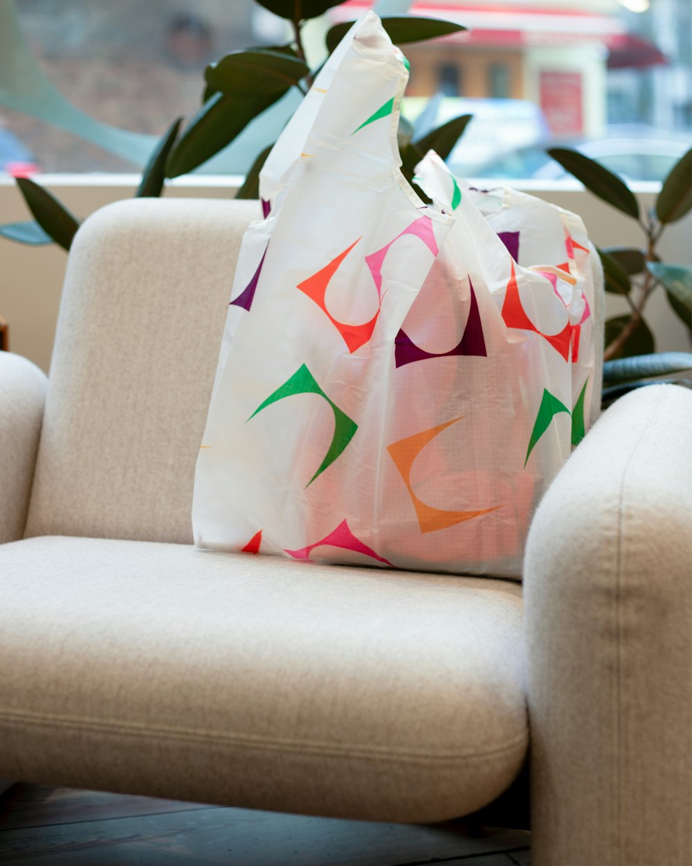
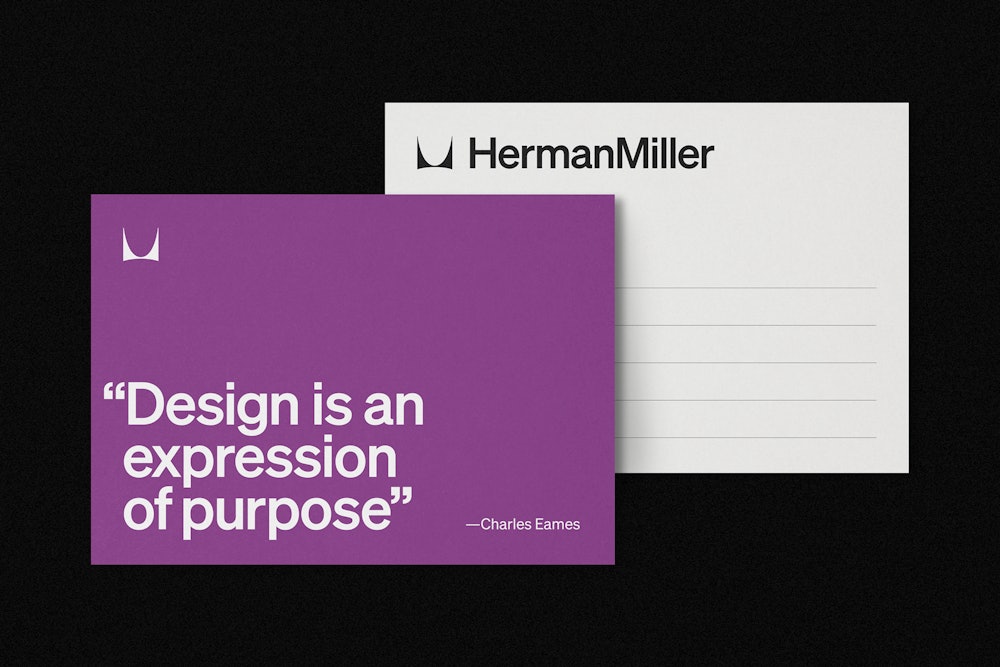
Additional physical and printed material shown were designed and produced by the Herman Miller in-house team.
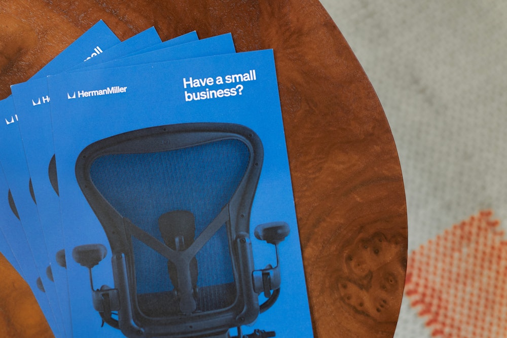
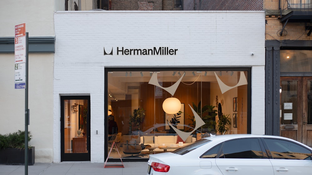
Embracing the legacy, the applications place the Herman Miller identity at the forefront of their communication.


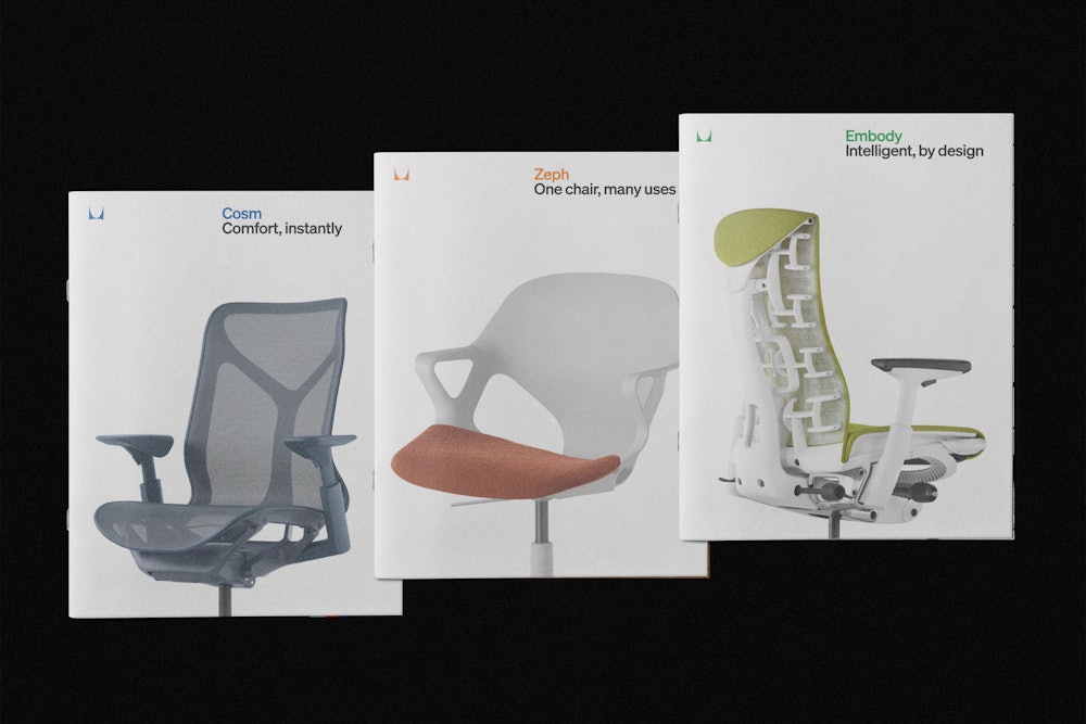
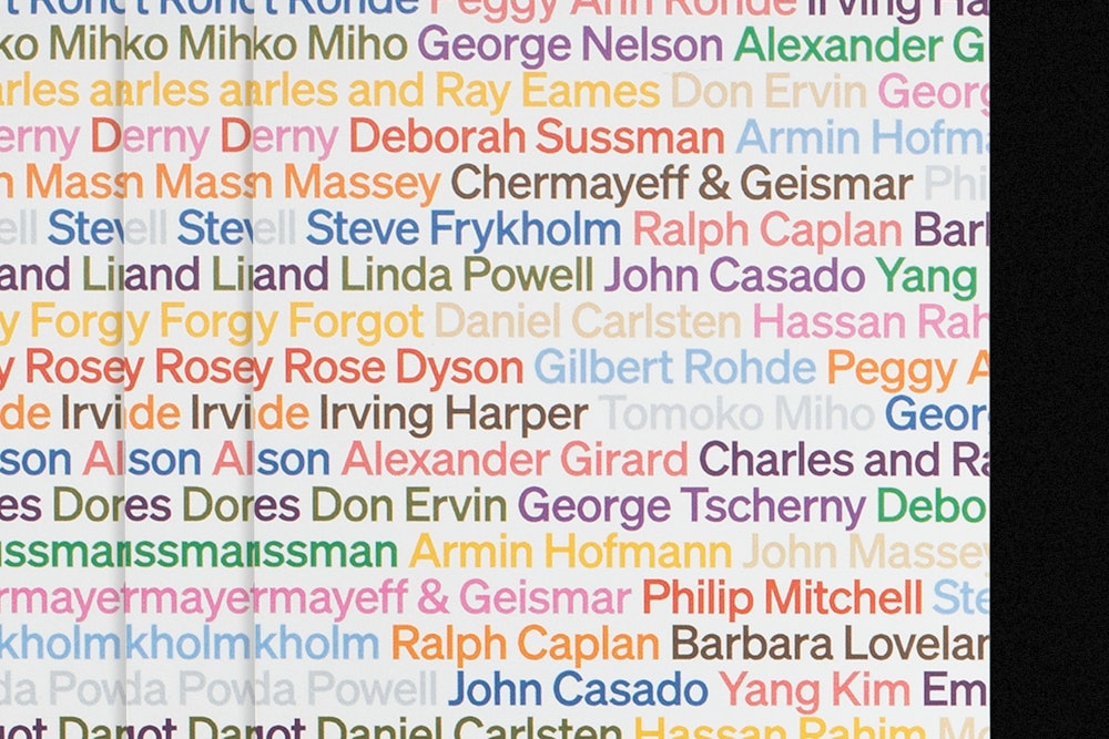

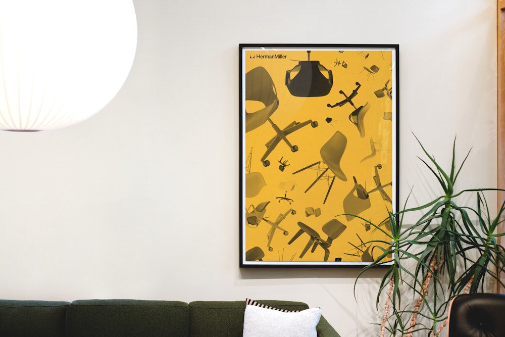
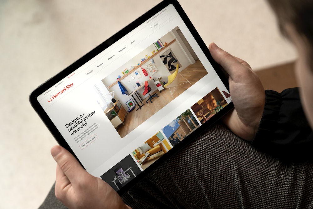
In addition to physical materials, the brand system extends into digital application through the use of motion, video, and photography.


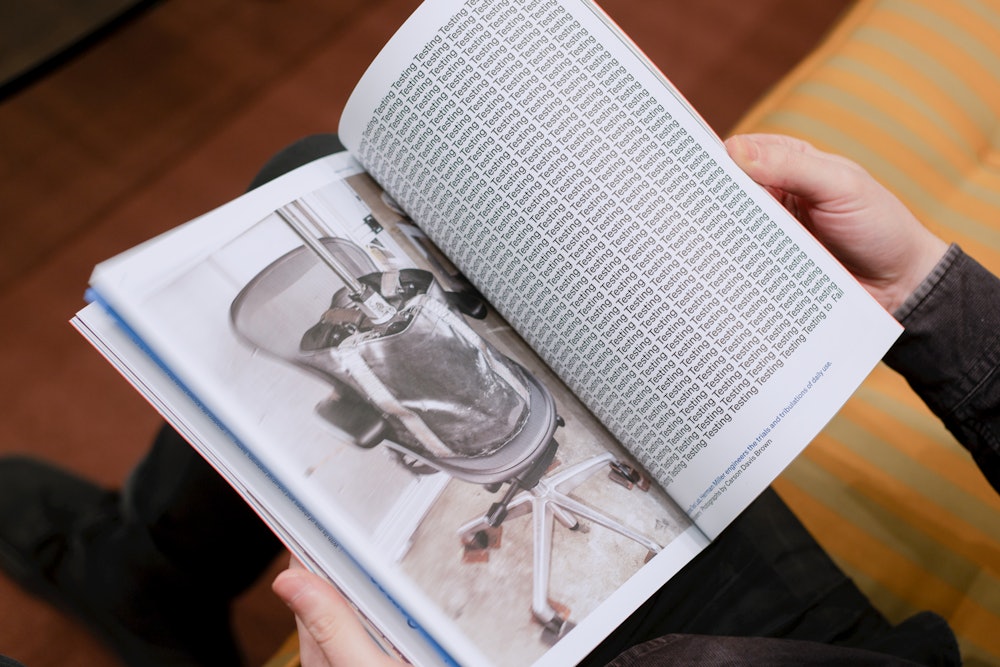
To celebrate the brand's, 100th anniversary, the Herman Miller team relaunched the printed version of their internal magazine, Ideas.

With a cover by Kelli Anderson and design direction by Leo Jung, it highlights past stories and recent collaborations for the brand.
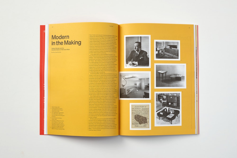
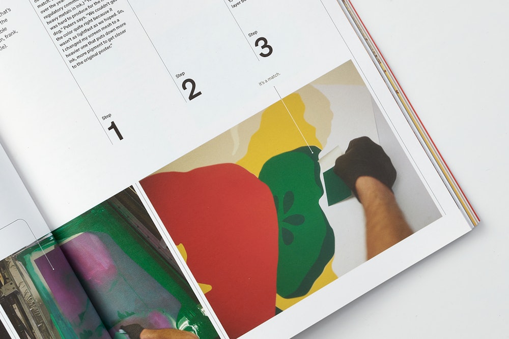
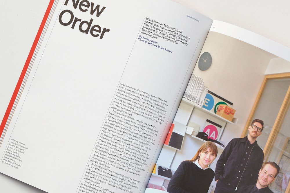
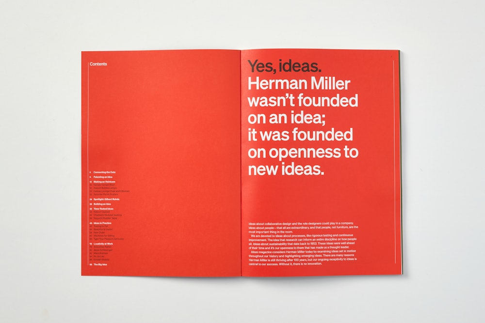

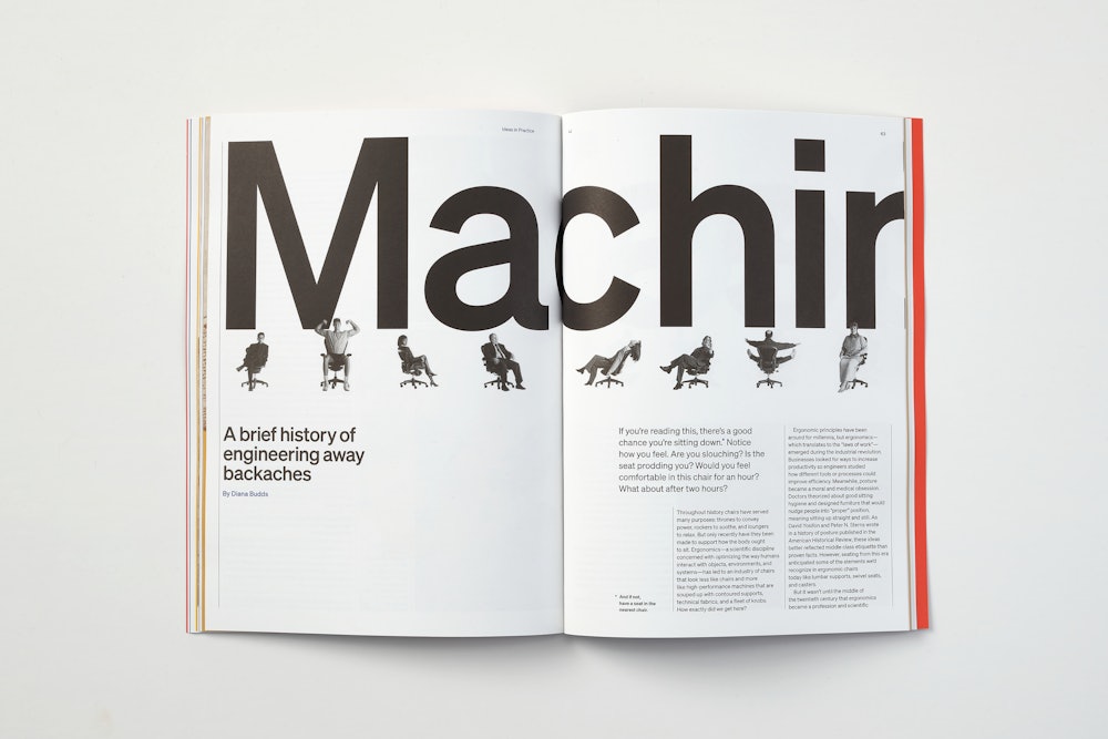


As the system continues its roll-out, the Herman Miller design team embraces elements of the past and carries them into the future through collaborations, revivals, and more.


Additional credits
Thank you to Kelsey Keith, Kelly O’Hara, Jenelle Kelsch, Ben Watson, Phyllis Aragaki, Tim Straker, Melody Lee, Amy Auscherman, and the entire Herman Miller team for their support, trust, and collaboration. Additional design work shown created by the in-house design team.