Heyday
Heyday is a productivity tool and browser extension that collects, connects, and organizes all your research, automatically. Its adaptable system eliminates the tedious work previously required to stay organized and gives you the freedom to focus on your work.
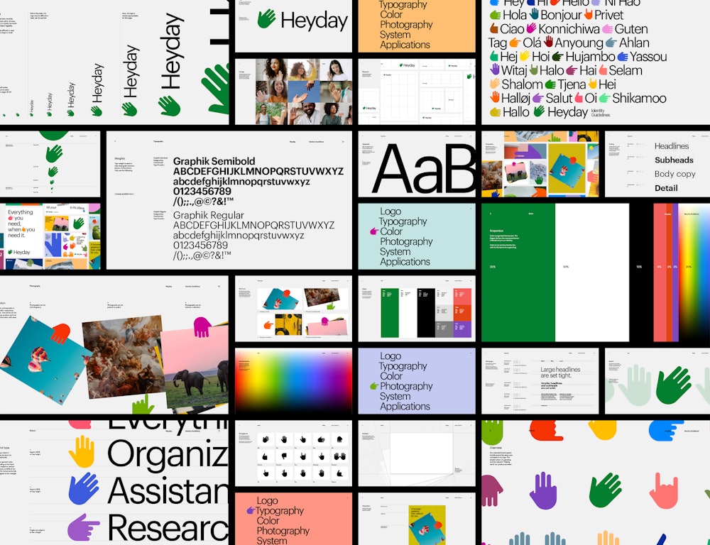
On the heels of a new name and strategic positioning, Order built a versatile identity system that showcases the core functions of the product in an immediate, recognizable way.
Collaborators
—
Project team
Jesse Reed, Partner
Garrett Corcoran, Designer
Megan Nardini, Operations
Brooklyn Office
The product captures the topics, articles, and images you’re researching so you no longer need dozens of tabs and windows open.
Heyday saves it all for you and resurfaces it when you need it.


With so much to offer as a product, we built the brand around a simple, recognizable concept—a helping hand.

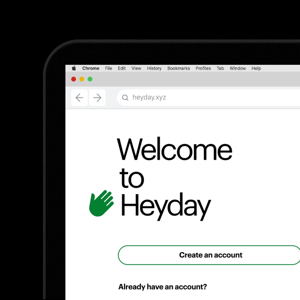
The Graphik type family from Commercial Type→ compliments the geometric forms of the hand and is designed to embrace the possibilities of the ordinary.

The hand and green color work together as the primary identifier, giving the brand an anchor in the system.
In the extended brand language the hand takes on any an all colors to provide a broad range of expression.

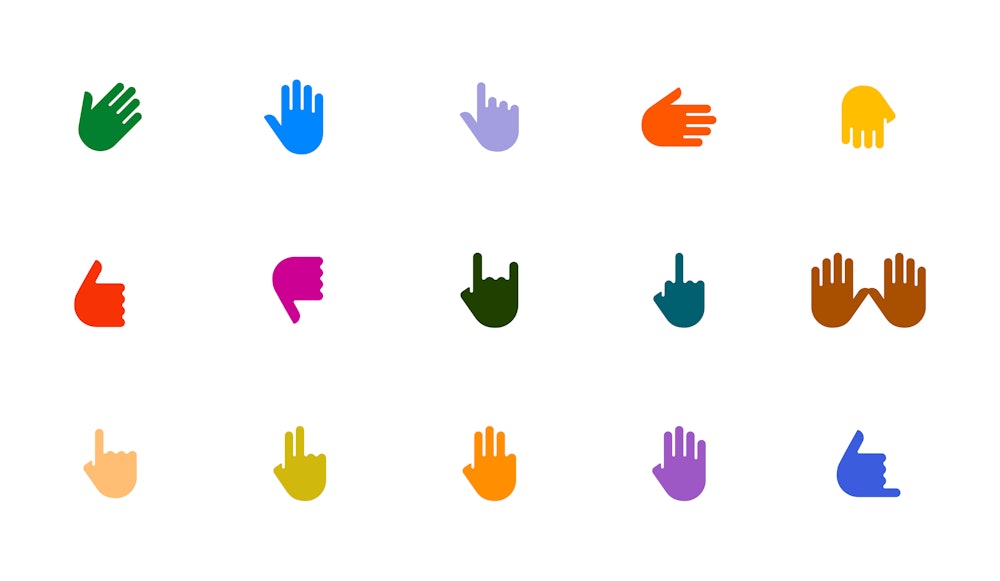
A full library of gestures was created to showcase different product features and use cases.

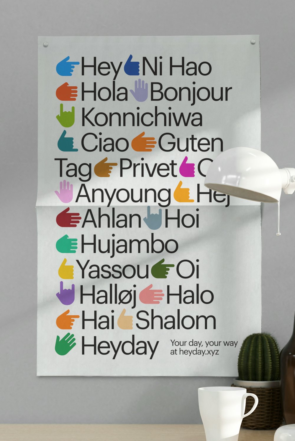


Each gesture can then act as a guide throughout brand experience.


Helpful and simple, the Heyday identity works with and for you.

