
Union AI is a software tool designed to implement and maintain accurate predictability of data workflows required for using artificial intelligence in a myriad of product services.
Following the success of the open-source version of the platform, Flyte→, Order constructed an identity system surrounding the data-focused nature of the team’s work.
Collaborators
Project team
Jesse Reed, Partner
Emily Klaebe, Designer
Megan Nardini, Operations
Brooklyn Office
Industries have looked to AI’s capabilities to achieve meaningful results in their services. However, the maintenance of those data workflows can often require considerable technical means.
Union’s software is used in a multitude of companies to reduce friction in the data workflow process — their work began with Lyft, where they created a system to calculate the estimated time of arrival for drivers between start and end destinations.


Union’s services have been lent to food delivery companies, such as Wolt, to optimize predictability for restaurant timing estimates.

In their work with Spotify, Union aided the finance team requires in compiling a 2-year projection into the future of profits and losses.
Union’s software uses the methodology of “orchestration” to systemize a set of pre-existing — and often disparate — data points.
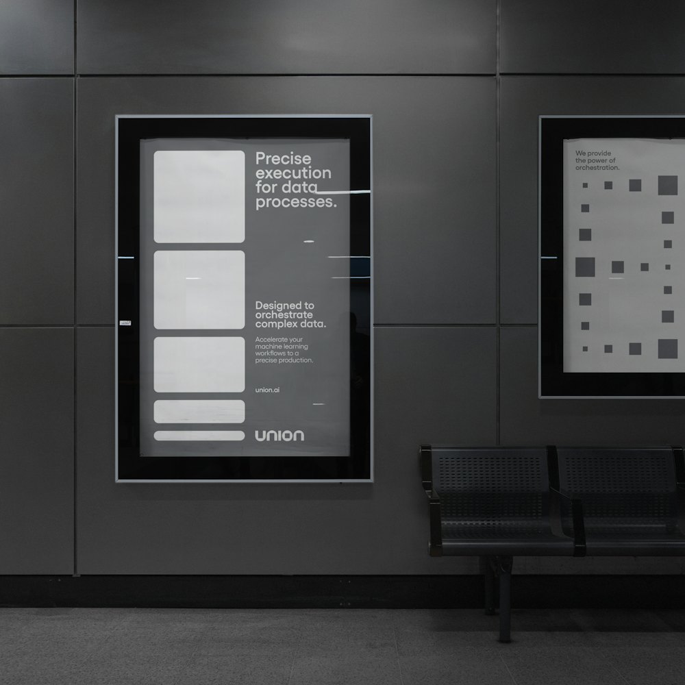
To illustrate the complex nature of Union’s work with orchestration, and the importance of each individual unit of data, Order looked towards core geometric language to build the foundational elements in the identity system.


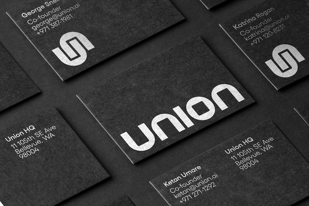
The wordmark is built using core geometric shapes of a circle and square.
A symbol was designed for secondary uses and at smaller scales, calling back to the user’s journey throughout the data workflow.


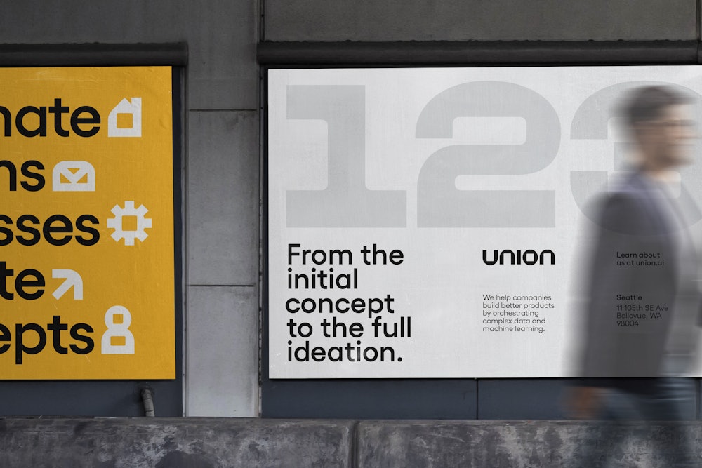
To create cohesion with the wordmark’s mathematic characteristics, Order looked towards early geometric sans-serif’s in Paul Renner’s Futura.

The Yellix type family by Displaay→ comprises our primary typographic voice.
Yellix’s early inspirations of Renner’s first Futura sketch aligned with the geometric qualities of the wordmark’s custom letterforms. The tension between the circular and square shapes lent to both elements of our mark.


Yellow acts as the primary identifier of the brand, with purple being used as a color highlight in the system.

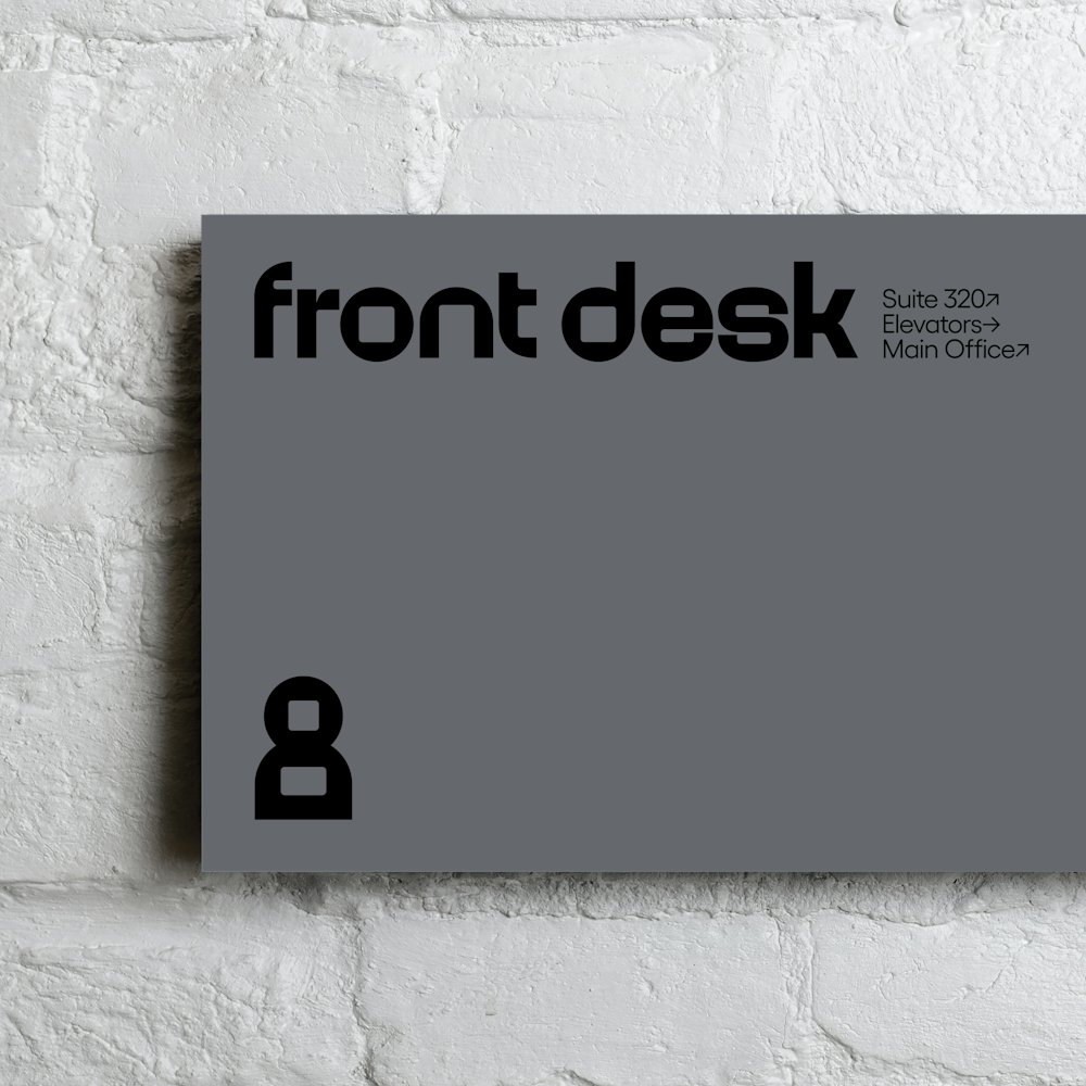
The geometric traits established in our wordmark extend into a diverse library of iconography and custom typography to represent the features of the software.


In a primarily black and white brand, photography is used in full color to accurately represent specific client use cases.
Geometric shapes and extended graphic devices are used as masking devices for to display imagery with a range of expression.


