Chapter
Founded to help seniors navigate elder care, Chapter is an organization focused on making complex processes in retirement clearer and more manageable. Through a thoughtful, human-centered approach, it connects families with trusted guidance and resources so they can make informed decisions with confidence.
Collaborators
Marc Weidenbaum
Andria Lo→
Project team
Jesse Reed, Partner
Joyce Ho, Designer
Emily Klaebe, Designer
Megan Nardini, Operations
Brooklyn Office


For many seniors, navigating healthcare, retirement, and Medicare means facing a system that’s already difficult—and often becoming even more complicated along the way. What should be straightforward decisions are layered with confusion, making an already frustrating process even harder to manage.


Chapter was born from founder Cobi Blumenfield-Gantz’s experience helping his grandfather Henry navigate Medicare. The process took weeks, countless phone calls, and still led to uncertainty.
After seeing his own family face the same confusion, he set out to build something better: a clearer, more supportive way to make these critical decisions.


Through a series of interviews, workshops, and exercises, Order worked closely with Chapter to better understand the people they serve. This process helped define an earnest way of speaking to and representing seniors, based on real lived experiences of their clients.


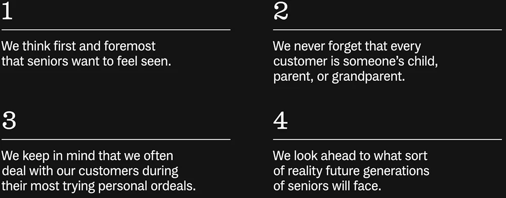
Chapter represents the “total” senior. That means considering finances, housing, social connection, and access to support, alongside medical needs. By looking at all the factors together, we can better understand what truly shapes quality of life in later years.
Order helped shape Chapter’s brand personality to reflect its approach to support and its understanding of its clients’ needs.

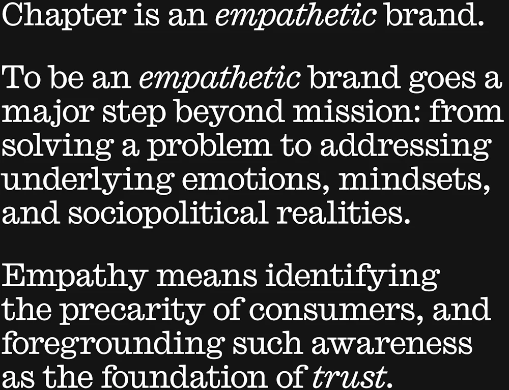
Order worked to translate empathy into something tangible for Chapter by defining what it means in practice, not just in principle.


The messaging toolkit captures Chapter’s empathetic spirit through familiar, grounded language for the sector.
When translating Chapter’s values into identity, Order focused on its role in supporting life’s transitions.
Retirement is not an ending, but a new chapter; a sunset is not finality, but a shift into what comes next.


Transitions look different for everyone.
To be empathetic is to support. For Chapter, that means supporting people through change, and being there for seniors at every step of their transition.
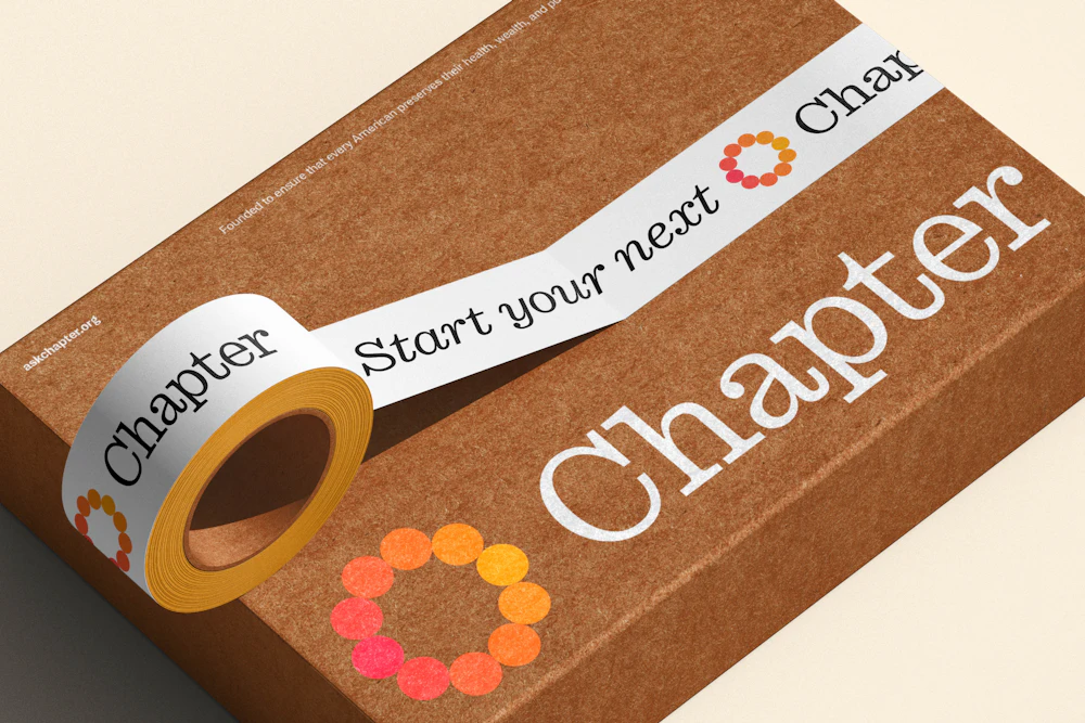
The symbol reflects Chapter’s focus on transition, and is designed to feel in motion rather than fixed.
Its form suggests continuity and change, capturing the idea that each stage leads naturally into the next.

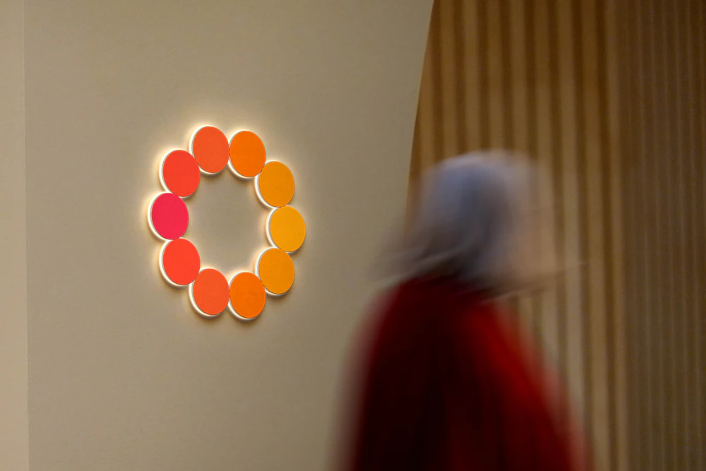


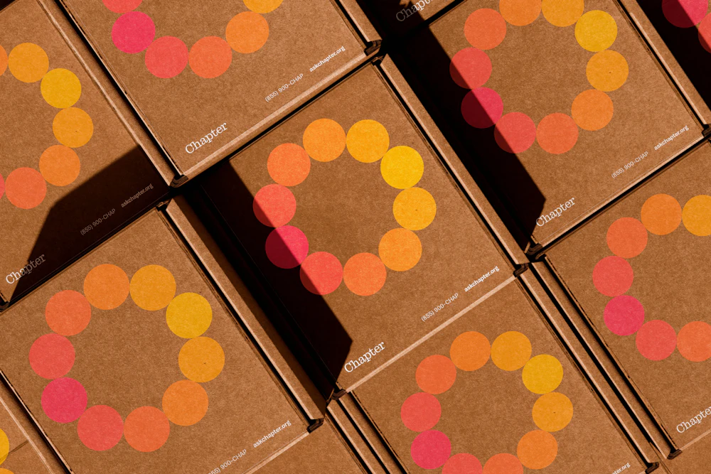


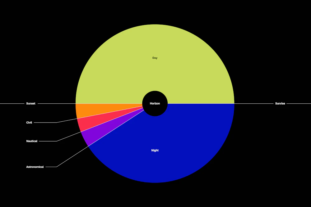
The color system is inspired by the shifting light before and after sunset, when the sky moves through subtle stages of change.
These transitions form the foundation of the palette: day, civil, nautical, astronomical, and night.
Together, they capture the gradual shift from light to dark as a continuous spectrum.


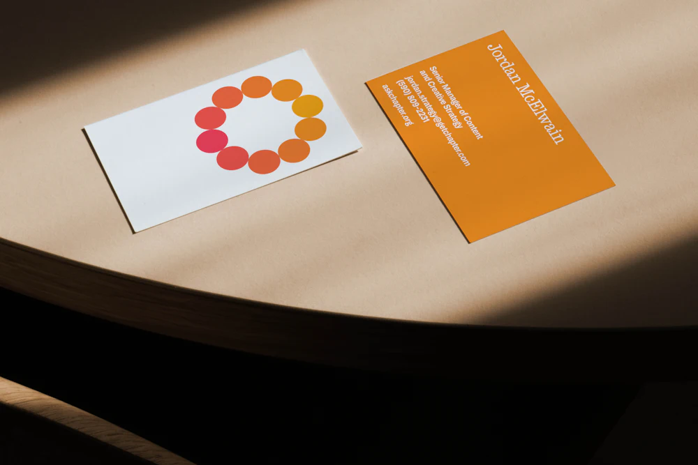
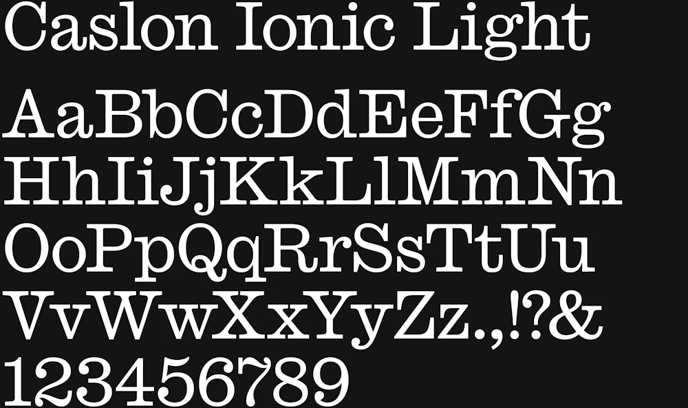
Caslon Ionic Light by Commercial Type is used for its accessible tone. Its subtle round forms echo the circularity of the symbol.
MD System by Mass Driver is used as supporting type for its legibility and human quality.


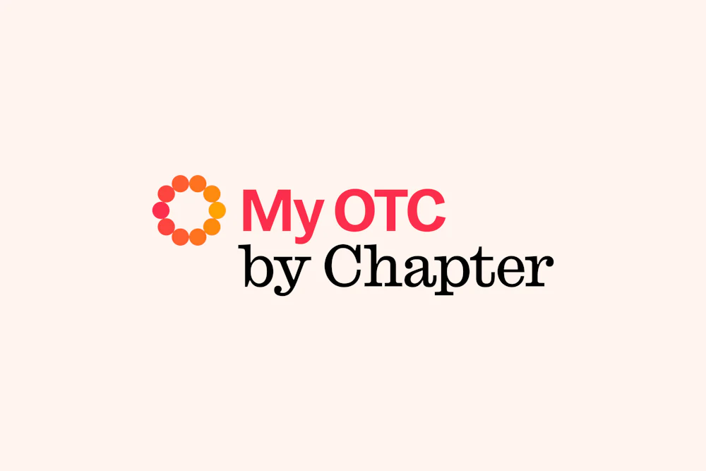
The brand architecture system is derived from the color families, using the same logic of transition and progression.

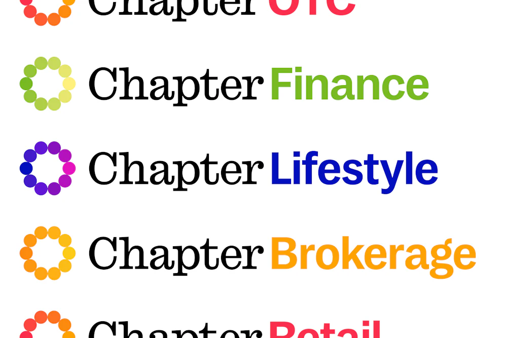


The architecture system is designed for flexibility, allowing for unique offerings to proceed the wordmark.

Clear guidance for how to compose partnership lockups allows the Chapter team to maintain brand legibility while speaking to their collaborations.


Through blending typographic styles, key words from messaging can be highlighted for quickly parsible language.
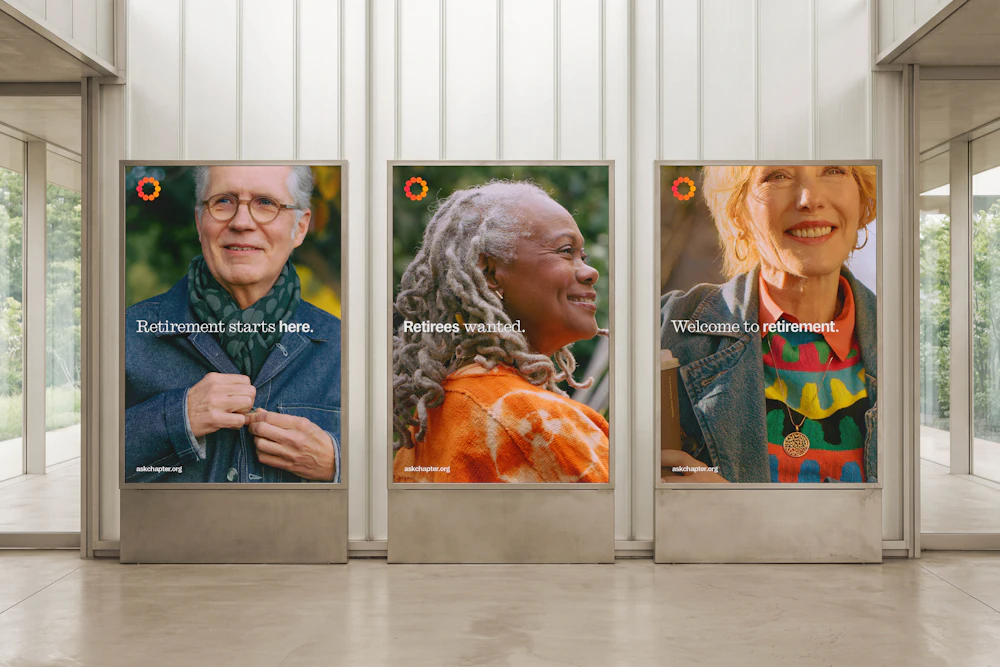
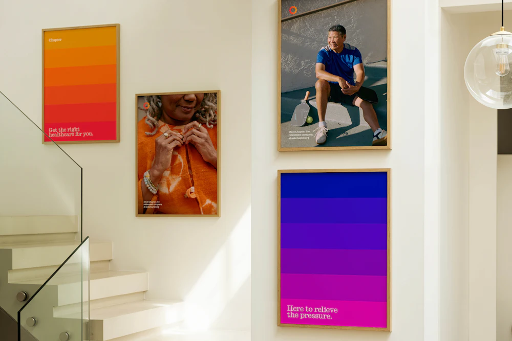
Photography
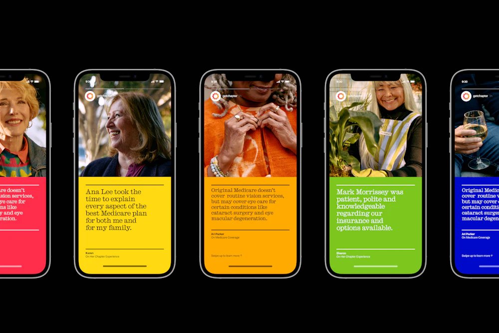
Custom photography of real Chapter customers, by Andria Lo, is used throughout the system to reflect the brand’s empathy and sincerity.


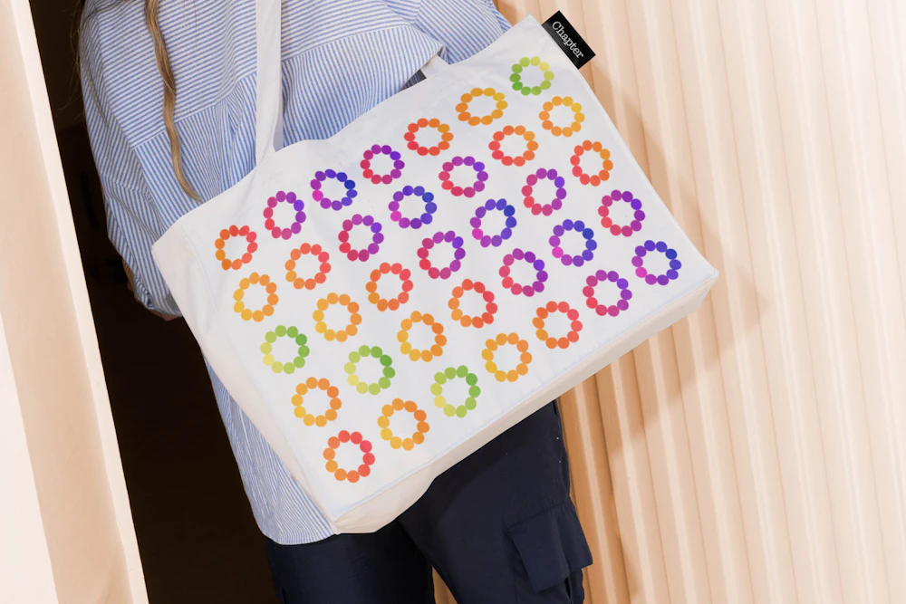
Brand devices derived from the symbol extend the concept of transition throughout the system.
Through subtle visual cues inspired by shifting light and sunsets, they reinforce Chapter’s focus on supporting change.


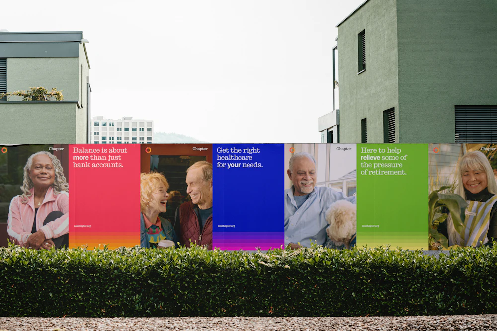
Brand devices are applied across social marketing and promotional materials to communicate Chapter’s services in a clear and consistent way.
They help create recognizable touchpoints that carry the brand’s voice and visual language across platforms.
Order developed a series of social media ad campaigns using the brand devices to bring Chapter’s system to life.
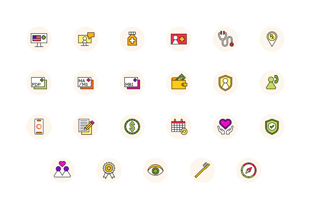
Iconography
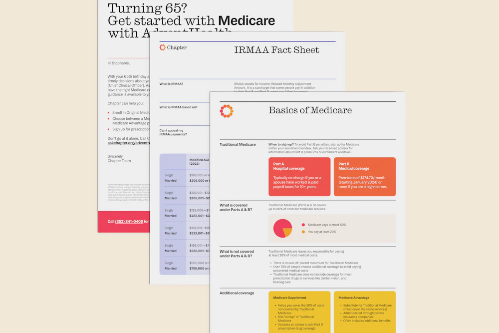
A comprehensive icon system was created to support clear, intuitive navigation across Chapter’s website. Infused with color and designed for clarity, the icons help simplify complex information and improve the overall user experience.


Iconography can flex between full color usage or single color usage, depending on the surrounding content.


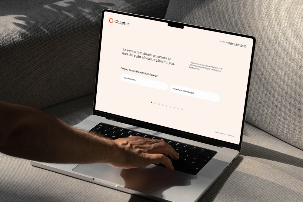
Order designed a website to coincide with the launch of the new brand, bringing all identity components together in one cohesive digital experience.


Key photography crops were carefully considered for mobile, ensuring the imagery translates seamlessly from desktop scaling.